
react-retro-display-tty-ansi-ascii
v0.1.190
Published
A reusable React retro display component with value, terminal, and prompt modes.
Downloads
2,187
Maintainers
 smysnk
Readme
react-retro-display-tty-ansi-ascii


Storybook: smysnk.github.io/react-retro-display-tty-ansi-ascii
react-retro-display-tty-ansi-ascii is a React component for calm, terminal-flavored interfaces.
It can be a read-only display, a controlled editable surface, a controller-driven terminal,
or a small command prompt without changing visual language. It also understands ANSI styling,
semantic display color modes, and an xterm-checked terminal behavior surface for real control
character playback. It can also project itself onto either dark or light LCD glass without
asking the whole app shell to follow.
See It In Action
Want to see the component running in a real product surface instead of a contained story? Check out ascii.gallery, which uses the retro player and viewer stack to honor the ANSI and ASCII scenes of old through a living gallery of scrolling artwork, fullscreen playback, and preserved retro display behavior.
Latest CI runs: github.com/smysnk/react-retro-display-tty-ansi-ascii/actions/workflows/cicd.yml
Getting Started
Install the package, bring in the shared stylesheet, and start with the simplest thing:
npm install react-retro-display-tty-ansi-asciiimport { RetroScreen } from "react-retro-display-tty-ansi-ascii";
import "react-retro-display-tty-ansi-ascii/styles.css";
export function StatusCard() {
return (
<RetroScreen
mode="value"
value="SYSTEM READY"
color="#97ff9b"
/>
);
}That is the whole entry point. You hand the component a mode, a value or controller when needed, and let it handle the grid, wrapping, cursor rendering, and terminal feel.
Touch Input
Use touchInput when the display itself should behave like a touch surface and report
grid-aligned cell hits back to the host application.
The touch contract is intentionally simple:
- the component emits 1-based
rowandcolcoordinates - it also reports the measured
rowsandcolsthat were active for that touch - input is delivered as a single
downevent for each press - long presses do not stream repeated events
- move events are ignored by default in touch mode
- the next touch is not accepted until the current press is released
That makes it a good fit for grid-driven interfaces such as soft terminals, retro games, touch menus, and keypad-like overlays where the host wants to interpret one deliberate press at a time.
See it in action in the live m68k-interpreter touch demo.
import { useState } from "react";
import { RetroScreen } from "react-retro-display-tty-ansi-ascii";
import "react-retro-display-tty-ansi-ascii/styles.css";

export function TouchDemo() {
  const [lastTouch, setLastTouch] = useState("Tap the screen");

  return (
    <RetroScreen
      mode="terminal"
      gridMode="static"
      rows={12}
      cols={32}
      value={[
        "┌──────────────────────────────┐",
        "│                              │",
        "│          TOUCH ME            │",
        "│                              │",
        "│   ↑ up          right →      │",
        "│                              │",
        "│   ← left       down ↓        │",
        "│                              │",
        "│                              │",
        "│                              │",
        "│                              │",
        "└──────────────────────────────┘"
      ].join("\\n")}
      touchInput={{
        enabled: true,
        onTouchCell: ({ row, col, rows, cols, pointerType }) => {
          setLastTouch(`${pointerType} @ ${row},${col} inside ${rows}x${cols}`);
        }
      }}
    />
  );
}
The host remains responsible for deciding what a touch means. RetroScreen only handles the overlay, pointer capture, hit testing, and the single-press-until-release behavior.
Display Padding
Use displayPadding when the screen content should sit tighter to the glass or breathe a little
more. The prop accepts:
- a number for uniform pixel padding
- a CSS length string for uniform padding
- an object with
blockandinline - an object with per-side
top,right,bottom, andleft
<RetroScreen mode="value" value="Tight framing" displayPadding={8} />

<RetroScreen mode="value" value="Room to breathe" displayPadding="1.25rem" />

<RetroScreen
  mode="terminal"
  displayPadding={{ block: 10, inline: 14 }}
  value="measured from the padded screen area"
/>

<RetroScreen
  mode="prompt"
  displayPadding={{ top: 6, right: 10, bottom: 12, left: 10 }}
/>
RetroScreen also shows a focus glow around the shell by default so editable, prompt, and terminal surfaces clearly read as active. Disable it when you want a quieter shell:
<RetroScreen mode="terminal" focusGlow={false} />Display Frame
Use displayFrame={false} when the glass itself should stay visible but the outer shell chrome
should drop away. This is especially useful for fullscreen mobile artwork, embedded canvases, or
layouts where the host surface already provides the surrounding frame.
<RetroScreen
  mode="terminal"
  value="frameless but still live"
  displayFrame={false}
  displayPadding={0}
/>
Frameless mode removes the bezel, inset border, outer radius, and shell shadow while keeping the same display surface, grid, ANSI rendering, and optional touch overlay behavior.
Because rows and columns are measured from the visible screen area, tighter padding yields a denser grid and looser padding yields fewer cells.
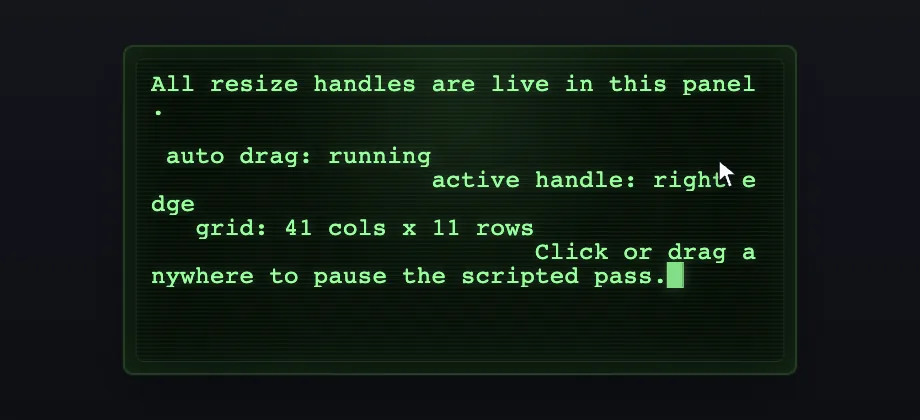
Resizable Panels
Use resizable when the panel itself should be draggable instead of only responding to layout
changes around it. The live Storybook demo now shows a visible mouse cursor grabbing the real
handles, including the optional leading-edge handles, so the docs match the shipped interaction.
<RetroScreen
  mode="terminal"
  resizable="both"
  resizableLeadingEdges
  displayPadding={{ block: 12, inline: 14 }}
  value={[
    "All resize handles are live here.",
    "",
    "Drag left, right, top, bottom, or either corner.",
    "Rows and columns recompute as the panel changes size."
  ].join("\n")}
/>
Reach for:
resizable="width"when the panel should only stretch sidewaysresizable="height"when it should stack or collapse verticallyresizableorresizable="both"for freeform terminal panesresizableLeadingEdgeswhen left, top, and top-left handles should join the same interaction surface
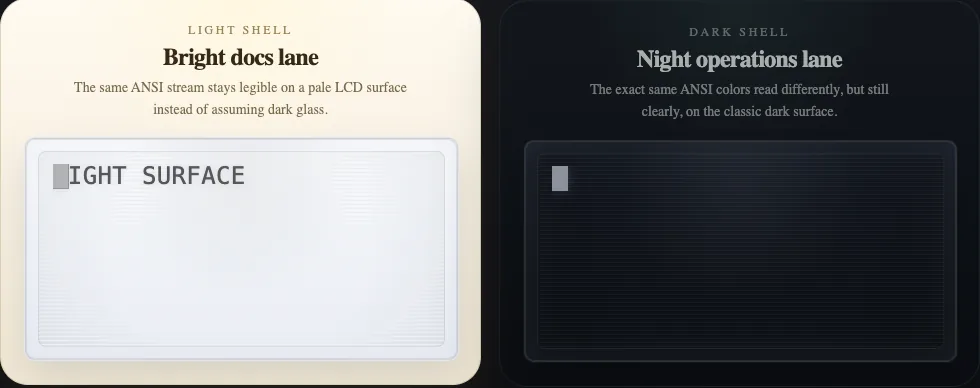
Light And Dark Surface Modes
Use displaySurfaceMode when the LCD itself should read like a light instrument panel or a
dark night-ops surface. This is separate from the host page theme, so the same ANSI-rich
terminal content can sit inside bright docs, dark dashboards, or a side-by-side comparison view.
<RetroScreen
  mode="terminal"
  value={[
    "\u001b[1mLIGHT SURFACE\u001b[0m",
    "\u001b[38;5;160mR\u001b[38;5;214mA\u001b[38;5;190mI\u001b[38;5;45mN\u001b[38;5;39mB\u001b[38;5;141mO\u001b[38;5;201mW\u001b[0m contrast check",
    "\u001b[38;2;194;94;0mamber\u001b[0m  \u001b[38;2;0;104;181mblue\u001b[0m  \u001b[38;2;108;40;148mviolet\u001b[0m"
  ].join("\n")}
  displaySurfaceMode="light"
  displayColorMode="ansi-extended"
  displayPadding={{ block: 12, inline: 14 }}
/>

<RetroScreen
  mode="terminal"
  value={[
    "\u001b[1mDARK SURFACE\u001b[0m",
    "\u001b[38;5;160mR\u001b[38;5;214mA\u001b[38;5;190mI\u001b[38;5;45mN\u001b[38;5;39mB\u001b[38;5;141mO\u001b[38;5;201mW\u001b[0m contrast check",
    "\u001b[38;2;255;176;86mamber\u001b[0m  \u001b[38;2;102;198;255mblue\u001b[0m  \u001b[38;2;214;145;255mviolet\u001b[0m"
  ].join("\n")}
  displaySurfaceMode="dark"
  displayColorMode="ansi-extended"
  displayPadding={{ block: 12, inline: 14 }}
/>
Reach for displaySurfaceMode="light" when the LCD should feel like paper, enamel, or a sunlit
instrument panel. Keep displaySurfaceMode="dark" for the classic terminal-glass look. The
same ANSI palette will still be remapped for readable contrast against each surface.
Modes Of Use
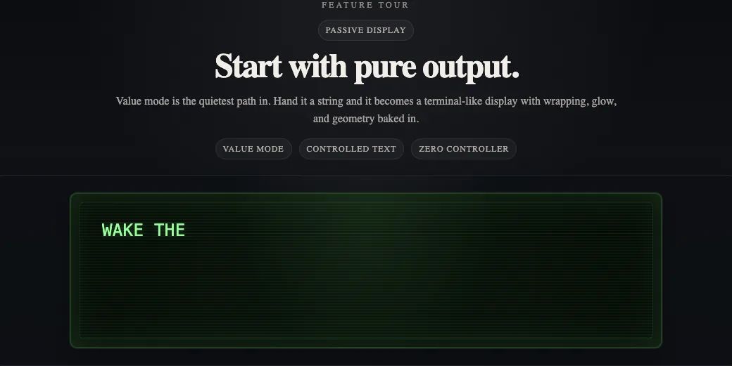
1. Quiet output
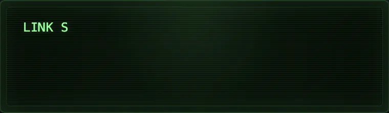
Use mode="value" when the display is just there to speak.
<RetroScreen
  mode="value"
  value="LINK STABLE\nAwaiting operator input."
/>
2. Signal intercept
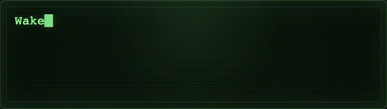
Use a controller when the display should reveal text over time and the cadence matters as much as the message.
import { useEffect } from "react";
import {
  RetroScreen,
  createRetroScreenController
} from "react-retro-display-tty-ansi-ascii";

const controller = createRetroScreenController({
  rows: 5,
  cols: 34,
  cursorMode: "solid"
});

export function WhiteRabbitSignal() {
  useEffect(() => {
    controller.reset();
    controller.write("Wake up, Neo...");
  }, []);

  return <RetroScreen mode="terminal" controller={controller} />;
}
The Storybook version uses timed writes and screen clears so the four-line sequence lands like a late-night intercepted signal instead of a static quote.
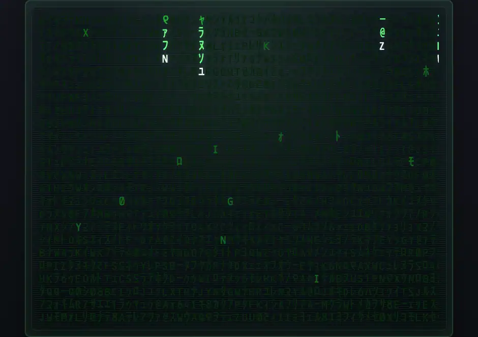
3. Matrix code rain
Use the terminal renderer as a dense animated display surface when you want the operators' green rain instead of a message prompt.
import type { CSSProperties } from "react";
import { RetroScreen, createRetroScreenController } from "react-retro-display-tty-ansi-ascii";

const controller = createRetroScreenController({ rows: 24, cols: 58 });
const matrixFontStyle = {
  "--retro-screen-font-family": "\"Matrix\""
} as CSSProperties;

<RetroScreen
  mode="terminal"
  controller={controller}
  gridMode="static"
  rows={24}
  cols={58}
  displayColorMode="ansi-extended"
  color="#8efe8e"
  displayFontScale={1.05}
  displayRowScale={1.08}
  displayPadding={{ block: 12, inline: 14 }}
  style={matrixFontStyle}
/>
The Storybook demo keeps the glyphs planted on the grid and moves waves of illumination through them so the effect feels closer to the movie than a simple falling-text loop. It uses the bundled Matrix font.
4. Editable drafting
Turn on editable when you want the same surface to behave like a controlled input.
import { useState } from "react";

export function DraftPad() {
  const [value, setValue] = useState("");

  return (
    <RetroScreen
      mode="value"
      value={value}
      editable
      autoFocus
      placeholder="Write a line, then press Enter."
      onChange={setValue}
      onSubmit={(submitted) => {
        console.log("submitted:", submitted);
      }}
    />
  );
}
5. Terminal output from a controller
Use a controller when the display should follow external writes over time.
import { useEffect } from "react";
import {
RetroScreen,
createRetroScreenController
} from "react-retro-display-tty-ansi-ascii";
const controller = createRetroScreenController({
rows: 9,
cols: 46,
cursorMode: "hollow"
});
export function StreamedTerminal() {
useEffect(() => {
controller.reset();
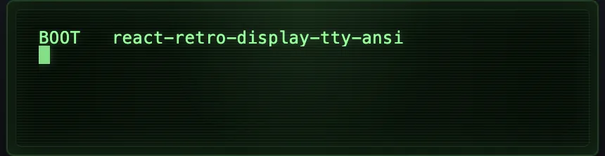
controller.writeln("BOOT react-retro-display-tty-ansi-ascii");
controller.write("\u001b[1mREADY\u001b[0m ansi parser online");
}, []);
return <RetroScreen mode="terminal" controller={controller} />;
}If you already have a terminal-like buffer as a string, mode="terminal" also accepts value
or initialBuffer.
Live TTY Websocket Bridge
RetroScreen can also act as the browser-side surface for a real TTY session. The transport
stays outside the component, while the component handles geometry, keyboard capture, paste,
focus reporting, mouse reporting, alternate-screen rendering, title updates, and bell metadata.
The demo sequence is recorded from a live shell session and stages the kind of workload this
bridge is built for: a live-updating top session, a fullscreen vim pass, and a nano
screen with help bars and cursor-owned chrome.
import {
  RetroScreen,
  createRetroScreenWebSocketSession
} from "react-retro-display-tty-ansi-ascii";

const session = createRetroScreenWebSocketSession({
  url: "ws://127.0.0.1:8787",
  openPayload: {
    cwd: "/workspace",
    term: "xterm-256color"
  }
});

export function LiveShell() {
  return (
    <RetroScreen
      mode="terminal"
      session={session}
      autoFocus
      displayColorMode="ansi-extended"
      displayPadding={{ block: 12, inline: 14 }}
    />
  );
}
For local development, the repo includes a reference node-pty websocket backend:
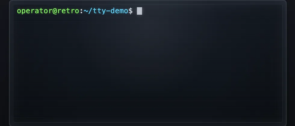
yarn tty:serverBy default, that example server starts a themed demo shell rooted at ~/tty-demo with the
prompt operator@retro:~/tty-demo$, so the live story and the recorded bridge demo share the
same shell framing.
There is also a dedicated Storybook story for this path. It now defaults to the local example
server at ws://127.0.0.1:8787, so if yarn tty:server is already running you can open the
Live Tty Terminal Bridge story directly without adding any extra query params.
If you want to override the target or the open payload, use:
window.__RETRO_SCREEN_TTY_DEMO__ = {
  url: "ws://127.0.0.1:8787",
  openPayload: {
    cwd: "/Users/josh/play/react-retro-display",
    term: "xterm-256color"
  }
};
The example server now supports token checks, origin checks, idle timeouts, payload-size limits, and optional command/cwd/env override restrictions. See examples/node-tty-websocket-server/README.md for the available flags.
6. Prompt-first interaction
Use mode="prompt" when the interface should feel like a guided shell.
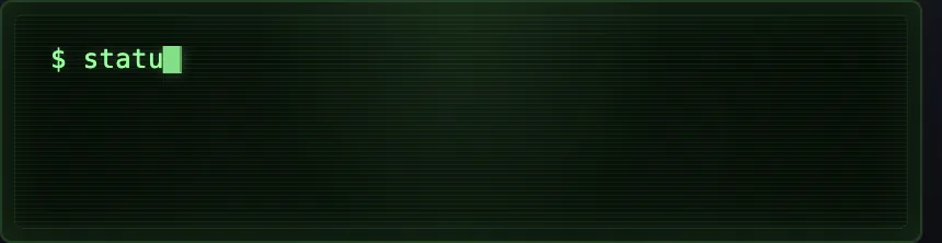
<RetroScreen
  mode="prompt"
  autoFocus
  promptChar="$"
  acceptanceText="READY"
  rejectionText="DENIED"
  onCommand={async (command) => {
    if (command === "status") {
      return {
        accepted: true,
        response: ["grid synced", "cursor stable"]
      };
    }

    return {
      accepted: false,
      response: "unknown command"
    };
  }}
/>
The Apple DOS 3.3 demo sits nicely in the same family when you want the interface to feel boot-first and command-led instead of form-like.
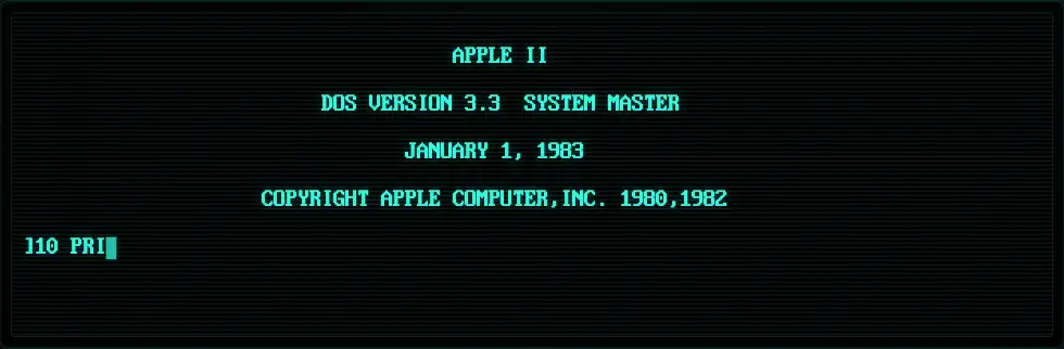
Under the hood, the Apple II shell is built as a small userland runtime on top of mode="terminal" instead of trying to force the one-shot prompt path to behave like BASIC. The Storybook surface feeds keyboard bytes into a session store that owns the boot transcript, prompt state, numbered program lines, and shell mode transitions. That session then hands stored BASIC lines to a parser/interpreter pair that supports immediate commands like LIST, NEW, and RUN, plus resumable program execution for INPUT and BREAK.
Implementation notes:
src/stories/Apple2Basic.stories.tsxwiresRetroScreento the Apple session and powers both the interactive story and the deterministic capture/demo variants.src/stories/apple2-basic/apple2-basic-shell-session.tsmanages uppercase input, line editing, transcript updates, prompt switching, and asynchronous runner scheduling.src/stories/apple2-basic/apple2-basic-parser.tsparses immediate commands, numbered program lines, and the supported BASIC statement/expression subset.src/stories/apple2-basic/apple2-basic-interpreter.tscompiles stored lines into a resumable runner soRUN,INPUT,GOTO,IF ... THEN,END, andCTRL+C/BREAKbehave like a shell instead of a static transcript.
Display Buffer And Follow Mode
Terminal and prompt surfaces now expose a real display buffer instead of only showing the live viewport. That means you can scroll back through recent output, inspect older lines, then return to the live tail when you are ready to follow the stream again.
Built-in behavior:
PageUpandPageDownmove through the display buffer- mouse wheel scrolling moves through the same history
Endreturns terminal mode to the live tail- auto-follow starts enabled, turns off when you scroll back, and turns back on when you return to the bottom
Use bufferSize to control how many rows of history the component-managed terminal or prompt
surface keeps, and defaultAutoFollow if you want the view to start detached from the tail.
<RetroScreen
  mode="terminal"
  bufferSize={400}
  defaultAutoFollow
  value={[
    "line-01  warm boot",
    "line-02  telemetry stable",
    "line-03  waiting for operator"
  ].join("\n")}
/>
If you are driving the component with your own controller, configure the underlying buffer size on the controller itself:
const controller = createRetroScreenController({
  rows: 9,
  cols: 46,
  scrollback: 400
});

<RetroScreen mode="terminal" controller={controller} />
The browser suite now covers this path directly, including paging, wheel scrolling, anchored scrollback while new lines arrive, and auto-follow recovery back to the live tail.
Auto Resize And Geometry Probing
When rows and columns matter to the program inside the display, listen to onGeometryChange,
turn that measurement into a terminal-style reply, and redraw from the reported size. The demo
below simulates a terminal app issuing CSI 18 t, receiving CSI 8;<rows>;<cols>t, then
repainting a full border and centered dimensions every time the panel resizes. The current demo
shows a visible cursor dragging the real resize handles, pauses if you intervene manually, and
still cycles through tight screen padding, multiple border alphabets, oversized glyph styles,
plus every monochrome and ANSI display mode so the same terminal program can be watched under
different visual projections.
import {
  RetroScreen,
  createRetroScreenController
} from "react-retro-display-tty-ansi-ascii";

const controller = createRetroScreenController({
  rows: 9,
  cols: 34,
  cursorMode: "solid"
});

export function ResizingTerminalProbe() {
  return (
    <RetroScreen
      mode="terminal"
      controller={controller}
      displayPadding={{ block: 8, inline: 10 }}
      onGeometryChange={(geometry) => {
        const nextReply = `\u001b[8;${geometry.rows};${geometry.cols}t`;

        console.log("terminal reply:", nextReply);
        controller.reset();
        controller.resize(geometry.rows, geometry.cols);
        redrawBorderAndMetrics(controller, geometry.rows, geometry.cols);
      }}
    />
  );
}
This is useful for terminal-style dashboards, resize-aware prompts, or retro UIs that need to
center content, draw frames, or adapt layouts from the actual LCD grid instead of from CSS alone.
It is also a good place to project displayColorMode changes when you want the terminal behavior
to stay fixed while the display mood shifts around it.
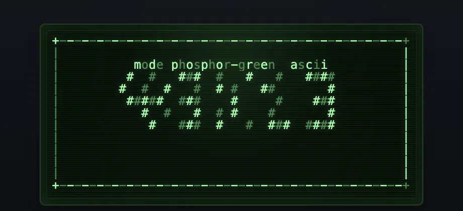
Terminal Color Modes
Use displayColorMode to decide how semantic terminal color should be projected onto the screen.
The phosphor modes keep the retro LCD personality even when the source emits ANSI color. The ANSI
modes preserve more of the source terminal palette.
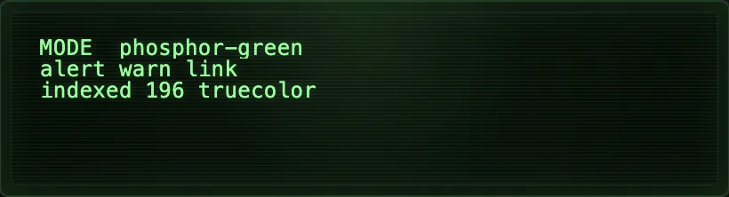
Available modes:
phosphor-greenphosphor-amberphosphor-iceansi-vgaansi-classicansi-extended
<RetroScreen
  mode="terminal"
  displayColorMode="ansi-extended"
  value={[
    "\u001b[31mALERT\u001b[0m \u001b[32mlink stable\u001b[0m",
    "\u001b[38;5;196mindexed 196\u001b[0m from the 256-color palette",
    "\u001b[38;2;255;180;120mtruecolor 255,180,120\u001b[0m"
  ].join("\n")}
/>
Reach for ansi-vga when you need the exact IBM PC/DOS 16-color palette used by ANSI art,
ansi-classic when you want the softened 16-color terminal profile, or
ansi-extended when 256-color and truecolor cells should survive all the way to the display.
ANSI Art Playback
The Midjourney galaxy demo uses the same RetroScreen cell pipeline to start from a drifting text field and pull it into a bright spiral structure.
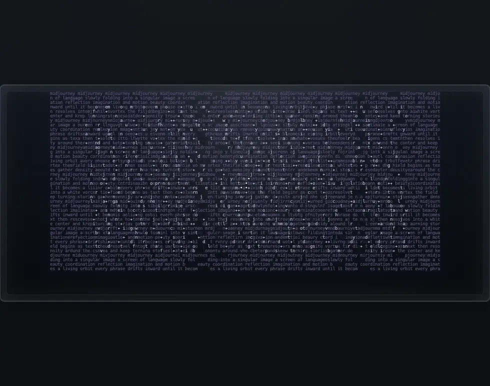
Open it here: smysnk.github.io/react-retro-display-tty-ansi-ascii/?path=/story/retroscreen--midjourney-vortex
Storybook now includes a dedicated Bad Apple ANSI demo that loads the real ANSI release,
decodes the original IBM VGA / CP437 bytes outside the display component, and then feeds those
bytes into the reusable RetroScreenAnsiPlayer wrapper. The player incrementally materializes
one mutable 80 x 25 terminal state at the configured baud while the parent owns byte loading and streaming. The
demo uses the full BADAPPLE.ANS payload, not a trimmed excerpt, and now uses the current
retained bitmap canvas backend with IBM VGA 8x16 glyphs.
The README clip is a 30-second capture of the real ANSI-art playback path, not a separate video renderer.
Credit for the original ANSI release goes to Mistigris.
Open it here: smysnk.github.io/react-retro-display-tty-ansi-ascii/?path=/story/retroscreen-display-buffer--bad-apple-ansi
The Storybook demo is backed by the bundled asset at src/stories/assets/bad-apple.ans.
The key wiring for this kind of ANSI-art playback is:
<RetroScreenAnsiPlayer
  byteStream={asset.byteStream}
  rows={25}
  cols={80}
  baud={14_400}
  complete
  loop
  canvasAccessibleText={false}
  displayColorMode="ansi-classic"
  displayGlyphMode="ibm-vga-8x16"
  displayLayoutMode="fit-width"
  displayPadding={0}
  displayScanlines={false}
  renderBackend="canvas"
  style={{ width: "100%" }}
/>
Use RetroScreenAnsiPlayer when a parent is responsible for supplying ANSI bytes or byte chunks,
including incremental streams. Keep the asset loading outside the display component, pass the
native rows and cols so the art is not reflowed. Playback state reports processedBytes,
totalBytes, status, and estimatedDurationMs; snapshots use drain to reach the same engine's
final state immediately. For ANSI art, the most useful display props
are:
displayCharacterSizingMode="font": lets browser font rendering own glyph sizing instead of forcing explicit cell dimensions.displayFontSizingMode="fit-cols": chooses the largest integer font size that still fits the requested columns horizontally.displayLayoutMode="fit-width": lets the component fill the available width and derive its height from the resolved grid.displayScanlines={false}anddisableCellRowScale: opt out of CRT-style effects that can create unwanted seams in ANSI art.
Canvas backend for read-only artwork
Large, read-only ANSI documents can opt into the bitmap canvas backend. It rasterizes CP437 glyphs
into retained ImageData, updates only changed cells during playback, and divides tall documents
into canvases no taller than 256 text rows. In explicit canvas mode no .retro-screen__line or
.retro-screen__cell elements are mounted.
<RetroScreenAnsiPlayer
  byteStream={asset.byteStream}
  rows={asset.height}
  cols={asset.width}
  displayColorMode="ansi-vga"
  displayGlyphMode="ibm-vga-8x16"
  renderBackend="canvas"
  canvasAccessibilityLabel={`${asset.title} by ${asset.author}`}
/>
renderBackend="canvas" requires a bitmap displayGlyphMode; font rendering and interactive
value, terminal, prompt, and editor surfaces resolve to the DOM backend. If the browser cannot
create a 2D canvas context the component also falls back to DOM. Omit renderBackend to preserve
the legacy rendering behavior, or use renderBackend="dom" to force rows and cells. Canvas mode
includes one visually hidden plain-text node by default; set canvasAccessibleText={false} when a
stable accessible label is preferable for animated artwork.
BADAPPLE.ANS uses lots of upper-half and lower-half block characters (▀ / ▄), so the demo
disables scanlines and rasterizes the IBM VGA glyph data directly.
Viewported ANSI Playback
RetroScreenAnsiPlayer can also render a fixed viewport over a larger ANSI buffer. This is useful
for gallery viewers, panning surfaces, and giant sparse ANSI files where the parent wants to keep a
stable 80 x 25 window while the underlying source geometry remains larger.
<RetroScreenAnsiPlayer
  byteStream={asset.byteStream}
  rows={asset.height}
  cols={asset.width}
  baud={14_400}
  complete={asset.complete}
  loop={asset.complete}
  viewportRows={25}
  viewportCols={80}
  viewportRowOffset={rowOffset}
  viewportColOffset={colOffset}
  displayCharacterSizingMode="font"
  displayFontSizingMode="fit-cols"
  displayLayoutMode="fit-width"
  displayPadding={0}
  displayScanlines={false}
  disableCellRowScale
/>
Set viewportFollowMode="cursor" when the viewport should remain fixed until the parser cursor
reaches its final visible row, then follow new output without discarding the rows above it. Combine
it with scrollMode="canvas" so the complete source document remains available for later panning,
export, or a full-document reveal. The default viewportFollowMode="fixed" preserves explicit
viewportRowOffset behavior.
<RetroScreenAnsiPlayer
  byteStream={asset.byteStream}
  rows={asset.height}
  cols={asset.width}
  viewportRows={25}
  viewportFollowMode="cursor"
  scrollMode="canvas"
  renderBackend="canvas"
/>
The playback callback reports source geometry and byte progress, so a parent can keep status UI in sync with the rendered stream:
<RetroScreenAnsiPlayer
// ...
onPlaybackStateChange={(state) => {
console.log(state.sourceRows, state.sourceCols);
console.log(state.processedBytes, state.totalBytes, state.status);
}}
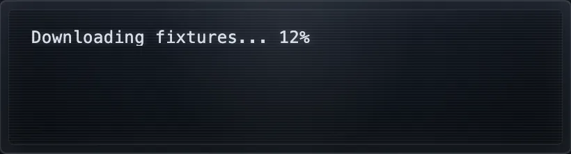
/>Control-Character Playback
The terminal path is now tested against an xterm oracle and can faithfully replay real control character effects like carriage return rewrites, erase-in-line, scroll regions, insert-line updates, ANSI 16-color, indexed 256-color, and truecolor output.
import {
  RetroScreen,
  createRetroScreenController
} from "react-retro-display-tty-ansi-ascii";

const controller = createRetroScreenController({ rows: 6, cols: 34 });

controller.write("Downloading fixtures... 12%");
controller.write("\rDownloading fixtures... 73%");
controller.write("\r\u001b[32mDownloaded fixtures.\u001b[0m\u001b[K\r\n");
controller.write("\u001b[2;6r");
controller.write(
  "\u001b[6;1H\u001b[L\u001b[38;2;255;180;120mrecorded regression fixture\u001b[0m"
);

<RetroScreen
  mode="terminal"
  controller={controller}
  displayColorMode="ansi-extended"
/>
The same trace fixtures used in Storybook are also exercised in the terminal verification layers:
yarn check:ansi-display-report
yarn test:e2e:ansi-display
yarn test:conformance
yarn test:tty
yarn test:e2e:tty
yarn test:e2e
The TTY-specific checks skip themselves automatically in environments where node-pty cannot
allocate a TTY session, but they run normally on TTY-capable developer machines and CI runners.
The authoritative display-facing ANSI ledger lives in
docs/ansi-display-support-matrix.md. It is generated
from the conformance matrix source and verified in CI so the published status stays in sync with
the implementation.
Ease Of Integration
The component is intentionally small at the edge:
- Start with
mode="value"when all you need is a beautiful terminal-like readout. - Add
editableif the content should be controlled by React state. - Switch to
mode="terminal"when output is driven by a stream or controller. - Switch to
mode="prompt"when commands and responses should live in one transcript. - Listen to
onGeometryChangeif rows and columns matter to the rest of your app.
Storybook
Storybook now acts as the living demo surface for the package. It includes stories for the main user journeys:
- read-only display
- editable drafting
- controller-fed terminal output
- display buffer paging and follow mode
- resizable live panels with scripted handle demos
- auto-resize geometry probing
- live TTY bridge wiring
- ANSI art playback
- ANSI styling
- display color mode projection
- light and dark surface modes
- control-character replay fixtures
- prompt interaction
- responsive geometry
- a capture-ready feature tour
Run it locally with:
npm install
npm run storybook
Releases from main publish through GitHub OIDC without a persistent npm token. Maintainers can find the one-time npm package configuration and migration checklist in npm trusted publishing.
Development
npm install
npm run build
npm run test
npm run test:unit
npm run storybook
Useful extra checks:
yarn test:tty
yarn test:e2e:tty
yarn perf:terminal