
react-search-input-zn
v1.1.10
Published
React search input component that supports search & filter the data of the array of an object.
Maintainers
 taukirnpm3
Readme
react-search-input-zn
A lightweight and customizable React search input component with:
- ✅ Support for searching list
- 🔍 Searchable, filterable options
- ✨ Clean, flexible, and accessible UI
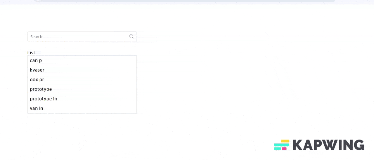
Demo
Installation
npm install react-search-input-znImport CSS
To apply default styles, import the CSS in your entry/root file:
import "react-search-input-zn/dist/index.css";Usage in ReactJs
import React, { useState } from "react";
import ReactSearchBox from "react-search-input-zn";
import "react-search-input-zn/dist/index.css";

const [data,setData]=useState([
  { name: "mango", price: "200" },
  { name: "apple", price: "160" },
  { name: "banana", price: "120" },
];)

function App() {
  const [result, setResult] = useState([]);
   const handleChange = (search) => {
      setMainData(search);
   };
  return (
    <ReactSearchBox
      data={data}
      handleChange={handleChange},
      matchesWith={["name", "price"]}
      //optional
      styles={{
      backgroundColor: "#ddd",
      borderRadius: "50px",
      margin: "0px",
      padding: "10px",
      width: "400px",
    }}
    />
  );
}

export default App;
Props
| Prop | Type | Default | Description |
| -------------- | ---------- | ------------------ | ------------------------------------------------------------------------------ |
| data | array | [] | Array of items to search (objects with any structure). |
| handleChange | function | null | Callback function triggered when a user search. |
| matchesWith | array | ["name","price"] | Keys in data objects to match user input against (e.g. ["name", "price"]). |
| searchLabel | string | "Search" | Placeholder text shown in the search input field. |
| styles | object | {} | Optional inline CSS styles for customizing the input container. |