
react-senha-checklist
v1.0.17
Published
A React Component to display the success or failure of password strength rules
Downloads
16
Maintainers
 helenapaixao
Readme
React Senha Checklist


Um componente React para exibir o sucesso ou a falha das regras de força da senha que são atualizadas conforme o usuário digita.
Example
Install in your project
npm install --save react-senha-checklist
yarn add react-senha-checklist
Note: react is a peer dependency. You should be using this in a React project.
Example Usage
import React, {useState} from "react"
import PasswordChecklist from "react-senha-checklist"
const SignUp = () => {
const [password, setPassword] = useState("")
const [passwordAgain, setPasswordAgain] = useState("")
return (
<form>
<label>Password:</label>
<input type="password" onChange={e => setPassword(e.target.value)}>
<label>Password Again:</label>
<input type="password" onChange={e => setPasswordAgain(e.target.value)}>
<PasswordChecklist
rules={["length","specialChar","number","capital","match"]}
minLength={5}
value={password}
valueAgain={passwordAgain}
onChange={(isValid) => {}}
/>
</form>
)
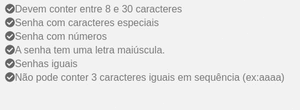
}Available Rules
Customize the component to display only the rules you need in the desired order you wish to display them.
length
Valid if the password meets the minimum length. Requires minLength prop to be included.
specialChar
Valid if the password contains a special character from ~!#$%\^&*+=\-\[\]\\';,/{}|\\":<>\?.
number
Valid if the password contains a number.
capital
Valid if the password contains a capital letter.
match
Valid if the password matches the confirm password valud. Requires valueAgain prop to be included.
Props
| Prop | Description | Type | Required | Default |
|---|---|---|---|---|
| rules | Rules to display in the order desired.Options are length, specialChar,number, capital, match | array | yes |
| value | Current potential password | string | yes |
| minLength | Minimum Password Length | number | Only withlength rule |
| valueAgain | Current potential password confirmation | string | Only withmatch rule |
| onChange | Callback that is triggered when thepassword becomes valid or invalid acrossall rules. | function | | (isValid) => {}
| className | Class applied to the entire component | string | |
| style | Inline styles applied to theouter component wrapper | object | |
| iconSize | Size of ✔ or 𐄂 icon | number | | 18 |
| validColor | Color of checkmark icon | string | | #4BCA81 |
| invalidColor | Color of X icon | string | | #FF0033 |
Available Classes
.valid- Valid Message.invalid- Invalid Message
Run Locally
npm run storybook
yarn storybook