
react-sensor-meters
v2.0.2
Published
Library of common microcontroller sensor gauges
Maintainers
 chrismilheim
Readme
react-sensor-meters
Meter-like components for building homemade dashboards for your data loggers.
Demo
GitHub ( PRs welcome! :) )
https://github.com/chrismilheim/react-sensor-meters
I could not find React components that suited my needs for my Arduino/Nodemcu data logger dashboards, so I decided to publish the ones I've made. Hopefully you will also find value in some of them. Feel free to open a PR for new meters/fixes to existing meters/fixes to anything broken.
Shoutout to https://www.svgrepo.com for providing the svg files.
Install
npm install react-sensor-meters
Import Example
import { TempSimple, Battery, HumidityDropPercent } from "react-sensor-meters";Possible values for import:
- TempLines
- TempRound
- TempSimple
- H20Drop
- WaterPlant
- LightThick
- HumidityDropPercent
- AirQualityMask
- AirQualityVent
- Battery
- CarBattery
- BasicCircle
- BasicRectangle
- NEW! BasicNumber
- NEW! BasicList
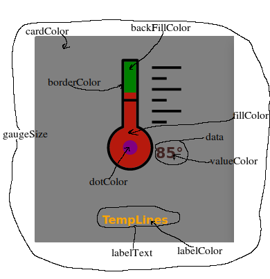
Props (*_ in Prop Name = required _)
| Prop Name | Value Type | Description | Possible Values | Examples | | ------------------ | ---------- | ----------------------------------------------------------------------- | ---------------------------------------- | ------------------------------------------ | | data* | Number | Value to be displayed. | Any Number | 58 | | topEndDataLimit * | Number | Max value of data. | Any Number | 1000 | | date* | String | Value to be displayed. | Any String | "" or "12/25/2024" or "12/25/2024 11:45AM" | | animate | Boolean | Animates the fill of the meter. | true/false | true | | neon | String | Removes backfill on meter leaving only outline. | null, border, noBorder | "border" | | fillColor | String | Color of the fill. | Any string that can translate to a color | "grey" or "#ffff" or"rgba(1,1,1,1)" | | highFillColor | String | Use with highFillThreshhold. Changes fill color after a certian amount. | Any string that can translate to a color | “grey” or “#ffff” or”rgba(1,1,1,1)” | | highFillThreshold | Number | Use with highFillColor. Sets the threshhold for fill color change. | Any number | 90 | | backFillColor | String | Back fill color of meter. | Any string that can translate to a color | “grey” or “#ffff” or”rgba(1,1,1,1)” | | dotColor | String | Special features of meter that do not fill (not all meters have one). | Any string that can translate to a color | “grey” or “#ffff” or”rgba(1,1,1,1)” | | gaugeSize | String | Sets the size of the meter. | small,medium,large | medium | | valueColor | String | Changes the color of the value displayed. | Any string that can translate to a color | "grey” or “#ffff” or”rgba(1,1,1,1)” | | labelColor | String | Changes the color of the label text. | Any string that can translate to a color | "grey” or “#ffff” or”rgba(1,1,1,1)” | | cardColor | String | Changes the color of the div the gauge is on. | Any string that can translate to a color | "grey” or “#ffff” or”rgba(1,1,1,1)” | | hover | Boolean | On hover it increases meter size. | true/false | true | | labelText | String | Text to be displayed under meter. | Any string value | "Garage" or "Family Room" | | borderColor | String | Color of the border of meter. | Any string that can translate to a color | “grey” or “#ffff” or”rgba(1,1,1,1)” |
Default colors are black on white if only using the required props.
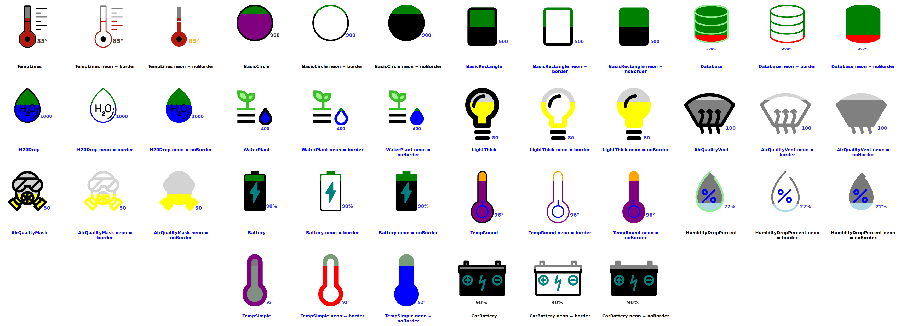
Meters
TempLines
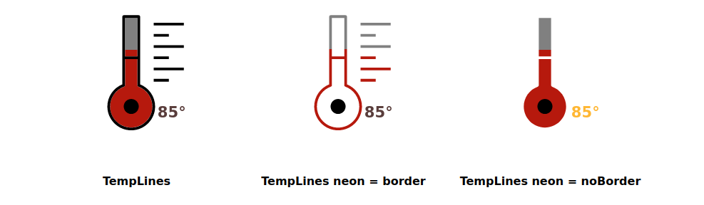
<TempLines
  data={85}
  topEndDataLimit={120}
  date={"12/24/2024"}
  animate={false}
  neon={""}
  fillColor={"rgb(182, 25, 13)"}
  backFillColor={"green"}
  valueColor={"rgb(48, 13, 10)"}
  labelColor={"orange"}
  cardColor={"grey"}
  dotColor={"purple"}
  hover={true}
  gaugeSize={"medium"}
  labelText={"TempLines"}
  highFillColor={"purple"}
  highFillThreshold={95}
/>
TempRound
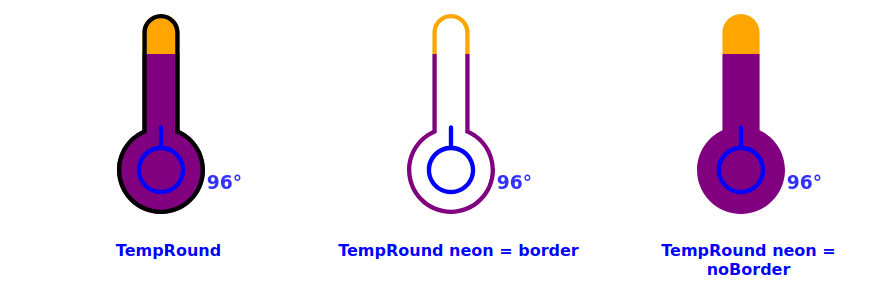
<TempRound
  data={96}
  topEndDataLimit={120}
  date={"12/24/2024"}
  animate={true}
  neon={""}
  fillColor={"red"}
  backFillColor={"orange"}
  valueColor={"blue"}
  labelColor={"blue"}
  cardColor={"white"}
  dotColor={"blue"}
  hover={true}
  gaugeSize={"medium"}
  labelText={"TempRound"}
  highFillColor={"purple"}
  highFillThreshold={95}
/>
TempSimple
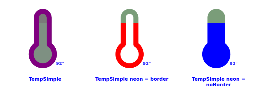
<TempSimple
  data={92}
  topEndDataLimit={120}
  date={"12/24/2024"}
  animate={true}
  neon={""}
  fillColor={"rgba(49, 78, 55, 0.627)"}
  backFillColor={"rgba(43, 42, 42, 0.627)"}
  valueColor={"blue"}
  labelColor={"blue"}
  cardColor={"white"}
  dotColor={"blue"}
  hover={true}
  gaugeSize={"medium"}
  labelText={"TempSimple"}
  highFillColor={"purple"}
  highFillThreshold={95}
  borderColor={"purple"}
/>
H20Drop
!!!! IMPORTANT !!!!!: Water detecting sensors work on an inverse. The higher the number means there is no presense of water. The lower the number means more of a presense of water. This corresponds to the resistance of the sensor.
This component operates on that principal. Give it a higher number, the meter will have low fill. Give it a lower number the meter will have more fill.
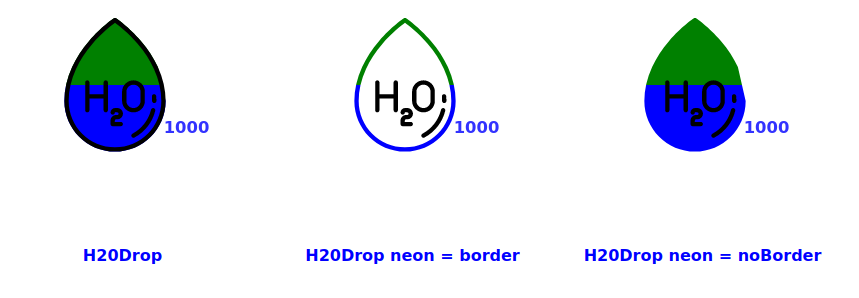
<H2ODrop
  data={1000}
  topEndDataLimit={2000}
  date={"12/24/2024"}
  animate={false}
  neon={""}
  fillColor={"blue"}
  backFillColor={"green"}
  valueColor={"blue"}
  labelColor={"blue"}
  cardColor={"white"}
  dotColor={"black"}
  hover={false}
  gaugeSize={"medium"}
  labelText={"H20Drop"}
/>
WaterPlant
!!!! IMPORTANT !!!!!: Water detecting sensors work on an inverse. The higher the number means there is no presense of water. The lower the number means more of a presense of water. This corresponds to the resistance of the sensor.
This component operates on that principal. Give it a higher number, the meter will have low fill. Give it a lower number the meter will have more fill.
This meter changes the color of the plant leaves as water depletes. 100% - 60% green leaves = plant is watered, 60% - 30% brown leaves = plant should be watered soon, 30% - 0% black leaves = plant has no water.
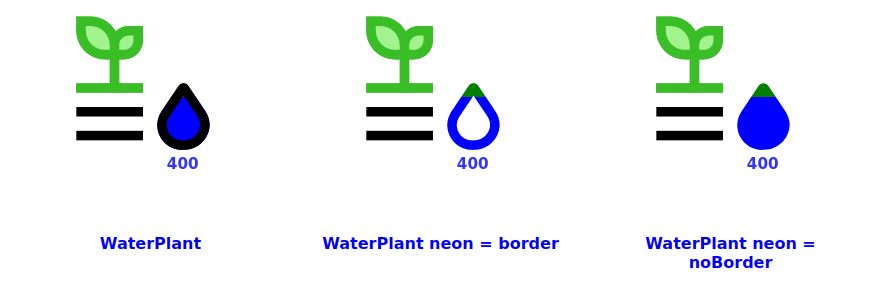
<WaterPlant
  data={400}
  topEndDataLimit={2000}
  date={"12/24/2024"}
  animate={true}
  neon={""}
  fillColor={"blue"}
  backFillColor={"green"}
  valueColor={"blue"}
  labelColor={"blue"}
  cardColor={"white"}
  dotColor={"teal"}
  hover={true}
  gaugeSize={"medium"}
  labelText={"WaterPlant"}
/>
LightThick
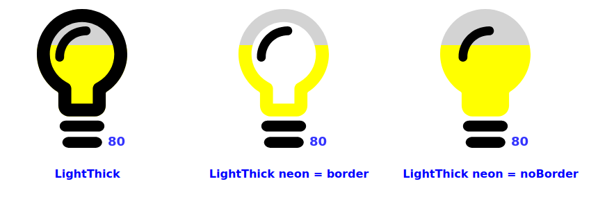
<LightThick
  data={80}
  topEndDataLimit={120}
  date={"12/24/2024"}
  animate={true}
  neon={""}
  fillColor={" yellow "}
  backFillColor={"lightgrey"}
  valueColor={"blue"}
  labelColor={"blue"}
  cardColor={"white"}
  dotColor={"black"}
  hover={true}
  gaugeSize={"medium"}
  labelText={"LightThick"}
/>
HumidityDropPercent
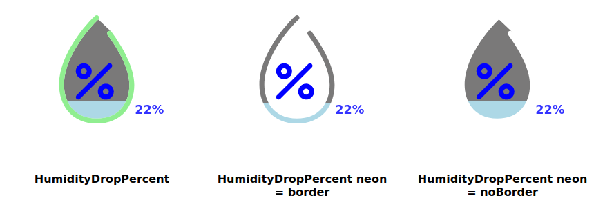
<HumidityDropPercent
  data={22}
  topEndDataLimit={120}
  date={"12/24/2024"}
  animate={true}
  neon={""}
  fillColor={"lightblue"}
  backFillColor={"rgba(43, 42, 42, 0.627)"}
  valueColor={"blue"}
  labelColor={"black"}
  cardColor={"white"}
  dotColor={"blue"}
  hover={true}
  gaugeSize={"medium"}
  labelText={"HumidityDropPercent "}
  highFillColor={"purple"}
  highFillThreshold={95}
  borderColor={"lightGreen"}
/>
AirQualityMask
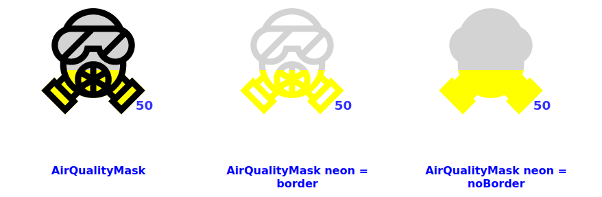
<AirQualityMask
  data={50}
  topEndDataLimit={120}
  date={"12/24/2024"}
  animate={true}
  neon={""}
  fillColor={" yellow "}
  backFillColor={"lightgrey"}
  valueColor={"blue"}
  labelColor={"blue"}
  cardColor={"white"}
  dotColor={"teal"}
  hover={true}
  gaugeSize={"medium"}
  labelText={"AirQualityMask"}
/>
AirQualityVent
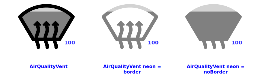
<AirQualityVent
  data={100}
  topEndDataLimit={120}
  date={"12/24/2024"}
  animate={true}
  neon={""}
  fillColor={" grey "}
  backFillColor={"lightgrey"}
  valueColor={"blue"}
  labelColor={"blue"}
  cardColor={"white"}
  dotColor={"teal"}
  hover={true}
  gaugeSize={"medium"}
  labelText={"AirQualityVent"}
/>
Battery
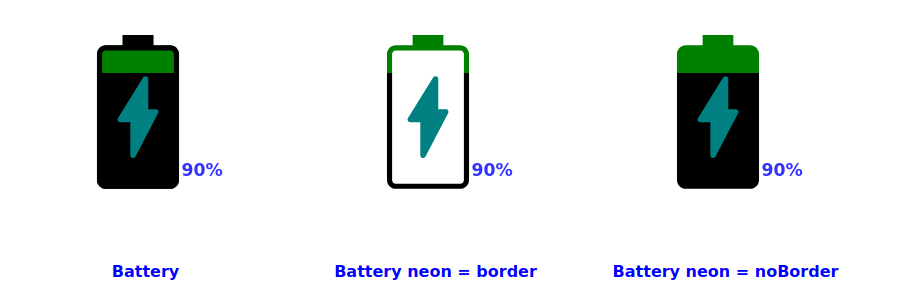
<Battery
  data={90}
  topEndDataLimit={120}
  date={"12/24/2024"}
  animate={true}
  neon={""}
  fillColor={"lightgreen"}
  backFillColor={"green"}
  valueColor={"blue"}
  labelColor={"blue"}
  cardColor={"white"}
  dotColor={"teal"}
  hover={true}
  gaugeSize={"medium"}
  labelText={"Battery "}
  highFillThreshold={80}
/>
CarBattery
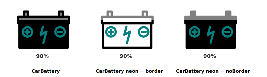
<CarBattery
  data={90}
  topEndDataLimit={120}
  date={"12/24/2024"}
  animate={true}
  neon={""}
  fillColor={"black"}
  backFillColor={"grey"}
  valueColor={"black"}
  labelColor={"black"}
  cardColor={"white"}
  dotColor={"teal"}
  hover={true}
  gaugeSize={"medium"}
  labelText={"CarBattery"}
  highFillThreshold={80}
/>
BasicCircle
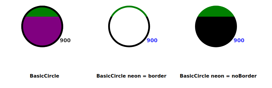
<BasicCircle
  data={900}
  topEndDataLimit={1220}
  date={"12/24/2024"}
  animate={true}
  neon={""}
  fillColor={"lightgreen"}
  backFillColor={"green"}
  valueColor={"black"}
  labelColor={"black"}
  cardColor={"white"}
  dotColor={"teal"}
  hover={true}
  gaugeSize={"medium"}
  labelText={"BasicCircle"}
  highFillColor={"purple"}
  highFillThreshold={80}
/>
BasicRectangle
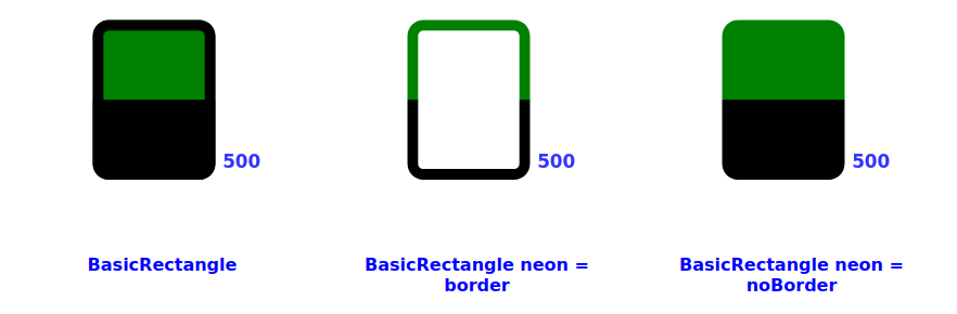
<BasicRectangle
  data={500}
  topEndDataLimit={1000}
  date={"12/24/2024"}
  animate={true}
  neon={""}
  fillColor={"lightgreen"}
  backFillColor={"green"}
  valueColor={"blue"}
  labelColor={"blue"}
  cardColor={"white"}
  dotColor={"teal"}
  hover={true}
  gaugeSize={"medium"}
  labelText={"BasicRectangle"}
  highFillThreshold={80}
/>
Build NPM Package
From the root folder run:
npm run build-lib