
react-slideable
v1.1.1
Published
A component for displaying data/image lists with dynamic items' width. Has an ability to create looped list.
Maintainers
 zilijonas
Readme
react-slideable
A component for displaying data/image lists with dynamic items' width. Has an ability to create looped list.

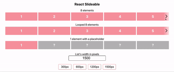
Demo
Install
npm install --save react-slideableor
yarn add react-slideableUsage
import { Slideable, DisplayConfig } from 'react-slideable';
import 'react-slideable/dist/index.css';

const Example = () => (
  <Slideable
    // Array of your list items.
    // Items width must be set to `100%`.
    // Required.
    items={items.map(item => (
      <div key={item} style={{ width: '100%' }}>
        {item}
      </div>
    ))}
    // JSX Element to display for `finite` list
    // when items < number of displayed items by config.
    // Placeholder's width must be `100%`.
    // By default empty space is displayed.
    placeholder={<span style={{ width: '100%' }}>Placeholder</span>}
    // Type of the list. Available options: `finite` | `infinite`.
    // Default is `finite`.
    type="infinite"
    // Enables scroll by swipe.
    // Defaults to `false`.
    swipeable={true}
    // Height of the list.
    // Defaults to items height.
    height={200}
    // Width of the list.
    // Defaults to `100%`.
    width={500}
    // Enables scroll by swipe.
    // Defaults to `false`.
    swipeable={true}
    // Removes scroll buttons.
    // Defaults to `false`.
    noButtons={true}
    // Gap between list items.
    // Defaults to `0`.
    itemsGap={8}
    // Time of the slide animation, ms.
    // Defaults to 600.
    animationTime={600}
    // You can set how many items will list display at given resolutions.
    // Defaults to the current value.
    displayConfig={{ 480: 2, 768: 3, 1200: 4, max: 5 }}
    // Style of the arrow buttons.
    buttonsStyle={{ background: '#777' }}
    // Custom button for scroll to left.
    customButtonLeft={<div>Scroll Left</div>}
    // Custom button for scroll to right.
    customButtonRight={<div>Scroll Right</div>}
    // Callback function that will be called when the list is scrolled.
    onScrolled={direction => console.log(direction)}
  />
);
License
MIT © zilijonas