
react-smart-loading-effects
v1.0.0
Published
Beautiful React skeleton loaders with shimmer animation — card, table, dashboard, profile, list, and text loading placeholders. Zero config, TypeScript, Next.js ready.

Maintainers
 surajlulla
Readme
React Smart Loading Effects




The easiest way to add beautiful React skeleton loaders to your app.
react-smart-loading-effects is a lightweight React skeleton loader library with polished shimmer animation, zero configuration, and production-ready layouts for the UI patterns you build every day — product cards, data tables, SaaS dashboards, user profiles, notification lists, and article text.
Stop hand-coding dozens of placeholder <div> elements. Install once, drop in <SmartLoader />, and ship professional loading skeleton screens in under 30 seconds.
npm install react-smart-loading-effectsPeer dependencies: React 18+ and React DOM 18+
See it in action
Six loader types, one package. GPU-friendly shimmer, accessible defaults, ~2.7 KB gzipped.
Table of contents
- Why use this library?
- Key features
- Quick start
- Loader demos
- API reference
- Framework support
- Accessibility
- FAQ
- Local demo
- License
Why use this library?
Most React apps need loading placeholders — but building them from scratch is repetitive:
- Card grids need image, title, description, and button skeletons
- Admin panels need table row and column placeholders
- Dashboards need KPI cards, chart areas, and sidebar stubs
- Profile pages need avatar, name, and bio lines
- Feeds need list items with avatars and text
- Articles need multi-line text skeletons
react-smart-loading-effects gives you all of this with a single prop:
<SmartLoader type="table" rows={10} columns={5} />No CSS imports. No UI framework. No Tailwind dependency. Just beautiful, accessible React loading states out of the box.
Key features
- 6 production-ready layouts — card, table, dashboard, profile, list, text
- Shimmer animation — smooth, GPU-accelerated skeleton shimmer (disable with
animated={false}) - Zero configuration — styles inject automatically on first render
- Tiny bundle — ~2.7 KB gzipped (ESM)
- TypeScript — full type exports for props and loader types
- Accessible —
aria-busy,aria-hidden, andprefers-reduced-motionsupport - Next.js ready — works with App Router, Pages Router, and React Server Components consumers
- Tree-shakeable — ESM + CommonJS builds via tsup
Quick start
import { SmartLoader } from "react-smart-loading-effects";

function ProductGrid({ loading }: { loading: boolean }) {
  if (loading) {
    return <SmartLoader type="card" />;
  }
  return <ProductCard />;
}
Use while data is fetching:
{isLoading ? <SmartLoader type="table" rows={8} columns={5} /> : <DataTable data={data} />}Loader demos
Card skeleton loader
Perfect for product cards, blog post previews, e-commerce grids, and service tiles.

<SmartLoader type="card" />Includes image placeholder (16:9), title bar, description lines, and CTA button skeleton.
Table skeleton loader
Ideal for admin dashboards, CRM tables, analytics grids, and any paginated data view.

<SmartLoader type="table" rows={10} columns={5} />Configurable rows and columns with a responsive horizontal scroll wrapper.
Dashboard skeleton loader
Built for SaaS dashboards, analytics pages, and internal admin tools.

<SmartLoader type="dashboard" />Includes KPI stat cards, two chart panel placeholders, and a sidebar navigation strip.
Profile skeleton loader
Great for user profile pages, team directories, and account settings screens.

<SmartLoader type="profile" />Centered layout with circular avatar, name bar, and multi-line bio placeholders.
List skeleton loader
Use for notification feeds, message inboxes, activity streams, and comment lists.
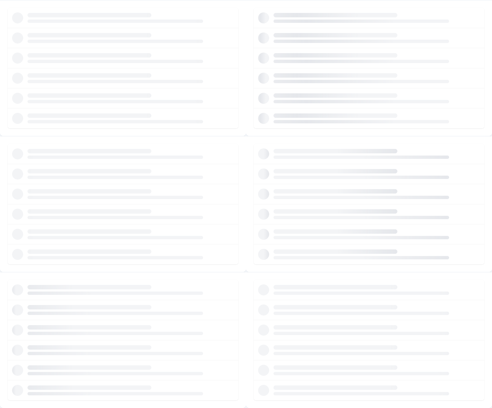
<SmartLoader type="list" rows={6} />Each row includes a circular avatar, title line, and subtitle line.
Text skeleton loader
Designed for blog articles, documentation pages, long-form content, and paragraph loading.

<SmartLoader type="text" rows={8} />Multiple text rows with varied widths (100%, 92%, 78%) for a natural reading feel.
Static skeleton (no animation)
Disable shimmer for static placeholders or when you handle animation yourself:
<SmartLoader type="card" animated={false} />API reference
SmartLoader
| Prop | Type | Default | Description |
|------|------|---------|-------------|
| type | "card" \| "table" \| "dashboard" \| "profile" \| "list" \| "text" | — | Skeleton layout (required) |
| rows | number | varies | Row count for table, list, and text loaders |
| columns | number | 4 | Column count for table loader |
| animated | boolean | true | Enable shimmer skeleton animation |
| width | number \| string | "100%" | Container width |
| height | number \| string | — | Container height |
| className | string | — | Additional CSS class on loader root |
Individual loaders
Import loaders directly for finer control:
import {
  CardLoader,
  TableLoader,
  DashboardLoader,
  ProfileLoader,
  ListLoader,
  TextLoader,
  Skeleton,
} from "react-smart-loading-effects";

<CardLoader animated />
<TableLoader rows={5} columns={4} />
<Skeleton width={200} height={20} borderRadius={8} />
TypeScript
import type { SmartLoaderProps, LoaderType, LoaderCommonProps } from "react-smart-loading-effects";Framework support
| Framework | Support | |-----------|---------| | React 18+ | Yes | | React 19+ | Yes | | Next.js (App Router) | Yes | | Next.js (Pages Router) | Yes | | Vite | Yes | | Create React App | Yes |
No CSS file imports required — shimmer keyframes are injected automatically when SmartLoader mounts.
Next.js example
"use client";

import { SmartLoader } from "react-smart-loading-effects";

export default function Loading() {
  return <SmartLoader type="dashboard" />;
}
Accessibility
Built-in accessibility for screen readers and motion preferences:
- Loading root uses
role="status",aria-busy="true", andaria-label="Loading" - Decorative skeleton blocks are marked
aria-hidden="true" - Shimmer animation respects
prefers-reduced-motion: reduce— users who prefer less motion see static skeletons automatically
FAQ
What is a React skeleton loader?
A skeleton loader (or skeleton screen) is a placeholder UI that mimics the shape of content while data loads. Unlike spinners, skeletons reduce perceived wait time by showing users what is coming. react-smart-loading-effects provides pre-built skeleton layouts with shimmer animation.
How is this different from a spinner?
Spinners show activity but not structure. Skeleton loaders preview the actual layout — card images, table rows, dashboard charts — so users feel less disoriented during loading.
Do I need to import CSS?
No. Shimmer styles are injected once on first render. Zero extra setup.
Does it work with Next.js?
Yes. Use SmartLoader in client components ("use client") or in loading.tsx files. No SSR issues — styles inject on the client.
Can I disable the shimmer animation?
Yes: <SmartLoader type="card" animated={false} />. Animation also auto-disables when the user has reduced motion enabled in their OS settings.
How big is the bundle?
Approximately 2.7 KB gzipped (ESM). No runtime dependencies beyond React.
Can I use individual loader components?
Yes. Export CardLoader, TableLoader, DashboardLoader, ProfileLoader, ListLoader, TextLoader, and the base Skeleton primitive.
Local demo
Preview all loaders with animation controls:
npm run build
npm run demo
Open http://localhost:5174.
Regenerate README GIFs
npm run build
npm run demo          # keep dev server running
npm run demo:gif      # captures docs/*.gif via Playwright
License
MIT