
react-social-widget
v1.0.1
Published
A React social share button library with smart defaults and broad network support.


Readme
react-social-widget
Make sharing effortless. Add polished, brand-colored social share buttons with a single component:
<SocialShare />.
This package is designed to feel “drop-in”:
smart defaults (it auto-detects your url, title, and meta description), instant layout options (inline or floating), and built-in fallbacks for the networks that don’t have perfect public icons everywhere.
Quick Start
- Install
npm install react-social-widget
npm install react react-dom- Import the CSS + use the component
import "react-social-widget/styles.css";
import { SocialShare } from "react-social-widget";

export function ArticleShare() {
  return <SocialShare layout="inline" theme="dark" size="md" />;
}
That’s it. SocialShare will automatically use window.location.href and document.title (SSR-safe).
Live Demo
Want to see it in action before you integrate?
Try the live demo here: react-share-widget-demo
Visual Examples
Bubble buttons (icon + text):
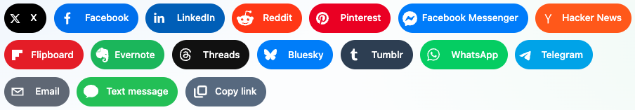
Icon-only buttons:

Embed It Anywhere (Inline or Floating)
Inline (inside your content)
<SocialShare
  layout="inline"
  networks={[
    "x",
    "facebook",
    "linkedin",
    "threads",
    "bluesky",
    "copy-link"
  ]}
  size="md"
  iconOnly={true}
/>
Floating (sticky share bar)
<SocialShare layout="floating" floatingSide="left" theme="brand" size="sm" />In floating mode, the buttons stay fixed on the viewport and form a vertical stack.
Customize Everything (without extra libraries)
Button size + icon feel
size:sm | md | lgiconOnly:true | false(show/hide platform text)
Theme (and color overrides)
theme:brand | light | darkbuttonBgColor: override all button backgrounds (optional)iconFgColor: override all icon foreground colors (optional)
Example:
<SocialShare
  theme="brand"
  buttonBgColor="#111827"
  iconFgColor="#ffffff"
  size="lg"
/>
Provide the Right Share Text
By default:
titlecomes fromdocument.titletextdefaults totitledescriptioncomes from<meta name="description">(if present)
If you want custom messaging:
<SocialShare
  url="https://example.com/my-post"
  title="My Post"
  text="Check this out!"
  messageText="SMS message text"
/>
Facebook Messenger (requires an App ID)
The facebook-messenger share button uses Facebook’s share dialog, which requires an app_id from a Facebook App.
How to get an App ID:
- Go to Facebook for Developers
- Create an App (or select an existing one)
- Open your App dashboard and copy the
App ID
Use it like this:
<SocialShare
  networks={["facebook-messenger"]}
  facebookAppId="YOUR_FACEBOOK_APP_ID"
/>
Copy Link + Text Message
copy-link: copies your resolvedurlusing the Clipboard API.text-message: opens an SMS intent (sms:). Support varies by browser/device (best-effort).
Networks Supported (MVP)
x,facebook,linkedin,reddit,pinterestfacebook-messenger,hacker-news,flipboard,evernote,threads,bluesky,text-message,copy-linktumblr,whatsapp,telegram,email
react-social-icons is used for covered networks; custom SVG icons and optimized brand colors are used for networks where icons may not match perfectly.
Props Reference
| Prop | Type | Default | What it does |
|---|---|---|---|
| networks | Network[] | ["x","facebook","linkedin"] | Which share buttons to render |
| url | string | window.location.href | The page URL used for most share intents |
| title | string | document.title | The page title used in many share intents |
| text | string | title | General text used for intents that support text |
| messageText | string | text | SMS text override for text-message |
| facebookAppId | string | undefined | Required for facebook-messenger |
| buttonBgColor | string | undefined | If set, overrides the background color for all buttons |
| iconFgColor | string | undefined | If set, overrides the icon color for all buttons |
| description | string | meta description or title | Used by a few networks (or as a fallback) |
| subject | string | title | Used by email |
| layout | "inline" \| "floating" | "inline" | Inline row vs floating vertical stack |
| floatingSide | "left" \| "right" | "right" | Side for floating layout |
| theme | "brand" \| "light" \| "dark" | "brand" | Controls styling contrast |
| size | "sm" \| "md" \| "lg" | "md" | Icon/button size |
| className | string | undefined | Add custom class to the wrapper |
| iconOnly | boolean | true | Show only icons (hide/show text labels) |
Network Buttons (with optional props)
All networks support the “global” props: layout, floatingSide, theme, size, iconOnly, buttonBgColor, iconFgColor, url, title, text, description, and subject (where applicable).
X ("x")
Use this for posts/articles you want to share on X. Optionally override url, title, and/or text.
<SocialShare networks={["x"]} url="https://example.com/post" title="My Post" text="Worth a read" />Facebook ("facebook")
Uses the Facebook share intent with your url. Optionally override url and title.
<SocialShare networks={["facebook"]} url="https://example.com/post" />LinkedIn ("linkedin")
Shares your url via LinkedIn. Optionally override url and title.
<SocialShare networks={["linkedin"]} title="My Article" url="https://example.com/article" />Reddit ("reddit")
Pre-fills the Reddit submission with your url and title. Optionally override both (and optionally text).
<SocialShare networks={["reddit"]} title="A take on modern web" url="https://example.com/rant" />Pinterest ("pinterest")
Pre-fills a Pinterest pin using your url and description (fallback: text). Optionally override description.
<SocialShare networks={["pinterest"]} description="Aesthetic design + implementation" url="https://example.com/design" />Email ("email")
Uses a mailto: link. Optionally override subject and the body (text).
<SocialShare networks={["email"]} subject="Check this out" text="Here’s the link:" url="https://example.com" />WhatsApp ("whatsapp")
Creates a WhatsApp share link using your text and url. Optionally override text.
<SocialShare networks={["whatsapp"]} text="Sent you this" url="https://example.com" />Telegram ("telegram")
Uses Telegram’s share intent with text and url. Optionally override text.
<SocialShare networks={["telegram"]} text="Thought you might like this" url="https://example.com" />Facebook Messenger ("facebook-messenger")
This one is special: Messenger requires a valid Facebook app_id. Provide it via facebookAppId, and optionally override url.
<SocialShare networks={["facebook-messenger"]} facebookAppId="YOUR_FACEBOOK_APP_ID" url="https://example.com" />Hacker News ("hacker-news")
Opens the Hacker News submission form with your url and title. Optionally override both.
<SocialShare networks={["hacker-news"]} title="Show HN: This is neat" url="https://example.com" />Flipboard ("flipboard")
Pre-fills Flipboard with your title and url. Optionally override both.
<SocialShare networks={["flipboard"]} title="My Flipboard pick" url="https://example.com" />Evernote ("evernote")
Clips to Evernote using your title and url. Optionally override both.
<SocialShare networks={["evernote"]} title="Save for later" url="https://example.com" />Threads ("threads")
Opens the Threads composer using your text and url. Optionally override text.
<SocialShare networks={["threads"]} text="Discussion time!" url="https://example.com" />Bluesky ("bluesky")
Opens the Bluesky composer using your text and url. Optionally override text.
<SocialShare networks={["bluesky"]} text="Sharing this ✨" url="https://example.com" />Tumblr ("tumblr")
Pre-fills Tumblr with title, url, and description. Optionally override description.
<SocialShare networks={["tumblr"]} title="A post on Tumblr" description="Short caption here" url="https://example.com" />Text message / SMS ("text-message")
Opens an sms: intent. By default it uses text (fallback: title), but you can override via messageText.
<SocialShare networks={["text-message"]} messageText="Check this out:" url="https://example.com" />Copy link ("copy-link")
Copies the resolved url to the clipboard (no extra intent needed). You can still customize theme, size, and colors.
<SocialShare networks={["copy-link"]} url="https://example.com" />Notes
- React compatibility: requires
reactandreact-domv16.8+ (hooks). reactandreact-domare peer dependencies—install them in your app.- Some share actions are best-effort (for example, SMS and clipboard availability depends on browser permissions).
- SSR-safe: this component avoids reading
window/documentduring server rendering. - Built with:
License
MIT. See LICENSE.