
react-spotlight-card
v0.1.1
Published
A lightweight, dependency-free React card component with a cursor-tracking spotlight and glowing border effect.

Maintainers
 godwire
Readme
react-spotlight-card






A React card with a cursor-tracking spotlight glow and an optional glowing
border. One component, about 1 kB gzipped, nothing in dependencies.
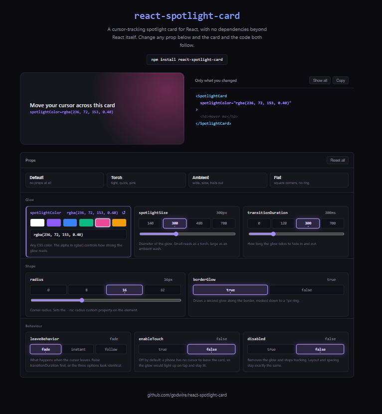
Try it live — change any prop and watch both the card and the code follow.
Install
npm install react-spotlight-cardUsage
import { SpotlightCard } from 'react-spotlight-card'
import 'react-spotlight-card/style.css'

function Example() {
  return (
    <SpotlightCard spotlightColor="rgba(139, 92, 246, 0.35)">
      <h3>Hover me</h3>
      <p>The glow follows your cursor.</p>
    </SpotlightCard>
  )
}
The stylesheet import is not optional. Without it the card renders, takes up space, and produces no glow at all — if that is what you are seeing, this line is the reason.
Why
Most spotlight-card effects arrive with a design system attached: a Tailwind config, Framer Motion, often both. This one is a single component.
The cursor position is written straight to CSS custom properties on the DOM node through a ref, and a radial gradient reads them. No React state changes while the pointer moves, or on enter and leave — so the component never re-renders at all during the effect, and a grid of a hundred cards stays smooth.
Props
Every prop a <div> accepts is forwarded, so the card can be clickable,
labelled, or carry data attributes. ref gives you the outer element.
| Prop | Type | Default | Description |
|---|---|---|---|
| children | ReactNode | — | Card content |
| spotlightColor | string | 'rgba(255, 255, 255, 0.20)' | Any CSS color. The alpha is what controls how strong the glow reads |
| spotlightSize | number | 300 | Diameter of the glow, in pixels |
| borderGlow | boolean | true | Draws a second glow along the border, masked to a 1px ring |
| transitionDuration | number | 300 | Fade in/out duration, in milliseconds |
| radius | number \| string | 16 | Corner radius. A number is treated as pixels |
| leaveBehavior | 'fade' \| 'instant' \| 'follow' | 'fade' | What the glow does once the cursor leaves — see below |
| enableTouch | boolean | false | React to touch as well as mouse and pen |
| disabled | boolean | false | Render without any glow, keeping layout identical |
| className | string | '' | Added to the outer element |
| style | CSSProperties | — | Merged with the component's own custom properties |
leaveBehavior
With a short transitionDuration the three options are hard to tell apart.
Raise it to 700 and the difference is obvious.
fade— the glow stays where the cursor crossed the edge and fades out there. A light left behind, which is sometimes the effect you want.instant— the glow disappears the moment the cursor leaves, whatevertransitionDurationsays. The fade in is unaffected.follow— the glow keeps tracking the cursor past the edge while it fades, so it slides out of the card instead of stopping at the border.
enableTouch
Off by default, and that default is deliberate. A phone has no cursor to leave the card, so the glow would light up on tap and then sit there until something else took the pointer. Turn it on only if that is what you want.
Styling
The component renders a plain <div> and imposes no padding, background or
layout of its own — give it those yourself through className or style.
Under the hood it sets these custom properties, which you can also set from your own CSS if you prefer that to props:
| Property | Set from | Meaning |
|---|---|---|
| --rsc-color | spotlightColor | Glow color |
| --rsc-size | spotlightSize | Glow diameter |
| --rsc-duration | transitionDuration | Fade duration |
| --rsc-radius | radius | Corner radius |
| --rsc-x, --rsc-y | pointer | Cursor position inside the card |
Anyone who has asked their system to reduce motion gets the glow without the fade; the stylesheet handles that.
Compatibility
React 17, 18 and 19. Tested against React 19; peerDependencies allows
>=17.0.0.
TypeScript
Types ship with the package. SpotlightCardProps and LeaveBehavior are
exported if you need them.
import type { SpotlightCardProps, LeaveBehavior } from 'react-spotlight-card'Development
git clone https://github.com/godwire/react-spotlight-card.git
cd react-spotlight-card

npm install
npm run dev        # playground at http://localhost:5173, importing from src/
npm test # component tests in jsdom
npm run typecheck # tsc --noEmit
npm run build # dist/: ESM + CJS + .d.ts + style.css
npm run verify # all three, and what CI runsThe example/ app aliases react-spotlight-card to ../src/index.ts, so the
playground always reflects the current source — no linking, no rebuild while
you iterate.
License
MIT — see LICENSE.