
react-stepper-component
v1.0.4
Published
React Stepper Component

Readme
react-stepper-component
stepper component for react.js
Installation
npm install react-stepper-component --saveUsage
import Stepper from 'react-stepper-component';
// ...
handlerStepperClick(id){
//id from Stepper.Content props 'id;
console.log(id)
}
render() {
return (
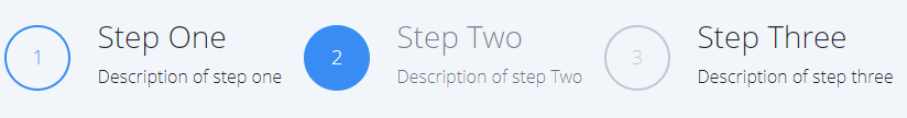
<Stepper onClick={this.handlerStepperClick}>
<Stepper.Content id="1" >
<Stepper.Title>
1
</Stepper.Title>
<Stepper.Detail>
<Stepper.TitleHeadline >
Step One
</Stepper.TitleHeadline>
<Stepper.Description>
Description of step one
</Stepper.Description>
</Stepper.Detail>
</Stepper.Content>
<Stepper.Content id="2" active >
<Stepper.Title>
2
</Stepper.Title>
<Stepper.Detail>
<Stepper.TitleHeadline>
Step Two
</Stepper.TitleHeadline>
<Stepper.Description>
Description of step Two
</Stepper.Description>
</Stepper.Detail>
</Stepper.Content>
<Stepper.Content disabled>
<Stepper.Title>
3
</Stepper.Title>
<Stepper.Detail>
<Stepper.TitleHeadline>
Step Three
</Stepper.TitleHeadline>
<Stepper.Description>
Description of step three
</Stepper.Description>
</Stepper.Detail>
</Stepper.Content>
</Stepper>
);
}Props
| Property | Type | isRequired? | Default | Description |
| --- | :---: | :---: | :---: | --- |
| OnClick | func | required | - | Callback when content onClick |
| id | string | optional | undefined | indicator from container |
| disabled | bool | optional | false | disabled item stepper|
| active | bool | optional | false | indicator active of item stepper |
License
MIT