
react-stepper-lite
v1.0.7
Published
Lightweight React stepper component
Maintainers
 prathmesh-jain
Readme
react-stepper-lite
Lightweight, production-friendly React stepper.
What you get:
- Good defaults: works out of the box.
- Accessible: roving focus + keyboard navigation.
- Easy to customize: CSS variables,
classNames, and per-step overrides. - CSP-friendly styling: CSS is shipped as a separate file (no runtime style-tag injection).
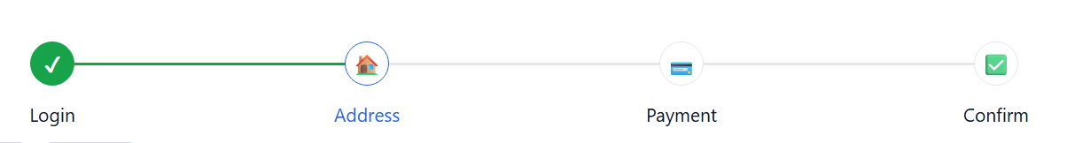
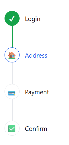
Screenshots
Horizontal
Vertical
Install
npm i react-stepper-litePeer deps:
reactreact-dom
Quick start
import { useState } from 'react'
import { Stepper, type StepConfig } from 'react-stepper-lite'
import 'react-stepper-lite/styles' // import once (e.g., app entry)

const steps: StepConfig[] = [{ label: 'Login' }, { label: 'Address' }, { label: 'Payment' }]

export function Example() {
  const [activeStep, setActiveStep] = useState(0)

  return <Stepper steps={steps} activeStep={activeStep} onStepClick={setActiveStep} />
}
Stepper is controlled: you own activeStep, and onStepClick is optional.
Styles import (required)
After v1.0.4, library CSS is distributed as a separate file for CSP compatibility.
Import styles once in your app:
import 'react-stepper-lite/styles'Why this change:
- avoids runtime
<style>injection - works better with strict CSP policies
- gives explicit control over when/how styles are loaded
Examples
1) Basic (non-clickable)
Useful when you have your own “Next” / “Back” buttons and just want a visual indicator.
import { useState } from 'react'
import { Stepper, type StepConfig } from 'react-stepper-lite'

const steps: StepConfig[] = [{ label: 'Login' }, { label: 'Address' }, { label: 'Payment' }]

export function NonClickable() {
  const [activeStep, setActiveStep] = useState(0)

  return (
    <div style={{ display: 'grid', gap: 12 }}>
      <Stepper steps={steps} activeStep={activeStep} />
      <div style={{ display: 'flex', gap: 8 }}>
        <button type="button" onClick={() => setActiveStep((s) => Math.max(0, s - 1))}>
          Back
        </button>
        <button type="button" onClick={() => setActiveStep((s) => Math.min(steps.length, s + 1))}>
          Next
        </button>
      </div>
    </div>
  )
}
2) Clickable steps
When you pass onStepClick, step buttons become interactive (click + Enter/Space).
import { useState } from 'react'
import { Stepper, type StepConfig } from 'react-stepper-lite'

const steps: StepConfig[] = [{ label: 'Login' }, { label: 'Address' }, { label: 'Payment' }]

export function Clickable() {
  const [activeStep, setActiveStep] = useState(1)

  return <Stepper steps={steps} activeStep={activeStep} onStepClick={setActiveStep} />
}
3) Vertical stepper
import { useState } from 'react'
import { Stepper, type StepConfig } from 'react-stepper-lite'

const steps: StepConfig[] = [{ label: 'Account' }, { label: 'Profile' }, { label: 'Done' }]

export function Vertical() {
  const [activeStep, setActiveStep] = useState(0)

  return (
    <Stepper
      steps={steps}
      activeStep={activeStep}
      onStepClick={setActiveStep}
      orientation="vertical"
      labelPlacement="side"
    />
  )
}
4) Prev / Next / Skip
“Skipped” is different from “not completed”. Future steps are not completed, but they are not skipped.
import { useMemo, useState } from 'react'
import { Stepper, type StepConfig } from 'react-stepper-lite'

export function SkipExample() {
  const steps = useMemo<StepConfig[]>(
    () => [{ label: 'Login' }, { label: 'Address' }, { label: 'Payment' }, { label: 'Confirm' }],
    [],
  )

  const [activeStep, setActiveStep] = useState(0)
  const [skippedSteps, setSkippedSteps] = useState<number[]>([])

  return (
    <div style={{ display: 'grid', gap: 12 }}>
      <Stepper
        steps={steps}
        activeStep={activeStep}
        skippedSteps={skippedSteps}
        labelPlacement="below"
      />

      <div style={{ display: 'flex', gap: 8, flexWrap: 'wrap' }}>
        <button type="button" onClick={() => setActiveStep((s) => Math.max(0, s - 1))}>
          Prev
        </button>
        <button type="button" onClick={() => setActiveStep((s) => Math.min(steps.length, s + 1))}>
          Next
        </button>
        <button
          type="button"
          onClick={() => {
            setSkippedSteps((prev) => (prev.includes(activeStep) ? prev : [...prev, activeStep]))
            setActiveStep((s) => Math.min(steps.length, s + 1))
          }}
        >
          Skip
        </button>
        <button
          type="button"
          onClick={() => {
            setActiveStep(0)
            setSkippedSteps([])
          }}
        >
          Reset
        </button>
      </div>
    </div>
  )
}
5) Icons + per-step overrides
You can set icons and override colors per step.
icon can be:
- a React node
- a string (treated as text)
- a string URL/path (treated as an image)
import { useState } from 'react'
import { Stepper, type StepConfig } from 'react-stepper-lite'

const steps: StepConfig[] = [
  { label: 'Login', icon: '1', color: '#2563eb' },
  { label: 'Address', icon: '2', completedColor: '#16a34a' },
  { label: 'Payment', icon: 'https://raw.githubusercontent.com/prathmesh-jain/react-stepper-lite/main/assets/stepper-horizontal.png' },
  { label: 'Confirm', disabled: true },
]

export function IconsAndOverrides() {
  const [activeStep, setActiveStep] = useState(1)

  return (
    <Stepper
      steps={steps}
      activeStep={activeStep}
      onStepClick={setActiveStep}
      completedIcon="✓"
      skipIcon="↷"
    />
  )
}
6) Styling via CSS variables
import { Stepper } from 'react-stepper-lite'

export function ColorsExample({ steps, activeStep }: { steps: { label: string }[]; activeStep: number }) {
  return (
    <Stepper
      steps={steps}
      activeStep={activeStep}
      style={{
        ['--stepper-active' as any]: '#7c3aed',
        ['--stepper-complete' as any]: '#059669',
      }}
    />
  )
}
For strict CSP environments, prefer external CSS classes instead of inline style:
.checkoutStepper {
  --stepper-active: #2563eb;
  --stepper-complete: #059669;
  --stepper-connector: #d1d5db;
  --stepper-connector-complete: #059669;
}
<Stepper steps={steps} activeStep={activeStep} className="checkoutStepper" />7) classNames (optional)
Use classNames to attach your own classes to internal elements.
import { useState } from 'react'
import { Stepper, type StepConfig } from 'react-stepper-lite'

const steps: StepConfig[] = [{ label: 'One' }, { label: 'Two' }, { label: 'Three' }]

export function ClassNamesExample() {
  const [activeStep, setActiveStep] = useState(0)

  return (
    <Stepper
      steps={steps}
      activeStep={activeStep}
      onStepClick={setActiveStep}
      classNames={{
        list: 'myList',
        stepButton: 'myStepButton',
        activeStep: 'myStep--active',
      }}
    />
  )
}
Styling contract
Use this as a stable guide for customizing the component.
classNames key to element mapping:
root: outer container. Use for global variables, width, spacing around the whole stepper.list: the<ol>wrapper. Use for layout-level spacing/alignment of all steps.step: each<li>step item. Use for per-step container spacing/positioning.stepInner: inner step wrapper around button/label structure.stepButton: clickable/focusable step button. Use for padding, hover, focus visuals.stepIndicator: the circle/icon node. Use for size, border, bg, icon alignment.stepLabel: label wrapper next to/below the indicator.connector: connector line element between steps.activeStep: extra class added when step is active.completedStep: extra class added when step is completed.skippedStep: extra class added when step is skipped.disabledStep: extra class added when step is disabled.
Built-in classes/state selectors you can target:
.stepper--horizontal: horizontal layout rules..stepper--vertical: vertical layout rules..stepper--sm,.stepper--md,.stepper--lg: size variants (indicator/typography/gaps)..stepper--label-below: label-under-indicator layout..stepper--label-side: label-next-to-indicator layout..stepper__step--active: active step colors/label emphasis..stepper__step--completed: completed step indicator/label visuals..stepper__step--passed: step whose connector segment should look completed..stepper__step--skipped: skipped step muted visuals..stepper__step--disabled: disabled step visuals and tone.
Quick example (what to edit for common needs):
- Indicator size/border: target
classNames.stepIndicatoror.stepper__indicator. - Active label color: target
classNames.activeStepwith.stepper__labelText. - Connector thickness/color: target
classNames.connectoror.stepper__connector. - Disabled step tone: target
classNames.disabledStep.
CSS variables supported by default styles:
--stepper-active--stepper-complete--stepper-connector--stepper-connector-complete--stepper-disabled--stepper-text--stepper-muted--stepper-border--stepper-surface
Styling notes
The default styles are plain CSS and are loaded when you import:
import 'react-stepper-lite/styles'If you prefer to bring your own styles:
- use
classNamesto attach your own classes
API (quick reference)
Main exports:
StepperuseStepperState
Most used props:
steps: StepConfig[]activeStep: numberonStepClick?: (index: number) => voidorientation?: 'horizontal' | 'vertical'size?: 'sm' | 'md' | 'lg'labelPlacement?: 'below' | 'side'color?: stringstepColor?: stringcompletedColor?: stringcompletedStepColor?: stringconnectorColor?: stringconnectorCompletedColor?: stringcompletedIcon?: ReactNodeskipIcon?: ReactNodeskippedSteps?: number[]disabled?: booleanclassNames?: StepperClassNames
CSP guidance
- CSP-safe default:
- styles are shipped as a separate CSS file (
react-stepper-lite/styles) - no runtime style-tag injection is used
- with default usage (
steps,activeStep, optional orientation/size/labelPlacement), no inline style attributes are emitted by the component - Recommended for strict CSP: theme via external CSS classes and CSS variables.
- Inline styles are emitted only when user override props are passed:
styleprop- root color override props (
color,stepColor,completedColor,completedStepColor,connectorColor,connectorCompletedColor) - per-step overrides (
step.color,step.completedColor) - If your CSP forbids inline styles, prefer className/classNames + external CSS variables.
StepConfig:
label: string(required)icon?: ReactNode | stringcompletedIcon?: ReactNodecompleted?: booleancolor?: stringcompletedColor?: stringskipped?: booleandisabled?: boolean
Accessibility
- Roving focus (Arrow keys)
Home/Endmove to first/last enabled stepEnter/Spaceactivates a step whenonStepClickis provided- Active step uses
aria-current="step"