react-sticky-children
v0.1.1
Published
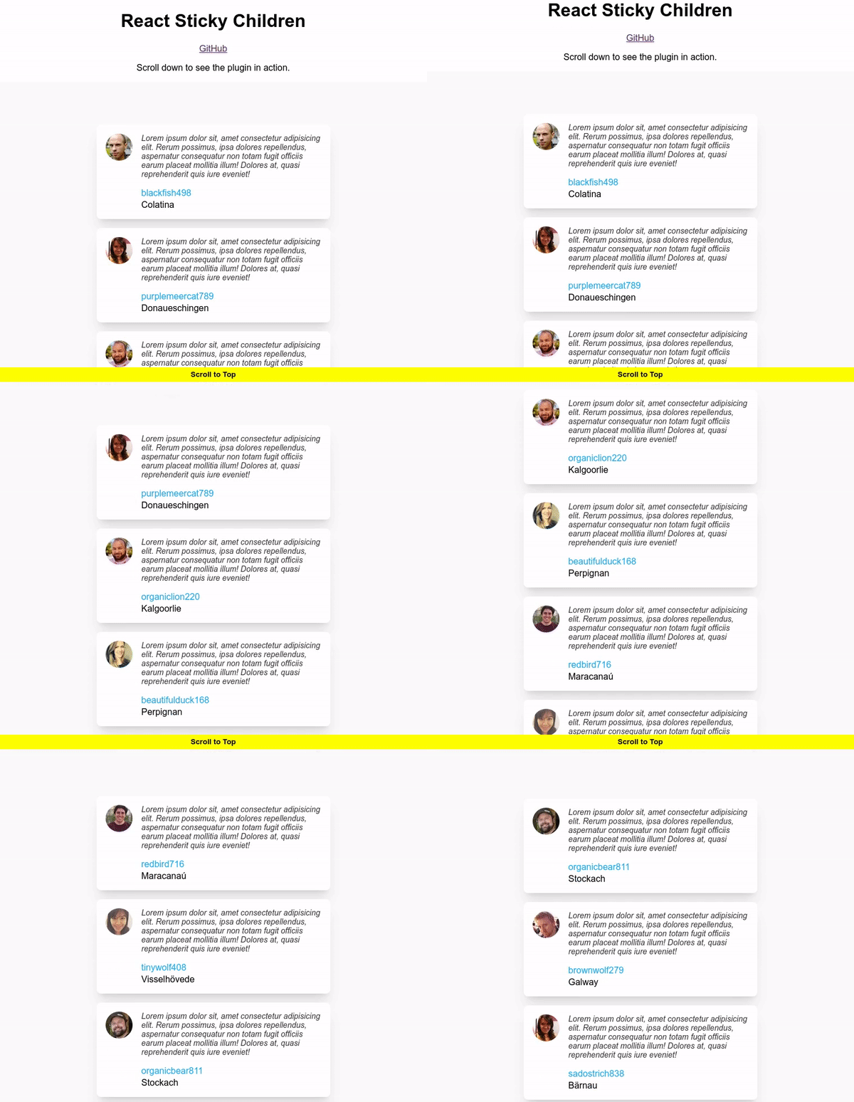
ReactJS component that applies CSS styles as it approaches the top of the viewport.
Maintainers
Readme
react-sticky-children
A React component that applies CSS styles as it approaches the top of the viewport.
Demo | Playground

Installation:
npm -i -s react-sticky-childrenUsage
import { ReactStickyChildren } from 'react-sticky-children';<ReactStickyChildren initialStyle={initialStyle} intersectingStyle={intersectingStyle}>
<MyComponent />
</ReactStickyChildren>Performance
The component aims to be lightweight and is only 1.2KB minified. Additionally, it does not incur any additional re-renders and uses CSS styles for a jank-free user experience.
Recommendations
Use a
constfor your styles and place it outside of the component's render method.If you are animating your component, use CSS transitions on
opacityandtransformto take advantage of GPU compositing. How to create high-performance CSS animations.Good
const initialStyle = { opacity: 0 };
const intersectingStyle = { opacity: 1 };

const MyComponent = () => (
  <ReactStickyChildren
    initialStyle={initialStyle}
    intersectingStyle={intersectingStyle}
  >
    <MyComponent />
  </ReactStickyChildren>
);
Bad
const MyComponent = () => (
  <ReactStickyChildren
    initialStyle={{ opacity: 0 }}
    intersectingStyle={{ opacity: 1 }}
  >
    <MyComponent />
  </ReactStickyChildren>
);
Options
| Option | Type | Description |
| ----------------- | ------------- | ----------------------------------------------------------------------------------------------------------------------------------------------------------------------------------------------------------------------------------------------------------------------------------------------- |
| initialStyle | CSSProperties | Initial style to be applied on the element when it is beneath or within the viewport. (Default: { opacity: 0, visibility: "hidden" }) |
| intersectingStyle | CSSProperties | Style to be applied on the element when it intersects with the top of the viewport. (Default: { opacity: 1, visibility: "visible" }) |
| root | Element | The IntersectionObserver interface's read-only root property identifies the Element or Document whose bounds are treated as the bounding box of the viewport for the element which is the observer's target. If the root is null, then the bounds of the actual document viewport are used. |
| top | number | Top margin from the root in px. (Default: 0) |
| once | boolean | Disconnect the IntersectionObserver after one intersection. (Default: false) |
| className | string | CSS class attributed to be applied to the element. |
FAQs
Does this use the IntersectionObserver API?
Yes, beneath the hood it uses the IntersectionObserver API.
Why would I use this component instead of the IntersectionObserver API?
This component aims to abstract some of the complexities with the IntersectionObserver API and provide a simple React component for toggling styles on components as they approach the top of the viewport.
Can I execute JavaScript or useEffect hooks when the element intersects with the top of the viewport?
No. The scope of this plugin is only to toggle styles.
Which browsers are supported?
As IntersectionObserver is available on all modern browsers, react-sticky-children should also run on all modern browsers. Support for older browsers can be achieved by using the IntersectionObserver polyfill.
Contributing
Anyone and everyone is welcome to contribute to this project and leave feedback. Please take a moment to review the guidelines for contributing.
License and Copyright
This software is released under the terms of the MIT license.
