
react-styling-hoc
v1.0.3
Published
HOC, позволяющий переопределять стили компонентов
Downloads
26
Maintainers
 superol3g
Readme
react-styling-hoc 
Механизм темизации для React-компонентов, написанных с использованием CSS модулей. Позволяет переопределять стили для любых присутствующих в разметке компонента селекторов.
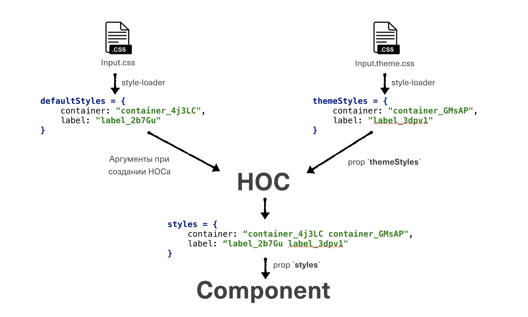
Механизм работы
Установка
npm i react-styling-hocЯвное задание темы
Button.jsx
import defaultStyles from './Button.css';
import styleHOC from 'react-styling-hoc';

class Button extends Component {
    render() {
        const { styles } = this.props;

        return <div className={styles.button}>Text</div>;
    }
}

const StylableButton = styleHOC(defaultStyles)(Button);

export default StylableButton;
Button.css
.button {
    background: #ffdd2d;
    color: #333;
    border: none;
}
myButton.theme.css
.button {
    background: red;
}
myCode.jsx
import Button from '@tinkoff-ui/button';
import themeStyles from 'myButton.theme.css';

const MyButton = props => <Button {...props} themeStyles={themeStyles} />;

const MyComponent = () => <div>
    <div>Something special</div>
    <MyButton/>
</div>;
Сброс стандартных стилей
Если вам не нужны стандартные стили компонента, и вы хотите их написать сами с нуля, то с помощью пропа resetDefaultStyles можно их сбросить.
const MyButton = props => <Button
    {...props}
    themeStyles={themeStyles}
    resetDefaultStyles
/>;
Темизация через контекст
Бывают случаи, когда мы не можем внедриться в чужую часть кода.
Например, мы имеем некоторый компонент InputGroup, который использует в себе темизируемый компонент Input.
Явно заменить <Input> на <ThemedInput> мы не можем.
В таких случаев предусмотрена темизация через контекст, задать который можно через компонент ThemeProvider.
InputGroup.jsx
import Group from '@tinkoff-ui/group';
import Input from '@tinkoff-ui/input';


const InputGroup = () => <Group>
    <Input/>
    <Input/>
    <Input/>
</Group>;

export default InputGroup;
myCode.jsx
import InputGroup from '@tinkoff-ui/inputGroup';
import Input from '@tinkoff-ui/input';
import { ThemeProvider } from 'react-styling-hoc';

import themeStyles from 'myInput.theme.css';

const MyComponent = () => <div>
    <div>Something special</div>
    <ThemeProvider
        themes={[
            {
                component: Input,
                themeStyles
            }
        ]}
    >
        <InputGroup/>
    </ThemeProvider>
</div>;
Ура, мы великолепны, теперь все инпуты внутри ThemeProvider будут выглядеть иначе!
ThemeProvider имеет единственный проп themes, принимающий в себя объект, ключами в котором являются названия темизирумых компонентов,
а значениями - объекты с пропсами theme HOC'а.
ThemeProvider можно вкладывать друг в друга, одинаковые темы будут переопределяться, а разные сохраняться.
Инъекция зависимостей
Бывают случаи, когда переопределять нужно не только стили, но и целые части компонента или разметки.
Например, мы решили провести A/B-тестирование полей ввода даты, и нам необходимо заменить использование <Calendar>
на <NewCalendar> внутри компонента <DateInput>.
Если мы заранее предусмотрим возможность переопределения, то аналогично стилям через Theme HOC и <ThemeProvider> мы
можем передать в компонент новый компонент календаря.
InputDate.jsx
 import Calendar from '@tinkoff-ui//calendar';
 import Input from '@tinkoff-ui/input';
 import styleHOC from 'react-styling-hoc';

 const InputDate = styleHOC()(({ themeBlocks }) => {
     const CalendarElem = themeBlocks && themeBlocks.Calendar || Calendar;

     return <div>
         <Input/>
         <CalendarElem/>
     </div>;
 });

 export default InputDate;
myCode.jsx
import InputDate from '@tinkoff-ui/inputDate';
import { ThemeProvider } from '@tinkoff-ui/style-hoc';
import NewCalender from './NewCalender.jsx';


const MyComponent = () => <div>
    <div>Something special</div>
    <ThemeProvider
        themes={[
            {
                component: InputDate,
                themeBlocks: {
                    Calendar: NewCalender
                }
            }
        ]}
    >
        <InputDate/>
    </ThemeProvider>
</div>;
Повышение веса стилей
Все cелекторы с переопределяющими стилями должны всегда иметь большую специфичность, чем базовые. Для этого можно собственноручно повышать ее или воспользоваться небольшим postcss-плагином.