npm package discovery and stats viewer.

Discover Tips

  • General search

    [free text search, go nuts!]

  • Package details

    pkg:[package-name]

  • User packages

    @[username]

Sponsor

Optimize Toolset

I’ve always been into building performant and accessible sites, but lately I’ve been taking it extremely seriously. So much so that I’ve been building a tool to help me optimize and monitor the sites that I build to make sure that I’m making an attempt to offer the best experience to those who visit them. If you’re into performant, accessible and SEO friendly sites, you might like it too! You can check it out at Optimize Toolset.

About

Hi, 👋, I’m Ryan Hefner  and I built this site for me, and you! The goal of this site was to provide an easy way for me to check the stats on my npm packages, both for prioritizing issues and updates, and to give me a little kick in the pants to keep up on stuff.

As I was building it, I realized that I was actually using the tool to build the tool, and figured I might as well put this out there and hopefully others will find it to be a fast and useful way to search and browse npm packages as I have.

If you’re interested in other things I’m working on, follow me on Twitter or check out the open source projects I’ve been publishing on GitHub.

I am also working on a Twitter bot for this site to tweet the most popular, newest, random packages from npm. Please follow that account now and it will start sending out packages soon–ish.

Open Software & Tools

This site wouldn’t be possible without the immense generosity and tireless efforts from the people who make contributions to the world and share their work via open source initiatives. Thank you 🙏

© 2024 – Pkg Stats / Ryan Hefner

react-sweet-button

v0.0.5

Published

a button component of react

Downloads

7

Readme

react-sweet-button

About

a button component of react

来了就留个 :feet:吧,star一下证明你来过 :stuck_out_tongue_closed_eyes:

如果对您对此项目有兴趣,可以点 "Star" 支持一下 谢谢! ^_^

或者您可以 "follow" 一下,我会不断开源更多的有趣的项目

如有问题请直接在 Issues 中提,或者您发现问题并有非常好的解决方案,欢迎 PR 👍

传送门1:vue2-admin-grace优雅的后台管理系统

传送门2:微信小程序——前端排行榜

传送门3:ionic2-janalytics(ionic native插件)

传送门4:ionic2-wechat(ionic native插件)

技术栈

react + sass + classnames + webpack

Install

npm i react-sweet-button -S

Usage

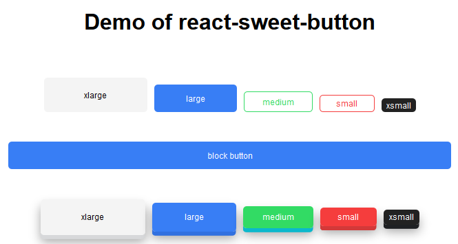
import { SweetButton, DimensionButton } from 'react-sweet-button';
  • SweetButton
<SweetButton className="m-t" type="light" size="xlarge" onClick={()=>{alert('我是超大按钮')}}>
  xlarge
</SweetButton>
<SweetButton className="m-l" type="primary" size="large">
  large
</Sweet
<SweetButton className="m-l" type="secondary" size="medium" outline>
  medium
</SweetButton>
<SweetButton className="m-l" type="danger" size="small" outline>
   small
</SweetButton>
<SweetButton className="m-l" type="dark" size="xsmall">
   xsmall
</SweetButton>
<SweetButton size="large" block>
  block button
</SweetButton>
  • DimensionButton
<DimensionButton className="m-t" type="light" size="xlarge" onClick={()=>{alert('我是超大按钮')}}>
  xlarge
</DimensionButton>
<DimensionButton className="m-l" type="primary" size="large">
  large
</DimensionButton>
<DimensionButton className="m-l" type="secondary" size="medium">
   medium
</DimensionButton>
<DimensionButton className="m-l" type="danger" size="small">
   small
</DimensionButton>
<DimensionButton className="m-l" type="dark" size="xsmall">
   xsmall
</DimensionButton>

效果预览

预览图

API

通过设置 Button 的属性来产生不同的按钮样式,推荐顺序为:type -> size -> outline(仅适用于SweetButton) ->block(仅适用于SweetButton)

按钮的属性说明如下:

  • type: 设置按钮类型,可选值为 light primary secondary danger dark或者不设 默认值为 primary

  • size: 设置按钮大小,可选值为 xlarge large medium small xsmall或者不设 默认值large

  • outline: 设置按钮样式(仅带边框按钮)

  • block: 设置按钮样式(block button)