
react-tagit
v1.0.4
Published
Simple input tag component for react
Maintainers
 shaian.npm
Readme
react-tagit


A simple and customizable Input Tag Component for React.
Demo
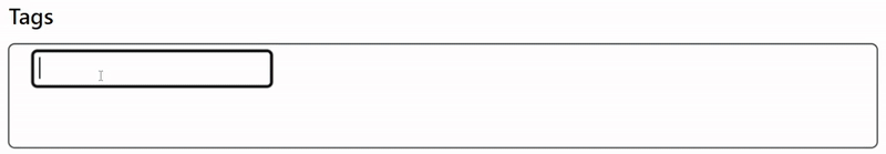
Table of Contents
Installation
Install the package using your preferred package manager:
NPM
npm install react-tagitYarn
yarn add react-tagitPNPM
pnpm add react-tagitPeer Dependencies
Ensure you have the following peer dependencies installed:
"peerDependencies": {
  "react": "^19.0.0",
  "react-dom": "^19.0.0"
}
Usage
Here’s an example of how to use the <InputTag> component:
import { InputTag } from 'react-tagit';
import { useState } from 'react';

export default function App() {
  const [tags, setTags] = useState<Array<string>>([]);

  return (
    <form>
      <InputTag
        separator="Space"
        theme="theme-1"
        maxTags={5}
        maxTagsValue={25}
        value={tags}
        onChange={setTags}
      />
      <button type="submit">Submit Tags</button>
    </form>
  );
}
And that's it! You now have a fully functional input tag component.
Props
Here’s a list of props you can pass to the <InputTag> component:
| Prop | Type | Default | Description |
| ----------------------------- | ------------------------------------- | ----------- | --------------------------------------------------------------------- |
| autoFocus | boolean | false | Autofocus the tag input element when the component mounts. |
| customClass | object | {} | Custom classes for the elements of the InputTag component. |
| disabled | boolean | false | Disable the InputTag component. Hides the remove button for each tag. |
| inputTagContainerStyleProps | object | {} | Style props for the container element. |
| labelStyleProps | object | {} | Style props for the label element. |
| inputStyleProps | object | {} | Style props for the input element. |
| tagsContainerStyleProps | object | {} | Style props for the tags list container. |
| tagsStyleProps | object | {} | Style props for individual tag elements. |
| removeTagBtnStyleProps | object | {} | Style props for the remove button on each tag. |
| hideLabel | boolean | false | Whether to hide the label. |
| label | string | 'Tags' | Label for the input. |
| maxTags | number | infinite | Maximum number of tags allowed. |
| maxTagsValue | number | infinite | Maximum number of characters per tag. |
| name | string | 'tags' | Name attribute for the input element. |
| separator | 'Enter' \| 'Space' | 'Enter' | The key that triggers tag creation. |
| theme | 'theme-1' \| 'theme-2' \| 'theme-3' | undefined | Available themes for styling the component. |
| value | Array<string> | [] | Current tag values. |
| onChange | (tags: Array<string>) => void | undefined | Function to update the tag values. |
| onFocus | (event: FocusEvent) => void | () => {} | Callback when the input gains focus. |
| onBlur | (event: FocusEvent) => void | () => {} | Callback when the input loses focus. |
Styling & Theming
react-tagit comes with built-in themes and allows you to customize styles using class names or inline styles.
Built-in Themes
You can use one of the predefined themes:
Theme 1
<InputTag theme="theme-1" />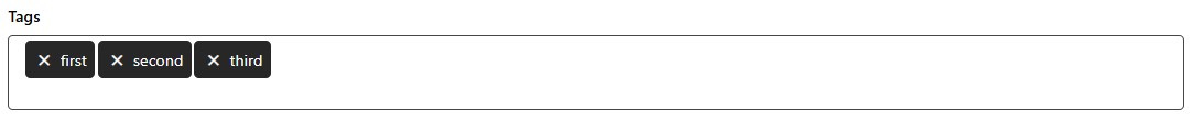
Theme 2
<InputTag theme="theme-2" />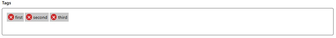
Theme 3
<InputTag theme="theme-3" />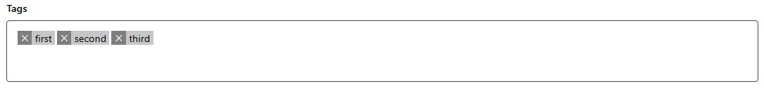
Custom Classes
You can override the default classes by passing a customClass object:
<InputTag
  customClass={{
    inputTagContainerElement: 'custom-container',
    inputTagLabelElement: 'custom-label',
    inputTagListContainerElement: 'custom-list',
    inputTagTagItemElement: 'custom-tag-item',
    inputTagTagRemoveBtnElement: 'custom-remove-btn',
    inputTagTagContentElement: 'custom-tag-content',
    inputTagInputElement: 'custom-input',
  }}
/>
Default Classes
Here are the default class names you can target for styling:
input-tag-container-elementinput-tag-label-elementinput-tag-list-container-elementinput-tag-tag-item-elementinput-tag-tag-remove-btn-elementinput-tag-tag-content-elementinput-tag-input-element
Development
Testing
This project uses Jest and Testing Library for testing. To run the tests:
npm run testStorybook
The project uses Storybook for component documentation and previews. To start Storybook:
npm run storybookThis will start a local server and provide a preview URL.
Building
The project uses Rollup as the bundler. To build the project:
npm run buildThe compiled code will be available in the dist folder.
Contributing
Contributions are welcome! Please open an issue or submit a pull request for any improvements or bug fixes.
License
This project is licensed under the MIT License.