
react-tags-component
v1.1.0
Published
There are Tags component for React


Readme
React-Tags-Component
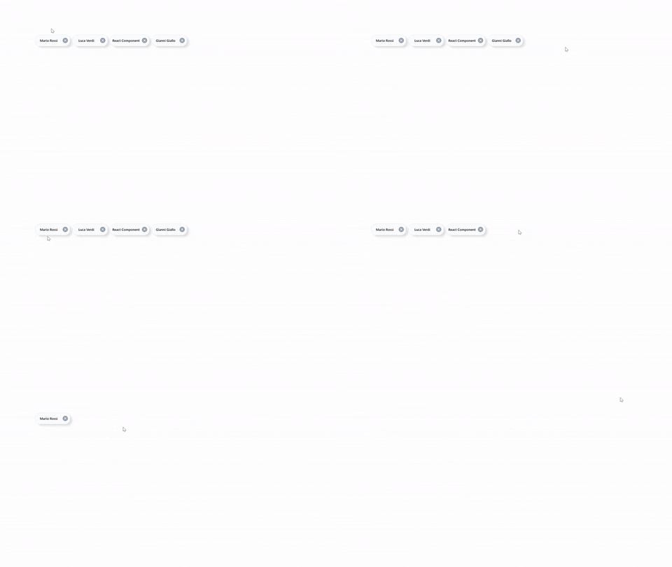
React-tags-component is a component for tags management. It consists of a customizable label and a button to which you can attach an action (the button can be visible or hidden). You can also customize the tag in all its graphic features.
Installation
npm install --save react-tags-component
Demo
Import
import TagsComponent from "react-tags-component";Usage
Using this component is very simple , once you import you can use a list to generate how many tags you want.
{
  ["Mario Rossi", "Luca Verdi", "React Component", "Gianni Giallo"].map(el => (
    <TagsComponent textLabel={el} />
  ));
}
Options
| Options | Type | Default | Description | | --------------- | -------- | ---------------- | ---------------------------------------------------------------- | | hideShadowTags | Boolean | false | Allows the shadow under the component to be visible | | colorTextLabel | String | #5c6f82 | Allows you to change the color of the label | | textLabel | String | Sanf Tags | That’s the tags label value | | iconComponent | Element | Delete Component | Allows you to switch an item that will replace the default icon | | borderTagsColor | String | #dfe4f2 | Allows you to change the color of the component border | | backgroundTags | String | #fcfdff | Allows you to change the color of the component background | | deleteTag | Function | Remove the tags | Allows you to change the function associated with the icon click | | hideIcon | Boolean | False | Allows you to hide the icon |