
react-tailwind-timeline-component
v1.1.2
Published
Highly customizable React Timeline component
Maintainers
 mtetik
Readme
React Tailwind Timeline Component


Render a timeline with React and Tailwind CSS in your React project.
React Tailwind Timeline Component is a highly customizable timeline component that works perfect with Tailwind CSS.
⚠️ DISCLAIMER
Using this package does not mean you are using Tailwind CSS nor any icon package. You should import your own icon package and install Tailwind CSS yourself.
Try it yourself!
Install
npm install react-tailwind-timeline-componentUsage
With Timeline
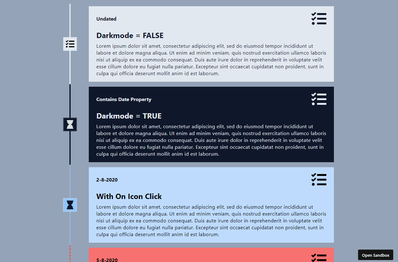
Use Timeline component to render a sorted timeline. Notice that you should pass a date property to the timeline events and those that do have this property, will be sorted.
// App.js
import { Timeline, EventTimeline } from "react-tailwind-timeline-component";

// Disclaimer: This icon package is used as example only.
import { FaTasks } from "react-icons/fa";

export default function App() {
    return (
        <Timeline>
            <EventTimeline
                title="Title 1"
                description="Some description..."
                icon={<FaTasks />}
                date={new Date(2022, 5, 15)}
            />
            <EventTimeline
                title="Title 2"
                description="Some description..."
                icon={<FaTasks />}
                date={new Date(2022, 5, 1)}
            />
            <EventTimeline
                title="Title 3"
                description="Some description..."
                icon={<FaTasks />}
                date={new Date(2022, 5, 30)}
            />
        </Timeline>
    );
}
Without Timeline
If you do not require a sorted timeline, you can use the <EventTimeline> component without the <Timeline> component.
// App.js
import { Timeline, EventTimeline } from "react-tailwind-timeline-component";

// Disclaimer: This icon package is used as example only.
import { FaTasks } from "react-icons/fa";

export default function App() {
    return (
        <EventTimeline
            title="Title 1"
            description="Some description..."
            icon={<FaTasks />}
        />
        <EventTimeline
            title="Title 2"
            description="Some description..."
            icon={<FaTasks />}
        />
        <EventTimeline
            title="Title 3"
            description="Some description..."
            icon={<FaTasks />}
        />
    );
}
Types
Timeline
| Property | Description | Required | Type | Default Value |
|----------|-------------|:----:|------|---------------|
| children | Timeline events | ✔️ | ReactNode | - |
| className | Class name of the timeline | ❌ | string | - |
| sort | Whether to sort timeline events | ❌ | boolean | true |
| ascending | Whether to sort timeline events in ascending order | ❌ | boolean | true |
| beforeUndatedContent | Whether to display the sorted events before any other content that does not have a date property | ❌ | boolean | true |
EventTimeline
| Property | Description | Required | Type | Default Value |
|----------|-------------|:----:|------|---------------|
| title | Title of the timeline event | ✔️ | string | - |
| description | Description of the timeline event | ✔️ | string | - |
| icon | Icon of the timeline event | ✔️ | ReactNode | - |
| date | Date of the timeline event | ❌ | Date | - |
| className | Class name of the timeline event | ❌ | string | - |
| showLine | Whether to show a line between the timeline event and the previous one | ❌ | boolean | true |
| showIcon | Whether to show the icon of the timeline event | ❌ | boolean | true |
| leftSideContent | Content to be displayed on the left side of the timeline event | ❌ | string \|\| ReactNode | - |
| leftSideContentClassName | Class name of the left side content | ❌ | string | - |
| rightSideContent | Content to be displayed on the right side of the timeline event | ❌ | string \|\| ReactNode | - |
| rightSideContentClassName | Class name of the right side content | ❌ | string | - |
| titleClassName | Class name of the title of the timeline event | ❌ | string | - |
| lineClassName | Class name of the line between the timeline event and the previous one | ❌ | string | - |
| iconBackgroundClassName | Class name of the background of the icon of the timeline event | ❌ | string | - |
| cardClassName | Class name of the card (details) of the timeline event | ❌ | string | - |
| darkMode | Whether to use dark mode | ❌ | boolean | false |
| onIconClick | Callback to be executed when the icon of the timeline event is clicked | ❌ | function | - |
| onTitleClick | Callback to be executed when the title of the timeline event is clicked | ❌ | function | - |
| onCardClick | Callback to be executed when the card of the timeline event is clicked | ❌ | function | - |
| onLeftSideContentClick | Callback to be executed when the left side content of the timeline event is clicked | ❌ | function | - |
| onRightSideContentClick | Callback to be executed when the right side content of the timeline event is clicked | ❌ | function | - |
License
The React Tailwind Timeline Component is licensed under MIT.
Motivation
Due to the fact that there are a few timeline components out there, I decided to create my own. I wanted to create a timeline component that works perfectly with Tailwind CSS. I also wanted to create a timeline component that is highly customizable and easy to use.