
react-tailwindcss-datepicker-styles-exposed
v0.3.4
Published
Fork of react-tailwindcss-datepicker that exposes per-day / per-cell classNames for full calendar styling control
Maintainers
 nevaletik
Readme
React Tailwindcss Datepicker
Fork notice — this package (
react-tailwindcss-daypicker-styles-exposed) is a fork ofreact-tailwindcss-datepickerby onesine. It extends theclassNamesprop with additional slots that expose the internals of the calendar — popup, calendar container/header, prev/next/month/year buttons, week header, per-day callback (withisToday/isSelected/isInRange/isRangeStart/isRangeEnd/isHovered/isDisabled/defaultClassName), month picker, year picker and shortcuts sidebar — giving you full control over the calendar styling, including per-cell customization during range selection. The public API is otherwise unchanged and backwards compatible with the upstream package. All credit for the original component goes to the upstream author; this fork only adds the extendedclassNamessurface.Example:
<Datepicker
  value={value}
  onChange={setValue}
  classNames={{
    day: ({ isRangeStart, isRangeEnd, isInRange, defaultClassName }) => {
      const base = "flex items-center justify-center w-10 h-10";
      if (isRangeStart) return `${base} bg-emerald-600 text-white rounded-l-full`;
      if (isRangeEnd)   return `${base} bg-emerald-600 text-white rounded-r-full`;
      if (isInRange)    return `${base} bg-emerald-100 text-emerald-900`;
      return defaultClassName;
    },
    weekDay: ({ index }) =>
      `text-center ${index >= 5 ? "text-red-400" : "text-gray-500"}`
  }}
/>


Contents
- Features
- Documentation
- Supported versions
- Installation
- Simple Usage
- Theming Options
- Playground
- Contributing
Features
- ✅ Theming options
- ✅ Dark mode
- ✅ Single Date
- ✅ Single date use Range
- ✅ Shortcuts
- ✅ TypeScript support
- ✅ Localization(i18n)
- ✅ Date formatting
- ✅ Disable specific dates
- ✅ Minimum Date and Maximum Date
- ✅ Custom shortcuts
Documentation
Go to full documentation
⚠️ Supported versions
Only react-tailwindcss-datepicker versions greater than or equal to 1.7.4 receive bug fixes and new features. The table below lists compatibility with the different react versions:
| Version | React Version | |----------------------------------------------------------------------------|---------------| | 2.x | 19.x | | 1.x | 17.x, 18.x |
Installation
React Tailwindcss Datepicker uses Tailwind CSS 3 (with the @tailwindcss/forms plugin) & Dayjs under the hood to work.
Install via npm
npm install react-tailwindcss-datepickerInstall via yarn
yarn add react-tailwindcss-datepickerInstall for react 18 project
yarn add [email protected]Make sure you have installed the peer dependencies as well with the below versions.
"dayjs": "^1.11.12",
"react": "^17.0.2 || ^18.2.0" || "^19.0.0"
Simple Usage
Tailwindcss Configuration
Add the datepicker to your tailwind configuration using this code
// in your tailwind.config.js
module.exports = {
    // ...
    content: [
        "./src/**/*.{js,jsx,ts,tsx}",
        "./node_modules/react-tailwindcss-datepicker/dist/index.esm.js"
    ]
    // ...
};
Then use react-tailwindcss-select in your app:
import { useState } from "react";
import Datepicker from "react-tailwindcss-datepicker";

const App = () => {
    const [value, setValue] = useState({
        startDate: null,
        endDate: null
    });

    return (
        <>
            <Datepicker value={value} onChange={newValue => setValue(newValue)} />
        </>
    );
};

export default App;
Theming options
Light Mode
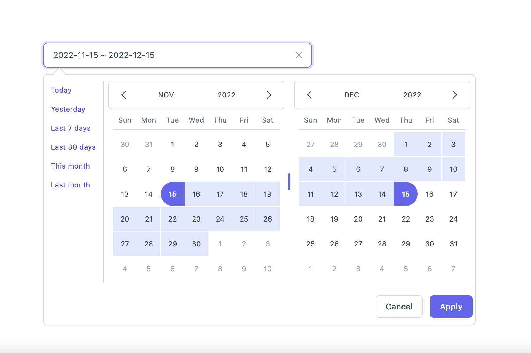
Dark Mode
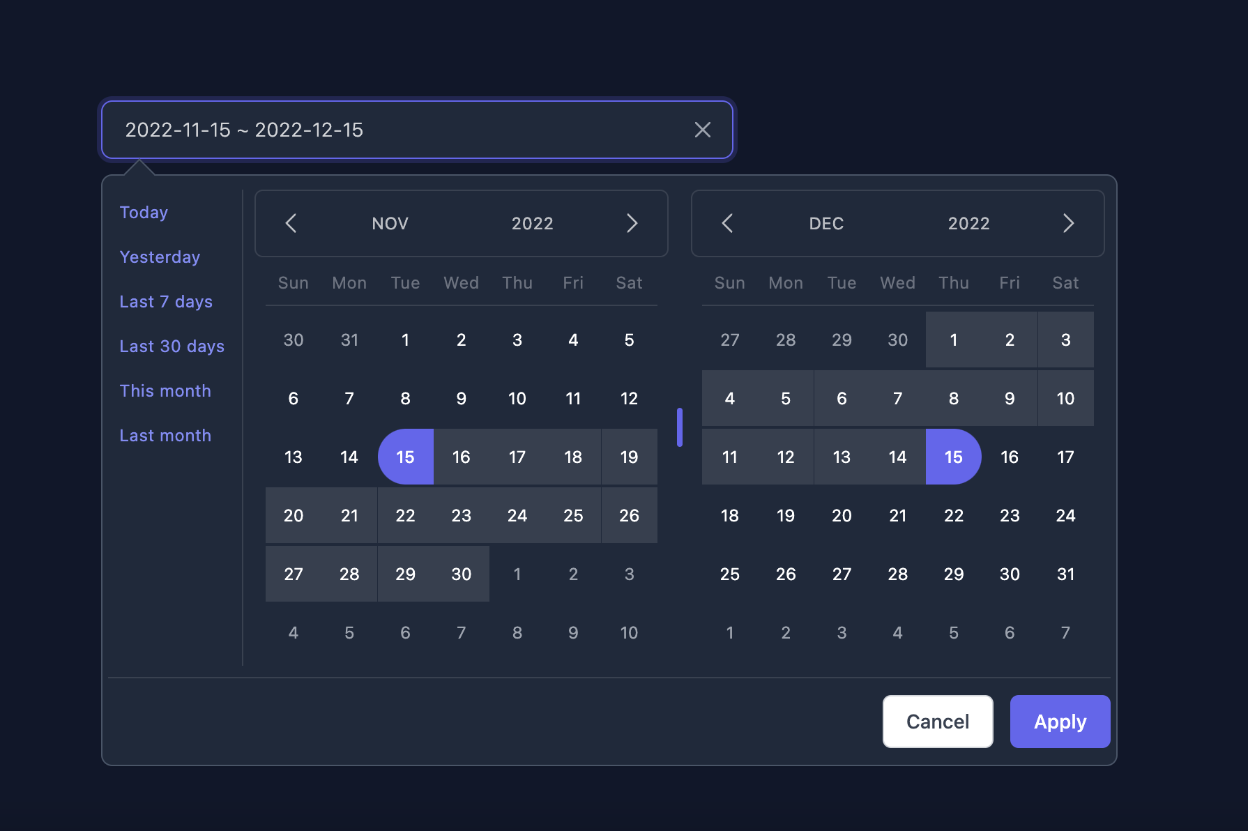
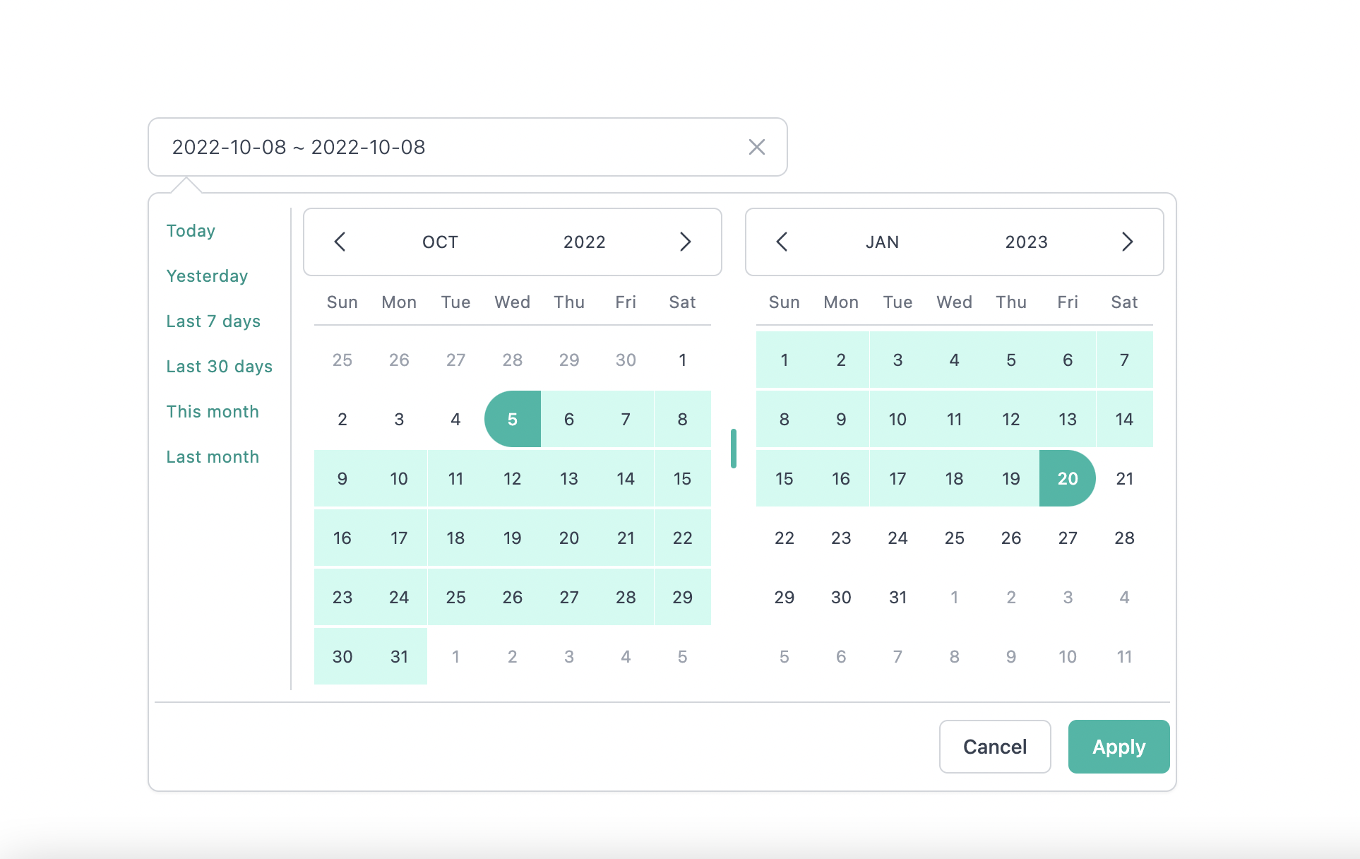
Supported themes
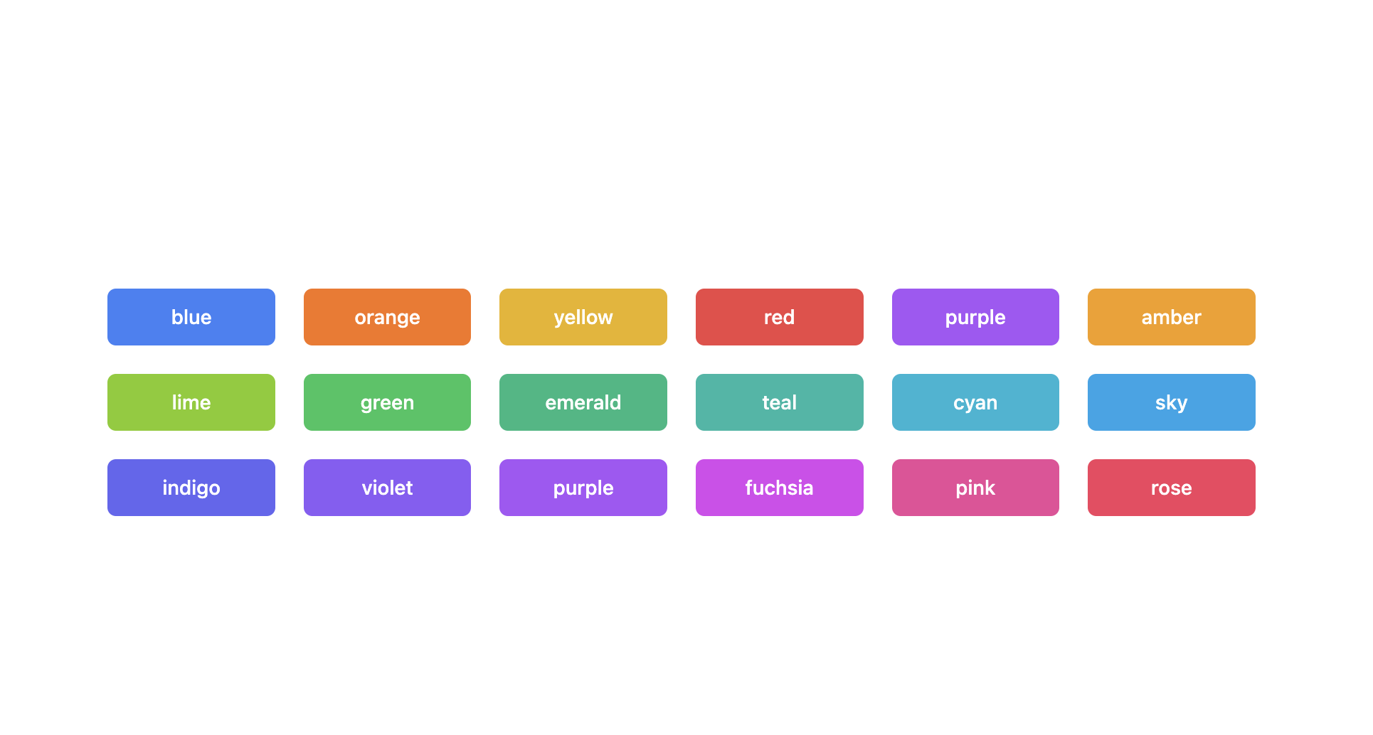
Teal themes example
You can find the demo at here
Info
👉 To discover the other possibilities offered by this library, you can consult the full documentation.
PlayGround
Clone the master branch and run commands:
# Using npm
npm install && npm dev

# Using yarn
yarn install && yarn dev
Open a browser and navigate to http://localhost:8888
Contributing
See CONTRIBUTING.md
Official Documentation repo
https://github.com/onesine/react-tailwindcss-datepicker-doc
Thanks to
I thank you in advance for your contribution to this project.
License
MIT Licensed. Copyright (c) Lewhe Onesine 2022.