
react-timeline-semantic-ui
v1.0.13
Published
A react timeline component built with Semantic UI React

Readme
react-timeline-semantic-ui
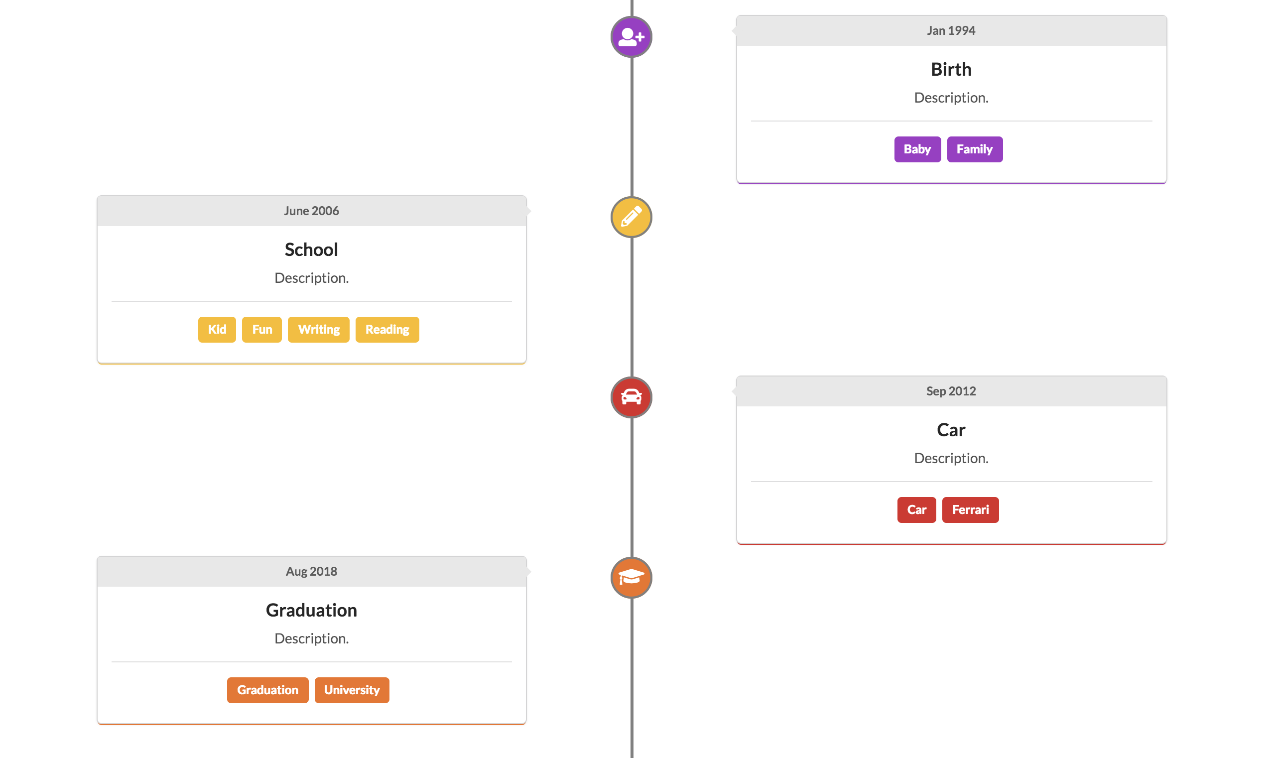
Introduction
This react timeline component is built with Semantic UI react. For more information about Semantic UI React, please visit this link.
Installation
npm install react-timeline-semantic-ui --saveUsage
import Timeline from 'react-timeline-semantic-ui';

<Timeline
  direction="left"
  icon="user"
  title="Title"
  time="Time"
  description="Description."
  color="red"
  tags={['tag1', 'tag2']}
  lineHeight={4}
/>
Timeline props
| Name | Type | Description | | ------------ | ------ | ---------------------------------------- | | title | string | The title of this timeline component. | | direction | enum | Enums: 'left', 'right'. It specifies which way the timeline component locates. | | icon | string | The name of the icon. Please refer to [icon] (http://react.semantic-ui.com/elements/icon/). | | time | string | The time of this timeline card. | | description | string | The description of this timeline card. | | color | enum | Optional, default color is 'grey'. Enums: 'red', 'orange', 'yellow', 'olive', 'green', 'teal', 'blue', 'violet', 'purple', 'pink', 'brown', 'grey', 'black'. It specifies the color of icon and the timeline card. | | tags | array | An array of strings. | | lineHeight | number | The height of middle line going through icons. The number refers to the number of timeline cards. | | labelColor | enum | Optional. Same enum values as color. The color of top label of the timeline component. | | lineColor | enum | Optional. Same enum values as color. The color of middle line of the timeline component. |