
react-toaster-message
v1.4.0
Published
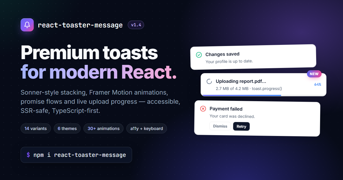
Premium React toast notifications — Sonner-style stacking, Framer Motion animations, promise & upload-progress toasts, 14 variants, accessible, SSR-safe, TypeScript-first.

Maintainers
 yogeshgabani
Readme
react-toaster-message
A premium, Sonner-inspired React toast notification library.
Framer-Motion animations · swipe-to-dismiss · promise & upload-progress toasts · FIFO stagger · 6 themes · 14 visual variants · rich colors · a11y · SSR-safe · TypeScript-first.


A modern, premium React toast notification library — Sonner-inspired, built with Framer Motion, fully accessible, SSR-safe, and tree-shakeable.
- 🎬 Smooth Framer-Motion-powered animations (slide, blur-fade, spring, scale, bounce)
- 🧱 Stack reposition with
layoutanimations - 👆 Swipe-to-dismiss (touch + mouse) with velocity detection
- 🌗 Light / dark / system / glass / gradient / accent themes via CSS variables
- 🎨 14 visual variants — glass, gradient, accent, solid, soft, outline, neon, and 6 border-bar styles (
left/right/x/top/bottom/y-border) - 🌈 Rich colors mode
- ⏸ Pause on hover, pause on window blur
- 📦 Sonner-style collapsed stack (expand on hover) +
maxVisibleToasts - ⏳ Promise toasts with loading → success / error transitions
- 📤 Upload / progress toasts — a live 0 → 100% bar driven by
toast.progress(id, value) - 🎯 Action / cancel / undo / confirmation toasts
- ♻️
toast.update(id, …)to mutate live toasts - 🔊 Optional sound + mobile vibration, per toast type or per individual toast
- 🎯
containerprop to mount the portal anywhere (shadow root, modal, …) - ♿ ARIA
role,aria-live, reduced-motion aware, hotkey-focusable, arrow-key toast navigation, Escape-to-dismiss - 🪶 Lightweight, tree-shakeable ESM + CJS builds, SSR-safe
What's new in v1.4.0
Added
- Progress toasts for uploads, exports and other long tasks — pass
progress(0–1) and calltoast.progress(id, value)as work advances. See Upload / progress toasts. - Per-toast
pauseOnHoverandpauseOnWindowBlurnow work (they were in the types but ignored).
Fixed
toast.loading()followed bytoast.success("…", { id })left the success toast on screen forever — it now auto-closes after the default duration.- The countdown
progressBarjumped ahead of the real timer whenever the toast re-rendered (hover, a new toast arriving). dismissible: falsetoasts could still be swiped away.pauseOnHover={false}still paused a toast while the pointer was over it.toastOptions.durationwas ignored in favour ofduration.- Two
toast.promise()calls in the same millisecond shared one toast. toast.promise(fn)wherefnthrows synchronously crashed instead of showing the error toast; the success state also ignored the Toaster'sduration.draggable: falsetoasts couldn't be focused by the hotkey, arrow keys or Escape.
Demo site
- New Upload progress demo, live npm download stats, and a refreshed look with a social preview image.
What's new in v1.3.0
Added
- Optional sound per toast type or per individual toast (
sounds,soundVolume,sound) — the library ships no audio files, nothing plays until you point it at a URL. - Optional mobile vibration per toast type or per individual toast (
vibrate), using the same shape as sound. containerprop — mount the toast portal anywhere (a shadow root, a specific stacking context, a second scoped<Toaster />) instead of alwaysdocument.body.- Overflow indicator — a
+N morebadge appears whenmaxVisibleToastshides older toasts, instead of them silently expiring with no trace. Escapedismisses whichever toast is currently focused;↓/↑arrow keys jump between toasts once one has focus.toast.error(err)now accepts anErrorobject directly and useserr.message(orerr.name) as the title — a plain string still works as before.- First test suite (Vitest + React Testing Library,
npm test) covering the store, thetoast()API, and<Toaster />behaviour.
Fixed
dir="auto"(the default) never actually resolved tortl, so the RTL CSS (icon/text order, accent bar side) silently never engaged even on an RTL page. Now resolved from the document's real direction, and kept in sync if it changes.hotkeyonly searched the Toaster's default position for a toast to focus, missing any toast rendered at a per-toastpositionoverride. Now searches the whole portal.
Changed
- Center-positioned toasts with an explicit
swipeDirection: "x"now feel biased toward the natural swipe-away direction for the resolveddir(mirrored in RTL).
Install
1. Install the package (framer-motion and zustand come with it):
npm install react-toaster-message
# or: pnpm add react-toaster-message · yarn add react-toaster-message
2. Import the stylesheet — required, otherwise toasts will render unstyled / invisible:
import "react-toaster-message/styles.css";Put this once at the root of your app (e.g.
main.tsx/_app.tsx/layout.tsx). Next.js 13+ App Router and Vite both support importing CSS fromnode_modulesdirectly.
Quick start
The bare minimum — render <Toaster /> once at the root of your app, then call
toast() from anywhere:
// app entry — e.g. main.tsx
import "react-toaster-message/styles.css";

import { Toaster, toast } from "react-toaster-message";

export default function App() {
  return (
    <>
      <button onClick={() => toast.success("File saved!")}>Save</button>
      <Toaster position="bottom-right" richColors closeButton />
    </>
  );
}
Next.js (App Router)
The build ships with a "use client" directive, so <Toaster /> can go
straight into a Server Component layout:
// app/layout.tsx
import "react-toaster-message/styles.css";
import { Toaster } from "react-toaster-message";

export default function RootLayout({ children }: { children: React.ReactNode }) {
  return (
    <html lang="en">
      <body>
        {children}
        <Toaster richColors closeButton />
      </body>
    </html>
  );
}
Call toast() from any Client Component ("use client"), event handler or
client-side utility.
Full <Toaster /> reference (every prop, with comments)
Copy-paste this once into your app — every option is documented inline so you know what to keep and what to remove:
import "react-toaster-message/styles.css";
import { Toaster } from "react-toaster-message";

<Toaster
  /* ─── Placement ──────────────────────────────────────────────── */
  position="bottom-right"        // top-left | top-center | top-right |
                                 // bottom-left | bottom-center | bottom-right
  offset="1rem"                  // distance from the viewport edge (number = px)
  gap={14}                       // pixels between toasts when expanded
  dir="auto"                     // ltr | rtl | auto — mirrors layout (icon/text
                                 //   order, accent bar side) and, for
                                 //   center-positioned toasts, which way
                                 //   feels natural to swipe away

  /* ─── Look & feel ───────────────────────────────────────────── */
  theme="light"                  // light | dark | system | glass | gradient |
                                 //   accent (left color bar on every toast)
  richColors                     // bold semantic tint per type (success/error/…)
  closeButton                    // show ✕ on every toast
  animation="slide"              // slide | blur-fade | scale | spring | bounce
                                 //   …or any AOS-style preset: fade-up,
                                 //   zoom-in, flip-left, slide-right, etc.

  /* ─── Stack behaviour ───────────────────────────────────────── */
  maxVisibleToasts={Infinity}    // how many are on screen at once.
                                 //   The NEWEST toasts always show — older
                                 //   ones slide out and keep expiring in the
                                 //   background (sonner-style). Default: Infinity.
  expand={false}                 // false (default) = collapsed stack: older
                                 //   toasts peek out behind the newest one.
                                 //   true = always show every toast at full
                                 //   size in a list.
  expandOnHover                  // when collapsed, hovering the stack expands
                                 //   the whole stack into the full list;
                                 //   collapses again on mouse leave.

  /* ─── Timing ────────────────────────────────────────────────── */
  duration={4000}                // default auto-close time in ms.
                                 //   Pass Infinity (or `duration: Infinity`
                                 //   per-toast) to disable auto-close.
  pauseOnHover                   // hover any toast → all timers pause
  pauseOnWindowBlur              // tab/window blur → timers pause

  /* ─── Keyboard / a11y ───────────────────────────────────────── */
  hotkey={["altKey", "KeyT"]}    // press Alt+T anywhere on the page →
                                 //   focuses the frontmost toast (any
                                 //   position). From there: Tab moves
                                 //   through its action/cancel/close
                                 //   buttons, ↑/↓ arrows jump between
                                 //   toasts, Escape dismisses the focused
                                 //   one. Modifier keys (altKey/ctrlKey/
                                 //   metaKey/shiftKey) + a KeyboardEvent.code
                                 //   (e.g. "KeyT", "Digit1"). Set to `[]`
                                 //   or `undefined` to disable.

  /* ─── Sound & vibration ─────────────────────────────────────── */
  sounds={{                      // per-type sound URLs — no sound plays
    success: "/sounds/success.mp3", //   for a type with no entry here (the
    error:   "/sounds/error.mp3",   //   library ships no audio files, so
  }}                              //   nothing plays unless you set this)
  soundVolume={0.6}              // 0–1, applies to every `sounds` entry
                                 //   (and to a per-toast `sound` override)
  vibrate={{                     // per-type vibration pattern (ms, or an
    error: 200,                  //   on/off/on/… array). Mobile only —
    success: [40, 30, 40],       //   silently does nothing on desktop /
  }}                              //   browsers without the Vibration API.

  /* ─── Defaults applied to every toast call ──────────────────── */
  toastOptions={{
    progressBar: false,          // visual countdown bar
    closeButton: true,           // overrideable per toast()
    classNames: { toast: "my-toast" },
    styles:     { toast: { borderRadius: 12 } },
  }}

  /* ─── Portal target (advanced) ──────────────────────────────── */
  container={() => document.getElementById("modal-root")}
                                 // where the toast portal mounts — an
                                 //   element, or a function returning one.
                                 //   Defaults to `document.body`. Use this
                                 //   to render inside a shadow root, a
                                 //   specific stacking context (e.g. so
                                 //   toasts stay above an open modal), or
                                 //   to keep two `<Toaster />`s scoped to
                                 //   different parts of the page.

  /* ─── Custom container styling (advanced) ───────────────────── */
  containerClassName="my-portal"
  containerStyle={{
    // any CSS variable from styles.css can be overridden here, e.g.:
    // ["--rtoast-radius" as any]: "12px",
    // ["--rtoast-bg" as any]:     "#fafafa",
  }}
/>;
Calling toast() — every per-toast option
import { toast } from "react-toaster-message";

// ─── Built-in types (auto-styled, auto a11y role) ────────────────
toast("Hello world");                       // default
toast.success("Saved!");
toast.error("Failed", { description: "Try again later." });
toast.error(err);                           // err is an Error → uses err.message
                                            //   (or err.name if message is empty).
                                            //   A plain string still works as before.
toast.warning("Heads up");
toast.info("New update available");
toast.loading("Saving…");                   // stays until dismissed/updated
toast.message("Plain message");             // alias of toast(...)

// ─── Full options bag (everything is optional) ──────────────────
toast("Item moved to trash", {
  id: "trash-1",                            // pass an id to update/dismiss later
  description: "You can undo within 5s.",
  duration: 5000,                           // override the global default
  position: "top-center",                   // per-toast position override
  variant: "glass",                         // default | glass | gradient | accent |
                                            //   solid | soft | outline | neon |
                                            //   left-border | right-border | x-border |
                                            //   top-border | bottom-border | y-border
                                            //   accent  = rounded color bar on the left
                                            //   solid   = bold filled surface per type
                                            //   soft    = pastel tint + colored text
                                            //   outline = colored border, clean card
                                            //   neon    = dark card with glowing edge
                                            //   *-border = rounded color bar on that
                                            //   edge (x = both sides, y = top+bottom)
  richColors: true,                         // semantic tint just for this toast
  progressBar: true,                        // visual countdown bar
  progress: 0.4,                            // determinate 0–1 bar (uploads…);
                                            //   the toast stays up while set —
                                            //   see toast.progress() below
  closeButton: true,                        // show ✕
  dismissible: true,                        // false = ignore swipe/✕/Escape
  draggable: true,                          // swipe-to-dismiss on/off
  swipeDirection: "x",                      // x | y | auto
  pauseOnHover: true,                       // override the Toaster setting
  pauseOnWindowBlur: true,                  //   for this toast only

  icon: "🗑️",                                // any ReactNode (string/JSX/svg)
  animation: "blur-fade",                   // override the global animation
  sound: "/sounds/ding.mp3",                // overrides the Toaster's `sounds`
                                            //   map for this toast; `false`
                                            //   mutes it even if `sounds` has
                                            //   an entry for its type
  vibrate: 200,                             // overrides the Toaster's `vibrate`
                                            //   map for this toast (ms, or an
                                            //   on/off/on/… array); `false` mutes it

  className: "my-toast",                    // attached to the toast <li>
  style: { padding: 20 },
  classNames: { title: "my-title", description: "my-desc" },
  styles:     { title: { color: "crimson" } },

  action: {                                 // primary button on the right
    label: "Undo",
    onClick: () => restore(),
    closeOnClick: true,                     // dismiss after click (default true)
  },
  cancel: {                                 // secondary/ghost button
    label: "Cancel",
    onClick: () => {},
  },

  onDismiss:   (t) => console.log("dismissed (any reason)", t.id),
  onAutoClose: (t) => console.log("dismissed by timer",     t.id),
});

// ─── Programmatic control ───────────────────────────────────────
const id = toast.loading("Uploading…");
toast.update(id, { type: "success", title: "Uploaded!", duration: 3000 });
toast.success("Uploaded!", { id });          // same thing, shorter
toast.progress(id, 0.5);                     // report 50% progress
toast.dismiss(id);     // dismiss one
toast.dismiss();       // dismiss all

// ─── Fully custom render ────────────────────────────────────────
toast.custom((t) => <MyOwnToast toast={t} onClose={() => toast.dismiss(t.id)} />);
API
Promise toast — loading → success / error
toast.promise() shows a loading toast that resolves to a success or error
toast when the promise settles. Great for save/upload/fetch flows:
toast.promise(saveUser(), {
  loading: "Saving user…",
  success: (data) => `Saved ${data.name}`,        // string or ReactNode
  error:   (err)  => `Failed: ${err.message}`,    // string or ReactNode
  description: (data, state) =>                   // optional second line
    state === "success" ? "All set." : "Try again in a moment.",
});

// Also accepts a function form (lazy):
toast.promise(() => fetch("/api/me").then((r) => r.json()), {
  loading: "Loading…",
  success: "Done",
  error:   "Failed",
});
Upload / progress toasts
For work where you know how far along you are — file uploads, exports,
imports, batch jobs — give the toast a progress value (0–1) and keep it
updated with toast.progress(id, value). A determinate bar fills along the
bottom edge:
const id = toast.loading("Uploading report.pdf…", { progress: 0 });

const xhr = new XMLHttpRequest();
xhr.upload.onprogress = (e) => {
  const pct = e.loaded / e.total;
  // optional 3rd argument patches any other field in the same call
  toast.progress(id, pct, { description: `${Math.round(pct * 100)}% uploaded` });
};
xhr.onload = () => toast.success("Upload complete", { id });
xhr.onerror = () => toast.error("Upload failed", { id });
xhr.open("POST", "/api/upload");
xhr.send(file);
Effect: the toast stays on screen while it reports progress (it never
auto-closes mid-upload). As soon as it changes type — toast.success(…, { id })
or toast.error(…, { id }) — the progress bar is cleared and the normal
auto-close timer starts. Values are clamped to 0–1. The bar is exposed to
assistive tech as role="progressbar" with aria-valuenow, and its color
can be themed with the --rtoast-progress-color CSS variable.
progress (determinate, you drive it) is separate from progressBar (the
auto-close countdown).
Confirmation / undo
// Undo pattern — auto-dismisses, but offers a quick action while visible
toast("Item moved to trash", {
  action: { label: "Undo", onClick: () => restore() },
});

// Modal-ish confirmation — sticky until user picks
toast("Delete this project?", {
  duration: Infinity,                            // never auto-close
  action: { label: "Delete", onClick: confirmDelete },
  cancel: { label: "Cancel", onClick: () => {} },
});
Sound
The library ships no audio files — nothing plays unless you point it at
a sound (an .mp3/.wav/.ogg URL: a path under your public/ folder, or
a hosted file). Map a URL per toast type on <Toaster sounds={...} />:
<Toaster
  sounds={{
    success: "/sounds/success.mp3",
    error: "/sounds/error.mp3",
  }}
  soundVolume={0.6}              // 0–1, defaults to 1
/>
Effect: with the config above, toast.success(...) plays
success.mp3 and toast.error(...) plays error.mp3; every other type
(default, warning, info, loading, …) stays silent since it has no
entry in the map. A toast.promise() loading → success transition plays
the success sound the moment it resolves (loading itself stays silent
unless you add a loading entry too).
Override or mute it per call:
toast.success("Saved!", { sound: "/sounds/custom-ding.mp3" }); // this call only
toast.success("Saved quietly", { sound: false });              // never plays, even with `sounds` set
Browsers block audio before any user interaction with the page (autoplay
policy) — a sound triggered by a toast() call from a click handler plays
fine; one fired on page load, before the user has clicked/typed anything,
may be silently blocked. That failure is swallowed rather than thrown.
Vibration (mobile haptics)
Same shape as sound, using the same Partial<Record<ToastType, …>> map —
this time of vibration patterns instead of URLs:
<Toaster
  vibrate={{
    error: 200,              // one 200ms buzz
    success: [40, 30, 40],   // buzz, pause 30ms, buzz — on/off/on/… pairs
  }}
/>
Effect: toast.error(...) triggers a 200ms vibration, toast.success(...)
a double-tap pattern; every other type stays silent (no entry in the map).
Override or mute per call the same way as sound —
toast.error("bad", { vibrate: 400 }) or { vibrate: false }.
Only does anything on devices/browsers that support the Vibration API — mobile Chrome/Firefox on Android, mainly. Desktop browsers and iOS Safari don't implement it, so this is a no-op there rather than an error.
Custom mount target
By default the toast portal renders into document.body. Point it
elsewhere with container:
<Toaster container={() => document.getElementById("modal-root")} />Effect: toasts render inside #modal-root instead of document.body —
useful when an open modal/dialog traps focus or sits in its own stacking
context and toasts need to render inside it to stay visible/reachable, when
rendering inside a shadow root, or when running two independent
<Toaster />s that need to stay visually scoped to different parts of the
page. If the function returns null/undefined (e.g. the element isn't
mounted yet), it falls back to document.body.
Keyboard shortcuts
<Toaster hotkey={["altKey", "KeyT"]} /> // default — change or set to [] to disableEffect:
Alt+T(or whateverhotkeyis set to) — jumps focus to the frontmost toast on screen, at any position. Useful for keyboard-only users who don't want toTabthrough the rest of the page first.Tab, once a toast is focused — moves into its action / cancel / close buttons.↓/↑(arrow keys), while a toast is focused — jumps to the next / previous toast, wrapping around at the ends. Does nothing when focus isn't on a toast, so it never hijacks arrow keys used elsewhere on the page (a<select>, a text input, …).Escape, while a toast (or one of its buttons) is focused — dismisses that toast, the same as clicking its ✕. Toasts created withdismissible: falseignore it, same as they ignore the close button and swipe.
hotkey accepts any combination of the modifier keys (altKey, ctrlKey,
metaKey, shiftKey) plus one KeyboardEvent.code, e.g.
["ctrlKey", "shiftKey", "KeyN"] for Ctrl+Shift+N.
<Toaster /> props (cheat-sheet)
Full annotated reference is in Quick start above. Defaults:
| Prop | Type | Default |
| ------------------- | --------------------------------------------------------- | -------------- |
| position | top-left / top-center / top-right / bottom-* | bottom-right |
| theme | light/dark/system/glass/gradient/accent | light |
| richColors | boolean | false |
| closeButton | boolean | false |
| duration | number | 4000 |
| maxVisibleToasts | number | Infinity |
| gap | number | 14 |
| offset | number / string | 1rem |
| expand | boolean (false = collapsed stack, true = full list) | false |
| expandOnHover | boolean (hovering the stack expands it) | true |
| pauseOnHover | boolean | true |
| pauseOnWindowBlur | boolean | true |
| animation | slide / blur-fade / scale / spring / bounce | slide |
| dir | ltr / rtl / auto | auto |
| hotkey | string[] — e.g. ["altKey", "KeyT"] | alt+T |
| sounds | Partial<Record<ToastType, string>> — sound URL per type | undefined |
| soundVolume | number (0–1) | 1 |
| vibrate | Partial<Record<ToastType, number \| number[]>> | undefined |
| container | Element / () => Element \| null \| undefined | document.body|
| toastOptions | Partial<ToastOptions> — defaults applied to every toast | {} |
Per-toast options
See the fully-commented toast(...) block in Quick start for
every per-call option (description, action, cancel, icon, variant,
richColors, progressBar, progress, draggable, swipeDirection,
pauseOnHover, pauseOnWindowBlur, sound, vibrate, onDismiss,
onAutoClose, className(s), style(s), …).
Theming
Override any CSS variable to customize globally:
.rtoast-portal {
  --rtoast-radius: 12px;
  --rtoast-bg: #fafafa;
  --rtoast-fg: #18181b;
  --rtoast-success: #22c55e;
}
Gradient colors
Use theme="gradient" to apply gradients to every toast, or variant: "gradient" per-toast.
The gradient backgrounds are driven by six CSS variables — override them to pick your own palette:
| Variable | Applied to | Default |
| ----------------------- | ---------------- | ------------------------------------------- |
| --rtoast-grad-default | default toasts | linear-gradient(135deg, #6366f1, #8b5cf6) |
| --rtoast-grad-success | success toasts | linear-gradient(135deg, #10b981, #059669) |
| --rtoast-grad-error | error toasts | linear-gradient(135deg, #ef4444, #b91c1c) |
| --rtoast-grad-warning | warning toasts | linear-gradient(135deg, #f59e0b, #d97706) |
| --rtoast-grad-info | info toasts | linear-gradient(135deg, #3b82f6, #2563eb) |
| --rtoast-grad-loading | loading toasts | inherits --rtoast-grad-default |
Globally via CSS
.rtoast-portal {
  --rtoast-grad-default: linear-gradient(135deg, #ec4899, #a855f7);
  --rtoast-grad-success: linear-gradient(135deg, #14b8a6, #0284c7);
  --rtoast-grad-error: linear-gradient(135deg, #f43f5e, #7c2d12);
}
Inline via the <Toaster> (per-instance)
<Toaster
  theme="gradient"
  containerStyle={
    {
      "--rtoast-grad-default": "linear-gradient(135deg, #ec4899, #a855f7)",
      "--rtoast-grad-success": "linear-gradient(135deg, #14b8a6, #0284c7)",
      "--rtoast-grad-error": "linear-gradient(135deg, #f43f5e, #7c2d12)",
    } as React.CSSProperties
  }
/>
The CSS variables also drive the per-toast variant: "gradient", so you can mix and match — keep the
base theme light/dark and call toast.success("…", { variant: "gradient" }) for one-off gradient toasts.
Accessibility
role="status"for default toasts,role="alert"for error / warningaria-live="polite"(orassertivefor errors)- Respects
prefers-reduced-motion - Hotkey (
alt+Tby default) focuses the frontmost toast,↓/↑move between toasts — see Keyboard shortcuts Escape, while a toast is focused, dismisses it (unlessdismissible: false)- The overflow badge (when
maxVisibleToastshides older toasts) isaria-live="polite"so screen readers announce the hidden count
SSR
Safe out of the box — the portal mounts only after hydration, all window /
matchMedia access is guarded inside useEffect.
License
MIT License - Copyright (c) 2026 Yogesh Gabani
Built by Yogesh Gabani.