
react-twentytwenty
v1.2.1
Published
TwentyTwenty component for React
Downloads
872
Maintainers
 jacobp100
Readme
React TwentyTwenty
A TwentyTwenty component for React
npm install --save react-twentytwentyDemo (with cats)
- Images can be different sizes
- Only uses valid CSS1, so works on older browsers
- Doesn't use clip
- Mobile Friendly
Docs
TL;DR,
<TwentyTwenty
  left={<img src="left" />}
  right={<img src="right" />}
/>
Properties
defaultPosition: The position to use when mounted (between 0 and 1)verticalAlign: One of 'top', 'middle', or 'bottom'leftHorizontalAlign: One of 'left', 'center', or 'right'rightHorizontalAlign: One of 'left', 'center', or 'right'
You can also use this component as a controlled component. Just provide the props position, and listen to the onChange event, which will called with a number when the slider is moved.
Slider
You can include a custom slider. The slider is placed inside a zero-width, full height element, positioned to the correct left offset: basically just set height: 100% and a width on your slider.
<TwentyTwenty
  left={<img src="left" />}
  right={<img src="right" />}
  slider={<div className="slider" />}
/>
.slider {
height: 100%;
width: 1px;
background: mediumaquamarine;
}Advanced
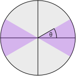
On mobile, we will only initiate sliding if it is clear the user is not trying to vertically scroll, and instead is trying to interact with the component. This is done ensuring the user moves a minimum distance, and looking at the angle.
The default values for these settings are minDistanceToBeginInteraction={15} and maxAngleToBeginInteraction={20}, but you can configure them as you wish. The angle is done in degrees, and looks like this (where the purple area is the angles that will start an interaction, and theta is maxAngleToBeginInteraction).
You can turn off this all together by setting the maxAngleToBeginInteraction to Infinity and the minDistanceToBeginInteraction to zero.