
react-typescript-ui
v1.0.1
Published
A themeable, sizeable React + TypeScript UI component library (CSS-variable based).

Maintainers
 arunsarva
Readme
React TypeScript UI
A themeable, size-able React + TypeScript component library. No Tailwind, no
CSS-in-JS runtime — every color, radius, shadow, and size step resolves to a
plain CSS variable set by <ThemeProvider>, so theming works even for people
consuming your published package without any build-step dependency.
Showcase
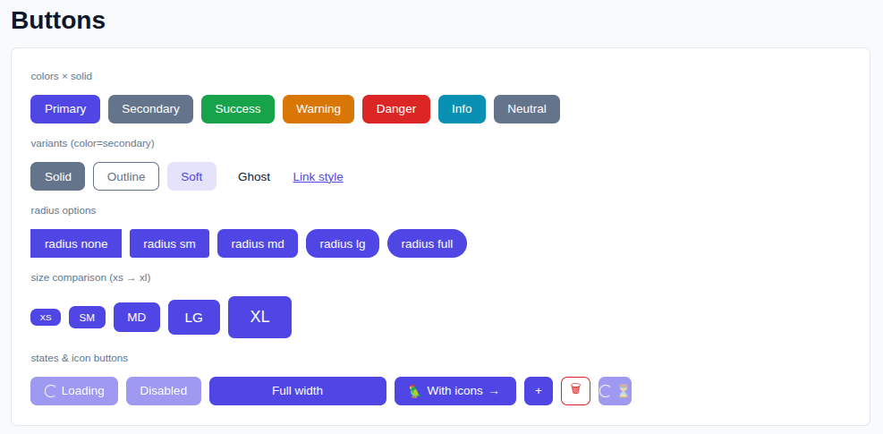
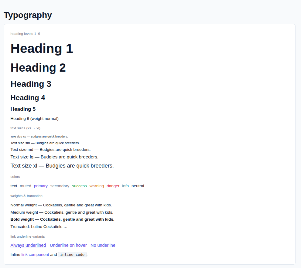
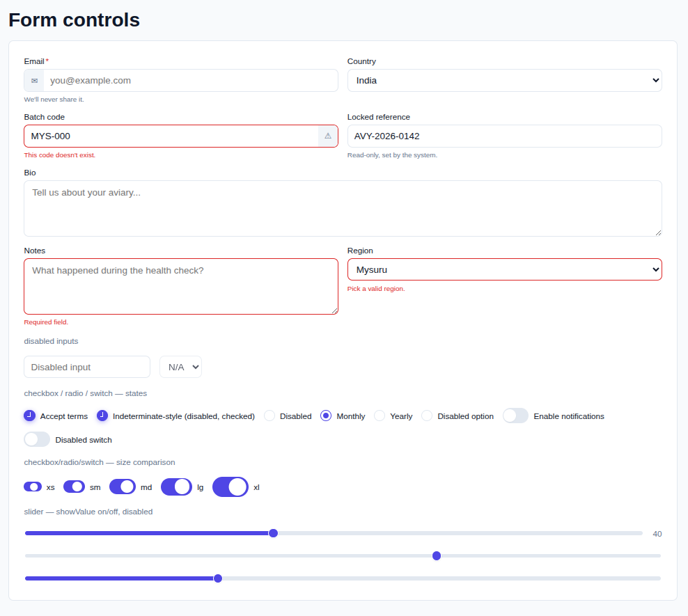
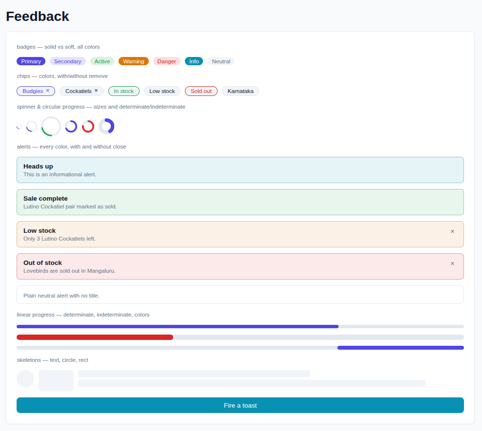
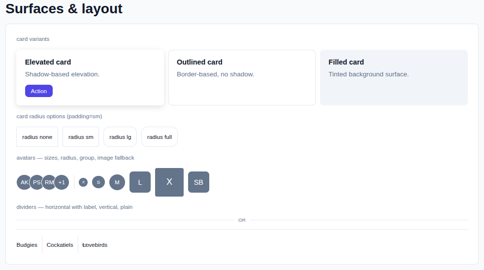
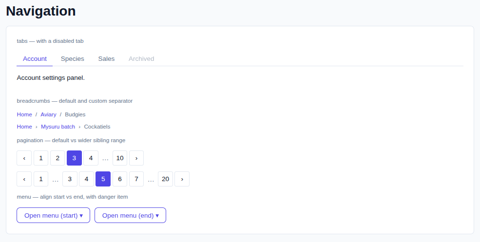
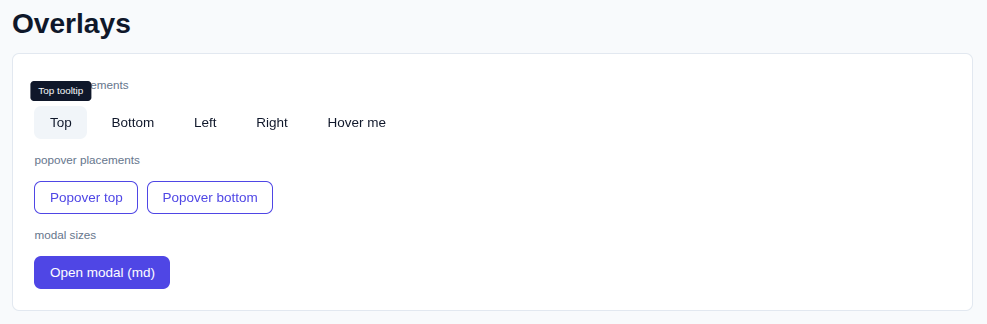
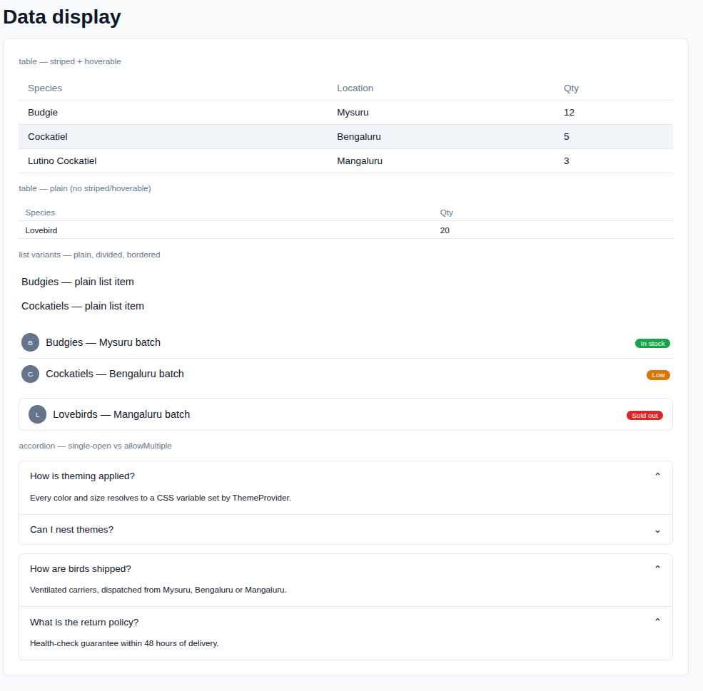
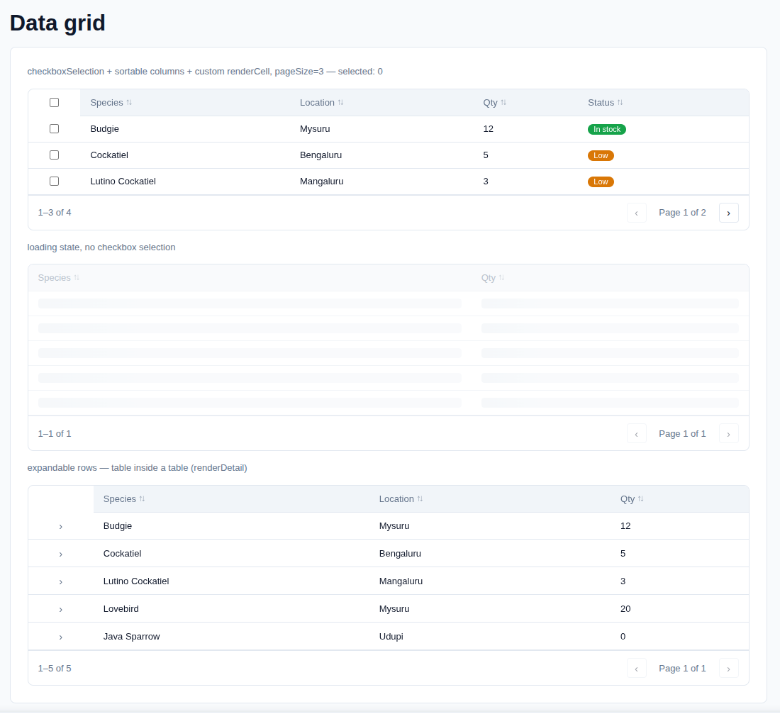
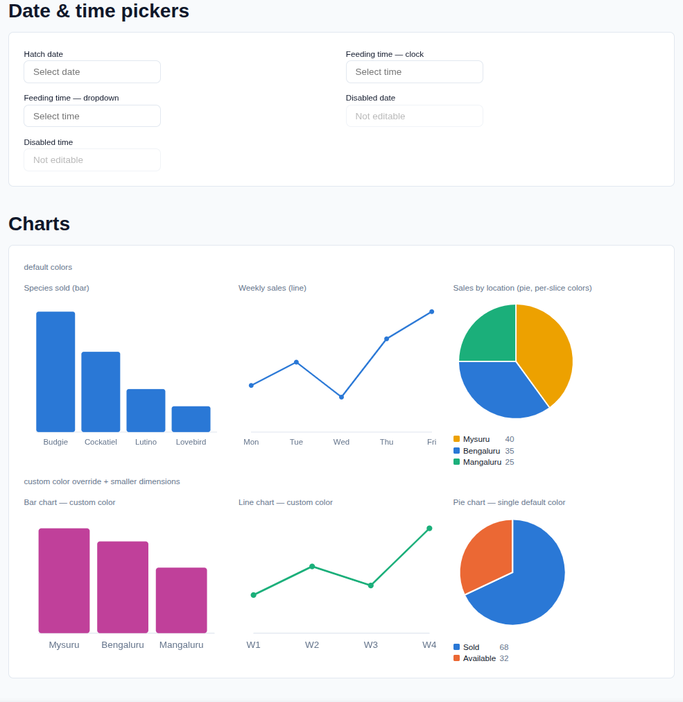
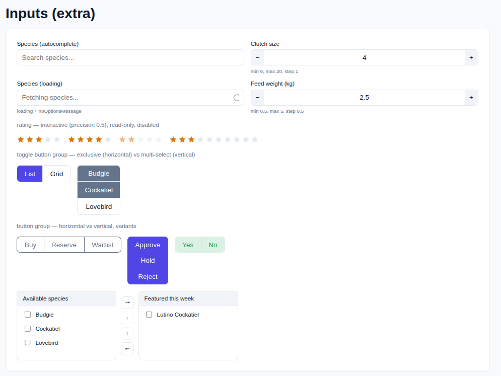
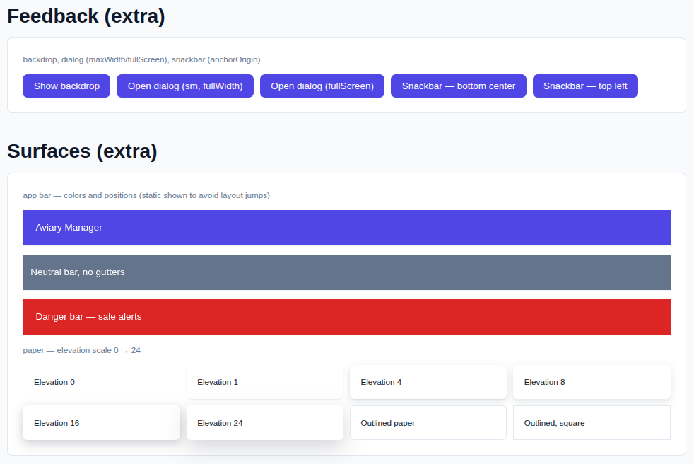
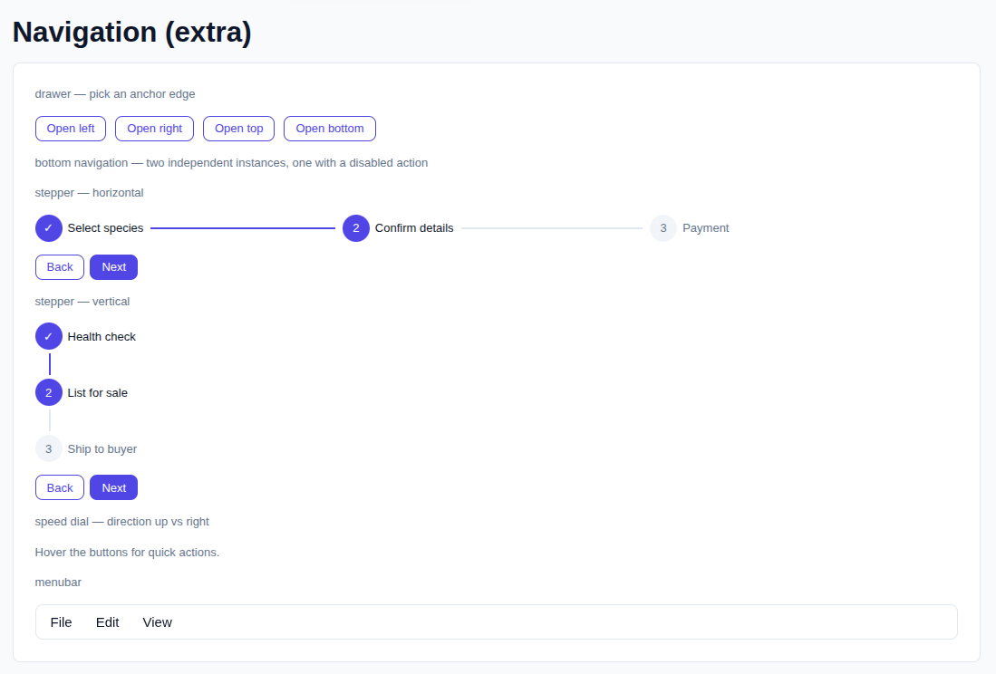
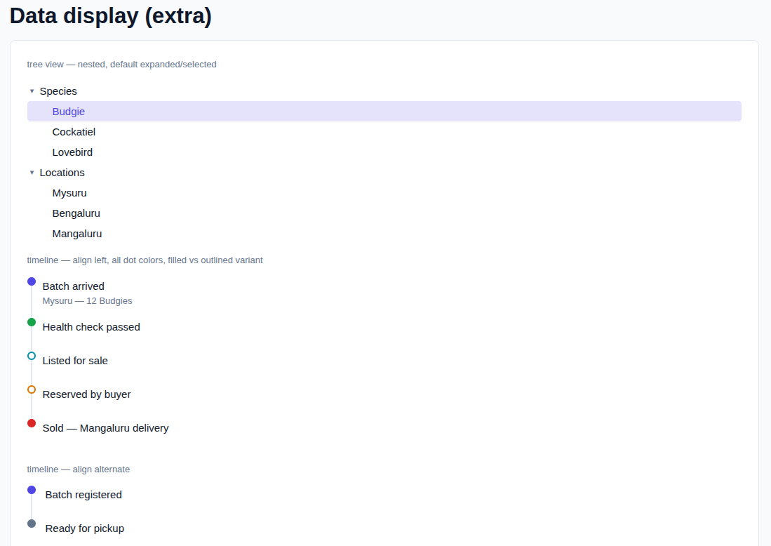
The demo app (src/App.tsx) walks through every component group. A couple of
sections to give you a feel for it:
Run the demo locally
npm install
npm run dev       # opens the showcase app at http://localhost:5173
The showcase (src/App.tsx) renders every component with live theme, dark
mode, and size switches — use it to test everything in one place.
npm run typecheck # tsc --noEmit
npm run build     # builds the demo app to dist/ (for the app, not the lib)
Project structure
src/
  theme/          ThemeProvider, theme tokens, size scale, shared prop types
  components/     One file (+ matching .css) per component group
  styles/         globals.css — fallback CSS variables + reset
  index.ts        Barrel export — this is your npm package's public API
  App.tsx         Showcase / demo app (not exported by the library)
Using the library in your own app
import { ThemeProvider, Button, Card, Input } from "react-typescript-ui";
import "react-typescript-ui/dist/style.css";

function App() {
  return (
    <ThemeProvider>
      <Card padding="lg">
        <Input placeholder="Bird species" />
        <Button color="primary" size="md">
          Save
        </Button>
      </Card>
    </ThemeProvider>
  );
}
Custom themes
Every component reads colors/sizes from CSS variables, so a theme is just an object of overrides — you don't have to redefine the whole palette:
<ThemeProvider
  theme={{
    colors: {
      primary: { light: "#059669", dark: "#34d399" },
      border: "#d1fae5",
    },
    radii: { md: "16px" },
  }}
>
  <YourApp />
</ThemeProvider>
Three bundled themes ship out of the box — defaultTheme, sunsetTheme,
slateTheme — pass one as baseTheme and layer your own theme overrides
on top:
import { ThemeProvider, sunsetTheme } from "react-typescript-ui";

<ThemeProvider baseTheme={sunsetTheme}>
  <YourApp />
</ThemeProvider>;Nesting: wrap any subtree in its own <ThemeProvider> to scope a
different theme to just that section (e.g. a dark sidebar inside a light
app) — variables are set on a wrapper div, not :root.
Dark mode: pass mode="dark" (controlled) or defaultMode="dark"
(uncontrolled), or call useTheme().toggleMode() from inside the provider.
Tooltips on any component
Every component accepts optional tooltip / tooltipPlacement props — no
wrapping required, and zero overhead when unset:
<Button tooltip="Save changes">Save</Button>
<Badge tooltip="3 unread messages">3</Badge>
<Card tooltip="Read-only" tooltipPlacement="right">...</Card>
Ref forwarding still works normally through components that support it.
For one-off cases outside this library's own components, the underlying
<Tooltip content="...">{children}</Tooltip> wrapper is also exported directly.
Custom sizes
Every interactive component accepts size="xs" | "sm" | "md" | "lg" | "xl".
The scale itself (font size, control height, padding, icon size, gap) is
theme-level, so you can redefine the whole scale once:
<ThemeProvider
  theme={{
    sizes: {
      controlHeight: { md: "40px", lg: "48px" },
      fontSize: { md: "16px" },
    },
  }}
>
  <YourApp />
</ThemeProvider>
Components included (90+)
- Buttons: Button, IconButton, ButtonGroup
- Typography: Heading, Text, Link, Code
- Forms: Field, Input, Textarea, Select, Checkbox, Radio, Switch, Slider, Autocomplete, NumberField, Rating, TransferList, ToggleButton, ToggleButtonGroup
- Feedback: Badge, Chip, Alert, Spinner, LinearProgress, CircularProgress, Skeleton, Toast/useToast, Backdrop, Dialog (+Title/Content/Actions), Snackbar
- Surfaces: Card (+Header/Body/Footer), Avatar, AvatarGroup, Divider, Paper, AppBar, Toolbar
- Layout: Box, Container, Stack, Grid, GridItem, ImageList (+Item/ItemBar), Masonry
- Navigation: Tabs, Breadcrumb, Pagination, Menu (dropdown), Drawer, BottomNavigation (+Action), Stepper (+Step/StepLabel), SpeedDial (+Action), Menubar (+MenubarMenu)
- Overlays: Modal, Tooltip, Popover
- Data display: Table (+ sub-parts), List, ListItem, Accordion, AccordionItem, TreeView, TreeItem, Timeline (+Item/Separator/Dot/ Connector/Content/OppositeContent)
- Data grid: DataGrid — sortable columns, pagination, row selection,
expandable rows via
renderDetail(nest another DataGrid/Table inside a row),density(compact/default/comfortable) - Date & time: DatePicker, TimePicker (
variant="clock"analog dial orvariant="dropdown"hour/minute/AM-PM selects) - Charts: BarChart, LineChart, PieChart (pure SVG, no chart library)
- Utils: ClickAwayListener, Portal, Popper, NoSsr, CssBaseline, useMediaQuery, transitions (Fade, Grow, Collapse, Slide)
Every component is a plain named export from src/index.ts — add new ones
by dropping a Component.tsx + Component.css file in src/components/ and
exporting it from index.ts.
Publishing to npm
Published as react-typescript-ui
on the public npm registry.
"name"inpackage.jsonisreact-typescript-ui(must stay unique on npm, or move to a scope like@your-org/react-typescript-ui).- Build the publishable bundle (separate from the demo app build):
This runsnpm run build:libvite build --config vite.lib.config.ts(ESM + CJS bundles, externalizingreact/react-dom) followed bytsc -p tsconfig.lib.json(type declarations). Output goes todist/. - Log in and publish:
npm login npm publish --access public # omit --access public for a private scope - Bump
"version"inpackage.jsonbefore each subsequent publish (npm version patch|minor|majordoes this for you).
package.json already has "files": ["dist"] and "main"/"module"/"types"
pointed at dist/, so nothing else needs to change for publishing.
Notes
- Styling uses
color-mix()(soft button/badge variants) — supported in all current evergreen browsers; drop those variants if you need older browser support. - No component here uses
localStorage/sessionStorage. - No external UI dependency (no MUI, no Tailwind) — only
react/react-domas peer dependencies (never realdependencies— that would nest a second copy of React under consuming apps and cause "invalid hook call" crashes).
Feedback & Issues
Found a bug, have a feature request, or just want to share feedback? Open an issue on GitHub: Editor feedback or issue.
When reporting a bug, please include the package version you're on (the
react-typescript-ui version in your package.json), a minimal reproduction
if possible, and the browser/OS you're seeing it in.
License
MIT — see LICENSE.
Demo
see Demo here.