
react-vertical-stepers
v1.0.35
Published
A customizable React component library for building vertical steppers with support for nested, collapsible steps and active/completed/waiting states.
Maintainers
 pranaypsurve
Readme
🧭 React Vertical Stepper UI

A customizable React component library for building vertical steppers — supports nested collapsible steps (accordion-style) with active, completed, and waiting statuses.
Ideal for:
- Onboarding flows
- Multi-step forms
- Wizard-style interfaces
- Task progress trackers
🚀 Features
- ✅ Vertical Stepper UI
- 🪜 Nested Steps with collapsible accordion support
- 🎯 Step States: Active, Completed, Waiting
- 🎨 Easily customizable styles
- 💡 Lightweight and framework-friendly
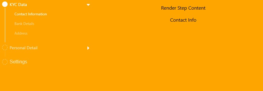
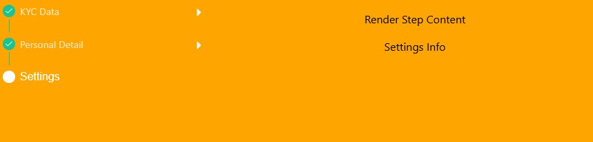
📸 Demo Screenshot
Initial Stepper

Active Step
Inner Finish Step
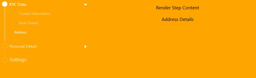
Finished Step
📦 Installation
npm install react-vertical-stepers
# or
yarn add react-vertical-stepers
🛠 Peer Dependencies
Make sure you have compatible versions of React and ReactDOM:
"peerDependencies": {
  "react": "^18.0.0 || ^19.0.0",
  "react-dom": "^18.0.0 || ^19.0.0"
}
🔧 State Structure
{
    kyc_details: {
      status: "finish",
      disable: false,
      contact_info: { status: "finish", disable: false },
      corporate_details: { status: "finish", disable: false },
      address_details: { status: "finish", disable: false },
    },
    personal_details: {
      status: "finish",
      disable: false,
      family_info: { status: "finish", disable: false },
      work_details: { status: "finish", disable: false },
    },
    settings_info: { status: "wait", disable: false },
  }
🔧 Usage
Here’s a basic example like above image:
import { useState } from "react";
import "../node_modules/react-vertical-stepers/dist/index.css"; // it will be removed in future versions
import Stepper from "./components";

const dummyList = [
  {
    id: 1,
    title: "KYC Data",
    hasInnersteps: false,
    isAccordion: true,
    dataKey: "kyc_details",
    innerSubChilds: [
      {
        id: 1,
        title: "Contact Information",
        dataKey: "contact_info",
      },
      {
        id: 2,
        title: "Bank Details",
        dataKey: "corporate_details",
      },
      {
        id: 3,
        title: "Address",
        dataKey: "address_details",
      },
    ],
  },
  {
    id: 4,
    title: "Personal Detail",
    hasInnersteps: false,
    isAccordion: true,
    dataKey: "personal_details",
    innerSubChilds: [
      {
        id: 4,
        title: "Family Info",
        dataKey: "family_info",
      },
      {
        id: 5,
        title: "Work Info",
        dataKey: "work_details",
      },
    ],
  },
  {
    id: 6,
    hasInnersteps: false,
    isAccordion: false,
    title: "Settings",
    dataKey: "settings_info",
  },
];
function App() {
  const [reduxState, setReduxState] = useState({
    kyc_details: {
      status: "finish",
      disable: false,
      contact_info: { status: "finish", disable: false },
      corporate_details: { status: "finish", disable: false },
      address_details: { status: "finish", disable: false },
    },
    personal_details: {
      status: "finish",
      disable: false,
      family_info: { status: "finish", disable: false },
      work_details: { status: "finish", disable: false },
    },
    settings_info: { status: "wait", disable: false },
  });
  const [currentStage, setCurrentStage] = useState(0);
  const [stepAccordionActiveId, setStepAccordionActiveId] = useState(null);

  const getStepContent = () => {
    switch (currentStage) {
      case 1:
        return "Contact Info";
      case 2:
        return "Corporate Details";
      case 3:
        return "Address Details";
      case 4:
        return "Family Info";
      case 5:
        return "Work Details";
      case 6:
        return "Settings Info";
      default:
        return "No Content";
    }
  };

  return (
    <section className="flex gap-4">
      <aside>
        <div style={{ width: "300px" }}>
          <Stepper
            steps={dummyList}
            activeStep={currentStage}
            stepperState={reduxState}
            onStepClick={(id) => {
              setCurrentStage(id);
            }}
            stepAccordionActiveId={stepAccordionActiveId}
            updateAccordionActiveId={(id) => {
              setStepAccordionActiveId(id);
            }}
          />
        </div>
      </aside>
      <div className="flex-1 text-center pt-4">
        <h2 className="mb-4">Render Step Content</h2>
        {getStepContent()}
      </div>
    </section>
  );
}

export default App;
🧩 Props
| Prop Name | Type | Description |
| ------------------------- | ---------------------------------------- | ------------------------------------------------ |
| rootClassName | string (optional) | Custom class for root container styling. |
| steps | any[] | Step definitions, including nested steps. |
| activeStep | number \| string | Currently selected step key. |
| stepAccordionActiveId | any (optional) | ID of the currently open accordion sub-step. |
| onStepClick | (id: number \| string) => void | Called when a step is clicked. |
| stepperState | Record<string, any> | Redux or local state representing step statuses. |
| updateAccordionActiveId | (id: number \| string \| null) => void | Updates active accordion section. Optional. |
You can override styles using your own CSS by targeting class names like:
.step-item.step-item-active.steps-item-container.steps-item-title- etc.
🖼 Custom Icons
The component uses the following default images:
/assets/step-finish-check.svg/assets/collapse-arrow-down.svg/assets/green-simple-tick.svg
You can host your own images and customize the paths in the source or via props if extended.
📜 License
ISC License © 2025 Pranay Surve
💬 Feedback / Issues
Comming Soon