
react-web3-icons
v3.2.0
Published
React SVG icon library for Web3 — blockchains, wallets, DEXs, tokens, and more
Maintainers
 derodero24
Readme


React Web3 Icons
A comprehensive React SVG icon library for Web3 — blockchains, wallets, DEXs, tokens, and more.
Browse all icons · API Reference
Features
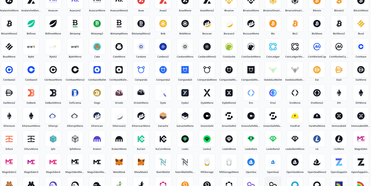
- 270+ icons across 15 categories
- Colored and monochrome variants for every icon
- Tree-shakeable — only import what you use (
sideEffects: false) - Scales with font size (
1emdefault) - Full TypeScript support
- Works with React 18+
Install
npm install react-web3-iconsOr with other package managers:
yarn add react-web3-icons
pnpm add react-web3-icons
Quick Start

import { Ethereum, EthereumMono } from 'react-web3-icons';

function App() {
  return (
    <div>
      {/* Colored icon — renders official brand colors */}
      <Ethereum />

      {/* Mono icon — inherits CSS color */}
      <EthereumMono style={{ color: '#6366f1' }} />
    </div>
  );
}
Usage
Sizing
Icons default to 1em, so they scale with the surrounding font size:
<Ethereum style={{ fontSize: '2rem' }} />You can also set explicit dimensions:
<Ethereum width={32} height={32} />Monochrome Variants
Every icon has a Mono variant that uses currentColor, making it easy to match your app's theme:
<BitcoinMono style={{ color: 'white' }} />
<BitcoinMono className="text-gray-500" /> {/* Tailwind */}
Accessibility
Add a title prop for screen reader support:
<Ethereum title="Ethereum" />When no title is provided, the icon is treated as decorative.
For maximum screen reader compatibility, pair title with titleId — the SVG will automatically get aria-labelledby pointing to the title:
<Ethereum title="Ethereum logo" titleId="eth-title" />
{/* Renders: <svg aria-labelledby="eth-title"><title id="eth-title">Ethereum logo</title>…</svg> */}
All Standard SVG Props
Icons accept all standard SVG attributes:
<Ethereum className="my-icon" style={{ opacity: 0.8 }} onClick={handleClick} />Per-Category Imports
Import from a specific category to reduce your bundle size:
import { Ethereum } from 'react-web3-icons/chain';
import { Uniswap } from 'react-web3-icons/dex';
The root import still works and includes all icons:
import { Ethereum } from 'react-web3-icons';IconContext
Use IconContext.Provider to set default props for all icons in a subtree:
import { IconContext } from 'react-web3-icons';

<IconContext.Provider value={{ size: 32, className: 'my-icon' }}>
  <Ethereum />
  <Bitcoin />
</IconContext.Provider>
Any prop that can be passed directly to an icon can be set via context (size, className, style, fill, etc.). Per-icon props always take precedence; style objects are merged rather than replaced.
React Server Components (RSC)
Icons use React hooks (useId, useContext) and therefore cannot be rendered in React Server Components directly. Add a 'use client' directive (as the first statement in the file) to the component that renders icons, or to a small client-only re-export wrapper:
// app/my-component.tsx
'use client';

import { Ethereum, Bitcoin } from 'react-web3-icons';

export function MyComponent() {
  return <Ethereum />;
}
Alternatively, create a small client-only re-export wrapper and import icons from it in your Client Components:
// app/icons.tsx — must be a Client Component
'use client';
export { Ethereum, Bitcoin } from 'react-web3-icons';
// app/my-component.tsx — Client Component that renders icons
'use client';
import { Ethereum } from './icons';
export function MyComponent() {
return <Ethereum />;
}Type-Safe Dynamic Icon Lookup
Use the IconName type to reference icon names safely:
import type { IconName } from 'react-web3-icons';
import * as allIcons from 'react-web3-icons';

function DynamicIcon({ name }: { name: IconName }) {
  const Icon = allIcons[name];
  return <Icon />;
}

// TypeScript errors on unknown names:
<DynamicIcon name="Ethereum" />   // ✅
<DynamicIcon name="Unknown" />    // ❌ TypeScript error
Dynamic Icon Components
The react-web3-icons/dynamic entry point provides components that lazily load icons at runtime by identifier (ticker, slug, or chain ID). Each category has a dedicated component:
import { ChainIcon, CoinIcon, WalletIcon, ExchangeIcon } from 'react-web3-icons/dynamic';

<ChainIcon chainId={1} />               // Ethereum by chain ID
<ChainIcon name="arbitrum" />            // Arbitrum by slug
<CoinIcon symbol="ETH" />               // ETH coin icon
<WalletIcon name="metamask" />           // MetaMask wallet icon
<ExchangeIcon name="binance" />          // Binance exchange icon
Use the variant prop to switch between colored and monochrome:
<CoinIcon symbol="BTC" variant="mono" />Fallback
Use the fallback prop to render alternative content while the icon chunk is loading or when the identifier is not recognized:
<CoinIcon symbol={token.symbol} fallback={<GenericTokenIcon />} />
<CoinIcon symbol={token.symbol} fallback={<Skeleton width={24} height={24} />} />
When omitted, nothing is rendered for unknown identifiers and during loading.
All standard icon props (size, className, fill, etc.) are forwarded to the underlying SVG icon.
Metadata Lookups
The react-web3-icons/meta subpath exports lookup maps for resolving icons by chain ID, slug, or ticker symbol at runtime:
| Export | Key | Value | Example |
| --- | --- | --- | --- |
| CHAIN_ID_TO_NAME | EVM chain ID (1, 42161, …) | Chain icon base name | 1 → 'Ethereum' |
| CHAIN_SLUG_TO_NAME | Lowercased slug ('arbitrum', …) | Chain icon base name | 'arbitrum' → 'Arbitrum' |
| TICKER_TO_COIN | Uppercase ticker ('ETH', …) | Coin icon base name | 'ETH' → 'Eth' |
| WALLET_SLUG_TO_NAME | Lowercased slug ('metamask', …) | Wallet icon base name | 'metamask' → 'MetaMask' |
| EXCHANGE_SLUG_TO_NAME | Lowercased slug ('binance', …) | Exchange icon base name | 'binance' → 'Binance' |
| DEFI_SLUG_TO_NAME | Lowercased slug ('aave', …) | DeFi icon base name | 'aave' → 'Aave' |
| DEX_SLUG_TO_NAME | Lowercased slug ('uniswap', …) | DEX icon base name | 'uniswap' → 'Uniswap' |
| BRIDGE_SLUG_TO_NAME | Lowercased slug ('layerzero', …) | Bridge icon base name | 'layerzero' → 'LayerZero' |
Each map exports a corresponding type (ChainId, ChainSlug, Ticker, WalletSlug, ExchangeSlug, DefiSlug, DexSlug, BridgeSlug) for type-safe key access.
Example: Resolve a chain icon from wagmi/viem
import { CHAIN_ID_TO_NAME, type ChainId } from 'react-web3-icons/meta';
import * as chains from 'react-web3-icons/chain';

function ResolvedChainIcon({ chainId }: { chainId: number }) {
  if (!(chainId in CHAIN_ID_TO_NAME)) return null;
  const name = CHAIN_ID_TO_NAME[chainId as ChainId];
  const Icon = chains[name];
  return <Icon />;
}
Example: Resolve a coin icon from a ticker
import { TICKER_TO_COIN, type Ticker } from 'react-web3-icons/meta';
import * as coins from 'react-web3-icons/coin';

function TokenIcon({ symbol }: { symbol: string }) {
  const key = symbol.toUpperCase().trim();
  if (!(key in TICKER_TO_COIN)) return null;
  const Icon = coins[TICKER_TO_COIN[key as Ticker]];
  return <Icon />;
}
Icon Categories
| Category | Description | Examples |
| --- | --- | --- |
| bridge | Cross-chain bridge protocols | Across, LayerZero, Stargate, Wormhole |
| chain | L1/L2 blockchains | Ethereum, Arbitrum, Polygon, Solana |
| coin | Cryptocurrencies & tokens | Bitcoin, Doge, Usdt, Usdc |
| defi | DeFi protocols | Aave, EigenLayer, Lido |
| devtool | Developer tools | Hardhat, Truffle, Web3Js |
| dex | Decentralized exchanges | Uniswap, PancakeSwap, Dydx |
| domain | Domain services | Ens, UnstoppableDomains |
| exchange | Centralized exchanges | Binance, Coinbase, Kraken |
| explorer | Block explorers | Etherscan, Bscscan, Solscan |
| marketplace | NFT marketplaces | OpenSea, MagicEden, LooksRare |
| node | Node providers | Alchemy, Infura, QuickNode |
| portfolio | Portfolio trackers | DeBank, Zapper, CoinLedger |
| storage | Decentralized storage | Ipfs, Arweave, NftStorage |
| tracker | Analytics & tracking | DefiLlama, CoinGecko, CoinMarketCap |
| wallet | Wallet apps | MetaMask, PhantomWallet, RainbowWallet |
Browse the full list at the demo site.
Props
All icons extend SVGProps<SVGSVGElement> with the following additions:
| Prop | Type | Default | Description |
| --- | --- | --- | --- |
| title | string | — | Accessible title rendered as <title> inside the SVG |
| titleId | string | — | ID applied to the <title> element; when provided together with title, aria-labelledby is automatically set to this value |
| size | string \| number | "1em" | For icons created via createIcon/useIconContext, sets both width and height unless explicitly overridden |
| width | string \| number | — | Icon width (overrides size for width only) |
| height | string \| number | — | Icon height (overrides size for height only) |
| className | string | — | CSS class name |
| style | CSSProperties | — | Inline styles |
Plus all standard SVG attributes (fill, stroke, opacity, onClick, etc.).
Contributing
We welcome contributions! Please see CONTRIBUTING.md for guidelines on adding icons, lifecycle/deprecation rules, the SVG optimization pipeline, and submitting pull requests.
Icon Lifecycle Policy
When icon brands are renamed (for example, GnosisSafe -> Safe, Matic -> Pol), this project keeps backward compatibility by shipping deprecated aliases.
- Canonical exports follow the current official brand name.
- Deprecated aliases stay available for at least one minor release and at least 90 days.
- Alias removals happen only in major releases and are documented in changelog/release notes.
Filtering Deprecated Icons
Use the exported DEPRECATED_ICON_NAMES set to filter deprecated aliases from icon lists:
import * as icons from 'react-web3-icons';
import { DEPRECATED_ICON_NAMES } from 'react-web3-icons';

// Get current (non-deprecated) icon names, excluding non-icon exports
const activeIconNames = Object.keys(icons).filter(
  name =>
    !DEPRECATED_ICON_NAMES.has(name) &&
    name !== 'IconContext' &&
    name !== 'DEPRECATED_ICON_NAMES',
);
Or import from the dedicated subpath to avoid loading the full bundle:
import { DEPRECATED_ICON_NAMES } from 'react-web3-icons/deprecated';Full process and test requirements: CONTRIBUTING.md#icon-lifecycle-policy.