
react_typescript_editor
v0.4.5
Published
A rich text editor built with contenteditable + React + TypeScript.
Downloads
103

Maintainers
 arunsarva
Readme
react_typescript_editor
A rich text editor built directly on contenteditable + React + TypeScript — no
editor framework underneath. It ships as both an installable npm package
(react_typescript_editor) and a standalone demo app in this repo.
Keywords: rich text editor, WYSIWYG editor, React editor component, TypeScript editor, contenteditable, balloon toolbar, floating toolbar, text color, highlight color, table editor, image resize, file attachments, video embed, audio embed, LaTeX formula editor, MathJax, molecule editor, SMILES structure editor, chemistry editor, code block syntax highlighting, highlight.js, PDF export, Word/docx export, find and replace, undo redo, npm package, React component library.
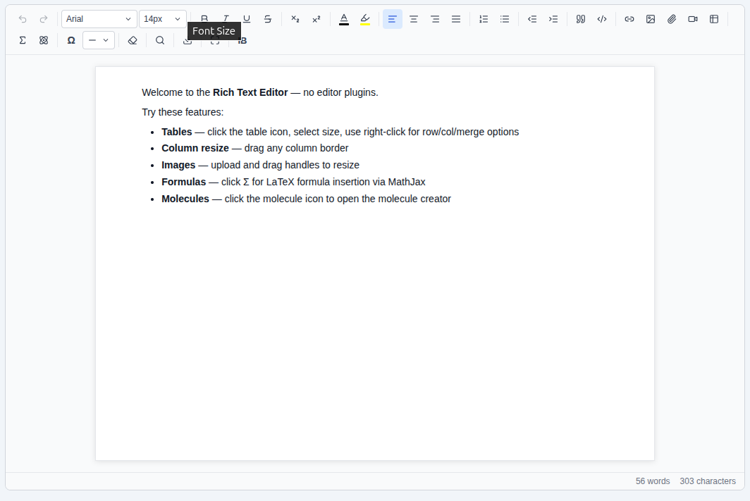
Features
- Formatting — bold, italic, underline, strikethrough, sub/superscript, text color & highlight color, font family & size, text align, ordered/bullet lists, increase/decrease indent, blockquote, clear formatting
- Balloon toolbar — a floating mini toolbar (bold, italic, underline, strikethrough, link, text/highlight color) pops up above any text selection, alongside the fixed toolbar. See Balloon toolbar.
- Tables — insert by size picker, column resize by dragging; right-click a cell for insert/delete row & column, merge/split cells, toggle header row/column, insert/remove a caption, delete the table, and per-cell/per-table properties (border, background, alignment)
- Media — images (upload, drag-to-resize), file attachments, video/audio embeds via URL
- Math & chemistry — LaTeX formulas (via MathJax) and molecule structures, either typed as SMILES or hand-drawn on a canvas (place atoms, draw bonds with adjustable bond order, delete/select); click an inserted formula or molecule, then use the "Edit" button that appears to change it
- Code blocks — syntax highlighting (via highlight.js) with a language picker
- Other — links, horizontal rules, page breaks, special characters/emoji, find & replace, undo/redo history, export to PDF and Word
- Page sizes — A4, Letter, Legal, or an unconstrained "Normal" layout
- Markdown shortcuts — typed as you go:
#/##/###for headings,-/*for a bullet list,1.for an ordered list,>for a blockquote, and inline**bold**,*italic*/_italic_,`code` - Smart paste — clipboard images are inserted as
<img>; pasted Markdown tables and HTML tables (e.g. copied from Excel or Word) are converted into real, editable tables - Security — all editor output and pasted HTML is sanitized (DOMPurify-based, strips
<iframe>and other unsafe content) and links are validated before insertion - Keyboard shortcuts — Ctrl/Cmd+Z undo, Ctrl/Cmd+Y (or Ctrl/Cmd+Shift+Z) redo, Ctrl/Cmd+F find & replace, plus the browser's native bold/italic/underline shortcuts
- Theming — built-in light, dark, and sepia themes, plus per-color overrides for brand-matching. See Theming.
Installation
npm install react_typescript_editorreact and react-dom are peer dependencies (^19.0.0) — install them in
your app if you haven't already. Everything else the editor needs (KaTeX,
MathJax, highlight.js, DOMPurify, html2canvas, jsPDF) is installed
automatically as a regular dependency.
Usage
import { useState } from "react";
import RichEditor from "react_typescript_editor";
import "react_typescript_editor/style.css";

function App() {
  const [html, setHtml] = useState("<p>Hello world</p>");

  return (
    <RichEditor
      value={html}
      onChange={setHtml}
      height="560px"
      pageSize="A4"
      placeholder="Start typing..."
    />
  );
}
The named export works the same way:
import { RichEditor } from "react_typescript_editor";Don't forget the stylesheet.
react_typescript_editor/style.csscarries the toolbar, table, and code-block styling and isn't injected automatically — import it once anywhere in your app.
Props
| Prop | Type | Default | Description |
| ---------------- | ----------------------------------------- | ------------------- | ----------------------------------------------------------------------------------------------------------------------------------------- |
| value | string | — | Editor content as an HTML string (controlled). |
| onChange | (html: string) => void | — | Called with the updated HTML after edits (debounced ~400ms). |
| height | string | "500px" | CSS height of the editing area. |
| placeholder | string | "Start typing..." | Shown when the editor is empty. |
| pageSize | "A4" \| "Letter" \| "Legal" \| "Normal" | "A4" | Sheet width the editor renders as, and the page format used on PDF export. "Normal" fills the available width with no fixed-paper look. |
| toolbar | ToolbarItemKey[][] \| false | DEFAULT_TOOLBAR | Which toolbar buttons to show and in what order. See Customizing the toolbar. |
| fontFamilies | string[] | built-in font list | Restricts the Font Family dropdown to these values. |
| fontSizes | string[] | built-in size list | Restricts the Font Size dropdown to these values. |
| showWordCount | boolean | true | Shows the word/character count bar under the editing area. |
| customButtons | Record<string, CustomToolbarButton> | — | Custom toolbar buttons, keyed by the id you reference from toolbar. See Custom toolbar buttons. |
| theme | "light" \| "dark" \| "sepia" | "light" | Visual theme for the toolbar, menus, modals, and editing surface. See Theming. |
| customColors | RichEditorCustomColors | — | Fine-grained color overrides layered on top of theme. See Theming. |
| balloonToolbar | boolean | true | Shows a floating mini toolbar above any text selection. See Balloon toolbar. |
<RichEditor
  value={html}
  onChange={setHtml}
  fontFamilies={["Arial", "Georgia"]}
  fontSizes={["12px", "14px", "16px", "20px"]}
/>
Additional types are exported for consumers who need them: PageSize,
ToolbarItemKey, ToolbarKey, ToolbarConfig, CustomToolbarButton,
RichEditorApi, RichEditorCustomColors, and the table properties API's
CellProperties/TableProperties.
import type {
  RichEditorProps,
  PageSize,
  ToolbarItemKey,
  ToolbarKey,
  ToolbarConfig,
  CustomToolbarButton,
  RichEditorApi,
  RichEditorCustomColors,
  CellProperties,
  TableProperties,
} from "react_typescript_editor";
Customizing the toolbar
The toolbar prop takes an array of groups, each group an array of item
keys, rendered in that exact order with a separator between groups.
import RichEditor from "react_typescript_editor";

<RichEditor
  value={html}
  onChange={setHtml}
  toolbar={[
    ["bold", "italic", "underline"],
    ["link", "image", "table"],
  ]}
/>;
Pass toolbar={false} to hide the toolbar entirely (e.g. for a read-only or
programmatically-driven editor):
<RichEditor value={html} onChange={setHtml} toolbar={false} />Omit the prop to get the full built-in toolbar (DEFAULT_TOOLBAR, exported
if you want to build on top of it — e.g. spread it and drop one group).
Available ToolbarItemKey values:
undo, redo,
fontFamily, fontSize,
bold, italic, underline, strikethrough,
subscript, superscript,
textColor, backgroundColor,
align-left, align-center, align-right, align-justify,
orderedList, bulletList,
outdent, indent,
blockquote, codeBlock,
link, image, file, video, table,
formula, molecule,
specialChars, hr,
clearFormat,
find,
export,
fullscreen
codeBlock includes its code-language picker automatically when active — no
separate key for it. Every key works standalone; there's no requirement to
match DEFAULT_TOOLBAR's grouping.
Balloon toolbar
Selecting text pops up a small floating toolbar above the selection —
bold, italic, underline, strikethrough, link, and text/highlight color —
independent of and in addition to the fixed toolbar. It's on by default; set
balloonToolbar={false} to turn it off:
<RichEditor value={html} onChange={setHtml} balloonToolbar={false} />Its contents aren't currently configurable via toolbar — it's a fixed set
of the most common selection-level actions.
Custom toolbar buttons
customButtons adds your own icon buttons alongside the built-in ones —
each is a normal-looking toolbar button (same size, hover state, and dynamic
tooltip as everything else) that runs your own onClick when pressed. Key
it in customButtons by whatever id you like, then reference that same id
from toolbar:
import RichEditor, { DEFAULT_TOOLBAR } from "react_typescript_editor";

<RichEditor
  value={html}
  onChange={setHtml}
  toolbar={[...DEFAULT_TOOLBAR, ["insertBlank"]]}
  customButtons={{
    insertBlank: {
      title: "Insert Blank",
      icon: <span style={{ fontWeight: 700 }}>B</span>,
      onClick: (api) => api.insertHTML("<p>Testing @^^{Blank 1}^^@</p>"),
    },
  }}
/>;
onClick receives a small RichEditorApi handle rather than raw DOM
access — currently just insertHTML(html), which inserts sanitized HTML at
the cursor (replacing any selection). Since it's a plain HTML string, style
it with an inline CSS string (style="color:red;") or a class from your
own stylesheet — not a JSX style object, which only exists in React/JSX, not
in HTML.
Theming
The editor ships with three built-in themes, switched with the theme prop:
<RichEditor value={html} onChange={setHtml} theme="dark" /> {/* "light" | "dark" | "sepia" */}This recolors the toolbar, menus/popovers, modals (Formula, Molecule, Special Characters, Table Properties), and the editing page itself — no extra setup, no separate stylesheet to swap.
For brand-matching without building a full custom theme, layer individual
color overrides on top via customColors. Any key you omit falls back to
the active theme's value:
<RichEditor
  value={html}
  onChange={setHtml}
  theme="light"
  customColors={{
    accent: "#7c3aed", // toolbar active-state, primary buttons, links' active color
    toolbarBg: "#111827", // just the toolbar strip
    canvasBg: "#fefce8", // just the editing page/canvas
  }}
/>
RichEditorCustomColors keys:
| Key | Affects |
| ------------------------------------------------------- | --------------------------------------------------------------------------------------------------------------------------------------------------------------------------------------------- |
| surface | Default background for modals, dropdowns, popovers. |
| surfaceSubtle | Subtle background (e.g. the word-count footer bar). |
| surfaceHover / surfaceActive | Hover/active background for buttons and list items. |
| border / borderSubtle | Border colors, from prominent to hairline. |
| text / textStrong / textMuted / textFaint | Body text, from primary to faint/placeholder. |
| accent / accentStrong | Primary brand color and its darker/active variant. |
| accentBg / accentBgSubtle / accentBorder | Tinted backgrounds/borders paired with accent (e.g. active toolbar buttons). |
| accentText | Text color used on top of accent backgrounds (defaults to white). |
| danger / dangerStrong / dangerBg / dangerBorder | Error/destructive states (e.g. invalid formula syntax). |
| toolbarBg | Background of the toolbar strip specifically. |
| canvasBg | Background of the editing page/canvas specifically. |
| canvasBackdrop | Background behind the page when pageSize isn't "Normal" (the margin around the sheet). If omitted while canvasBg is set, this is derived automatically as a lighter tint of canvasBg. |
| link / linkHover | Link color inside the editing content. |
toolbarBg/canvasBg are intentionally independent of surface/surfaceSubtle
— overriding one won't also recolor modals or dropdowns.
TypeScript
Type declarations are bundled — no @types package needed.
Known caveat: MathJax + Rolldown-based bundlers
mathjax-full's CJS entry contains a Node-only fallback (eval('require'))
that some bundlers fail to tree-shake, which can throw
ReferenceError: require is not defined at runtime. This has been reproduced
independently of this package (i.e. it also happens importing mathjax-full
directly) with Vite 8's Rolldown-based bundler. If you hit this in your app,
it's a mathjax-full compatibility issue with your bundler, not specific to
react_typescript_editor — check your bundler's CJS interop / define settings for
mathjax-full, or pin to a Vite/webpack version that pre-bundles it via
esbuild.
Local development (this repo)
npm install
npm run dev       # demo app at http://localhost:5173, hot reload
The demo app lives in src/App.tsx / src/main.tsx; the editor itself is
under src/editor/.
Scripts
| Script | Description |
| ------------------- | ---------------------------------------------------------------------------------------------------- |
| npm run dev | Start the demo app's dev server. |
| npm run build | Typecheck + build the demo app to demo-dist/. |
| npm run build:lib | Build the publishable npm package to dist/ (ESM .mjs, CJS .cjs, bundled .d.ts, style.css). |
| npm run preview | Preview the built demo app (demo-dist/). |
| npm run lint | Run ESLint. |
Project layout
src/
  editor/           the library — RichEditor and its supporting modals/helpers
    RichEditor.tsx
    editorHelpers.ts
    icons/          local SVG icon assets (used via vite-plugin-svgr)
    *.tsx           modals: Formula, Molecule, Special Character, Table Properties, Table Context Menu
  index.ts          npm package entry point (re-exports RichEditor + types)
  App.tsx           demo app UI
  main.tsx          demo app entry point
vite.config.ts       demo app build config (outputs demo-dist/)
vite.lib.config.ts   library build config (outputs dist/, used by build:lib)
tsconfig.lib.json    TS config scoped to the library for declaration output
Publishing
npm run build:lib   # also runs automatically via prepublishOnly
npm publish
files in package.json restricts the published tarball to dist/, so the
demo app, source, and dev tooling are never included in the package.
Feedback & Issues
Found a bug, have a feature request, or just want to share feedback? Open an issue on GitHub: Editor feedback or issue.
When reporting a bug, please include the editor version (react_typescript_editor
version from your package.json), a minimal reproduction if possible, and the
browser/OS you're seeing it in.
License
MIT — see LICENSE.
Demo
see Demo here.