
reacto-loader
v1.0.8
Published
A sleek, high-performance Loader component.
Maintainers
 rishi007
Readme
reacto-loader
A sleek, high-performance Loader component designed for seamless integration into both React and React Native/Expo applications.
Installation
Using npm:
npm install reacto-loaderUsing Yarn:
yarn add reacto-loaderNote for React Native / Expo Users: To use
reacto-loaderin React Native or Expo environments, make sure you also install these required peer dependencies:
Follow the installation steps in their documentation to ensure proper linking and setup
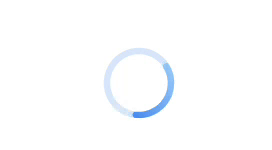
Circular Loader
| Prop | Type | Default | Description |
| ------------------- | -------- | --------- | ------------------------------------------------- |
| size | number | 40 | Diameter of the loader in pixels |
| primaryColor | string | #3B82F6 | Start color of the animated gradient stroke |
| secondaryColor | string | #93C5FD | End color of the animated gradient stroke |
| speed | number | 2 | Duration (in seconds) for one full animation loop |
| thickness | number | 8 | Stroke width of the loader circle |
| backgroundOpacity | number | 0.2 | Opacity of the background circle |
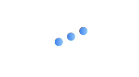
Bounce Loader
| Prop | Type | Default | Description |
| -------------------- | -------- | --------- | -------------------------------------------------------------- |
| primaryColor | string | #3B82F6 | Start color of the animated gradient on the dots |
| secondaryColor | string | #93C5FD | End color of the animated gradient on the dots |
| speed | number | 0.8 | Duration (in seconds) of one full bounce animation |
| dotCount | number | 3 | Number of bouncing dots |
| dotSize | number | 16 | Diameter of each dot in pixels |
| dotSpacing | number | 8 | Spacing (gap) between dots in pixels |
| bounceHeightFactor | number | 1.5 | Multiplier for how high the dots bounce relative to their size |
Dots Loader
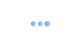
Props
| Prop | Type | Default | Description |
| ---------------- | -------------------------- | ------------- | ------------------------------------------- |
| primaryColor | string | #3B82F6 | Start color of the dot gradient |
| secondaryColor | string | #93C5FD | End color of the dot gradient |
| speed | number | 1 | Controls animation speed (higher = slower) |
| dotCount | number | 3 | Number of dots |
| dotSize | number | 16 | Diameter of each dot in pixels |
| dotSpacing | number | 8 | Horizontal spacing between dots |
| scaleRange | [number, number, number] | [1, 1.5, 1] | Defines keyframes for scale animation cycle |
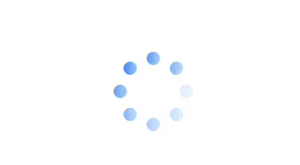
Fade Loader
| Prop | Type | Default | Description |
| ---------------- | -------- | --------- | ------------------------------------------------------ |
| size | number | 40 | Diameter of the loader in pixels(px) |
| primaryColor | string | #3B82F6 | Gradient start color for each dot |
| secondaryColor | string | #93C5FD | Gradient end color for each dot |
| speed | number | 1.2 | Duration of the fade animation cycle (seconds) |
| dotCount | number | 8 | Number of dots arranged in a circle |
| dotSize | number | 12 | Diameter of each dot (px) |
| radius | number | 30 | Radius of the circle on which dots are positioned (px) |
Grid Loader
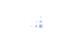
| Prop | Type | Default | Description |
| ---------------- | -------- | --------- | ------------------------------------------------- |
| primaryColor | string | #3B82F6 | Gradient start color for each square |
| secondaryColor | string | #93C5FD | Gradient end color for each square |
| speed | number | 1.2 | Duration of one full animation cycle (in seconds) |
| gridSize | number | 3 | Number of rows and columns in the grid |
| squareSize | number | 12 | Width and height of each square (in pixels) |
| gap | number | 4 | Gap (in pixels) between squares in the grid |
Wave Loader
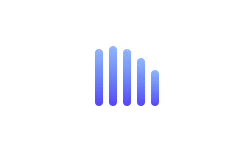
| Prop | Type | Default | Description |
| ---------------- | -------- | --------- | ------------------------------------------------------ |
| primaryColor | string | #3B82F6 | Start color of the animated gradient on each bar |
| secondaryColor | string | #93C5FD | End color of the animated gradient on each bar |
| speed | number | 1 | Duration (in seconds) of the full wave animation cycle |
| barCount | number | 5 | Number of animated vertical bars |
| barWidth | number | 8 | Width (in pixels) of each bar |
| barSpacing | number | 6 | Horizontal spacing (gap) between the bars |
| minHeight | number | 24 | Minimum height (in pixels) each bar animates to |
| maxHeight | number | 60 | Maximum height (in pixels) each bar animates to |
Morphing Shapes Loader
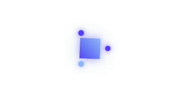
| Prop | Type | Default | Description |
| ---------------- | -------- | --------- | ---------------------------------------------------------------------------------- |
| size | number | 80 | Size of the container holding the morphing shape and orbiting dots |
| primaryColor | string | #3B82F6 | Primary color used in gradients and glow effects |
| secondaryColor | string | #93C5FD | Secondary color used in gradients and glow effects |
| speed | number | 2 | Speed multiplier for the morphing and orbit animations (higher = slower animation) |
| shapeSize | number | 40 | Diameter of the central morphing shape |
| morphDuration | number | 2 | Base duration (in seconds) for a full morph/rotate cycle |
| glowIntensity | number | 8 | Intensity multiplier for the glow around the shape and dots |
Matrix Loader
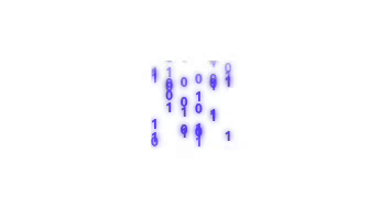
| Prop | Type | Default | Description |
| ------------ | -------- | --------- | ------------------------------------------------------------- |
| size | number | 80 | Width and height of the loader container (in pixels) |
| color | string | #3B82F6 | Color of the falling characters |
| speed | number | 2 | Speed multiplier for the animation (higher = slower fall) |
| columns | number | 6 | Number of vertical columns of falling characters |
| characters | string | "01" | String containing possible characters for the matrix effect |
| dropSpeed | number | 2 | Drop animation duration baseline (used in calculating delays) |
📄 License
MIT