
red-form
v1.0.31
Published
A powerful, type-safe React form library that lets you create dynamic dialog-based forms using schema definitions — inspired by Formik but designed for real-time UI rendering and reusability.
Maintainers
 manishgun
Readme

🟥 Red Form
Schema-driven React form system that builds entire UI — no HTML, no CSS. Define once. Render anywhere. Fully typed, flexible, and lightning-fast.
🚀 Why RED FORM?
Building forms in React often means juggling inputs, styles, and validation logic for every single field. Red Form solves that by letting you define the schema only once — it automatically generates the UI, handles validation, manages state, and aligns everything perfectly.
You get developer clarity, instant layout, and zero boilerplate.
✨ Features
- 🧱 Schema-driven – define once, render everywhere
- 🎨 No HTML/CSS needed – automatic layout, focus, hover, spacing, and shadows
- ⚙️ Type-safe – fully typed schema and form instance with TypeScript
- 🧩 Extensible – inject custom components and validation logic
- 🚀 Optimized – minimal re-renders, built for scalability
- 💡 Declarative logic – dynamic visibility and conditional rendering
- 🪶 Extremely Lightweight – 80kb package saves hours of development
- 🪲 Low Code – less code means fewer bugs
- ✅ Built-in Validation – email, password, phone, date, and custom validators
- 🎯 20+ Field Types – text, email, password, select, multi-select, tags, date, time, image, and more
- 🪜 StepperForm – production-grade multi-step forms with visual progress indicators (see docs)
📦 Installation
npm install red-form
# or
yarn add red-form
# or
pnpm add red-form
🚀 Quick Start
import Form, { create } from "red-form";
import "red-form/dist/index.css";

const loginSchema = create({
  email: {
    label: "Email",
    component: "email",
    value: "",
    required: true
  },
  password: {
    label: "Password",
    component: "password",
    value: "",
    required: true,
    min: 8
  }
});

export default function LoginForm() {
  return <Form title="Welcome Back" description="Sign in to your account" schema={loginSchema} onSubmit={values => console.log(values)} />;
}
🧩 Example 1 — Create Product Form
A simple and elegant example showing Red Form's minimal setup.
import Form, { create } from "red-form";
import "red-form/dist/index.css";

const productForm = create({
  name: {
    label: "Product Name",
    component: "text",
    value: "",
    required: true,
    max: 100
  },
  category: {
    label: "Category",
    component: "select",
    options: ["Electronics", "Clothing", "Books", "Other"],
    value: "",
    required: true
  },
  price: {
    label: "Price ($)",
    component: "number",
    value: 0,
    min: 0,
    required: true
  },
  available: {
    label: "In Stock",
    component: "switch",
    value: true
  },
  description: {
    label: "Description",
    component: "textarea",
    value: "",
    span: 12,
    max: 500
  }
});

export default function CreateProduct() {
  return (
    <Form title="Add New Product" description="Fill in the details below to list your product." schema={productForm} onSubmit={values => alert(JSON.stringify(values, null, 2))} />
  );
}
⚙️ Example 2 — Dynamic Form + Custom Component
Dynamic field rendering and asynchronous file uploads — all declaratively.
import Form, { create } from "red-form";

const schema = create({
  title: {
    label: "Project Title",
    component: "text",
    value: "",
    required: true
  },
  category: {
    label: "Category",
    component: "select",
    options: ["Web", "Mobile", "AI", "IoT"],
    value: "",
    required: true
  },
  image: {
    label: "Cover Image",
    component: "image",
    value: "",
    onSelect: async file => {
      const reader = new FileReader();
      return new Promise(resolve => {
        reader.onloadend = () => resolve(reader.result as string);
        reader.readAsDataURL(file);
      });
    }
  },
  isPrivate: {
    label: "Private Project",
    component: "switch",
    value: false
  },
  password: {
    label: "Access Password",
    component: "password",
    value: "",
    hidden: form => !form.values.isPrivate
  },
  customFooter: {
    label: "Custom Note",
    component: "custom",
    inputBase: false,
    render: () => (
      <div style={{ padding: 12, background: "#f5f5f5", borderRadius: 6 }}>
        <small>All fields are auto-validated before submit ✅</small>
      </div>
    ),
    span: 12
  }
});

export default function ProjectForm() {
  return <Form title="New Project" description="Quickly configure and submit your project details." schema={schema} onSubmit={values => console.log("Submitted:", values)} />;
}
🪜 Example 4 — Multi-Step Registration with StepperForm
Production-grade stepper with visual progress, validation, and data persistence.
import { StepperForm, create } from "red-form";

export default function Registration() {
  return (
    <StepperForm
      steps={[
        {
          label: "Personal Info",
          description: "Basic details",
          schema: create({
            firstName: { label: "First Name", component: "text", value: "", required: true, span: 6 },
            lastName: { label: "Last Name", component: "text", value: "", required: true, span: 6 },
            email: { label: "Email", component: "email", value: "", required: true, span: 12 }
          })
        },
        {
          label: "Address",
          description: "Where you live",
          schema: create({
            street: { label: "Street Address", component: "text", value: "", required: true, span: 12 },
            city: { label: "City", component: "text", value: "", required: true, span: 6 },
            zip: { label: "Zip Code", component: "text", value: "", required: true, span: 6 }
          })
        },
        {
          label: "Preferences",
          description: "Optional settings",
          schema: create({
            newsletter: { label: "Subscribe to Newsletter", component: "switch", value: false, span: 12 }
          }),
          optional: true
        }
      ]}
      title="Create Account"
      description="Complete all steps to register"
      onComplete={data => {
        console.log("Registration data:", data);
        // Submit to API
      }}
      options={{
        showStepNumbers: true,
        allowSkip: true,
        validateOnNext: true
      }}
    />
  );
}
📖 Full StepperForm Documentation
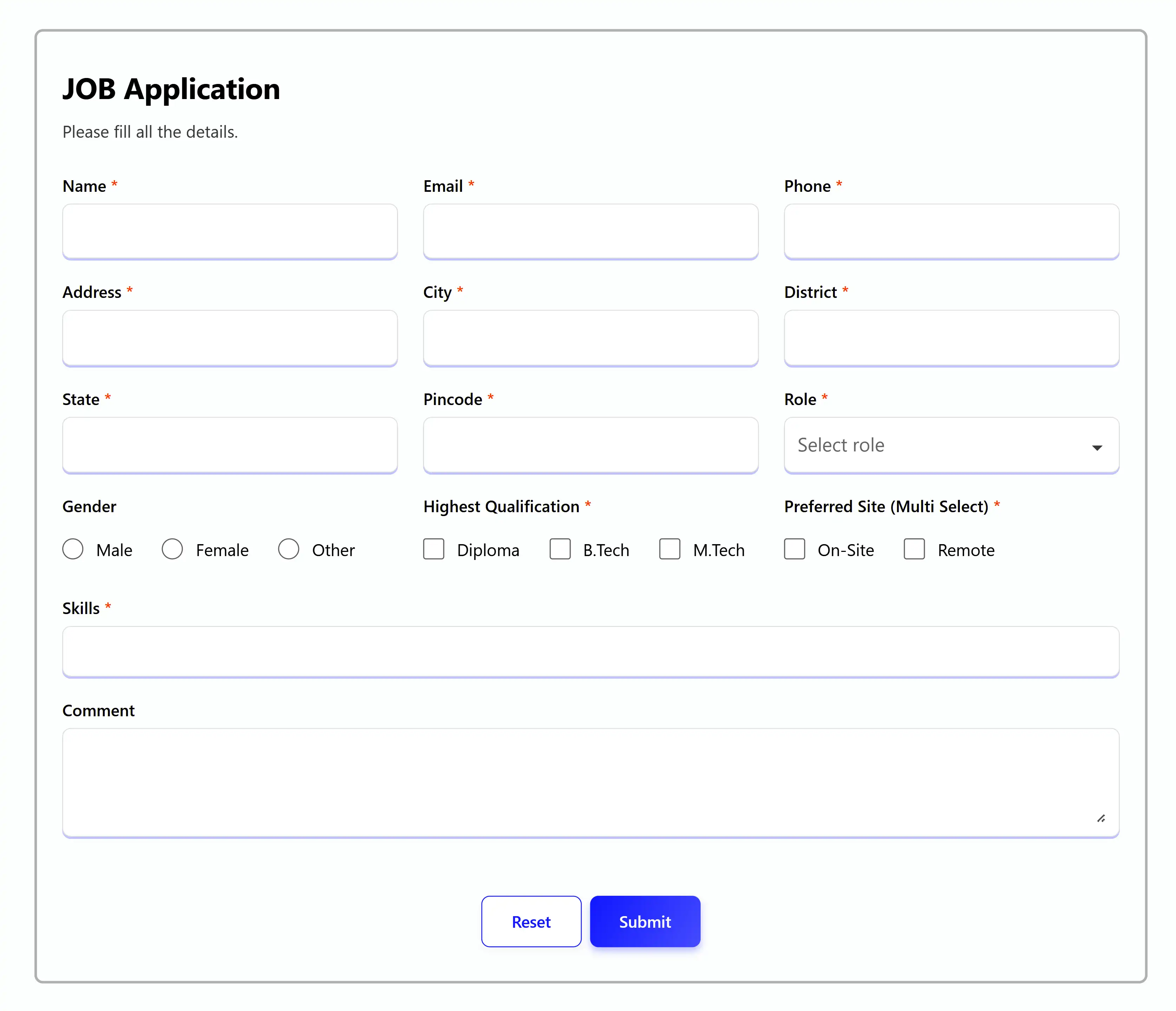
👩💼 Example 3 — Job Application Form (Real-world)
A large, production-grade form built entirely through schema configuration.
import Form, { create } from "red-form";

export default function JobApplication() {
  const schema = create({
    name: {
      label: "Name",
      component: "text",
      value: "",
      autoFill: "name",
      required: true,
      max: 50
    },
    email: {
      label: "Email",
      component: "email",
      value: "",
      autoFill: "email",
      required: true
    },
    phone: {
      label: "Phone",
      component: "telephone",
      value: "",
      autoFill: "tel",
      required: true,
      min: 10,
      max: 10
    },
    address: {
      label: "Address",
      component: "text",
      value: "",
      autoFill: "address-line1",
      required: true,
      span: 6
    },
    city: {
      label: "City",
      component: "text",
      value: "",
      autoFill: "address-level2",
      required: true,
      span: 6
    },
    state: {
      label: "State",
      component: "text",
      value: "",
      autoFill: "address-level1",
      required: true,
      span: 6
    },
    zipcode: {
      label: "Pincode",
      component: "text",
      value: "",
      autoFill: "postal-code",
      required: true,
      max: 6,
      span: 6
    },
    role: {
      label: "Role",
      component: "search",
      value: "",
      options: ["Frontend", "Backend", "Sales", "Analyst", "Architect", "DBA"],
      required: true
    },
    gender: {
      label: "Gender",
      component: "radio",
      value: "",
      options: ["Male", "Female", "Other"],
      direction: "row"
    },
    qualification: {
      label: "Highest Qualification",
      component: "checkbox",
      value: "", // Single selection
      options: ["Diploma", "B.Tech", "M.Tech"],
      required: true
    },
    workMode: {
      label: "Preferred Work Mode",
      component: "checkbox",
      value: [], // Multi selection
      options: ["On-site", "Remote", "Hybrid"],
      required: true
    },
    skills: {
      label: "Skills",
      component: "multi-select",
      value: [],
      span: 12,
      options: [
        { label: "React", value: "react" },
        { label: "Angular", value: "angular" },
        { label: "Node.js", value: "node" },
        { label: "PHP", value: "php" }
      ],
      required: true
    },
    comment: {
      label: "Additional Comments",
      component: "textarea",
      value: "",
      span: 12,
      max: 500
    }
  });

  return (
    <Form
      title="Job Application"
      description="Please fill all the details carefully."
      schema={schema}
      onSubmit={values => console.log(values)}
      options={{
        validateOn: ["change", "blur", "submit"]
      }}
    />
  );
}
🧩 Components
💎 Common Props (Available in all components)
{
  label: string;                    // Required - Field label
  required?: boolean;               // Mark field as required
  placeholder?: string;             // Placeholder text
  helperText?: ReactNode;          // Helper text below field
  information?: string;            // Tooltip information
  disabled?: boolean;              // Disable field
  span?: 1 | 2 | 3 | 4 | 5 | 6 | 7 | 8 | 9 | 10 | 11 | 12;  // Grid column span
  validate?: ({ field, props, form }) => string[];  // Custom validation
  hidden?: boolean | ((form) => boolean);  // Hide field conditionally
  adorment?: {                     // Add elements at start/end
    start?: ReactNode;
    end?: ReactNode;
  };
}
🛡️ Custom Validation
const schema = create({
  website: {
    component: "text",
    label: "Website URL",
    value: "",
    validate: ({ field, props, form }) => {
      const errors: string[] = [];
      const value = form.values[field];
      if (value && !value.startsWith("http")) {
        errors.push(`${props.label} must start with "http".`);
      }
      return errors;
    }
  }
});
📝 Field Types
🗒️ Text
{
  component: "text";
  value: string;
  autoFill?: AutoFillField;  // Browser autofill
  min?: number;              // Min length
  max?: number;              // Max length
}{
component: "email";
value: string;
// Auto-validates email format
}🔑 Password
{
  component: "password";
  value: string;
  min?: number;  // Min length (e.g., 8)
  max?: number;  // Max length
  // Shows/hides password toggle
}
🔢 Number
{
  component: "number";
  value: number | "";
  min?: number;
  max?: number;
  step?: number;
  fraction?: number;  // Decimal places
}
📞 Telephone
{
  component: "telephone";
  value: number;
  min?: number;  // Min digits
  max?: number;  // Max digits
}
🖹 TextArea
{
  component: "textarea";
  value: string;
  min?: number;
  max?: number;
  span?: 12;  // Usually full width
}
🔽 Select
{
  component: "select";
  value: string | number;
  options: string[] | { label: string; value: string | number }[];
}
🔍 Search (Searchable Dropdown)
{
  component: "search";
  value: string | number;
  options: string[] | { label: string; value: string | number }[];
  reloadOptions?: boolean;
}
🏷️ Tags
{
  component: "tags";
  value: string[];
  // Prevents duplicates automatically
  // Add tags with Enter or comma
}
🔽🔍 Multi-Select
{
  component: "multi-select";
  value: string[];
  options: { label: string; value: string }[];
  // Searches by label, not value
  onClick?: ({ field, props, form, item }) => void;
}
✅ Checkbox (Single)
{
  component: "checkbox";
  value: string | undefined;  // Single selection
  options: string[] | { label: string; value: string }[];
  direction?: "row" | "column";
}
✅✅ Checkbox (Multiple)
{
  component: "checkbox";
  value: string[];  // Multi selection
  options: string[] | { label: string; value: string }[];
  direction?: "row" | "column";
}
🔴 Radio
{
  component: "radio";
  value: string | number;
  options: string[] | { label: string; value: string | number }[];
  direction?: "row" | "column";
}
⇆ Switch
{
  component: "switch";
  value: boolean;
}
─•──── Range (Slider)
{
  component: "range";
  value: number;
  min: number;
  max: number;
  step?: number;
}
🌈 Color
{
  component: "color";
  value: `#${string}`; // Hex color
}
🌄 Image
{
  component: "image";
  value: string; // URL or data URL
  onSelect: (file: File) => Promise<string>;
}
📅 Date
{
  component: "date";
  value: "" | "YYYY-MM-DD";
  min?: string;
  max?: string;
}
📅🕘 DateTime
{
  component: "datetime";
  value: "" | "YYYY-MM-DDTHH:mm";
  min?: string;
  max?: string;
}
🕘 Time
{
  component: "time";
  value: "" | "HH:mm";
  min?: string;
  max?: string;
}
📅 Week
{
  component: "week";
  value: "" | "YYYY-Www";
  min?: string;
  max?: string;
}
🗓 Month
{
  component: "month";
  value: "" | "YYYY-MM";
  min?: string;
  max?: string;
}
✨ Custom
{
  component: "custom";
  value?: any;
  inputBase?: boolean;  // Wrap in input container
  render: ({ field, props, form, error, sx }) => ReactNode;
}
🎨 Styling with sx
Customize any part of the form with inline styles:
<Form
  schema={schema}
  sx={{
    container: { maxWidth: 800, margin: "0 auto" },
    title: { color: "#e11d48", fontWeight: 700 },
    description: { color: "#64748b" },
    submitButton: { background: "#e11d48", color: "#fff" },
    resetButton: { borderColor: "#e11d48", color: "#e11d48" },
    inputBase: { borderRadius: 8, borderColor: "#ddd" },
    inputLabel: { fontWeight: 600 },
    errorItem: { fontSize: 12 }
  }}
/>
Available sx properties:
container,title,description,formactionArea,submitButton,resetButton,deleteButtoninputContainer,inputLabelContainer,inputLabelinputBase,helperText,errorList,errorItemtooltipContainer,tooltipInfoIcon,tooltip
⚙️ Form Options
<Form
  schema={schema}
  options={{
    validateOn: ["change", "blur", "submit"], // When to validate
    reInitialization: true, // Re-init on schema change
    onValidate: () => console.log("Validating..."),
    buttons: {
      submit: "Create Account",
      reset: "Clear Form",
      delete: "Remove"
    },
    infoIcon: <CustomIcon /> // Custom info icon
  }}
  onSubmit={(values, form) => console.log(values)}
  onChange={(values, form) => console.log("Changed:", values)}
  onError={(errors, form) => console.log("Errors:", errors)}
  onBlur={(touched, form) => console.log("Touched:", touched)}
  onDelete={form => console.log("Delete clicked")}
/>
🔧 useForm Hook
For advanced use cases, use the useForm hook directly:
import { useForm, create } from "red-form";

function CustomForm() {
  const schema = create({
    name: { label: "Name", component: "text", value: "" }
  });

  const form = useForm(schema, values => {
    console.log("Submit:", values);
  });

  return (
    <div>
      <input {...form.getFieldProps("name")} />
      <button onClick={form.handleSubmit}>Submit</button>
    </div>
  );
}
🐛 Recent Bug Fixes
Version 1.x.x includes 14 critical bug fixes:
- ✅ Fixed email validation
- ✅ Fixed password min/max validation
- ✅ Fixed telephone validation
- ✅ Fixed date/time range validation
- ✅ Fixed TagsField crash on undefined values
- ✅ Fixed duplicate tags prevention
- ✅ Fixed MultiSelectField search by label
- ✅ Improved error messages
- ✅ Fixed type safety issues
See BUG_FIXES.md for complete details.
📚 Documentation
🤝 Contributing
Contributions are welcome! Please feel free to submit a Pull Request.
- Fork the repository
- Create your feature branch (
git checkout -b feature/AmazingFeature) - Commit your changes (
git commit -m 'Add some AmazingFeature') - Push to the branch (
git push origin feature/AmazingFeature) - Open a Pull Request
🧑💻 Author
Manish Gun 💻 GitHub • 🌐 Website • ✉️ [email protected]
🪪 License
MIT © Manish Gun
⭐ Show Your Support
If you find this project helpful, please give it a ⭐️ on GitHub!