
redux-theme
v0.3.4
Published
Theme and Styles provider for Redux
Downloads
35
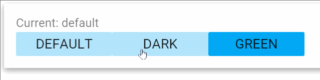

Readme
redux-theme v0.3.4
note: early preview ! wait for 1.0.0 before using
Decorate your components using themes
This package try to provide best practices for managing inline-styles.
- radium for inline-style
- material-ui inspired theme template
- react-redux connect decorator for injecting themed styles
In term of UX:
Installation
npm install --save redux-themeUsage
Modify app structure
Using redux-theme add generally two new folders to your app structure:
└── src                      # Application source code
    ├── components           # Generic React Components (generally Dumb components)
    ├── styles               # Redux-theme styles definitions for components
    ├── themes               # Redux-theme definitions
    ├── reducers             # Redux reducers
    etc...
Configure your store
Like other reducers, theme: is required in app state shape.
import { combineReducers }         from 'redux';
import { routerStateReducer }      from 'redux-router';
import { themeReducer }            from 'redux-theme';

export default combineReducers({
  theme: themeReducer,
  router: routerStateReducer
});
Provide theme via ReduxTheme component
The ReduxTheme component responsible of :
On mount:
- Registering your themes
- Registering your styles
- Applying the first theme
On theme change:
- Update googlefont from theme
- Update body.backgroundColor from theme
Exemple:
import { ReduxTheme } from 'redux-theme';

/// Some themes...
const baseTheme = new Theme ('base');
const myTheme = new Theme ('mytheme');
myTheme.typo.font = 'Luckiest Guy, sans-serif';

const textStyle = (theme) => ({
  base: {
    fontFamily: theme.typo.font
  }
});


// Build array of themes and styles
const themes = [defaultTheme, myTheme];
const styles = [{
  componentName: 'Text', // Will apply on decorated component with this name
  style: textStyle
}];

export default class Root extends Component {
  render() {
    const {store} = this.props;
    return (
      <div>

        <ReduxTheme
          store={store}
          themes={themes}
          styles={styles}
          defaultTheme={'mytheme'} />

        <Provider store={store}>
          <ReduxRouter>
            {routes}
          </ReduxRouter>
        </Provider>
      </div>
    );
}
Decorate your components
Connect you components using @connectTheme decorator.
Your component will receive a styles props. with radium styles.
note: The component class name is used for resolution of styles, in this case, it will look for a Button in theme.styles of your state.
import React, {Component, PropTypes}  from 'react';
import {connectTheme}                 from 'redux-theme';

@connectTheme
export default class Button extends Component {

  static propTypes = {
    styles: PropTypes.object.isRequired
  }

  render() {
    const {styles, kind, action, text} = this.props;
    return <button
      style={[
          styles.base,
          styles[kind]
        ]}
      onClick={action}
    >
      {text}
    </button>
  }
}
Theme class
You can use, override and export the default redux-theme:
Colors and utilities is also provided.
new Theme ()
// /themes/custom-theme.js
import { Theme, Colors, ColorManipulator } from 'redux-theme';

const customTheme = new Theme ('custom');
// Change some default theme properties
customTheme.typo.font = 'Luckiest Guy, sans-serif';
customTheme.palette.subTextColor = ColorManipulator.fade(Colors.white, 0.54);
export default customTheme;
Available methods
A theme can register and apply if you provide the dispatch func.
const customTheme = new Theme ('custom');
// Change some default theme properties
// ...
const {dispatch} = this.props;
customTheme.register (dispatch);
customTheme.apply (dispatch);
Styles
A style file is a function receiving the current theme as argument.
Style file is using radium convention for applying a kind.
export default (theme) => {
  return {
    base: {
      display: 'inline-block',
      fontSize: '18px',
      fontFamily: theme.typo.font,
      fontWeight: 400,
      textTransform: 'uppercase',
      cursor: 'pointer',
      userSelect: 'none',
      outline: 'none',
      marginTop: '3px',
      minWidth: theme.spacing.desktopKeylineIncrement * 2,
      border: 'none',
      paddingLeft: '5px',
      paddingRight: '5px',
      paddingTop: '5px',
      paddingBottom: '5px',
      color: theme.palette.textColor,
      backgroundColor: theme.palette.primary1Color,
      borderRadius: theme.shapes.defaultBorderRadius,
      ':hover': {
        backgroundColor: theme.palette.primary3Color,
      },
      ':focus': {
        backgroundColor: theme.palette.primary3Color,
      },
      ':active': {
        backgroundColor: theme.palette.primary3Color,
      }
    },
    small: {
      paddingLeft: '15px',
      paddingRight: '15px'
    },
    accept: {
      fontWeight: 'bold',
    },
    cancel: {
      fontStyle: 'italic',
    }
  }
};
Reducer actions
You can bootstrap your theme by dipatching action yourself. Logic order is:
- register your themes
- register your styles
- you can apply one of your registred themes
registerTheme (<theme object>)
registerStyle (<component name>, <style function>)
applyTheme (<theme name>)