
rei-kit
v4.4.0
Published
One kit, every look. 106 accessible Vue 3 + Tailwind 4 components, four materials (quiet, glass, brutal, soft) and ten WCAG-checked palettes, each switched with one attribute.

Maintainers
 ramazandogna
Keywords
Readme
rei-kit
One kit. Every look. An accessible Vue 3 + Tailwind 4 component library: 106 components for Vue 3 and Tailwind CSS 4. Change the material with one attribute and the palette with another — every component follows, and none of them knows your brand.




Try every material and palette live →
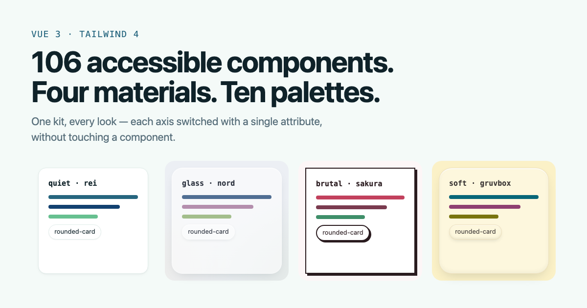
pnpm add rei-kit<html data-material="glass" data-palette="nord" class="dark"></html>That line is the whole redesign. Three axes, each changed on its own:
| | |
| ------------ | -------------------------------------------------------------------------------------------------------- |
| Material | quiet · glass · brutal · soft — what a surface is made of: its fill, edge, depth, blur and press |
| Palette | 10 built in — Nord, Dracula, Catppuccin, Solarized, Gruvbox, Tokyo Night, Rosé Pine, Rei, Sakura, Matcha |
| Mode | light and dark, every palette measured against WCAG AA in both |
零 — rei, zero: the layer everything else starts from.
Stable. 4.x is a published API: no export is removed, no prop renamed and no component's output changed for the same input outside a major version. Every release is packed as a real tarball, installed into three applications and run through each one's own test suite before it ships. Changelog · Roadmap
Is it for you?
Reach for this when you are already on Tailwind 4 and want your own utilities and the kit to share one token layer; when the people using your app — not just you — should be able to change how it looks; when you want the accessible half of a control (the live region, the arrow keys, the focus management) without writing it; and when what you ship at ten-plus components matters.
Reach for something else when you need a data grid with pivots and frozen columns, a charting library, a Nuxt module, or a Vue 2 / Tailwind 3 target. Those are not on the roadmap.
Unlike shadcn-vue, components arrive as a dependency rather than copied into your repository, so a fix reaches you as a patch release. The escape hatch is a token set on one element, not a fork of the component.
In Nuxt, it is a plain Vue dependency: import from rei-kit as usual and
add the stylesheet to your CSS. There is no module, and the components are
SSR-safe — ssr.spec.ts renders every one of them on a server, and one of the
three apps that run on this kit prerenders every page it has.
| | |
| ---------------------- | ------------------------------------------------------------------------------ |
| rei-kit | Buttons, fields, sheets, modals, menus, tables, toasts — the parts any app has |
| rei-kit/web | Wide-site parts: dialogs, tabs, tooltips, pagination, breadcrumbs |
| rei-kit/app | Phone-app parts: the shell, the tab transition, the sign-in form |
| rei-kit/pwa | Installing and updating |
| rei-kit/motion | Numbers that count and roll, words that rotate and type, content that arrives |
| rei-kit/supabase | An optional Supabase entry — auth errors, a remember-me client |
Three apps run on it and no two resemble each other. Every component is typed, tested, themed by role rather than by colour, and carries the reasoning for its own awkward decisions in the source.
What is different here
Four things, and each one is a number or a file you can open rather than an adjective.
1. Three axes, not one theme
Most kits give you a theme: change it and everything changes together. This one separates what a surface is made of from what colour it is from light or dark — 4 materials × 10 palettes × 2 modes, each switched by its own attribute, and a product may hand any of the three to its own users. There is no hex value inside a component, and a test fails if one appears. That is what lets a phone journal, a phone ledger and a wide course site share one kit and look nothing alike.
One component can leave the system without forking it: set the token on that
element. [--radius-card:0px] squares one card, [--spacing:0.35rem]
tightens one, [--surface-shadow:var(--shadow-raised)] lifts one. A class
cannot do this — class="rounded-[2px]" against the kit's rounded-card
silently renders at 16px, because two utilities of equal specificity are
resolved by Tailwind's output order rather than by you. The showcase
demonstrates both, including the one that does not work.
2. The smallest of six, measured, with the trade stated
At ten components — a real screen — 31.7 KB against 104 to 195 for the
five kits measured beside it. The gap is not the total, it is the slope:
seven components past the first three cost this kit 5 KB and cost them 60 to
125, because the stylesheet here is flat and theirs is inside the JavaScript.
The tables are in Small, and measured, the script is
in bench/, and it says what it does not measure.
3. Every claim is a test that fails
This is the part that is hard to see from outside and is most of the work. The kit does not assert that it is accessible or stable; it has checks that go red, and several of them exist nowhere else:
| The check | What it catches that nothing else does |
| -------------------------------- | -------------------------------------------------------------------------------------------------------------------------------------------------------------------------------------------------------------------------------------------- |
| direction-styles.spec.ts | One case per file, reading each stylesheet for a property that picks a side — padding-left where padding-inline-start was meant — and for a one-sided gradient with no right-to-left counterpart. It found 61 on its first run. |
| direction-keys.spec.ts | One case per control, pressing ArrowLeft in a right-to-left document and asserting it went forward. Ten components were walking backwards through themselves. It type-checks, it renders, it passes axe, and only an Arabic reader sees it. |
| examples-axe.spec.ts | axe on all 106 usage examples, and again with each one opened — a menu, a dialog, a combobox list is exactly where the ARIA lives and where a closed-state audit says nothing. |
| focus.spec.ts | Reads every component for a focus ring. A missing one compiles, renders and passes every other check. |
| public-api.spec.ts | Names every runtime export of all six entries. A kit compiles fine without an export nothing inside it calls. |
| type-surface.ts | Re-exports every published type and is type-checked twice, because a test cannot see types — they are gone by the time one runs. |
| showcase-catalogue.spec.ts | Fails if a component has no usage sample, no description, or no behaviour test. The documentation cannot fall behind the package. |
| appearance.spec.ts | One case per component for a hex value, and one for a text-white on a filled role — neither is a colour a palette can follow, and white on the kit's own warning measures 2.3:1. Plus a frozen shadow-card where the runtime token was meant, and a cubic-bezier pasted in where a material's easing should reach. |
| consumer.yml | Packs the real tarball, installs it into all three apps and runs each one's whole gate. The only check that imports the package the way an app does. |
| pnpm size | Six budgets. The build fails when one grows past its line, and raising it has to say why in the commit. |
1,888 tests across 73 files, and every guard added is verified by being
broken first — the commit says what failed when it was removed. That habit
is what found the two cases in anchored-panel.spec.ts that were passing
with the feature deleted, and the comment in BasePopover that had
described the wrong behaviour since the day it was written.
4. The kit has no language of its own
Every visible string is a required prop. A component with an English
default would ship English into an app that has none, and it would do it
silently. That is also why PasswordInput asks for one label rather than
four, and why ActivityGrid takes levelFor instead of deciding whether
four of something is a lot.
What is deliberately not here
No create-rei-app, no Nuxt module, no base library underneath — the
primitives are ours, so there is no second project's roadmap between a bug
and its fix. No icons of its own, no copy, and no chart library — BarChart
and DonutChart draw a series and a composition, and an app that needs axes,
time scales or stacking reaches for something built for that. And no claim that has
not been measured: contrast and focus order still need a real browser, and
until that exists this file says so rather than implying otherwise.
Why it exists
The kit distributes decisions, not a look. Three apps run on it and no two resemble each other: a phone journal, a phone ledger, and a wide Japanese course site. None of them forked it, because there is not a single hex value inside a component. Colours are named for the role they play, and an app rebrands by redefining eleven values.
That is the whole trick, and everything else follows from it.
What gets to be in here
This is a kit. It is built for the ecosystem, not for the apps that happen to exist today.
A part belongs here if it is a piece of user interface at all — a button, a field, a toast, a modal, a shell. There is no waiting for a second consumer and no counting of call sites: an app that needs something the kit does not have is a gap in the kit, and the kit is what changes. Waiting means the next app begins by copying, and a kit whose parts arrive after the apps that needed them is a library of things nobody reached for.
A part is finished when three things are true:
- It covers every role the design system declares.
tokens.cssnames five colour roles; a button that exposes two of them is incomplete, whatever the apps currently use. - The app can take the behaviour without the appearance.
variant="unstyled"is the last resort, not the first: if several apps paint the same shape by hand, that shape is a variant the kit is missing. - It carries no product decision — no colour value, no copy, no icon. Those arrive as props and slots, which is what lets three apps that look nothing alike share one part.
The test that finds the gaps: a hand-written control in a file that already imports the kit's version of it. That is a bug in the kit, every time. Not in the app, and not a matter of taste.
Small, and measured
Two cases, because one is how a size comparison lies in either direction. Each kit is bundled the way its own docs set it up first, with styles included and Vue left out. Minified, gzip -9:
Three components — a button, a text input and a modal. The smallest real app, and the case least favourable to this kit:
| Kit | JS | CSS | Total | | -------------------- | ---------: | ----------: | ----------: | | rei-kit 4.4.0 | 3.7 KB | 23.2 KB | 26.9 KB | | element-plus 2.14.6 | 27.3 KB | 6.0 KB | 33.3 KB | | naive-ui 2.45.3 | 51.2 KB | — | 51.2 KB | | primevue 5.0.1 | 53.6 KB | — | 53.6 KB | | ant-design-vue 4.2.6 | 70.3 KB | — | 70.3 KB | | vuetify 4.2.1 | 44.0 KB | 34.3 KB | 78.4 KB |
Ten components — the same three plus a select, a checkbox, a switch, tabs, a data table, a tooltip and a card. A screen rather than a demo:
| Kit | JS | CSS | Total | | -------------------- | ---------: | ----------: | -----------: | | rei-kit 4.4.0 | 8.6 KB | 23.2 KB | 31.8 KB | | element-plus 2.14.6 | 90.1 KB | 14.0 KB | 104.1 KB | | naive-ui 2.45.3 | 132.4 KB | — | 132.4 KB | | primevue 5.0.1 | 135.8 KB | — | 135.8 KB | | vuetify 4.2.1 | 96.7 KB | 44.1 KB | 140.7 KB | | ant-design-vue 4.2.6 | 195.4 KB | — | 195.4 KB |
The slope is the point, not the total. Seven more components cost this kit 4.9 KB, because the stylesheet does not move and only the JavaScript grows. The kits that put their styles in the JavaScript have no flat part at all, so the same seven cost them 60 to 125 KB. A quarter smaller at three components; 3.3× smaller at ten.
That is the trade, stated rather than left to be inferred: rei-kit's CSS
column is the entire mobile.css preset — all 106 components, four materials,
ten palettes — and it is the same 23.1 KB whether an app imports three
components or every one of them. An app using very little of the kit carries
stylesheet it does not need; an app using a screenful stops paying anything
much for the next one. Which is why the three-component table above is the one
to be sceptical of, and it is still the one this kit wins.
The JavaScript is only what those components need: each is its own tree-shakeable module and there are no runtime dependencies. Naive UI, PrimeVue and Ant Design put their styles in the JavaScript, which is why their CSS column is empty and their JS column is not.
What this does not say: nothing has been measured past ten components, and
these are ten components imported rather than an app using them. The
ten-component row uses this kit's DataTable rather than its plainer
BaseTable, because the other five bring a data grid and the comparable part
is the one with sorting and selection — the heavier of the two. Run it
yourself: cd bench && npm install && npm run bench; it writes the numbers
this README and the showcase both read. Nuxt UI is left out because it builds
through its own Nuxt or Vite module and cannot be bundled the same way.
The kit's own sizes are a budget, not a boast: pnpm size bundles a
one-button app, the three-part app and an app using everything, and check
fails when one grows past its line.
Built to standards
Each claim here is enforced by something that fails, not by a promise.
| Standard | How it is held |
| ---------------------------------------- | --------------------------------------------------------------------------------------------------------------------------------------------------------------------------------------------------------------------------------------------------------------------------------------------------------------------------------------- |
| Open for extension, closed for edits | A new look is a token, a material or a palette — never an edit to a component. Materials and palettes restyle all 106 without touching one, and a test fails if a component holds a colour. |
| Single responsibility | One part, one job. Label-and-error wiring lives in FormField, not in five inputs; taking the page behind a layer out of reach lives in one helper the modal, the sheet and the guide share. |
| Depend on roles, not values | Components read primary, surface, --shadow-card — never a hex or a pixel shadow. An app's brand wins in both modes, tested. |
| WAI-ARIA Authoring Practices | Menus, comboboxes, tabs, sliders, dialogs and accordions follow their APG pattern: arrows move, Tab leaves, Escape closes, focus returns. Behaviour tests drive each with the keyboard. |
| WCAG 2.2 AA | Every palette pairing measured in both modes. Every control the kit draws has a visible focus ring, checked by a test. Reduced motion and reduced transparency are honoured by every material. |
| TypeScript, strict | strict, exactOptionalPropertyTypes, noUncheckedIndexedAccess, no any and no suppressed errors in the source — and clean under vue-tsc's strictTemplates, checked in CI, so an app on the strictest setting gets no errors from the kit. Declarations ship with the package, so JavaScript projects get the same autocomplete. |
| Semantic Versioning | Every export is named in a test. A minor adds, a patch fixes; a change to what a component renders waits for a major, and the three apps' full test suites run against the packed tarball. |
| Server rendering | No module touches window or document on import. One app is prerendered with it on every build. |
| Supply chain | No runtime dependencies. Published from CI with npm provenance, so every version is traceable to the commit that built it. |
Status
Three apps run on it, and none of them resembles another.
| | |
| ------------ | --------------------------------------------------------------------------------------------------------------------------------------------------------------------------------------------------------------------------------------------------------------------------------------------------------------------------------------------------------------------------------------------------------------------------------------------------------------------------------------------------------------------------------------------------------------------------------------------------------------------------------------------------------------------------- |
| Components | 106 (AuthForm, BaseTable, BaseCombobox, BaseSlider, TabShell, BaseModal, BaseTabs, BaseTooltip, BasePagination, BaseBreadcrumb, BaseDisclosure, BaseAccordion, NavLinks, OfflineBanner, FabButton, BaseButton, BaseCard, BaseInput, BaseSelect, BaseTextarea, BaseCheckbox, BaseSwitch, BaseRadioGroup, BaseMenu, BaseAvatar, BaseSpinner, BaseAlert, BaseBadge, BaseSheet, ProgressBar, PriceCard, ToastHost, TabBar, GoogleButton, LocaleLinks, LocaleSheet, AuthShell, TourShell, InstallPrompt, UpdatePrompt, InstallSettings, SkeletonList, PageContainer, ErrorBoundary, etc.) |
| Composables | 14 (useToast, useTheme, useMaterial, usePalette, useToday, useMediaQuery, useOnline, useInstall, useSnooze, useThemeSync, useVisualViewport, useDragScroll, useDebouncedCallback, useAnnounce) |
| Utilities | 48 functions and 5 constants (applyTheme, applyMaterial, applyPalette, MATERIALS, PALETTES, formatDate, fieldErrors, toAuthMessageKey, createAuthGuard, createQueryDefaults, createWriteReport, toRedirectPath, Supabase error mapper, i18n runtime, etc.) |
| Entry Points | rei-kit, rei-kit/app, rei-kit/web, rei-kit/pwa, rei-kit/motion, rei-kit/supabase, rei-kit/mobile.css, rei-kit/web.css, and each stylesheet on its own |
| Consumers | Hibi · Kakei · Kakehashi |
Every export is listed by name in src/__tests__/public-api.spec.ts, which is
the package's promise written down.
Install
rei-kit is the third thing you install, after a Vue app and Tailwind CSS. From an empty folder:
1. A Vue app — skip this if you have one. vue-ts for TypeScript, vue
for JavaScript.
pnpm create vite my-app --template vue-ts2. Tailwind CSS 4, with its Vite plugin:
pnpm add -D tailwindcss @tailwindcss/vite// vite.config.ts
import { defineConfig } from 'vite'
import vue from '@vitejs/plugin-vue'
import tailwindcss from '@tailwindcss/vite'
export default defineConfig({
plugins: [vue(), tailwindcss()],
})3. rei-kit, with the icon set a few components draw with:
pnpm add rei-kit lucide-vue-next4. The styles — replace your stylesheet's contents with two lines (more under Wiring the styles):
@import 'tailwindcss';
@import 'rei-kit/mobile.css'; /* or rei-kit/web.css for a site */
5. A component:
<script setup lang="ts">
import { BaseButton, useToast, ToastHost } from 'rei-kit'

const toast = useToast()
</script>

<template>
  <BaseButton @click="toast.success('Saved')">Save</BaseButton>
  <ToastHost close-label="Close" />
</template>
TypeScript or JavaScript. The package ships its own declarations, so
TypeScript gets autocomplete and checking with no @types package, and every
prop's type shows in the editor. In JavaScript the same code works — drop
lang="ts". Every component has a copyable sample in both.
Runs on Vue 3.5+, Tailwind CSS 4, Vite 5.2+ (or any bundler Tailwind 4 supports), and the browsers Tailwind 4 targets: Safari 16.4+, Chrome 111+, Firefox 128+. Server rendering and prerendering work — nothing touches the browser on import.
Everything the kit expects from the app is a peer dependency, so the app's copy is the only copy:
| peer | needed for |
| ----------------------- | --------------------------------- |
| vue | everything |
| tailwindcss | the tokens and utilities |
| lucide-vue-next | component icons |
| vue-router | TabBar, LocaleLinks |
| vue-i18n | the i18n runtime only |
| @supabase/supabase-js | the rei-kit/supabase entry only |
This is not a formality. A second copy of a library that works through provide/inject is not a spare copy — it is a different injection key, so the app's own provider becomes invisible and the component throws on mount.
Use
<script setup lang="ts">
import { BaseButton, BaseSheet, useTheme } from 'rei-kit'

const theme = useTheme()
</script>
Supabase lives behind its own entry, so an app that does not use it never downloads it:
import { createSupabaseClient } from 'rei-kit/supabase'Wiring the styles
Two lines, after Tailwind's own:
/* your app's main.css */
@import 'tailwindcss';
@import 'rei-kit/mobile.css'; /* a phone-shaped app — or rei-kit/web.css for a site */
That is the whole kit: the colour roles and dark variant, the shell, the four
materials, the ten palettes and the compiled component styles. The preset
also tells Tailwind where the components are, which used to be the step
people got wrong: Tailwind only builds classes it has seen and never looks in
node_modules on its own, and a missing or mis-counted @source path failed
silently — the components mounted and came out unstyled. The preset's
@source sits next to the files it points at, so it is right wherever your
stylesheet is.
Put your brand after it, and you are done:
@theme {
  --color-primary: #6b4de6;
}
The parts, one by one
The preset is only these, and an app that wants less can import them itself:
@import 'tailwindcss';
@import 'rei-kit/tokens.css'; /* colour roles, depth, motion, the dark variant */
@import 'rei-kit/shell/mobile.css'; /* or shell/web.css — see The shell, below */
@import 'rei-kit/materials.css'; /* optional: glass, brutal, soft */
@import 'rei-kit/palettes.css'; /* optional: the ten palettes */
@import 'rei-kit/styles.css'; /* compiled component styles */

/* Relative to this file: adjust the ../ depth to where it sits. */
@source '../../node_modules/rei-kit/dist';
Leaving any of these out fails quietly: the build succeeds, the
components mount, and they come out unstyled. Nothing type-checks CSS, so an
app on this path is worth a test that reads its own stylesheet and asserts
them — Hibi's kit-styling.spec.ts does, at unit-test speed. The kit holds
its presets to the same line: pnpm size builds each one with Tailwind's own
scanning switched off and fails if a component's classes are missing.
Materials
A material is how a surface is made — its fill, its edge, its depth, how it blurs what is behind it and what pressing it does. It is independent of colour, so any material works in any palette.
| Material | Closest to | What changes |
| -------- | --------------------------------------- | --------------------------------------------------------------------------------- |
| quiet | minimalism | The default. Hairline edges, tinted fills, depth you barely notice. |
| glass | glassmorphism, spatial UI, liquid glass | Frosted, translucent surfaces lit along the rim, over a page with colour to blur. |
| brutal | neo-brutalism | 2px ink borders, hard offset shadows, square corners. Buttons press into them. |
| soft | claymorphism, neumorphism | Rounded, raised, lit from above, with a little spring — and a real edge kept. |
<html data-material="brutal"></html>import { useMaterial } from 'rei-kit'
const material = useMaterial() // persisted, like useTheme
material.value = 'glass'The attribute works on any element, so a region can differ from the page.
quiet is the absence of the attribute; to restore it inside another
material, set data-material="quiet" on the region.
Glass needs something to see through. Put the page on the canvas
utility, which carries the material's backdrop — a frosted panel over flat
white is a grey panel. It falls back to solid where backdrop-filter is
unsupported and for readers who set prefers-reduced-transparency.
Depth is read at runtime, so reach it at runtime. Use the surface
utilities — surface, surface-raised, surface-overlay, control — or
shadow-(--shadow-card). There is deliberately no shadow-card utility:
Tailwind builds a theme shadow's utility by inlining its value, which would
freeze it at the quiet material's depth.
Palettes
Ten palettes, each with a light and a dark mode. Seven are well-known open palettes by their official values; three are the kit's own.
| Palette | By | Palette | By |
| ------------ | ----------------- | ------------- | --------- |
| rei | rei-kit (default) | gruvbox | morhetz |
| nord | Arctic Ice Studio | tokyo-night | enkia |
| dracula | Dracula Theme | rose-pine | Rosé Pine |
| catppuccin | Catppuccin | sakura | rei-kit |
| solarized | Ethan Schoonover | matcha | rei-kit |
import { PALETTES, usePalette } from 'rei-kit'

const palette = usePalette()
palette.value = 'catppuccin'

PALETTES.map((p) => p.swatch) // four colours each, for a picker
Every palette is measured before it ships. The text colour on each
filled role — on-primary, on-warning and the rest — is chosen by contrast
rather than by habit, so Solarized's yellow gets dark text and its blue gets
white. Every text pairing in both modes is checked against WCAG AA, and a
palette that fails one does not ship. Seven official values fell short on the
way in; each got the smallest nudge that clears the line.
Palettes are generated from src/palettes/palettes.source.json by
pnpm palettes; a test asserts the shipped CSS matches the source.
Motion
rei-kit/motion is for the parts of a page that move on purpose:
<script setup lang="ts">
import { CountUp, NumberTicker, TextRotate } from 'rei-kit/motion'
</script>

<template>
  <NumberTicker :value="balance" :format="{ style: 'currency', currency: 'TRY' }" />
  <CountUp :value="12480" />
  <h1>Build it <TextRotate :words="['glass', 'brutal', 'soft']" /></h1>
</template>
| Component | What it does |
| -------------- | --------------------------------------------------------------- |
| NumberTicker | Rolls each digit into place, like an odometer or a note counter |
| CountUp | Counts through every value once it scrolls into view |
| TextRotate | One word in a sentence that changes on its own |
| TypeWriter | Types a line out, and deletes it for the next |
| BaseReveal | Fades or rises into view on scroll; staggers with :delay |
| BaseMarquee | An endless sideways row — logos, testimonials |
The presets also bring animate-float, animate-pulse-soft, animate-glow,
animate-wiggle, animate-pop and text-shimmer.
Every one of them renders its finished state on a server and for anyone who has asked their system for less motion, reads only the final value to a screen reader, and stops while hovered if it moves on its own. Six components together add under 2 KB gzip.
Colours
tokens.css defines all eleven roles, the five on-* colours that sit on a
filled role, a .dark block for each, and the dark variant. A new app
rebrands by overriding values, never by renaming — or by choosing a palette:
@theme {
  --color-primary: #6b4de6; /* main action */
  --color-accent: #3b2f8f;
  --color-positive: #2fa36b;
  --color-negative: #d1453b;
  --color-warning: #d89a3e;
  --color-muted: #efeaff; /* calm surface, empty cell */
  --color-canvas: #faf9ff; /* behind the shell */
  --color-surface: #ffffff; /* card */
  --color-ink: #17132b; /* text */
  --color-ink-soft: #6a6484; /* secondary text */
  --color-hair: #e8e4f2; /* rule */

  /* the text on a filled role — set it dark when the role is light */
  --color-on-primary: #ffffff;
}
An app that already has its own palette does not have to rename it. Alias the
roles onto the names it already uses, and keep them as var() references so
the app's own dark-mode overrides carry into the kit's components:
@theme {
  --color-primary: var(--color-sea);
  --color-muted: var(--color-mist);
}
Put your own .dark block after the import. Both blocks match at the same
specificity, so the later one wins — which is what makes the override work.
Measures
Widths are roles too. PageContainer shipped with 75rem baked in, and the
first app that wanted it had deliberately measured its page at 1120px, so the
component written to remove that app's hand-rolled container could not replace
it — the same mistake as a hex inside a component, one axis over.
@theme {
  --measure-page: 1120px; /* a page */
  --measure-reading: 68ch; /* a column of prose */
}
The shell
Tokens are what every app needs. A shell is a decision about what shape the app is, so it is a separate import and there are two of them.
| | |
| -------------------------- | -------------------------------------------------------------------------------------------------------------------------------------------------------------------- |
| rei-kit/shell/mobile.css | shell-frame (a 430px column at viewport height), page-slide and page-auth scroll containers, and the sliding transition between screens |
| rei-kit/shell/web.css | .shell — the page's column as a class, for a header or footer whose bar spans the window while its contents line up with the text — and a short fade between pages |
Both are opt-in throughout: nothing applies until a class lands on an element,
and both read --measure-page rather than declaring a width of their own.
They were one file until 0.9.0, and it was tokens.css — so a wide course site
downloaded a 430px column, a full-viewport height and an iOS sheet curve in
order to ignore them, and had no counterpart of its own.
Prerendering
The kit imports and renders on a server, so an app can prerender with
vite-ssg or any other SSR build. Two things stay the app's job, because only
the app knows the answer:
- The theme.
applyThemedoes nothing without a document, so prerendered HTML carries no.dark. Set it before hydration with a small synchronous script inindex.html, or the first paint flashes light. - Today's date.
useToday()on a server is the server's today, a different day from the visitor's either side of midnight. Render anything derived from it on the client.
Seeing what is in it
pnpm showcase→ ramazandogna.github.io/rei-kit
— published from main by .github/workflows/showcase.yml, which needs Pages
switched on once under Settings → Pages → Source: GitHub Actions.
Every component, live, with its props. A page that wires the kit exactly the way this README says to, so a broken install shows up there before it ships. A component nobody can see is a component nobody uses.
The prop tables are generated from the source by scripts/extract-props.mjs
before every showcase build, and a test asserts the catalogue matches the
package's exports in both directions. A table maintained by hand is wrong by
the second release, and being wrong is worse than being absent — a reader
trusts it.
Working on rei-kit itself
The commands, the four checks that keep a release from breaking an app, and how a version is cut are in CONTRIBUTING.md — they are for somebody changing this package rather than using it.
Taking part
| File | What it answers | | -------------------------------------- | ------------------------------------------------------------------------ | | CONTRIBUTING.md | How to set it up, the one command CI runs, and what a new component needs | | SECURITY.md | How to report a vulnerability, and what the package does and does not do | | CHANGELOG.md | Why each change was made | | PATCHNOTES.md | What you gain per release, and what you have to do to take it |
The most useful issue you can open is the one that says what you tried to build and what you ended up writing by hand: a control hand-written in a file that already imports the kit's version of it is a bug in the kit, every time.
Author
Made by Ramazan Doğan — github.com/ramazandogna, doganrmzn40 [ at ] gmail.com. Issues and ideas are welcome on GitHub.
License
MIT