
remark-transform-blockquote
v1.2.3
Published
customize Markdown blockquote
Downloads
411

Maintainers
 vnphanquang
Readme
remark-transform-blockquote
turn a blockquote with special marker into a customisable element, similar but not limited to Github Markdown Alerts


Installation
pnpm add -D remark-transform-blockquote # or via npm, yarn, ...Usage
This code...
import rehypeStringify from 'rehype-stringify';
import remarkParse from 'remark-parse';
import remarkRehype from 'remark-rehype';
import remarkTransformBlockquote from 'remark-transform-blockquote';

const output = await unified()
	.use(remarkParse)
	.use(remarkTransformBlockquote, {
		mappings: [
			{
				marker: '!CUSTOM',
				tag: 'section',
				attributes: { class: 'custom-block' },
			},
		],
	})
	.use(remarkRehype)
	.use(rehypeStringify)
	.process('...');
will transform the following input...
> [!CUSTOM]
> This will be a custom block.
...to this output:
<section class="custom-block">
	<p>This will be a custom block.</p>
</section>
Presets
The package allows some presets for common use cases.
Specify preset:
const output = await unified()
	.use(remarkParse)
	.use(remarkTransformBlockquote, { preset: '<preset>' });
Import CSS
@import 'remark-transform-blockquote/presets/<preset>.css';
Where <preset> is listed in the following sections.
[!NOTE] You may provide additional
mappingsthat will take precedence over the preset's mappings. Be aware that only the first mapping that matches is applied.
Preset: github
Alerts that matches Github Markdown Alerts.
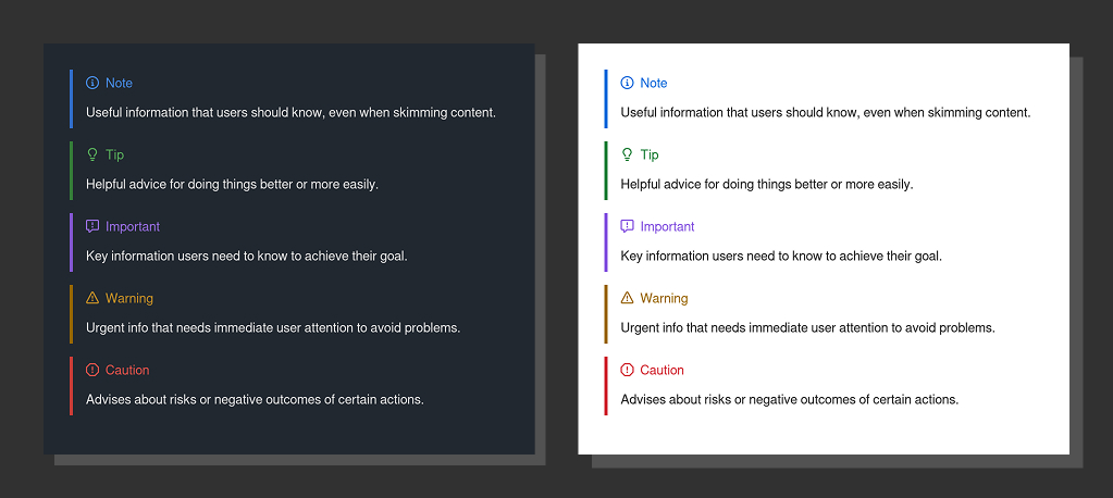
Input:
> [!<VARIANT>]
> ...
Output:
<div class="markdown-alert markdown-alert-<variant>" data-title="<Variant>">...</div>Where <VARIANT> is one of {NOTE, TIP, IMPORTANT, WARNING, CAUTION}.
CSS Custom Properties
| CSS Variable | Description | Fallback |
| --------------------------------- | ---------------------------------------- | -------- |
| --alert-padding-block | padding-inline of container | 1rem |
| --alert-padding-inline | padding-block of container | 0.5rem |
| --alert-margin-block-end | margin-block-end of container | 1rem |
| --alert-border-width | border-inline-start-width of container | 0.25em |
| --alert-icon-size | width & height of the icon | 1rem |
| --alert-header-margin-block-end | margin-block-end of the title and icon | 1rem |
| --alert-title-font-weight | color of the title | 500 |
Modifier variables (changed per variant):
| CSS Variable | Description | Fallback | Set to |
| ---------------------- | ---------------------------------------- | -------------- | -------------------------------- |
| --alert-border-color | border-inline-start-color of container | currentcolor | --alert-<variant>-border-color |
| --alert-header-color | color of the title and icon | currentcolor | --alert-<variant>-header-color |
| --alert-icon | an url-encoded SVG | | --alert-<variant>-icon |
See presets/github.css for more information.
[!NOTE] The color variables use CSS new light-dark function for minimal light/dark mode support.
To provide customisation, set the CSS variables where appropriate, e.g.
/* my-design-system.css */
:root {
	--alert-icon-size: 1.25rem;
	--alert-note-icon: url('...');
	--alert-success-border-color: green;
	--alert-success-header-color: darkgreen;
	/* ... */
}
Icons
SVG icons are also available should you need to reference / use them. For example:
// assuming vite or some bundler that supports importing SVG.
import svg from 'remark-transform-blockquote/presets/github/icons/note.svg'; // replace with <variant>.svg as needed
Preset: comeau
Sidenotes based on Josh Comeau's Blog.
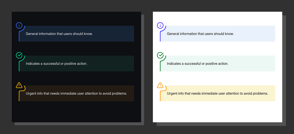
Input:
> [!<VARIANT>]
> ...
Output:
<aside class="md-sidenote md-sidenote-<variant>">
	<div class="md-sidenote-decoration"></div>
	...
</aside>
Where <VARIANT> is one of {INFO, SUCCESS, WARNING}.
CSS Custom Properties
| CSS Variable | Description | Fallback |
| ------------------------------- | --------------------------------- | -------- |
| --sidenote-margin-block-start | margin-block-start of container | 2rem |
| --sidenote-margin-block-end | margin-block-end of container | 4rem |
| --sidenote-padding-block | padding-block of container | 1.5rem |
Modifier variables (changed per variant):
| CSS Variable | Description | Set to |
| ----------------------------- | ----------------------------- | ------------------------------------- |
| --sidenote-icon | an 32x32 url-encoded SVG | --sidenote-<variant>-icon |
| --sidenote-decoration-color | color for icon & left border | sidenote-<variant>-decoration-color |
| --sidenote-background-color | background color of container | sidenote-<variant>-background-color |
[!NOTE] The color variables use CSS new light-dark function for minimal light/dark mode support.
Responsive variables:
| CSS Variable | Description | Fallback | Fallback (>= 35.1875rem) |
| --------------------------- | ------------------------------------- | -------- | ------------------------ |
| --sidenote-padding-inline | padding-inline of container | 1rem | 2rem |
| --sidenote-margin-inline | negative [margin-inline] of container | 1rem | 2rem |
When you provide custom value for responsive variables, make sure to set them at each breakpoint, e.g.
:root {
	--sidenote-padding-inline: 0.5rem;
	--sidenote-margin-inline: 0.5rem;

	@media (width >= 35.1875rem) {
		--sidenote-padding-inline: 1rem;
		--sidenote-margin-inline: 1rem;
	}
}
See presets/comeau.css for more information.
[!NOTE] For simplicity, this preset does not include some enhancements that Josh has for his component, for example
:selectioncolor or contextual colors for codeblocks within.
Icons
SVG icons are also available should you need to reference / use them. For example:
// assuming vite or some bundler that supports importing SVG.
import svg from 'remark-transform-blockquote/presets/comeau/icons/info.svg'; // replace with <variant>.svg as needed
Per-Transformation Attributes via Meta String
Sometimes it is helpful to allow users to customise the final HTML attribute per transformed element.
For this, turn on the meta option. For example, using preset:github...
unified.use(remarkTransformBlockquote, {
	preset: 'github',
	meta: true,
});
...user can provide i18n translation for the title:
> [!NOTE] `data-title="Thông tin"`
> "Thông tin" is Vietnamese for "Information"
Meta String
The meta string is an inline code, i.e. `...`, that follows immediately after the marker.
Inside, it can contain key-value pairs for string attribute, or standalone strings that will be
understood as boolean attributes. Some example:
- Simple string attribute, no space:
[!MARKER] `attr=value` - For string attribute with single quote in value, wrap in double quote:
[!MARKER] `attr="value with 'single' quote"` - For string attribute with double quote in value, wrap in single quote:
[!MARKER] `attr='value with "double" quote'` - Boolean attributes, implicitly
true:[!MARKER] `attr` - Boolean attributes with explicit value:
[!MARKER] `attr=true attr=false`
Merging Strategy via Prefixes
By default, parsed attributes from meta string will replace existing attributes with the same name in node.data.hProperties. This can be changed by providing a prefix to the attribute name:
^: prepend the value to existing attribute value, e.g.^class=" prepend",$: append the value to existing attribute value, e.g.$class="append ",#: parsed but skip merging, useful if you want to do some post-processing with hooks, e.g.#attr="internal".
Note that, on boolean attributes, ^ and $ can be used but have no effect. Also, remember to
consider adding space when prepending / appending attribute values.
Complex Transformation
Should you need to do more than just change tag name / attributes, you can specify a post hook
unified.use(remarkTransformBlockquote, {
	mappings: [
		{
			marker: '!CUSTOM',
			tag: 'section',
			attributes: { class: 'custom-block' },
			hooks: {
				post: ({ node, index, parent, tree, meta }) => {
					// do something with node, e.g. adding child, changing content, etc.
					// meta is only available if `meta: true` is set in the options.
				},
			},
		},
	],
});
Related Projects / Prior Arts
- montogeek/remark-custom-blockquotes
- jaywcjlove/remark-github-blockquote-alert
- nylonbricks/remark-blockquote-alerts
- lin-stephanie/remark-admonition-to-blockquote-callout
- incentro-ecx/remark-github-admonitions-to-directives
CONTRIBUTING
See CONTRIBUTING.md for contribution guidelines.