
replace-react-color
v4.1.3
Published
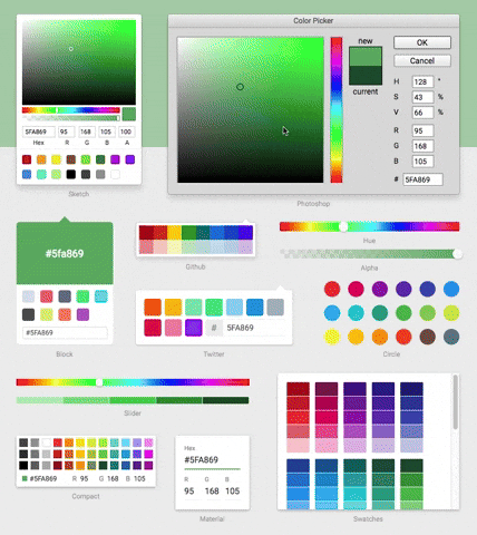
A Collection of Color Pickers from Sketch, Photoshop, Chrome & more
Maintainers
 felipecarrillo100
Readme
replace-react-color
A modernized, lightweight, and dependency-free TypeScript fork of the highly popular legacy react-color library.
This repository brings the classic color pickers (Sketch, Photoshop, Chrome, etc.) into the modern era, fully compatible with React 19, while completely eliminating legacy bloat and ensuring long-term maintainability.
🎨 Try the Live Demo — All pickers, fully interactive. Compare side-by-side with the original react-color.
🏆 Acknowledgements & Credits
- Modernization & Refactor: Spearheaded by felipecarrillo100, who completely overhauled the codebase to modern standards, purged legacy dependencies, implemented native TypeScript utilities, and modernized the build infrastructure to Vite/esbuild.
- Original Author: The original
react-colorlibrary was brilliantly designed and created by Case Sandberg (@casesandberg). All credit for the iconic UI designs, component structures, and the originalreactCSSparadigm goes to him.
🚀 What's New in Version 4.0
Version 4.0 marks a significant milestone in the evolution of this fork, moving from a "modernized wrapper" to a completely rebuilt internal architecture.
- Zero External Dependencies: We have completely eliminated the final production dependency (
tinycolor2) and replaced it with a custom, high-precision internal color engine. - Zero Styling Dependencies: We have completely removed the
reactCSSengine. Styles are now handled via native React inline styles, making the library even lighter and faster. - Standard Styling Props: Every picker now supports standard
classNameandstyleprops out of the box. - Performance Boost: Interactions (like dragging pointers) are significantly more fluid due to the removal of the legacy styling abstraction layer.
- Full Type Safety: Rebuilt internal types to ensure that custom sub-component styling is robust and type-safe.
🧠 Rationale for the Rewrite
The original react-color library was a staple in the React ecosystem but suffered from significant bit-rot:
- Dependency Bloat: It relied heavily on outdated utilities like
lodash,lodash-es, and@icons/material. - React 15/16 Legacy: The codebase was written using outdated React Class components, legacy lifecycle methods, and Enzyme testing paradigms, breaking entirely on modern React.
reactcssAbandonment: The underlying styling engine (reactcss) was unmaintained, throwing numerous deprecation warnings and causing performance bottlenecks.- TypeScript Deficiencies: It lacked native TypeScript support, relying on clunky third-party
@types.
What We Fixed:
- Reduced Dependencies: Eliminated
lodash,material-colors, and external icon libraries. - Inlined Assets: SVGs and standard color palettes are now natively built-in.
- Native Styling: Completely replaced the
reactcssengine with pure React inline styles, ensuring zero overhead and better performance. - Hooks & Functional Components: Completely rewrote the core library to use modern React Hooks, ensuring 100% compatibility with React 19 and Strict Mode.
- Highly Optimized Build: Modernized the build pipeline using
tsupto output optimized ESM and CommonJS bundles.
📖 Installation & Usage
Basic Example
import React, { useState } from 'react'
import { SketchPicker } from 'replace-react-color'

export const Component = () => {
  const [color, setColor] = useState('#fff')

  return (
    <SketchPicker
      color={color}
      onChangeComplete={(newColor) => setColor(newColor.hex)}
    />
  )
}
🎨 Styling (New in v4.0)
You can now style any picker using standard React props:
<ChromePicker
  className="my-custom-picker"
  style={{ boxShadow: 'none', border: '1px solid #eee' }}
/>
[!NOTE] The legacy
stylesprop (from the originalreact-color) is still supported for backward compatibility but is now considered deprecated. We recommend migrating to the standardstyleandclassNameprops.
🚀 Migration Plan (For Existing Users)
Migrating from the legacy react-color is a seamless, drop-in replacement.
1. Update Dependencies
npm uninstall react-color @types/react-color
npm install replace-react-color
2. Update Imports
// OLD: import { SketchPicker } from 'react-color'
// NEW:
import { SketchPicker } from 'replace-react-color'
3. Enjoy Modern Performance
You no longer need to use --legacy-peer-deps or worry about console flooding with deprecation warnings. You can now safely upgrade your application to React 18 or React 19!
🛠 Available Pickers
You can import AlphaPicker, BlockPicker, ChromePicker, CirclePicker, CompactPicker, GithubPicker, HuePicker, MaterialPicker, PhotoshopPicker, SketchPicker, SliderPicker, SwatchesPicker, and TwitterPicker.