
retro-react
v1.6.0
Published
A React UI library that looks like Windows 95/98. 50+ typed, accessible components with classic 3D bevels and sharp pixel edges.
Downloads
1,019
Maintainers
 namespace_irhad
Readme
retro-react

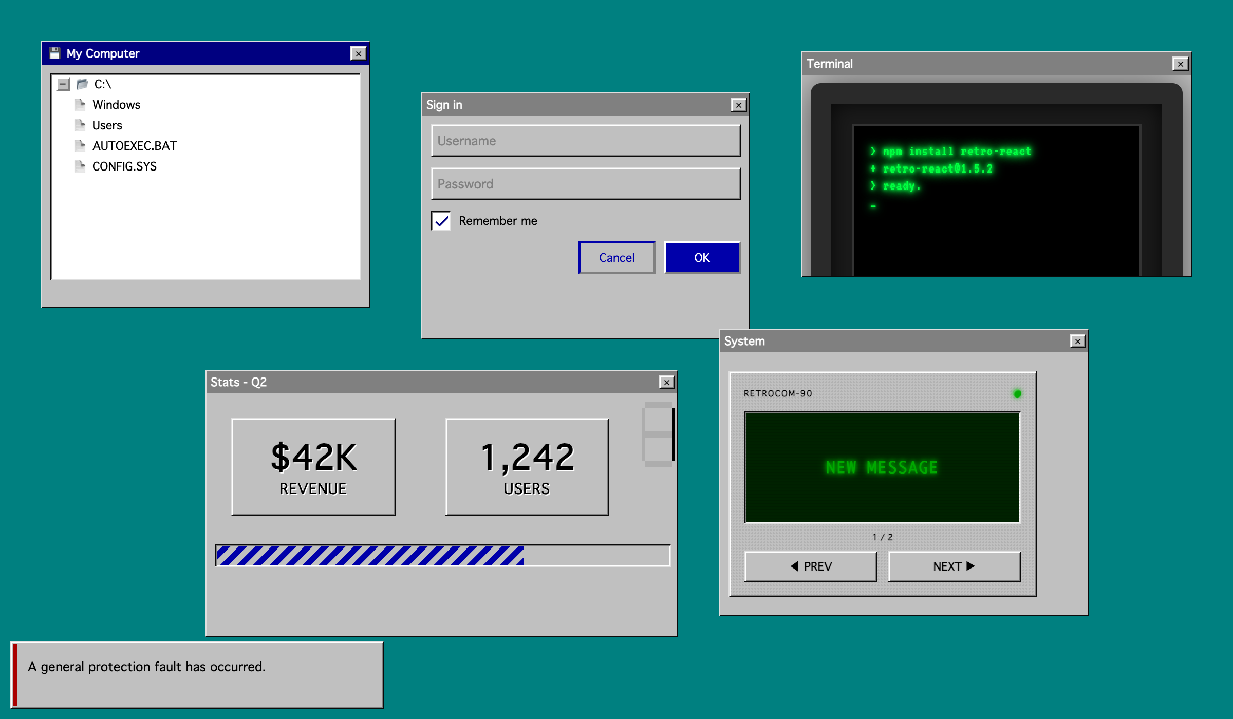
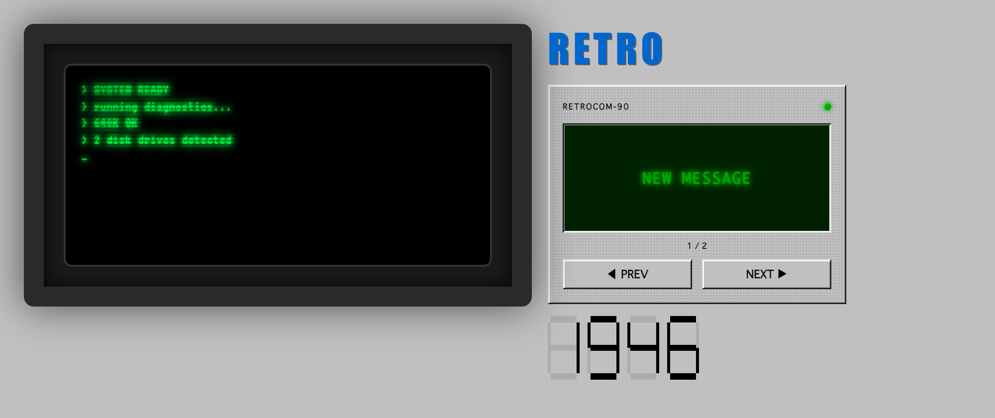
A React component library that looks like Windows 95 / 98. 50+ typed, tree-shakable components with classic 3D bevels and sharp pixel edges. Includes the usual lineup (buttons, inputs, modals, tabs, accordions, tables, trees, popovers, alerts) plus one-of-a-kind retro pieces like Pager, CRT, Terminal, WordArt, Marquee, TypewriterText, and SevenSegmentDisplay.
Highlights
- Looks like Win 9x. Sunken / raised / pressed bevels, system fonts, navy-and-silver palette, no rounded corners.
- Installs with one command. No peer-dep dance, no theme provider, no global CSS.
- Tree-shakable.
sideEffects: false, single ESM + CJS entry. Your bundler only ships what you import. - TypeScript-first. Strict types ship with the package and work with
tsc, Vite, Next.js, Remix. - Controlled and uncontrolled. Every form-style component supports both.
- Accessible by default. Focus trap on dialogs, ARIA on combobox / tree / tabs / menu, full keyboard nav.
- Works in React Server Components. The bundle ships with
"use client"so it drops into Next.js App Router without setup. - React 16.8 through 19 as the only peer dependency.
Install
npm install retro-react
# or
yarn add retro-react
# or
pnpm add retro-react
That's it. @emotion/react, @emotion/styled, and theme-ui install transitively. No provider setup required.
Quick start
import { Button, Card, Input, Modal } from 'retro-react';
import { useState } from 'react';

export default function App() {
	const [open, setOpen] = useState(false);

	return (
		<Card header="Sign in">
			<Input placeholder="Username" />
			<Button variant="primary" onClick={() => setOpen(true)}>
				OK
			</Button>
			<Button variant="outline">Cancel</Button>

			<Modal open={open} onClose={() => setOpen(false)} title="Welcome">
				<p>Logged in.</p>
			</Modal>
		</Card>
	);
}
What's in the box
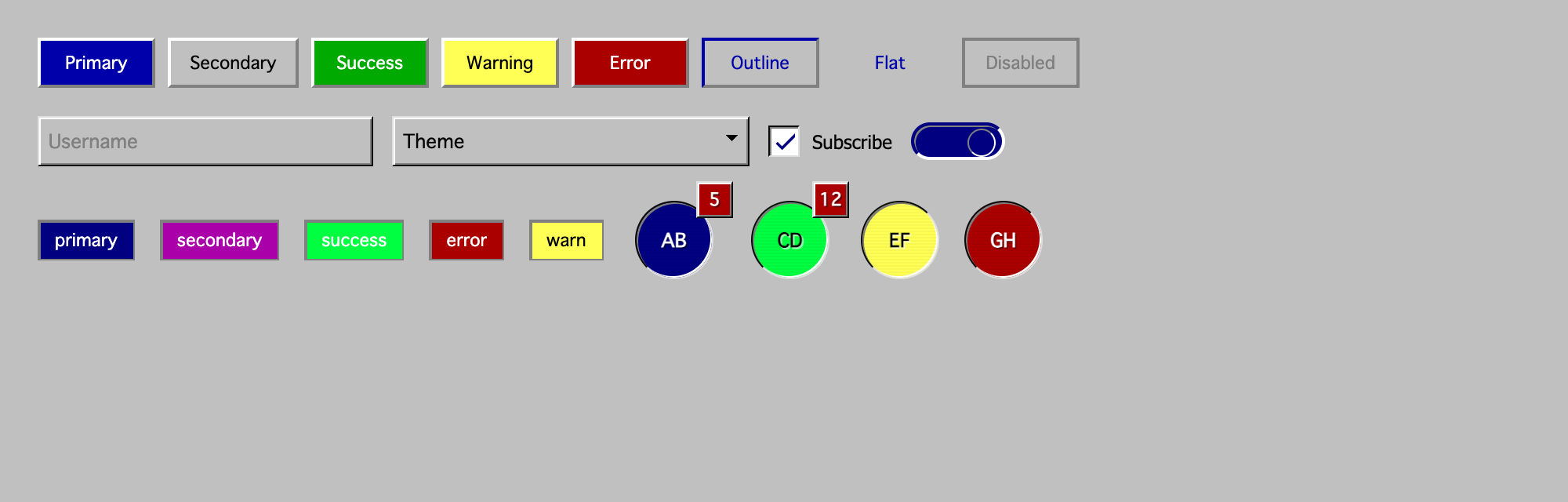
Buttons and actions: Button, ButtonGroup, ToggleButton, ToggleButtonGroup, Chip.
Form controls: Input, PasswordInput, Select, Autocomplete, Checkbox, Radio, Switch, Slider, DocumentUpload.
Data display: Table, Statistics, Avatar, Badge, Tree, SevenSegmentDisplay, Carousel.
Feedback and status: Alert, ProgressBar, Spinner, Skeleton, Stepper.
Navigation: Tabs, Menu, Navbar, Breadcrumbs, Pager.
Layout and containers: Box, Card, Container, Accordion, Divider, FlexibleLayout, Group.
Retro text effects: Text, WordArt, Marquee, TypewriterText.
Dialogs and overlays: Modal, Drawer, Popover, Tooltip.
Atmosphere: CRT, Terminal, StarField, MouseTrail, PixelatedImage, Scrollbar, Background.
See the demo for live props, controls, and source for every component.
Styling
sx prop
Every component accepts an sx prop for one-off overrides:
<Button sx={{ minWidth: 120 }}>Send</Button>
<Text sx={{ color: '#000080' }}>Heading</Text>
retro-ui class
Every component carries a retro-ui class so you can override globally without targeting internals:
.retro-ui {
	font-family: 'Pixelated MS Sans Serif', system-ui;
}
Emotion
styled and useTheme are re-exported for consumers that want their own retro-styled components:
import { styled, useTheme } from 'retro-react';

const Bevel = styled('div')`
	border: 2px solid;
	border-color: #fff #808080 #808080 #fff;
	background: #c0c0c0;
	padding: 8px 12px;
`;
Contributing
Issues and PRs are welcome at github.com/retro-react/retro-react. For non-trivial changes please open an issue first.
License
MIT