
retro8-ui
v0.4.0
Published
Retro8 UI component library authored with Tailwind CSS and shipped as framework-agnostic CSS and optional JavaScript.
Maintainers
 regiszaum
Readme
Retro8 UI
Retro 8-bit UI library authored with Tailwind CSS and shipped as framework-agnostic semantic CSS classes, plus an optional JavaScript runtime for interactive components.
Links
- NPM: https://www.npmjs.com/package/retro8-ui
- Docs: https://regiszaum.github.io/retro8-ui/
Overview
Retro8 UI is a design system for building retro game-inspired interfaces without locking consumers into a specific framework. It is written with Tailwind CSS as an authoring tool, but the public API is intentionally simple:
- semantic class names such as
r8-btn,r8-panel,r8-window, andr8-badge; - compiled CSS that can be imported anywhere;
- optional browser-side JavaScript for components that need runtime behavior;
- no dependency on Vue, React, or any other UI framework.
The goal is to provide a strong visual foundation for plain HTML, React, Next.js, Vue, Nuxt, Astro, Laravel, and similar stacks, while keeping the consumer markup short, readable, and predictable.
You do not need Tailwind CSS in the consuming project. Tailwind is used only to author the library source before the final CSS is compiled.
Why Retro8 UI
- Framework-agnostic by design.
- Semantic class API instead of utility-heavy consumer markup.
- Strong retro 8-bit visual language with thick borders, hard shadows, and pixel-shift interactions.
- Optional JavaScript runtime for dropdowns, dialogs, tabs, drawers, poptips, and other interactive patterns.
- Clear design tokens for color, spacing, borders, shadows, typography, and interaction states.
- Public documentation site with bilingual content, component routes, light mode, dark mode, and live previews.
Core Principles
- CSS-first product. The primary deliverable is compiled CSS.
- Optional runtime. JavaScript is available when behavior is needed, but it is not required for static styling.
- Semantic API. Consumers work with
r8-*classes, not internal Tailwind utilities. - Framework independence. The same assets should work anywhere CSS and browser JavaScript work.
- Scalable architecture. Tokens, components, utilities, and docs-site are organized for maintainability and future npm publishing.
Installation
npm install retro8-uiFor local development inside this repository:
npm installDo I Need Tailwind?
No. Tailwind CSS is not required in the project that consumes retro8-ui.
- If you are using the library, import the compiled assets and write semantic
r8-*classes. - If you are contributing to the library itself, Tailwind is part of the internal authoring and build workflow.
- If your application already uses Tailwind, that is fine, but
retro8-uidoes not depend on it at runtime.
Consumer projects only need these distributable files:
retro8.cssorretro8.min.cssretro8.jsorretro8.min.jsfor interactive components
Package Outputs
The build produces four distributable assets:
dist/retro8.cssdist/retro8.min.cssdist/retro8.jsdist/retro8.min.js
Use the CSS files for styling. Add the JavaScript runtime only if you want ready-to-use interactive behavior.
Quick Start
The standard consumer flow is:
- install the package
- import the compiled CSS
- import the optional JS runtime when behavior is needed
- write semantic HTML with
r8-*classes
Plain HTML
<link rel="stylesheet" href="./node_modules/retro8-ui/dist/retro8.css" />
<script src="./node_modules/retro8-ui/dist/retro8.js"></script>

<button class="r8-btn r8-btn--primary" type="button">
  Start Mission
</button>
ESM / Bundler
import "retro8-ui/retro8.css";
import "retro8-ui/retro8.js";
CSS-only usage
If your project does not need runtime behavior, import only the stylesheet:
import "retro8-ui/retro8.css";Tailwind in the host app
If your app already uses Tailwind, you can keep using it for layout or application-specific styling. retro8-ui still works the same way: import the compiled bundle and use the semantic component classes.
Usage by Stack
React / Next.js / Vite
import "retro8-ui/retro8.css";
import "retro8-ui/retro8.js";

export function Example() {
  return (
    <button className="r8-btn r8-btn--danger" type="button">
      Delete Save
    </button>
  );
}
Vue / Nuxt
<script setup>
import "retro8-ui/retro8.css";
import "retro8-ui/retro8.js";
</script>

<template>
  <button class="r8-btn r8-btn--success" type="button">
    Confirm
  </button>
</template>
Laravel / Blade
<link rel="stylesheet" href="{{ asset('vendor/retro8-ui/retro8.css') }}">
<script src="{{ asset('vendor/retro8-ui/retro8.js') }}"></script>

<section class="r8-panel">
  <div class="r8-panel__body">
    Retro content goes here.
  </div>
</section>
Public API Convention
The public API follows a simple naming system:
- Prefix:
r8- - Base class:
r8-btn,r8-window,r8-navbar - Modifier:
r8-btn--primary,r8-btn--danger,r8-badge--success - Inner element:
r8-window__titlebar,r8-panel__footer,r8-dialog__body
This convention keeps the library readable, predictable, and easy to document.
Example Markup
<section class="r8-panel">
  <div class="r8-panel__header">
    <h2 class="r8-panel__title">Pilot Profile</h2>
  </div>

  <div class="r8-panel__body r8-stack">
    <label class="r8-field">
      <span class="r8-label">Callsign</span>
      <input class="r8-input" type="text" placeholder="PIX-07" />
    </label>

    <div class="r8-row">
      <span class="r8-badge r8-badge--info">online</span>
      <button class="r8-btn r8-btn--primary" type="button">Save</button>
      <button class="r8-btn r8-btn--ghost" type="button">Cancel</button>
    </div>
  </div>
</section>
Optional JavaScript Runtime
The runtime is designed to feel similar to the role Bootstrap JavaScript plays for Bootstrap CSS: it enhances components that need client-side behavior while leaving the styling system usable on its own.
The current runtime covers patterns such as:
- dropdowns;
- dialogs;
- drawers;
- tabs;
- collapses;
- carousels;
- select-like controls;
- sliders;
- input tags;
- transfer lists;
- poptips, dialogs, and dismissible feedback surfaces.
You can use the bundled runtime or replace it with your own application logic if your stack already manages state and accessibility behavior.
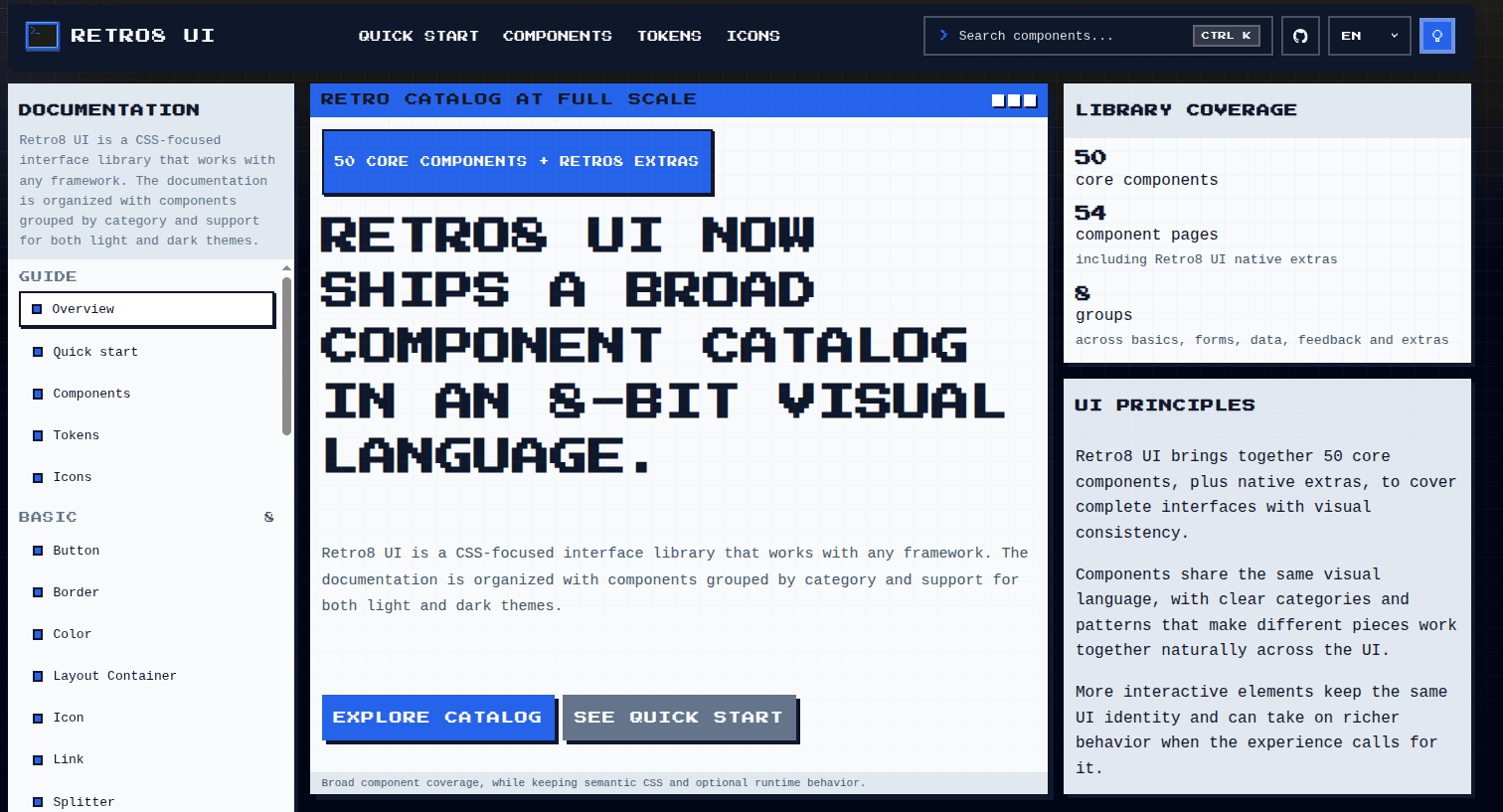
Component Coverage
The current catalog includes:
- 50 core components across the main catalog, plus retro8-ui-specific extras;
- grouped categories across Basic, Configuration, Form, Data, Navigation, Feedback, and Others;
- native
retro8-uiextras such asPanel,Window, andNavbar.
Every documented component has:
- a dedicated documentation page;
- semantic API notes;
- anatomy guidance;
- accessibility notes;
- HTML snippets;
- a live preview in the docs site.
Design Tokens
The design system is built on CSS custom properties covering:
- colors;
- spacing;
- border thickness;
- shadow depth;
- typography;
- focus styles;
- interaction motion.
All components consume the same token layer, which helps preserve visual consistency and makes future theme or skin variations easier to introduce.
Documentation Site
The public docs are built with Nuxt and live in docs-site/. The site includes:
pt-brandenlocales;- individual pages for every component;
- light mode and dark mode;
- live previews powered by the compiled library assets;
- guides for quick start, tokens, icons, and component browsing;
- a local pixel font for the docs interface.
The docs are statically generated, so they can be deployed to any static hosting provider.
Recommended Icon Pairing
retro8-ui does not ship with an icon pack in the core package. That separation is intentional.
The documentation currently recommends external 8-bit icon libraries such as:
This keeps the core package focused on layout, surfaces, and interaction patterns instead of bundling icons by default.
Development
Scripts
npm run buildBuilds the compiled CSS and JavaScript outputs.
npm run devRuns the local development workflow in parallel:
- CSS watch;
- JavaScript runtime watch;
- Nuxt docs site.
npm run build:docsBuilds the library and generates the static docs site in docs-site/.output/public.
npm run previewBuilds everything and previews the generated documentation locally.
Project Structure
retro8-ui/
├── dist/                    # Compiled CSS and JS outputs.
├── docs-site/               # Public Nuxt documentation app.
├── scripts/                 # Build helpers.
├── src/
│   ├── scripts/             # Optional runtime source.
│   └── styles/
│       ├── base/            # Tokens and reset layer.
│       ├── components/      # Semantic component styles.
│       ├── utilities/       # Small layout helpers.
│       └── index.css        # Main stylesheet entry point.
├── package.json
├── postcss.config.cjs
├── tailwind.config.cjs
└── README.md
Architecture Notes
- Tailwind CSS is used for authoring, not as the public consumer API.
- Tailwind
preflightis disabled to reduce unwanted global resets in host projects. - PostCSS, Autoprefixer, and cssnano handle the CSS pipeline.
- The JavaScript runtime is intentionally lightweight and browser-first.
- The documentation app is separate from the library package, so the product remains framework-agnostic.
License
MIT