
reveal.js-copycode
v1.4.2
Published
A simple plugin for Reveal.js that automatically shows a copy button in code blocks
Maintainers
 martinomagnifico
Readme
CopyCode


A simple plugin for Reveal.js that automatically shows a 'copy' button in code blocks.
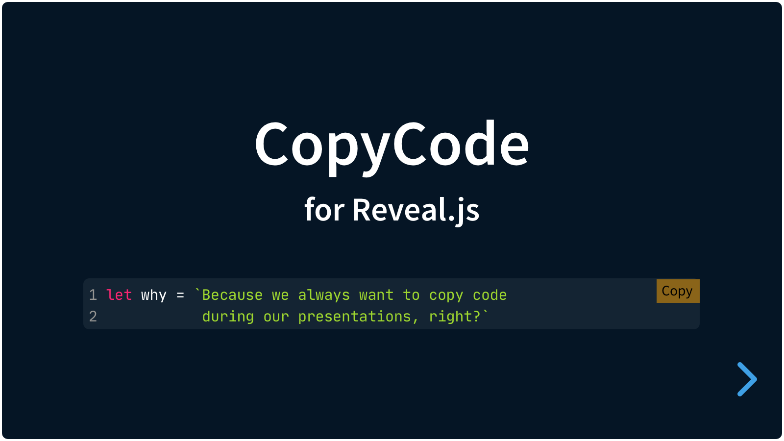
In Reveal.js presentations we can show blocks of code. This plugin for Reveal.js adds a 'copy' button to each of those, and optionally displays them in a macOS-style window frame.
It's easy to set up. If your code blocks are set up like this:
<pre>
  <code>
    Here is the code
  </code>
</pre>
…then install the plugin and a 'Copy' button is automatically added to any pre code block.
Setup
Basics
There are really only three steps:
- Install CopyCode
- Copy your code from a code block
- Paste your code somewhere
Installation
Regular installation
Copy the plugin > copycode folder to the plugins folder of the reveal.js folder, like this: plugin/copycode.
npm installation
This plugin is published to, and can be installed from, npm.
npm install reveal.js-copycodeThe CopyCode plugin folder can then be referenced from node_modules/reveal.js-copycode/plugin/copycode.
Adding CopyCode to your presentation
JavaScript
There are two JavaScript files for CopyCode, a regular one, copycode.js, and a module one, copycode.mjs. You only need one of them:
Regular
If you're not using ES modules, for example, to be able to run your presentation from the filesystem, you can add it like this:
<script type="text/javascript" src="dist/reveal.js"></script>
<script src="plugin/copycode/copycode.js"></script>
<script>
	Reveal.initialize({
		// ...
		plugins: [ CopyCode ]
	});
</script>
From npm
You can run it directly from npm:
<script type="module">
	import Reveal from 'reveal.js';
	import CopyCode from 'reveal.js-copycode';
	import 'reveal.js-verticator/plugin/copycode/copycode.css';
	Reveal.initialize({
		// ...
		plugins: [ CopyCode ]
	});
</script>
Otherwise, you may want to copy the plugin into a plugin folder or an other location::
<script type="module">
	import Reveal from './dist/reveal.mjs';
	import CopyCode from './plugin/copycode/copycode.mjs';
	import './plugin/copycode/copycode.css';
	Reveal.initialize({
		// ...
		plugins: [ CopyCode ]
	});
</script>
Styling
The styling of CopyCode is automatically inserted when the copycode folder is manually copied to the Reveal.js plugin folder.
If you import reveal.js-copycode from npm, you will need to import the CSS file yourself. Depending on your setup this can be something like this:
import 'reveal.js-copycode/plugin/copycode/copycode.css';CopyCode will detect if it runs in a module environment and will then not autoload the CSS. You can still set cssautoload to true if you like, but your bundler (Vite, Webpack) may not like that. In any of these cases, import the CSS file yourself.
If you want to change the CopyCode style, you do a lot of that via the Reveal.js options. Or you can simply make your own style and use that stylesheet instead. Linking to your custom styles can be managed through the csspath option of CopyCode or through import when using modules.
Custom CSS
If and when you decide to create your own CSS file, make sure that you also include the following CSS variable, that is used by the plugin to avoid loading the CSS multiple times, and to avoid using the autoloading feature when using modules:
:root {
    --cssimported-copycode: true;
}
Now change it
The following per-element changes use data-attributes. See the markdown demo for the instructions to add these data-attributes in MarkDown.
Disable CopyCode per element
To completely disable CopyCode for a specific code block:
<pre data-cc="false">
  <code>
    Here is the code
  </code>
</pre>
Window mode
Display code blocks in a macOS-style window frame with decorative control buttons:
<pre data-cc-window="My Code Example">
  <code>
    Here is the code
  </code>
</pre>
Enable window without a title:
<pre data-cc-window="true">
  <code>
    Here is the code
  </code>
</pre>
Alternative: use separate title attribute:
<pre data-cc-window="true" data-cc-window-title="app.js">
  <code>
    function app() {}
  </code>
</pre>
Disable window mode (when globally enabled):
<pre data-cc-window="false">
  <code>
    Here is the code
  </code>
</pre>
Customize window appearance:
<pre data-cc-window="Terminal"
     data-cc-window-controls="dark"
     data-cc-window-controls-opacity="0.8">
  <code>
    npm install
  </code>
</pre>
This can also be set globally. See Global options below.
Window data attributes:
| Attribute | Value | Description |
|-----------|-------|-------------|
| data-cc-window | string | "true" | "false" | Enable/disable window mode. If string (other than "true" or "false"), uses value as title |
| data-cc-window-title | string | Alternative way to set window title |
| data-cc-window-controls | 'color' | 'light' | 'dark' | Override control circle style |
| data-cc-window-controls-opacity | number (0-1) | Override control circle opacity |
| data-cc-window-padding | string | Override window padding (any valid CSS value like '1rem', '8px', '0.5rem 1rem') |
Change button visibility per element
Show button only on hover:
<pre data-cc-button="hover">
  <code>
    Here is the code
  </code>
</pre>
Always show the button:
<pre data-cc-button="always">
  <code>
    Here is the code
  </code>
</pre>
Hide the button (but keep any decorative frame in window mode):
<pre data-cc-window="Code Example" data-cc-button="false">
  <code>
    Here is the code
  </code>
</pre>
No button, nor decorative frame in window mode:
<pre data-cc="false">
  <code>
    Here is the code
  </code>
</pre>
This can also be set globally. See Global options below.
Note: The older
data-cc="hover"syntax still works for backwards compatibility, butdata-cc-buttonis now the preferred attribute for controlling button visibility.
Change the display of icons per element
Icons only:
<pre data-cc-display="icons">
  <code>
    Here is the code
  </code>
</pre>
Or both text and icons:
<pre data-cc-display="both">
  <code>
    Here is the code
  </code>
</pre>
This can also be set globally. See Global options below.
Change the text per element
<pre data-cc-copy="Copy HTML" data-cc-copied="Yes!">
  <code>
    Here is the code
  </code>
</pre>
This can also be set globally. See Global options below.
Global options
There are a few options that you can change from the Reveal.js options. The values below are default and do not need to be set if they are not changed. Some of the options were previously not nested; those overrides will continue to work.
Reveal.initialize({
  // ...
  copycode: {
    button: "always",
    display: "text",
    text: {
      copy: "Copy",
      copied: "Copied!",
    },
    plaintextonly: true,
    timeout: 1000,
    style: {
      copybg: "orange",
      copiedbg: "green",
      copycolor: "black",
      copiedcolor: "white",
      copyborder: "",
      copiedborder: "",
      scale: 1,
      offset: 0,
      radius: 0
    },
    window: false,
    tooltip: true,
    iconsvg: {
      copy: '',
      copied: ''
    },
    cssautoload: true,
    csspath: ""
  },
  plugins: [ CopyCode ]
});button: Set to"always"by default. Can be set to"hover"to only show the button on hover, or"false"to disable the button entirely.display: The copy buttons display only text by default, but this setting can be changed to"icons"to only show icons (based on the GitHub icons) or to"both"to show both text and icons.text: This is an object that contains options for text in the buttonscopy: The text for each copy button.copied: The text for each copy button when the copy action is successful.
plaintextonly: Set this to false to allow copying of rich text and styles.timeout: The time in milliseconds for the "Copied!"-state to revert back to "Copy".style: This is an object that contains options for styling the buttonscopybg: The background color.copiedbg: The background color in the Copied state.copycolor: The text color.copiedcolor: The text color in the Copied state.copyborder: A CSS 'border' rule. Can be, for example "1px solid gray".copiedborder: A CSS 'border' rule. Can be, for example "1px solid green".scale: The scale of the buttons and window elements.offset: The offset (in em) from the top and the right.radius: The border-radius (in em) of the buttons.
window: Controls whether code blocks are displayed in a macOS-style window frame. Can befalse(default),true, or an object with the following properties:title: Default title for all windows (empty by default).controls: Visual style of window control circles. Options:"color"(default, macOS red/yellow/green),"light"(monochrome light), or"dark"(monochrome dark).controlsOpacity: Opacity of the control circles, from 0 to 1 (default:1).padding: Sets the padding for the whole window (default:0.5rem).
tooltip: Show a tooltip at the Copied state, for the icons-only display version.iconsvg: This option is an object with placeholders for SVG icons for the 'copy' and 'copied' state. If left empty, it will use the default icons.copy: An SVG string (<svg>...</svg>) can be pasted here.copied: An SVG string (<svg>...</svg>) can be pasted here.
cssautoload: CopyCode will load the CSS if this is set totrue. If you import reveal.js-copycode from npm, you will need to import the CSS file yourself. If you use 'import', thencssautoloadshould be set tofalse. If you know the path to the CSS file, you can use thecsspathoption and keepcssautoloadset totrue.csspath: CopyCode will automatically load the styling. If you want to customise the styling, you can link to your own CSS file here.
Example configurations
GitHub-style buttons
To make the buttons look more like the standard GitHub copy-buttons:
copycode: {
  timeout: 1200,
  button: "hover",
  display: "icons",
  style: {
    copybg: "rgba(255,255,255,128)",
    copiedbg: "white",
    copyborder: "2px solid gray",
    copiedborder: "2px solid green",
    copiedcolor: "green",
    offset: 0.5,
    radius: 0.2
  }
}
Window mode with custom appearance
To enable window mode globally with dark controls:
copycode: {
  window: {
    controls: "dark",
    controlsOpacity: 0.7,
    padding: "1rem"
  }
}
Window mode with simple enable
To enable window mode with default settings:
copycode: {
  window: true
}
Manual styling
Just change the provided stylesheet and do not override it from the config.
Like it?
If you like it, please star this repo.
License
MIT licensed
Copyright (C) 2026 Martijn De Jongh (Martino)