
reveal.js-fsfx
v1.3.0
Published
A plugin for Reveal.js that enters or exits fullscreen, and toggles classes on certain elements

Maintainers
 martinomagnifico
Readme
FsFx


A plugin for Reveal.js, that enters or exits fullscreen, and toggles classes on certain elements.
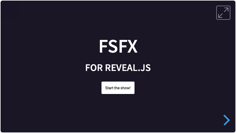
Sometimes you would like to have a button that starts a presentation and goes fullscreen at the same time. This plugin does just that. And some other things.
Here's a demo of a project that uses the FsFx.js plugin, and an embedded demo with two decks on one page.
FsFx.js does multiple things:
- It sets a class for buttons that should switch the browser to fullscreen or exit it. On unsupported devices, these buttons get configurable styling.
- Optional: It allows a fullscreen-button to also let Reveal.js go to the next slide, and set an optional delay for it.
- Optional: It looks for elements in the presentation that need to have a class toggled on entering fullscreen and sets that class; it will remove the class on exiting fullscreen. The class can be set per element. Nice for an icon on the fullscreen button itself.
- The Reveal DOM element always gets a
fullscreenclass in fullscreen, whether or not anything else is set to toggle. A slide cannot reach outside itself to add an attribute to that element, so generated decks — Quarto, for one — have no other way to style the fullscreen state. - Optional: in auto-mode, it is possible to auto-generate a single fullscreen button that is visible on all slides. The styling copies the style of the demo.
Breaking changes
In previous versions FsFx would set the styling of fullscreen buttons to display: inline-block through JavaScript, if the Fullscreen API was supported. It would rely on the user setting display:none in their CSS, so that buttons in unsupported browsers would not be shown.
- From FsFx version 1.2.0 onwards, fullscreen buttons can be added to the markup in any way that the user wants: block, inline-block, flex or whatever. That is just part of the design process. Unsupported buttons can now be hidden by either a global configuration, or per element with a data-attribute. This way, buttons can also use other styling, like
opacity: 0, to avoid shifting other elements in the markup. - A compatibility mode is now added, and set to
trueby default. If you have removed thedisplay:nonefrom your styling (if that's what was used with a previous version of FsFx), then it is safe to turn off compatibility mode.
Non-breaking changes
- A new auto-mode has been added. See "auto mode" section below on how to use it.
- The icons like in the demo are automatically inserted in this plugin. See the "Included icons" section below on how to use it, even without auto-mode.
Installation
FsFx.js automatically includes a (great) script to be able to function: Screenfull.js by Sindre Sorhus. This checks the capabilities of the browser to go fullscreen.
Regular installation
Copy the fsfx folder to the plugins folder of the reveal.js folder, like this: plugin/fsfx.
npm installation
This plugin is published to, and can be installed from, npm.
npm install reveal.js-fsfxThe FsFx plugin folder can then be referenced from node_modules/reveal.js-fsfx/plugin/fsfx
Setup
JavaScript
There are two JavaScript files for FsFx, a regular one, fsfx.js, and a module one, fsfx.mjs. You only need one of them. (The older name fsfx.esm.js still works: it re-exports fsfx.mjs, so decks that load it by path keep running.)
Regular
If you're not using ES modules, for example, to be able to run your presentation from the filesystem, you can add it like this:
<script type="text/javascript" src="dist/reveal.js"></script>
<script type="text/javascript" src="plugin/fsfx/fsfx.js"></script>
<script>
    Reveal.initialize({
        ...
        plugins: [ FsFx ]
    });
</script>
As a module
If you're using ES modules, you can add it like this:
<script type="module">
    // This will need a server
    import Reveal from './dist/reveal.esm.js';
    import FsFx from './plugin/fsfx/fsfx.mjs';
    Reveal.initialize({
        // ...
        plugins: [ FsFx ]
    });
</script>
CSS
FsFx ships a stylesheet, fsfx.css, which holds the icon font, the background of a fullscreen element, and the styling of the auto-generated button. Earlier versions wrote all of that into a <style> tag from JavaScript; it is a real file now, so your own CSS can override it.
You do not have to link it yourself. FsFx loads it from beside its own script, which works for both of the installations above. If you keep your stylesheets somewhere else, point at it:
fsfx: {
    csspath: 'css/fsfx.css'
}
And if you would rather bundle it yourself, or import it in your own build, switch the loading off:
fsfx: {
    cssautoload: false
}
Configuration
There are a few options that you can change from the Reveal.js options. The values below are default and do not need to be set if they are not changed.
Reveal.initialize({
    // ...
    fsfx: {
        baseclass: 'fsbutton',
        hideifnofs: true,
        nofsfxCss: 'display: none;',
        compatibility: true,
        cssautoload: true,
        csspath: '',
        auto: {
            generate: true,
            color: '',
            oppositecolor: '',
            position: {
                right: '20px',
                top: '20px'
            }
        },
        debugfsdisabled: false,
        icons: {
            enter: '<svg ...>...</svg>',
            exit: '<svg ...>...</svg>'
        }
    },
    plugins: [ FsFx ]
});baseclass: The baseclass of the fullscreen button(s). Change it if you like.hideifnofs: Hide any fullscreen button if the fullscreen API is not supported. See Unsupported browsers section below.nofsfxCss: How to hide any buttons that are hidden with the above setting, which applies one or multiple CSS rules. This can also be set per element with a data-attribute. See Unsupported browsers section below.compatibility: Older versions of FsFx rely on the user settingdisplay:nonein their CSS. If this is still the case in your styling, please remove that; then you can setcompatibilitytofalse.cssautoload: Whether FsFx loads its own stylesheet. See the CSS section above.csspath: Where that stylesheet is, if it is not beside the plugin's script.auto: Since FsFx 1.2.0, you can auto-generate a fullscreen button which is visible on every slide. See "auto mode" section below.color: The auto-generated button takes its color from the theme, and needs no setting. Give this one any CSS color to overrule that.oppositecolor: The same, for a slide whose background contrasts the theme — a white slide in a dark deck, say. The button already turns around on such a slide by itself; this is only for naming a color for that case.position: This sets the position of the auto-generated button. You can also useleftandbottomif needed. A position you set replaces the default one, so{ bottom: '20px', left: '20px' }puts the button in the bottom left corner. The button stays in that corner of what the reader sees in every view: the window, the box of an embedded deck, and in scroll view.
debugfsdisabled: If you're designing a presentation, and want to know what it looks like if there is no Fullscreen API support, set this to true.icons: The two icons, as SVG markup:enteris shown outside fullscreen,exitin fullscreen. See Included icons below.
HTML
Manually adding buttons
It is easy to set up your fullscreen buttons in HTML. Adding the class 'fsbutton', or the class you put in the configuration, suffices:
<button class="fsbutton">Start the show!</button>Optional 'auto' mode
Fullscreen buttons can be added to your slides manually, as shown right above. However, it is much nicer to have a single fullscreen button which is visible on every slide, but not part of those slides. Adding HTML outside of the main slides might be difficult to do yourself, or could not be part of the development flow.
You can now let FsFx auto-generate a (single) fullscreen button like that. This button is visible on every slide, except on slides with a data-attribute of data-state="no-fsfx-button". On those slides it will be hidden or shown differently with the same style as the nofsfxCss setting.
Auto-mode is turned on by default, but can be turned off in the configuration.
FsFx will also check if there are already fullscreen buttons with the base class in the viewport, like in a menubar. If so, there will be no button generated even if auto-mode is enabled.
Optional 'Next slide' functionality
This allows a fullscreen-button to also let Reveal.js go to the next slide, and set an optional delay for it. Add a data-fs-gonext attribute to the button. It would be wise to give it a value (in milliseconds).
<button class="fsbutton" data-fs-gonext="2000">Start the show!</button>Optional class toggle functionality
Add a data-fs-toggle attribute to any element. This adds that toggle-class to the element if the browser goes fullscreen. The easiest is to add it to the body, and then style your elements from that cascade, but per element is also possible:
<p data-fs-toggle="hide">I have the class 'hide' in fullscreen</p>You do not need this for the deck itself. The Reveal element gets a fullscreen class of its own, always, so this works without any attribute being set anywhere:
.reveal.fullscreen .mything {
    /* Only in fullscreen */
}
Styling
Auto styling
If you let FsFx generate a fullscreen button (see "auto mode" section above), the styling for that is already included.
Its color comes from the theme, and follows the slide: on a slide whose background contrasts the theme — a white slide in a dark deck — the button turns around with it. Nothing needs to be configured for that. FsFx reads the theme through the shared plugin toolkit, which publishes --c-theme-color and adds a c-theme-inverted class on such slides, so your own styling can follow the same two:
.myelement {
    color: var(--c-theme-color, currentColor);
}
If you want the button to be a specific color instead, set color and, for contrasting slides, oppositecolor in the auto options.
Manual styling
If you have other fullscreen buttons in your presentation, you should add the styling of the fullscreen buttons yourself, to fit in with the rest.
Color is the exception, because it usually wants to come from whatever the button sits in. A button in a Simplemenu bar should be the color of that bar, including a color you set on the bar yourself. A browser gives every button a color of its own, which would leave it black inside a light bar, so FsFx adds a class of fsfx-button to each button it wires and lets it inherit instead.
The same class centres the icon: the button is an inline-flex box with its icon in the middle, so it is as tall as the icon and its padding, whatever font or line height it sits in, and a button beside it with an icon of the same size lines up.
That rule carries no weight of its own: any color or display you set on your own buttons wins over it, and it only ever replaces the browser's default.
/* Your rule wins. */
.fsbutton {
    color: cornflowerblue;
}
Included icons
FsFx includes two line icons, one for entering fullscreen and one for leaving it. They are SVG, drawn in currentColor, so an icon has the colour of the button it is in, including a button in a Simplemenu bar.
- In auto-mode, they are already included in the generated button.
- In manual mode, they can be added to your buttons with the class
icon-fs. FsFx puts both icons at the end of the button and shows one. To make sure that the icon toggles with the toggle functionality, add thedata-fs-toggle="icon-fsexit"to it as well, like this:
<button class="fsbutton icon-fs" data-fs-toggle="icon-fsexit">Start the show!</button>The line width of the included icons is 1.5, in their 24 by 24 drawing. Set --fsfx-icon-stroke-width to change it:
:root {
    --fsfx-icon-stroke-width: 2;
}
To use your own icons, give their SVG markup in the configuration. Use currentColor in them to keep following the button's colour. Scripts and event attributes are removed, and the icons are sized to the button's text. Your icons keep their own line width; --fsfx-icon-stroke-width is for the included ones.
fsfx: {
    icons: {
        enter: '<svg viewBox="0 0 24 24" fill="none" stroke="currentColor" stroke-width="2">...</svg>',
        exit: '<svg viewBox="0 0 24 24" fill="none" stroke="currentColor" stroke-width="2">...</svg>'
    }
}
Unsupported browsers
Several things happen when a the Fullscreen API is not supported:
- A class of
no-fsfxwill be added to the body. You can use it to show warnings, hide elements etcetera. - If the setting
hideifnofsis set totrue, which is the default setting, fullscreen buttons will be hidden. Otherwise, a fullscreen button just sits there unable to do anything because the Fullscreen API is not supported. Hiding the buttons does 2 things:It sets
pointer-events: noneto the buttons.It sets the
nofsfxCssglobal styling to it. To change this globally, for example to make the button transparent instead of not displayed at all, change the styling in the config like this:nofsfxCss: 'opacity: 0'The above style can also be set per element (which overrides the global setting), with a data-attribute of
data-nofsfx-css. You can use this if you have several fullscreen buttons, but want different behaviour from them.<button class="fsbutton" data-nofsfx-css="opacity: 0">Go fullscreen</button>
A fullscreen button will not be hidden with the hideifnofs option, if a data-fs-gonext attribute (see "HTML" section above) is also set. This means that that button's functionality will fall back to 'next slide' only, if there is no fullscreen support.
Like it?
If you like it, please star this repo!
And if you want to show off what you made with it, please do :-)
License
MIT licensed
Copyright (C) 2026 Martijn De Jongh (Martino)