
richmoshiur
v1.2.2
Published
A lightweight, fully-typed React rich text editor component with formatting, lists, and link support

Maintainers
 moshiurrahmandeap
Readme
richmoshiur
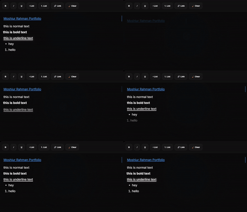
richmoshiur is a lightweight, fully-typed React rich text editor component built for modern TypeScript applications. It provides a polished editing toolbar with formatting controls, list management, link insertion, and comprehensive type definitions for seamless IDE support.
Banner
Features
- ✨ Bold, italic, and underline formatting
- 📝 Ordered and unordered lists
- 🔗 Inline link insertion with URL validation
- 📋 Paste handling that preserves plain text content
- 🎨 CSS module styling for encapsulated editor styles
- 📦 Full TypeScript support with exported type definitions
- 🔄 Dual bundle output (ESM and CommonJS)
- ⚡ Lightweight and optimized for modern React applications
Installation
npm install richmoshiurUsage
JavaScript
import { useState } from 'react';
import { RichTextEditor } from 'richmoshiur';

function App() {
  const [content, setContent] = useState('');

  return (
    <RichTextEditor
      value={content}
      onChange={setContent}
      placeholder="Start typing..."
    />
  );
}
TypeScript
import { useState } from 'react';
import { RichTextEditor, RichTextEditorProps } from 'richmoshiur';

function App() {
  const [content, setContent] = useState<string>('');

  const handleChange = (newContent: string) => {
    setContent(newContent);
  };

  return (
    <RichTextEditor
      value={content}
      onChange={handleChange}
      placeholder="Start typing..."
    />
  );
}
Props
The RichTextEditor component accepts the following props:
interface RichTextEditorProps {
  /** The current content of the editor as HTML string */
  value: string;

  /** Callback function called when editor content changes */
  onChange: (content: string) => void;

  /** Placeholder text shown in the editor */
  placeholder?: string;
}
| Prop | Type | Default | Description |
|------|------|---------|-------------|
| value | string | required | The editor content as HTML. |
| onChange | (content: string) => void | required | Called when editor content changes. |
| placeholder | string | "Start typing..." | Placeholder text displayed inside the editor. |
Development
Build the package locally:
npm run buildType-check TypeScript files:
npm run type-checkPublishing
The package is published to npm with GitHub Actions integration. When you push to the main branch, the package will automatically build and publish if the version in package.json has been updated.
For manual publishing:
npm publish --access publicIf your npm account requires two-factor authentication, include an OTP:
npm publish --access public --otp=123456Replace 123456 with your current npm authenticator code.
Browser Support
- Chrome/Edge: Latest 2 versions
- Firefox: Latest 2 versions
- Safari: Latest 2 versions
The component uses modern JavaScript and React 18+ APIs.
License
MIT - See LICENSE file for details