
richtext-core-angular
v0.2.0
Published
Angular wrapper for Eddyter editor
Maintainers
 eddyter-core
Readme
richtext-core-angular


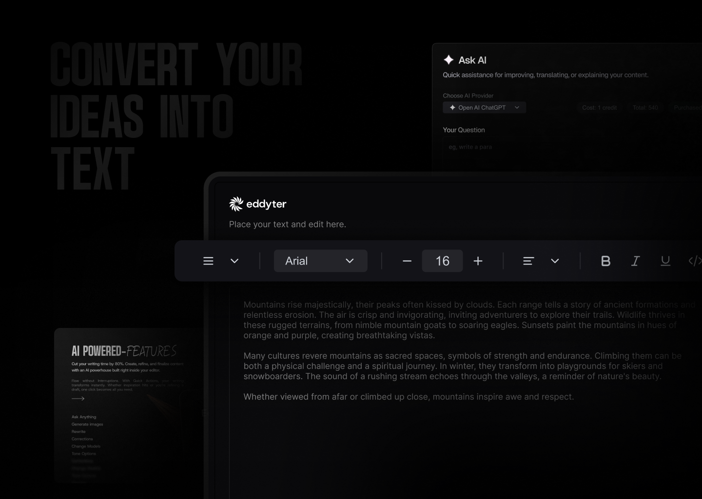
Plug and Play AI Rich Text Editor for Angular — built on Lexical with dark mode support, full reactive forms integration (ControlValueAccessor), and API key authentication.
This is the official Angular wrapper for the Eddyter editor. It exposes the editor as a standalone Angular component (<eddyter-editor>) that works seamlessly with ngModel and Reactive Forms, while internally calling richtext-core-sdk under the hood.
Resources
- Docs — Full API reference and integration guides
- What is Eddyter? Why Developers Are Switching to This AI Editor (2026) — YouTube
- Integrate Eddyter in 30 Minutes Using AI Tools Cursor, Claude, Lovable — YouTube
Installation
npm install richtext-core-angular
# or
yarn add richtext-core-angular
# or
pnpm add richtext-core-angular
You'll also need to load the editor stylesheet once in your global styles. Add this line to your app's global stylesheet (e.g. styles.css or styles.scss):
@import 'richtext-core-angular/styles.css';Or include it via the styles array in angular.json:
{
  "styles": [
    "src/styles.css",
    "node_modules/richtext-core-angular/styles.css"
  ]
}
Compatibility
| Requirement | Version | |-------------|---------| | Angular | 17, 18, 19, 20, 21 | | Node.js | 18+ | | Browsers | Evergreen (Chrome, Edge, Firefox, Safari) |
The wrapper depends on
richtext-core-sdk, which bundles React + ReactDOM internally. Your Angular app does not need to install or configure React.
Quick Start
1. Get your API key
- Create an account at eddyter.com
- Navigate to License Keys in your dashboard
- Copy your API key
2. Use the component
// app.component.ts
import { Component } from '@angular/core';
import { FormsModule } from '@angular/forms';
import { EddyterAngularComponent } from 'richtext-core-angular';

@Component({
  selector: 'app-root',
  standalone: true,
  imports: [EddyterAngularComponent, FormsModule],
  template: `
    <eddyter-editor
      [(ngModel)]="html"
      [apiKey]="apiKey"
      [user]="currentUser"
      [mentionUserList]="['Alice', 'Bob', 'Charlie']"
      (ready)="onReady()"
      (authError)="onAuthError($event)"
    ></eddyter-editor>
  `,
})
export class AppComponent {
  apiKey = 'YOUR_API_KEY';
  html = '<p>Start writing...</p>';

  currentUser = {
    id: 'user-123',
    name: 'John Doe',
    email: '[email protected]',
    avatar: 'https://example.com/avatar.jpg',
  };

  onReady() {
    console.log('Editor ready!');
  }

  onAuthError(error: string) {
    console.error('Auth failed:', error);
  }
}
Reactive Forms
The component implements ControlValueAccessor, so it plugs into reactive forms out of the box:
import { ReactiveFormsModule, FormControl } from '@angular/forms';

@Component({
  standalone: true,
  imports: [EddyterAngularComponent, ReactiveFormsModule],
  template: `
    <eddyter-editor
      [apiKey]="apiKey"
      [formControl]="content"
    ></eddyter-editor>
  `,
})
export class EditorPage {
  apiKey = 'YOUR_API_KEY';
  content = new FormControl('<p>Hello!</p>');
}
Features
Text & Formatting
- Bold, italic, underline, strikethrough, subscript, superscript
- Text color and background highlight with color picker
- 20+ font families with adjustable font sizes
- Text alignment (left, center, right, justify)
- Line height and letter spacing controls
Lists & Structure
- Bullet lists, numbered lists (decimal, alpha, roman)
- Interactive checklists with strikethrough
- Headings (H1-H6), blockquotes
- Horizontal rules
Tables
- Insert/delete rows and columns, merge cells
- Drag-to-resize columns and rows
- Header row styling, row striping
- Right-click context menu for table actions
Media
- Image upload with drag-drop and 8-point resize handles
- Video embed with drag-drop and paste support
- File attachments (downloadable files)
- Link insertion with floating editor
- Automatic link preview on hover
- Rich embeds for external content (YouTube, etc.)
AI Features (Premium)
- AI Chat assistant for content help
- Smart autocomplete (AI-powered text suggestions)
- Real-time grammar check and corrections
- Text enhancement (improve, shorten, expand)
- Tone adjustment (formal, casual, professional)
- AI image generation from text prompts
Advanced
- Slash commands (
/for quick formatting) - @Mentions with customizable user list
- Inline comments with bubble UI and sidebar
- Note panels (info, warning, error, success)
- Code blocks with syntax highlighting
- Interactive charts
- Digital signature capture
- Voice input / transcription
- Export to PDF
- HTML view toggle
- Drag-and-drop block reordering
- Markdown shortcuts
Dark Mode
The editor automatically detects your app's theme:
- Checks for
darkclass on<html>or<body> - Falls back to
prefers-color-scheme: darksystem preference - Or set explicitly via
[darkMode]— changes apply at runtime without remounting.
<eddyter-editor [apiKey]="apiKey" [darkMode]="isDark"></eddyter-editor>Preview Mode
Display saved editor content in read-only mode with interactive features:
<eddyter-editor
  [apiKey]="apiKey"
  [value]="savedHtml"
  mode="preview"
  containerClass="my-preview-styles"
  (previewClick)="switchToEditMode()"
></eddyter-editor>
API Reference
<eddyter-editor>
The main editor component. Selector: eddyter-editor. Standalone component (no NgModule required).
Inputs
| Input | Type | Required | Description |
|-------|------|----------|-------------|
| apiKey | string | Yes | Your Eddyter license key |
| value | string | No | HTML content. Two-way bind via [(value)] or use [(ngModel)] / [formControl] |
| user | EddyterCurrentUser | No | Current user for comments / mentions. Defaults to anonymous |
| mode | 'edit' \| 'preview' | No | Editor mode (default: 'edit') |
| darkMode | boolean | No | true/false. Omit to auto-detect host's .dark class |
| customVerifyKey | (key: string) => Promise<EddyterApiResponse> | No | Use your own backend to validate the API key |
| mentionUserList | string[] | No | Names that appear in @mention suggestions |
| defaultFontFamilies | string[] | No | Font family names for the font selector |
| className | string | No | CSS class applied to the outermost editor wrapper |
| containerClass | string | No | CSS class applied to the preview container (only used when mode: 'preview') |
| contentClass | string | No | CSS class applied to the editable content area |
| floatingToolbarClass | string | No | CSS class applied to the floating toolbar and its portal container |
| style | Record<string, string \| number> | No | Inline style object applied to the wrapper |
| toolbar | EddyterToolbarConfig | No | Toolbar behavior (default: { mode: 'sticky', offset: 20, zIndex: 1000 }) |
| editor | EddyterEditorOptions | No | Editor container options (maxHeight) |
| enableReactNativeBridge | boolean | No | Force-enable RN WebView bridge messaging |
Outputs
| Output | Payload | Fires when |
|--------|---------|------------|
| valueChange | string | Editor content changes (debounced) — drives [(value)] / [(ngModel)] |
| ready | void | Editor finished mounting and authenticated |
| authSuccess | void | API key validated successfully |
| authError | string | API key validation failed |
| focus | void | Editor gained focus (React Native bridge) |
| blur | void | Editor lost focus (React Native bridge) |
| heightChange | number | Editor content height changes (React Native bridge) |
| previewClick | void | User clicks anywhere inside the preview (e.g. to open edit mode) |
Forms Integration
The component implements ControlValueAccessor, so it supports:
[(ngModel)]withFormsModule[formControl]and[formControlName]withReactiveFormsModule- Touched / dirty state tracking (touched on blur)
Supporting Types
import type {
  EddyterInstance,
  EddyterCurrentUser,
  EddyterToolbarConfig,
  EddyterEditorOptions,
  EddyterApiResponse,
} from 'richtext-core-sdk';

interface EddyterCurrentUser {
  id: string;
  name: string;
  email?: string;
  avatar?: string;
}

interface EddyterApiResponse {
  success: boolean;
  message: string;
  data?: unknown;
}

interface EddyterToolbarConfig {
  mode?: 'sticky' | 'static';
  offset?: number;
  zIndex?: number;
}

interface EddyterEditorOptions {
  maxHeight?: string | number;
}
Toolbar Configuration
<eddyter-editor
  [apiKey]="apiKey"
  [toolbar]="{ mode: 'sticky', offset: 64, zIndex: 1200 }"
></eddyter-editor>
Modes:
mode: 'sticky'-> toolbar detaches/sticks while scrolling and appliesoffset+zIndexmode: 'static'-> toolbar stays attached and ignoresoffset+zIndexeven if provided
Defaults: { mode: 'sticky', offset: 20, zIndex: 1000 }.
In static mode, if you want only the editor content area to scroll, pass a maxHeight using editor:
<eddyter-editor
  [apiKey]="apiKey"
  [toolbar]="{ mode: 'static' }"
  [editor]="{ maxHeight: 600 }"
></eddyter-editor>
Examples
Basic Editor
@Component({
  standalone: true,
  imports: [EddyterAngularComponent],
  template: `
    <eddyter-editor
      [apiKey]="'your-api-key'"
      (ready)="console.log('Ready!')"
    ></eddyter-editor>
  `,
})
export class BasicEditorComponent {}
Editor with Reactive Forms & Save
@Component({
  standalone: true,
  imports: [EddyterAngularComponent, ReactiveFormsModule],
  template: `
    <eddyter-editor
      [apiKey]="apiKey"
      [formControl]="content"
    ></eddyter-editor>
    <button (click)="save()">Save</button>
  `,
})
export class EditorWithFormComponent {
  apiKey = 'your-api-key';
  content = new FormControl('<p>Start writing...</p>');

  async save() {
    await fetch('/api/save', {
      method: 'POST',
      headers: { 'Content-Type': 'application/json' },
      body: JSON.stringify({ content: this.content.value }),
    });
  }
}
Comments & Mentions
@Component({
  standalone: true,
  imports: [EddyterAngularComponent],
  template: `
    <eddyter-editor
      [apiKey]="apiKey"
      [user]="currentUser"
      [mentionUserList]="['Alice', 'Bob', 'Charlie']"
    ></eddyter-editor>
  `,
})
export class CommentsEditor {
  apiKey = 'your-api-key';
  currentUser = {
    id: 'u-1',
    name: 'Jane Doe',
    email: '[email protected]',
  };
}
Custom API Key Verification
@Component({
  standalone: true,
  imports: [EddyterAngularComponent],
  template: `
    <eddyter-editor
      [apiKey]="apiKey"
      [customVerifyKey]="customVerifyKey"
    ></eddyter-editor>
  `,
})
export class CustomAuthEditor {
  apiKey = 'your-api-key';

  customVerifyKey = async (apiKey: string) => {
    try {
      const res = await fetch('/api/verify-key', {
        method: 'POST',
        headers: { 'Content-Type': 'application/json' },
        body: JSON.stringify({ apiKey }),
      });
      const data = await res.json();
      return { success: data.valid, message: data.message || 'Verified' };
    } catch {
      return { success: false, message: 'Verification failed' };
    }
  };
}
Theme Toggle Without Remount
@Component({
  standalone: true,
  imports: [EddyterAngularComponent],
  template: `
    <button (click)="isDark = !isDark">Toggle theme</button>
    <eddyter-editor [apiKey]="apiKey" [darkMode]="isDark"></eddyter-editor>
  `,
})
export class ThemedEditor {
  apiKey = 'your-api-key';
  isDark = false;
}
Static Toolbar with Scrollable Content
<eddyter-editor
  [apiKey]="apiKey"
  [toolbar]="{ mode: 'static' }"
  [editor]="{ maxHeight: '420px' }"
></eddyter-editor>
Migration
If you are upgrading from an earlier release, two legacy inputs were removed because they targeted SDK options that never reached the underlying editor:
| Old input | New input | Status |
|-----------|-----------|--------|
| previewClass | containerClass | Removed — old value was a no-op |
| editorClass | contentClass | Removed — old value was a no-op |
| — | floatingToolbarClass | New — style the floating toolbar / portal |
- <eddyter-editor [apiKey]="key" previewClass="p" editorClass="c"></eddyter-editor>
+ <eddyter-editor [apiKey]="key" containerClass="p" contentClass="c"></eddyter-editor>
Troubleshooting
| Symptom | Fix |
|---------|-----|
| Editor renders but toolbars look broken | Add richtext-core-angular/styles.css to the styles array in angular.json (or @import it in your global stylesheet). |
| Theme does not switch | Bind [darkMode]="isDark" — it updates the editor without remounting. |
| API key errors | Confirm the key in your env vars and check the network tab for the verification request. |
| ngModel does not update parent | Make sure FormsModule is imported and you're binding via [(ngModel)]. |
License
Eddyter is proprietary software.
- Free for evaluation and non-commercial use
- Commercial use requires a paid license
- SaaS, redistribution, and competing products are prohibited without permission
For commercial licensing, visit eddyter.com