
rn-animated-border-view
v1.0.6
Published
A customizable animated border component for React Native using Reanimated
Maintainers
 bhaveshjadhav9172
Readme
React Native Animated Border
Animated Border is a fully customizable, high-performance animated border component
It allows you to create smooth, continuous clockwise border animations with multi-color segments, making it ideal for enhancing the visual appeal of your app. The component is lightweight, reusable, and works seamlessly on both Android and iOS.
Key Features
- Smooth, continuous clockwise animation
- Fully configurable width, height, colors, speed, and border segments
- High performance using native-thread animations
- Supports multi-color animated segments
- Easy to integrate into any React Native project
- Perfect for highlighting cards, buttons, profile containers, and important UI sections
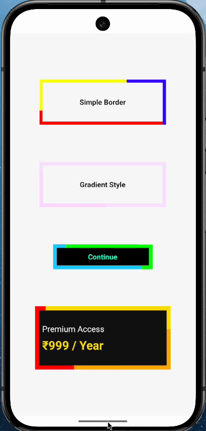
Screenshots
Installation
You can install React Native Animated Border using either npm or Yarn:
Using npm
npm install rn-animated-border-viewor
yarn add rn-animated-border-view Usage/Examples
import AnimatedBorder from 'rn-animated-border-view';

const App = () => {
  return (
    <View>
      <AnimatedBorder
        width={280}
        height={100}
        borderRadius={1}
        segmentWidth={1}
        segmentHeight={1}
        duration={5000}
        totalSegments={140}
        colors={['red', 'yellow', 'blue']}
      >
        <View style={{ alignItems: 'center', justifyContent: 'center', flex: 1 }}>
          <Text style={{}}>App Text</Text>
        </View>
      </AnimatedBorder>
    </View>
  );
};
Props Reference:
| Prop Name | Type | Default | Description | |------------------|---------|------------------------------------------|-------------| | width | Number | 260 | Width of the container | | height | Number | 250 | Height of the container | | children | Node | null | content | | segmentWidth | Number | 30 | Width of each animated segment | | segmentHeight | Number | 20 | Height of each animated segment | | totalSegments | Number | 100 | Total moving animated segments | | duration | Number | 6000 | Animation duration in milliseconds | | colors | Array | ['yellow','black','red'] | Colors used for animation | | backgroundColor | String | transparent | Background color of the container | | boxExtra | Number | 10 | Extra size added for visual glow effect | | containerStyle | Object | null | Optional outer container style |
Performance Notes:
- Uses useSharedValue and useAnimatedStyle for native-thread animations
- Uses memo for each animated segment to avoid unnecessary re-renders
- Border path calculation runs inside a Reanimated worklet for maximum performance
- Suitable for production use without UI lag
Common Use Cases:
- Highlighting profile cards
- Animated CTA buttons
- Dashboard widgets
- Payment and verification screens
- Premium feature highlighting
Troubleshooting:
- If animation does not start, make sure react-native-reanimated is properly installed and the Babel plugin is added.
- If border is not visible, ensure width and height props are greater than segment dimensions.
- Avoid extremely large totalSegments on very low-end devices.
Future Roadmap:
- Rounded corner smoothing
- Gradient animated borders
- Child content inside the animated container
- Shadow and glow presets
- TypeScript support
- NPM package publishing
License
Authors
Contributing
Contributions are always welcome! You can improve performance, add new visual effects, or enhance documentation. Fork the repository, create a new branch, and submit a pull request.