
rn-cross-calendar
v1.0.1
Published
Cross-platform Calendar component for React Native, compatible with React 18/19, RN 0.72+, and RNOH (HarmonyOS)

Maintainers
 rourouyo
Readme
rn-cross-calendar
Cross-platform Calendar component for React Native. Compatible with React 18/19, React Native 0.72+, and RNOH (HarmonyOS/OpenHarmony).
Features
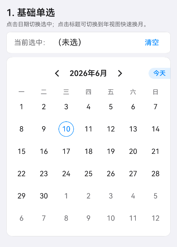
- 📅 Single date & range selection
- 🌓 Automatic light/dark theme adaptation
- 🌍 Built-in zh-CN / en-US locales, fully customizable
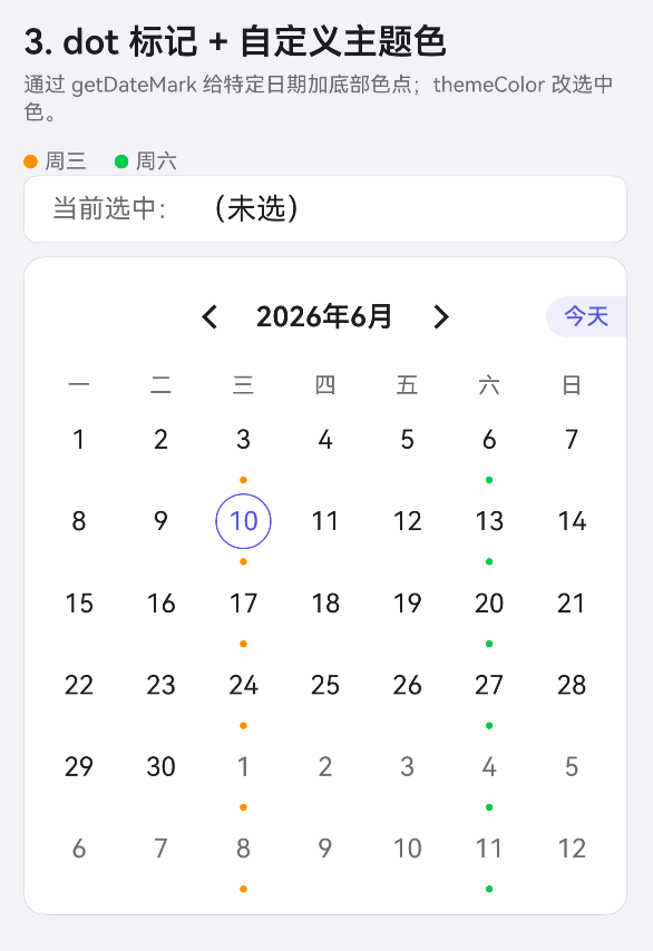
- 📌 Date marking (dots) and custom render
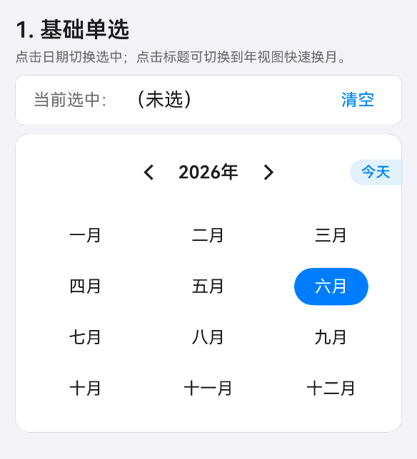
- 📆 Month & year panel views
- 🎨 Themeable colors
- 📱 Zero platform-specific code — works on iOS, Android, and HarmonyOS
Screenshots
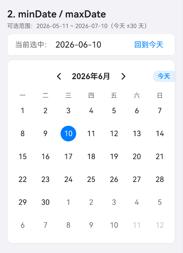
| Basic Single Select | Year Panel | Min/Max Date |
|:---:|:---:|:---:|
|  |
|  |
|  |
|
| Date Marks & Theme | Range Selection | Drawer Picker |
|:---:|:---:|:---:|
|  |
| 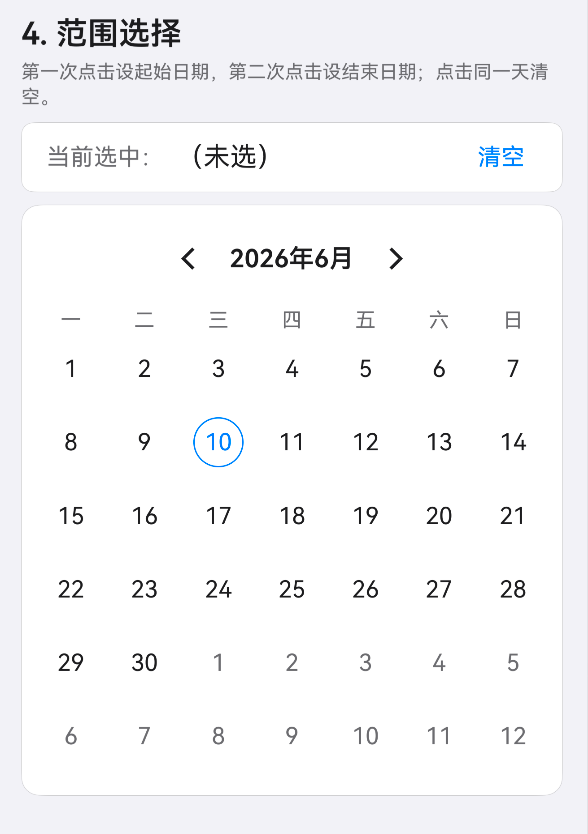 |
| 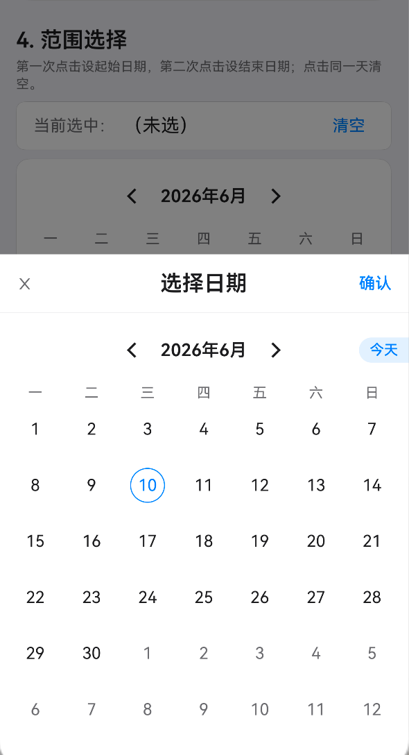 |
|
Install
npm install rn-cross-calendar
# or
yarn add rn-cross-calendar
Peer dependencies
Make sure these are installed in your project:
react>= 18.0.0react-native>= 0.72.0
dayjs is included as a direct dependency.
Quick Start
import React, {useState} from 'react';
import {View} from 'react-native';
import {Calendar} from 'rn-cross-calendar';

export default function App() {
  const [date, setDate] = useState<string | undefined>();

  return (
    <View style={{flex: 1, padding: 16}}>
      <Calendar value={date} onChange={setDate} />
    </View>
  );
}
Usage
Uncontrolled mode
<Calendar
  defaultValue="2025-05-20"
  onChange={d => console.log('Selected:', d)}
/>
Controlled mode
const [date, setDate] = useState('2025-05-20');

<Calendar value={date} onChange={setDate} />;
Range selection
import {Calendar} from 'rn-cross-calendar';
import type {DateRange} from 'rn-cross-calendar';

const [range, setRange] = useState<DateRange>([undefined, undefined]);

<Calendar mode="range" value={range} onChange={setRange} />;- First tap: set start date
- Second tap: set end date (auto-sorted)
- Tap same date: clear range
Min/Max date
import dayjs from 'dayjs';

const min = dayjs().subtract(30, 'day').format('YYYY-MM-DD');
const max = dayjs().add(30, 'day').format('YYYY-MM-DD');

<Calendar value={date} onChange={setDate} minDate={min} maxDate={max} />;
Disabled dates
// Disable weekends
const disabledDate = (d: string) => {
  const wd = dayjs(d).day();
  return wd === 0 || wd === 6;
};

<Calendar value={date} onChange={setDate} disabledDate={disabledDate} />;
Theme
// Override primary color (auto light/dark)
<Calendar value={date} onChange={setDate} theme={{primary: '#FF6B35'}} />

// Full custom
<Calendar
  value={date}
  onChange={setDate}
  theme={{
    primary: '#FF6B35',
    surface: '#000',
    text: '#fff',
    textSecondary: '#999',
  }}
/>
Locale
// English
<Calendar value={date} onChange={setDate} locale="en-US" />

// Chinese (default)
<Calendar value={date} onChange={setDate} locale="zh-CN" />

// Custom locale
<Calendar
  value={date}
  onChange={setDate}
  locale={{
    weekdayLabels: {0: 'S', 1: 'M', 2: 'T', 3: 'W', 4: 'T', 5: 'F', 6: 'S'},
    monthLabels: ['Jan','Feb','Mar','Apr','May','Jun','Jul','Aug','Sep','Oct','Nov','Dec'],
    titleFormat: (y, m) => `${m}/${y}`,
    yearFormat: y => `${y}`,
    todayLabel: 'Today',
  }}
/>
Date marks
// Simple dot marks
const getDateMark = (d: string) => {
  const wd = dayjs(d).day();
  if (wd === 3) return '#FF9500'; // Wednesday: orange dot
  if (wd === 6) return '#34C759'; // Saturday: green dot
  return false;
};

<Calendar value={date} onChange={setDate} getDateMark={getDateMark} />;
Custom date render
import {View, Text} from 'react-native';

const renderDate = (date: string, meta: DateMeta) => {
  if (date.endsWith('-01')) {
    return (
      <View style={{backgroundColor: '#FF3B30', borderRadius: 4, paddingHorizontal: 4}}>
        <Text style={{color: '#fff', fontSize: 9}}>New</Text>
      </View>
    );
  }
  return null;
};

<Calendar value={date} onChange={setDate} renderDate={renderDate} />;
Week start day
// Sunday start (default is Monday)
<Calendar firstDayOfWeek={0} value={date} onChange={setDate} />
Controlled panel
const [panel, setPanel] = useState('2025-06');

<Calendar
  value={date}
  onChange={setDate}
  panelDate={panel}
  onPanelChange={setPanel}
/>
Ref (shakeToday)
import {useRef} from 'react';
import type {CalendarRef} from 'rn-cross-calendar';

const ref = useRef<CalendarRef>(null);

// Shake today's date to draw attention
ref.current?.shakeToday();

<Calendar ref={ref} value={date} onChange={setDate} />;
Props
| Prop | Type | Default | Description |
|------|------|---------|-------------|
| mode | 'single' \| 'range' | 'single' | Selection mode |
| value | string \| DateRange | — | Controlled value |
| defaultValue | string \| DateRange | — | Uncontrolled initial value |
| onChange | (date: string) => void \| (range: DateRange) => void | — | Selection change callback |
| panelDate | string | — | Controlled panel month (yyyy-MM or yyyy-MM-dd) |
| onPanelChange | (panel: string) => void | — | Panel month change callback |
| minDate | string | — | Minimum selectable date |
| maxDate | string | — | Maximum selectable date |
| disabledDate | (date: string) => boolean | — | Custom disabled check |
| firstDayOfWeek | 0 \| 1 | 1 | Week start (0=Sunday, 1=Monday) |
| theme | Partial<CalendarThemeColors> | auto light/dark | Theme color overrides |
| themeColor | string | — | Primary color (deprecated, use theme.primary) |
| locale | 'zh-CN' \| 'en-US' \| CalendarLocale | 'zh-CN' | Language / locale |
| renderDate | (date, meta) => ReactNode | — | Custom date content render |
| getDateMark | (date) => string \| false | — | Dot mark color |
| style | StyleProp<ViewStyle> | — | Container style |
Exported Utilities
import {
  isSameDay,
  isInRange,
  parseDate,
  parsePanel,
  addMonths,
  addYears,
  buildMonthMatrix,
  getWeekHeaders,
  formatMonthTitle,
  formatYearTitle,
  sortRange,
  toYM,
  toYMD,
  LOCALE_ZH,
  LOCALE_EN,
  MONTH_LABELS_CN,
  WEEKDAY_LABELS_CN,
} from 'rn-cross-calendar';
Exported Types
import type {
  CalendarRef,
  CalendarProps,
  CalendarLocale,
  CalendarThemeColors,
  DateMeta,
  DateRange,
} from 'rn-cross-calendar';
Compatibility
| Platform | Version | |----------|---------| | React | >= 18.0.0 | | React Native | >= 0.72.0 | | RNOH (HarmonyOS) | All versions |
License
MIT