
rn-popover-selector
v1.1.4
Published
React Native selector component that displays options in a customizable popover. A lightweight and easy-to-use react native selector for iOS and Android
Downloads
68
Maintainers
 chandan_nath
Readme
rn-popover-selector: A Powerful React Native Selector


Documentation
https://rn-popover-selector.netlify.app/
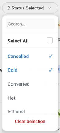
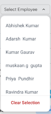
A high-performance, customizable React Native selector for React Native, This react native selector support:
- ✅ Single & Multiple selection
- 🔍 Searchable list
- ☑️ Select All (for multi-select)
- 🎨 Custom colors
- 🧩 Fully customizable button & item rendering
- ⚡ Optimized with memoization for large lists
Demo
You can try out the selector live in your browser or on your phone:
Installation
npm install rn-popover-selectoror
yarn add rn-popover-selectorBasic Usage
import RNPopoverSelector from 'rn-popover-selector';

const data = [
  { id: 1, title: 'Option 1' },
  { id: 2, title: 'Option 2' },
  { id: 3, title: 'Option 3' },
];

export default function App() {
  const [value, setValue] = useState<number | null>(null);

  return (
    <RNPopoverSelector
      data={data}
      value={value}
      onChange={(item) => setValue(item.id)}
      placeholder="Select option"
    />
  );
}
Multi Select Example
const [values, setValues] = useState<number[]>([]);

<RNPopoverSelector
  data={data}
  multiple
  searchable
  value={values}
  onChange={(items) => setValues(items.map(i => i.id))}
  selectAllLabel="Select All Items"
/>
Props
| Prop | Type | Default | Description |
|-----|------|--------|-------------|
| data | SelectorItem[] | — | List of items |
| value | string \| number \| array \| null | — | Selected value(s) |
| onChange | (item \| items) => void | — | Selection callback |
| placeholder | string | "Select" | Button placeholder |
| multiple | boolean | false | Enable multi-select |
| searchable | boolean | false | Enable search |
| selectAllLabel | string | "Select All" | Select-all label |
| color | string | #007AFF | Active color |
| renderButton | function | — | Custom button renderer |
| renderItem | function | — | Custom item renderer |
| width | number | — | Selector Modal width |
| style | ViewStyle | — | Selector Style |
| textStyle | TextStyle | — | Selector Text Style |
| disabled | boolean | — | |
| disableStyle | ViewStyle | — | Selector Style when its disabled|
| showClearButton | boolean | — | Show/Hide Clear Selection Button|
| clearButtonLabel | string | — | clear Button Label|
| selectorItemTextStyle | TextStyle | — | Text Style|
| selectorItemStyle | ViewStyle | — | Selector Item Style|
SelectorItem Interface
export interface SelectorItem {
  id: string | number;
  title: string | number;
  [key: string]: any;
}
Custom Button Example
<RNPopoverSelector
  data={data}
  value={value}
  onChange={(item) => setValue(item.id)}
  renderButton={(selected, open) => (
    <View style={{ padding: 12 }}>
      <Text>{selected ? selected.title : 'Choose item'}</Text>
    </View>
  )}
/>
Custom Item Example
renderItem={(item, isSelected, onSelect) => (
  <TouchableOpacity onPress={onSelect}>
    <Text style={{ color: isSelected ? 'blue' : 'black' }}>
      {item.title}
    </Text>
  </TouchableOpacity>
)}
Performance Notes
- Uses
React.memofor rows - Stable handlers via
useRef+useCallback - Optimized
FlatList(getItemLayout,removeClippedSubviews) - Handles large datasets smoothly
License
This project is licensed under the MIT License - see the LICENSE file for details.
