
rn-portal-confirm
v0.1.10
Published
test

Readme
React Native Confirm
Features
- implement ReactDom.Portal in React Native.
- multiple portalhost support.
- programmatically create components and support refresh.
- position configurable for dynamic components, e.g. center,bottom,top,auto.
- support for Confirm Dialog out of box.
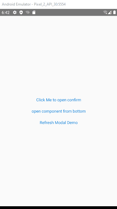
Example Screenshot
Installation And Usage
- install package
npm install rn-portal-confirm --save- Add the PortalProvider in the Entry Component, e.g App.
// assume we are in render function of App, Wrapper children under PortalProvider
<PortalProvider>
xxx
</PortalProvider>
- Add any PortalHost if needed, elements will be ported under this host. By default, we will create a root Portalhost in the PortalProvider. so you can skip this step, if single portalHost can match your requirement.
<PortalHost name='xxxuniquename'></PortalHost>
Example and API
for detail examples, please refer to the example in the source code. Bellow give two classic usage.
Confirm Dialog usage
call API to create confirm dialog before your process
import {useConfirm} from 'rn-portal-confirm';
const confirm = useConfirm();
confirm({
      message: 'Are you sure to do something?',
      ok: (closeMe)=>{dosomething();closeMe();},
      cancel: (closeMe) => closeMe(),
    });
Params
- useConfirm(portalHost?: string):confirm
|Parameter|Description|defaultValue| |--|--|--| |portalHost|the PortalHost Name in which the elements will be ported|by default it is the rootPortal|
confirm(param:ConfirmProps):[close,update];
export interface ConfirmProps {
  title?: ReactElement | string;
  message?: ReactElement | string;
  okText?: ReactElement | string;
  cancelText?: ReactElement | string;
  ok?: (closeMe: () => void) => void,
  cancel?: (closeMe: () => void) => void,
  dimissOnBackdropClick?: boolean;
  hideCancel?: boolean;
  Dialog?: (typeof React.Component<any>) | (React.FC<any>);
}

close:()=>void;
update:(props:ConfirmProps)=>void;
Here is the some definition of the ConfirmProps |Parameter|Type|Description|defaultValue| |--|--|--|--| |dimissOnBackdropClick|boolean|indicate if the Confirm Dialog will be closed if drawback is clicked|false| |hideCancel|boolean|indicate if the cancel button is hidden|false| |Dialog|React Component|inidcate which Modal will be used to Modal the Confirm,we provide one similar like the Dialog Component in React-native-elements,you can change it if it can't match your requirements|underfined| |title|stirng or ReactElement|the title of the confirm Dialog, you can provide a View if the default style can't match your requirements|null| |message|string or ReactElement|the message of the confirm Dialog|null| |okText|string or ReactElement|text of Ok Btn|Yes| |cancelText|string or ReactElement|text of Cancel Btn|No| |ok|function|callback function if ok button is clicked|underfined| |cancel|function|callback function if cancel button is clicked|underfined|
Open Dynamic Components
we use useComponent to open a custom component in the Modal.
import { useComponent } from 'rn-portal-confirm';
const open = useComponent();
let componentRef: ReturnType<typeof open>;
const confirm = () => {
componentRef?.close();
}
const component = (
<View>
<Text>Hello, I am a custom Component</Text>
<View style={{ marginTop: 20 }}>
<Button title='Close Me' onPress={confirm}></Button>
</View>
</View>
);
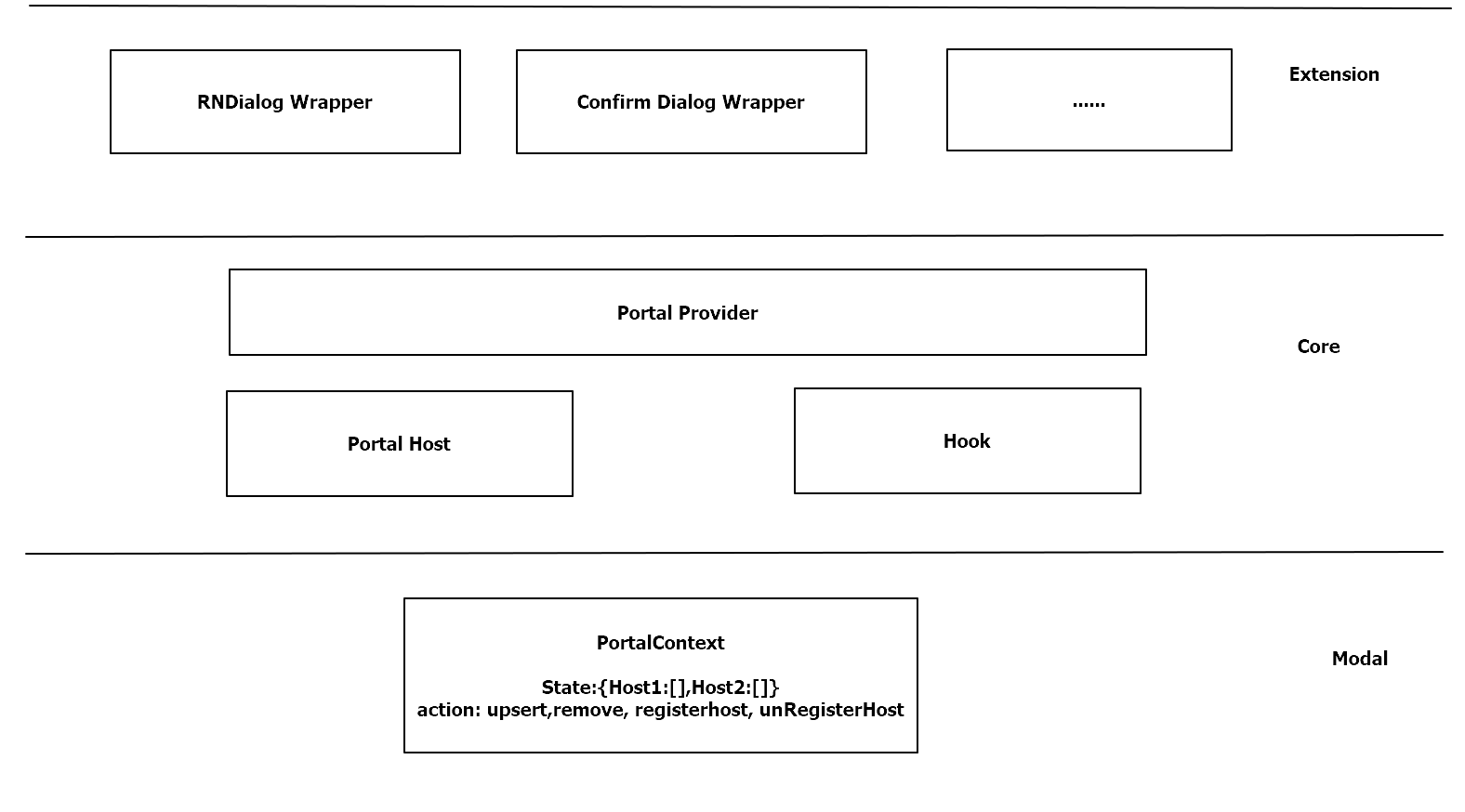
componentRef = open(component);Architechter Graphics
Support this package
If you like this package, consider giving it a github star ⭐
Also, PR's are welcome!