
rocket-cursor-component
v2.2.0
Published
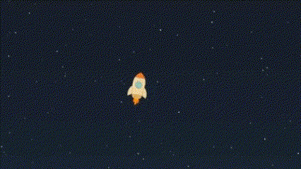
A customizable React component that replaces the cursor with an animated rocket, featuring rotation and flame effects.
Maintainers
 no898
no898Readme
Rocket Cursor Component
rocket-cursor-component is a React cursor library with two layers:
RocketCursor: the built-in animated rocket.CursorFollower: the generic motion engine for your own SVG, HTML, or CSS cursor.
If you only want the packaged rocket, use the default export.
If you want to build your own cursor, you do not need to fork this library. Use CursorFollower and render your own component inside it.
Installation
npm install rocket-cursor-componentRequirements
- React 18 or React 19
- React DOM 18 or React DOM 19
- Node.js 20.19+ or 22.12+ for local development in this repository
The published package already ships ESM, CommonJS, and type definitions.
Quick Start
Use the built-in rocket
import RocketCursor from "rocket-cursor-component";

export default function App() {
  return (
    <>
      <RocketCursor />
      <main>Your app content</main>
    </>
  );
}
Tune the rocket
import RocketCursor from "rocket-cursor-component";

export default function App() {
  return (
    <RocketCursor
      size={60}
      threshold={12}
      flameHideTimeout={250}
      followSpeed={0.35}
      hideCursor={false}
      excludeSelector=".no-rocket-cursor, [data-hide-rocket]"
      zIndex={1200}
    />
  );
}
Build Your Own Cursor
Use CursorFollower when you want custom visuals and keep the same motion system.
import { CursorFollower } from "rocket-cursor-component";

function StarCursor({ isMoving }: { isMoving: boolean }) {
  return (
    <svg viewBox="0 0 220 180" width="100%" height="100%" aria-hidden="true">
      <defs>
        <radialGradient id="star-glow" cx="50%" cy="50%" r="70%">
          <stop offset="0" stopColor="#fff7d6" stopOpacity="0.92" />
          <stop offset="0.55" stopColor="#7ee2ff" stopOpacity="0.32" />
          <stop offset="1" stopColor="#7ee2ff" stopOpacity="0" />
        </radialGradient>
        <linearGradient id="star-fill" x1="62" y1="36" x2="154" y2="142" gradientUnits="userSpaceOnUse">
          <stop offset="0" stopColor="#fffdf3" />
          <stop offset="0.46" stopColor="#ffd874" />
          <stop offset="1" stopColor="#ff9e47" />
        </linearGradient>
      </defs>

      <g
        style={{
          opacity: isMoving ? 1 : 0.28,
          transform: `scaleX(${isMoving ? 1 : 0.84})`,
          transformOrigin: "88px 90px",
          transition: "opacity 140ms ease, transform 140ms ease",
        }}
      >
        <path
          d="M8 90C18 77 33 70 58 72L82 78L82 102L58 108C33 110 18 103 8 90Z"
          fill="rgba(146, 234, 255, 0.2)"
        />
      </g>

      <circle cx="102" cy="90" r="58" fill="url(#star-glow)" />
      <path
        d="M102 31L117 65L155 69L127 92L134 129L102 110L70 129L77 92L49 69L87 65Z"
        fill="url(#star-fill)"
        stroke="#fff7de"
        strokeLinejoin="round"
        strokeWidth="3"
      />
    </svg>
  );
}

export default function App() {
  return (
    <CursorFollower
      width={96}
      height={78}
      anchorOffset={{ x: 26, y: 0 }}
      followSpeed={0.22}
      movingTimeout={260}
      threshold={10}
    >
      {({ isMoving }) => <StarCursor isMoving={isMoving} />}
    </CursorFollower>
  );
}
How To Add Another SVG Cursor
This is the intended extension path for users of the package.
1. Create a React component that renders your SVG
Your component can be as simple or as detailed as you want.
If you use gradients, filters, masks, or clip paths, prefer useId() so multiple cursors do not collide.
import { useId } from "react";

function MyShip({ isMoving }: { isMoving: boolean }) {
  const gradientId = useId();

  return (
    <svg viewBox="0 0 120 80" width="100%" height="100%" aria-hidden="true">
      <defs>
        <linearGradient id={gradientId} x1="0" y1="0" x2="120" y2="80">
          <stop offset="0" stopColor="#fff" />
          <stop offset="1" stopColor="#8ad5ff" />
        </linearGradient>
      </defs>

      <g style={{ opacity: isMoving ? 1 : 0.72, transition: "opacity 120ms ease" }}>
        <path d="M15 40L60 15L105 40L60 65Z" fill={`url(#${gradientId})`} />
      </g>
    </svg>
  );
}
2. Render it inside CursorFollower
import { CursorFollower } from "rocket-cursor-component";

<CursorFollower width={72} height={48}>
  {({ isMoving }) => <MyShip isMoving={isMoving} />}
</CursorFollower>;
3. Tune the alignment
The most important prop for custom SVGs is anchorOffset.
anchorOffset.x: how far the cursor anchor should move horizontally inside your artworkanchorOffset.y: how far the cursor anchor should move vertically inside your artwork
Examples:
- front-pointing ship: use a positive
x - centered icon like a star: use a smaller
x, often close to half the width or less - artwork with a nose above the centerline: use a negative
y
<CursorFollower
  width={96}
  height={78}
  anchorOffset={{ x: 26, y: 0 }}
>
  {({ isMoving }) => <MyShip isMoving={isMoving} />}
</CursorFollower>
4. Tune rotation
If your SVG points to the right by default, you usually want:
rotateWithMovement={true}
rotationOffset={0}
If your SVG points up, left, or diagonally in its default drawing direction, adjust rotationOffset.
Examples:
- points up:
rotationOffset={-90} - points down:
rotationOffset={90} - points diagonally: use the angle that matches your artwork
5. Use the motion state
CursorFollower can pass a render function and gives you:
isMoving: useful for flame, glow, wake, streaks, or scalingvisible: useful if you want to pause expensive effects when hidden
<CursorFollower movingTimeout={220}>
  {({ isMoving, visible }) => (
    <MyShip isMoving={isMoving} data-visible={visible} />
  )}
</CursorFollower>
6. Add “speed” without smoke
If you want motion to feel fast without using flame or smoke, the simplest patterns are:
- air streaks behind the object
- a soft glow envelope around the object
- slight width stretch while moving
- subtle opacity changes on secondary details
That is exactly the kind of effect used in the local demo star example.
API
RocketCursor props
| Prop | Type | Default | Description |
| --- | --- | --- | --- |
| className | string | undefined | Optional class passed to the wrapper. |
| disabled | boolean | false | Disables the custom cursor entirely. |
| disableOnCoarsePointer | boolean | true | Disables the cursor on touch/coarse pointers. |
| excludeSelector | string | ".no-rocket-cursor" | Selector for regions where the custom cursor should hide. |
| respectReducedMotion | boolean | true | Disables the cursor when the user prefers reduced motion. |
| size | number | 50 | Rocket size in pixels. |
| threshold | number | 10 | Minimum movement distance before rotation updates. |
| isVisible | boolean | true | Controls whether the custom cursor should render. |
| flameHideTimeout | number | 300 | Delay before the flame hides after movement stops. |
| hideCursor | boolean | false | Hides the native cursor when enabled. |
| followSpeed | number | 0.18 | Follow smoothing from 0 to 1. Higher is snappier. |
| zIndex | number | 9999 | Wrapper stacking order. |
CursorFollower props
CursorFollower includes the shared base props from RocketCursor:
classNamedisableddisableOnCoarsePointerexcludeSelectorfollowSpeedhideCursorisVisiblerespectReducedMotionthresholdzIndex
Additional props:
| Prop | Type | Default | Description |
| --- | --- | --- | --- |
| anchorOffset | { x: number; y: number } | { x: 0, y: 0 } | Moves the cursor anchor inside the artwork. |
| children | ReactNode \| (state) => ReactNode | required | Static node or render function that receives { isMoving, visible }. |
| movingTimeout | number | 300 | Delay before isMoving flips back to false. |
| rotateWithMovement | boolean | true | Rotates the content to match movement direction. |
| rotationOffset | number | 0 | Fixed angle offset for artwork with a different default direction. |
| width | number | 48 | Wrapper width in pixels. |
| height | number | 48 | Wrapper height in pixels. |
| wrapperProps | HTMLAttributes<HTMLDivElement> | undefined | Extra wrapper attributes, including data-* hooks. |
Feature Summary
- Built-in rocket cursor
- Generic cursor engine for custom SVG or HTML
- Motion-based rotation
- Optional native cursor hiding
- Reduced-motion and coarse-pointer safe defaults
- Exclusion zones via CSS selector
- TypeScript exports for both built-in and custom usage
- ESM and CommonJS builds
Development
nvm use
npm install
npm run demo
Useful commands:
npm run typecheck
npm run test
npm run test:package
npm run build
npm run check
npm run version:status
npm run version:check
npm run check:published
npm install also installs a local pre-push hook. When you push to main or master, the hook checks the latest npm version and blocks the push if publish-relevant files changed but package.json was not bumped ahead of what is already published.
Demo
Local demo:
npm install
npm run demo
Then open the Vite URL printed in the terminal.
Release
Update the package version, then merge the change into main or master.
The release workflow runs only on pushes to main and master, plus manual dispatches from those branches. It publishes only when package.json is ahead of the current npm version, so routine merges without a version bump are skipped cleanly.
Publishing uses npm trusted publishing via GitHub Actions OIDC. Configure the package on npm with:
- publisher:
GitHub Actions - organization or user:
No898 - repository:
RocketCursor - workflow filename:
ci.yml - environment name: leave empty unless you use a protected GitHub Actions environment
Recommended flow:
- run
npm run version:patch,npm run version:minor, ornpm run version:major - commit the version bump
- merge the branch into
mainormaster - let GitHub Actions publish automatically, or trigger the release workflow manually from
main/master
After trusted publishing is configured, you do not need an NPM_TOKEN secret for releases.
If you want to verify the version manually before tagging, run:
npm run version:status
npm run version:check
npm run check:published
For a dry run without changing package.json, you can preview the next version:
node ./scripts/bump-version.mjs patch --dry-runChangelog
Unreleased
- No unreleased changes yet.
2.2.0
- Added
CursorFolloweras a public API for custom cursors - Added custom cursor docs, examples, and the local demo star variant
- Expanded package coverage with component tests and tarball smoke checks
- Added release guards and version helper scripts for npm publishing
- Improved runtime controls for reduced motion, coarse pointers, visibility, and custom cursor options
- Modernized the package build, exports, and published type output
- Merged validation and publish into a single GitHub Actions workflow
- Made package smoke parsing tolerant to lifecycle logs in CI
- Added the demo GIF and refreshed the release notes in the README
2.1.1
- Fixed flame visibility updates
2.1.0
- Added
followSpeed - Changed rocket alignment to use the nose position
- Updated the demo to match the new API
2.0.0
- Added
useId()for SVG gradient safety - Added
hideCursor - Improved SSR safety
- Cleaned up types and removed dead props
License
MIT. See LICENSE.