
rolling-number
v1.2.1
Published
Ultra-fast, zero-dependency rolling number counter library, web component, and framework directives for Angular, React, and Vue.

Maintainers
 erlonrru
Readme
🎲 rolling-number-js
An ultra-fast, zero-dependency, GPU-accelerated Rolling Number Animation library, native Web Component (
<rolling-number>), and dedicated framework directives for Angular (PrimeNG, Material, AntD), React/Next.js (Shadcn, MUI, AntD), and Vue 3 (Vuetify, Element Plus, PrimeVue).
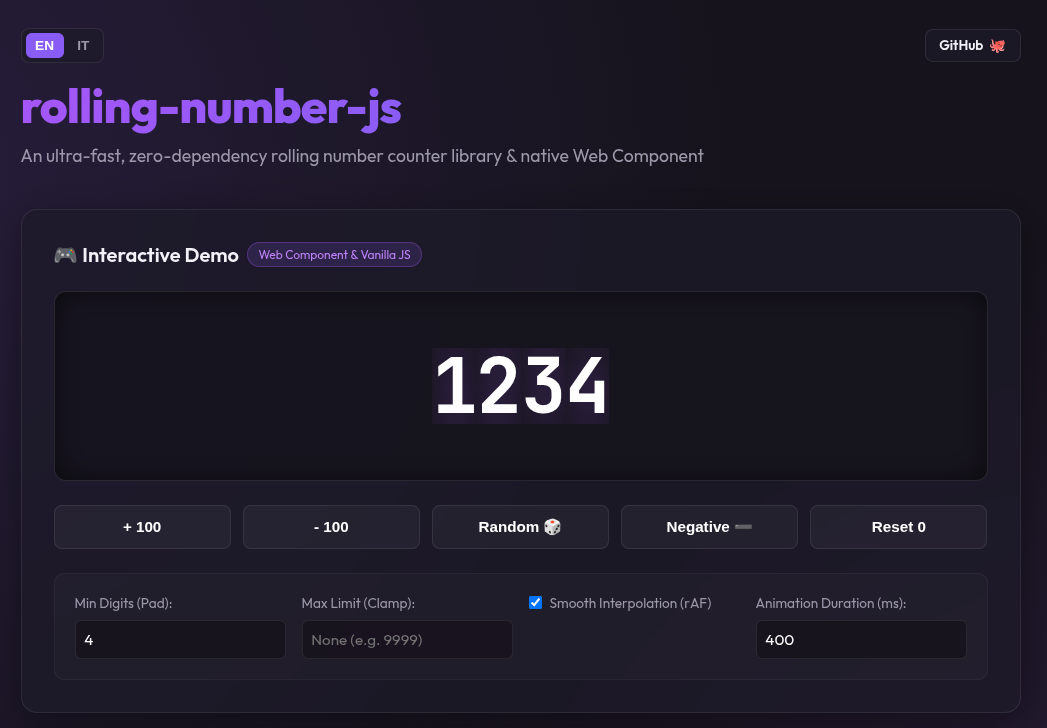




⚡ Preview
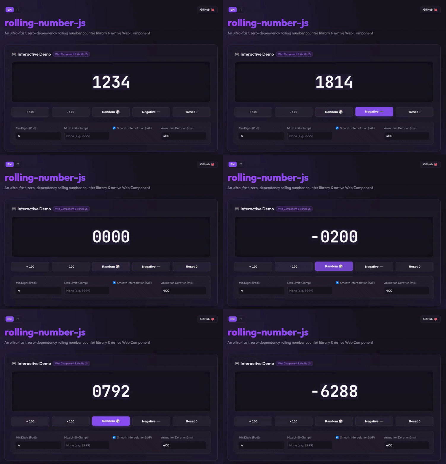
✨ Features
- ⚡ Ultra Fast & Lightweight: Zero external runtime dependencies for core library. Core engine is < 1.5 KB gzipped.
- 🚀 Hardware Accelerated (60 FPS): Powered by pure CSS
translateYtransitions on GPU compositor threads. No blocking JS loops. - 🔄 Progressive Value Interpolation (rAF): Smooth 60 FPS count-up / count-down value stepping with
easeOutCubiceasing (interpolateoption). - 🌐 Native Framework Subpaths (Tree-Shakable):
rolling-number— Core Vanilla JS & Web Componentrolling-number/angular— Standalone Directive for Angular 16-19+ (PrimeNG, Angular Material, NG-ZORRO)rolling-number/react— React Component (<RollingNumber />) & Hook (useRollingNumber) (Shadcn, MUI, AntD)rolling-number/vue— Vue 3 Directive (v-rolling-number) & Component (<RollingNumber />) (Vuetify, Element Plus, PrimeVue)
- ♿ Accessible: Built-in screen reader support (
role="img", dynamicaria-label, decorative rungs marked witharia-hidden="true"). - 🎨 Fully Customizable: Style font sizes, colors, duration, and easing curves using simple CSS variables.
📦 Installation
Install using pnpm (recommended), npm, or yarn:
# Using pnpm
pnpm add rolling-number

# Using npm
npm install rolling-number

# Using yarn
yarn add rolling-number
🅰️ Angular UI Library Integrations (PrimeNG, Material, NG-ZORRO)
1. PrimeNG 19 (p-inputNumber / p-badge)
import { Component } from '@angular/core';
import { FormsModule } from '@angular/forms';
import { InputNumberModule } from 'primeng/inputnumber';
import { BadgeModule } from 'primeng/badge';
import { RollingNumberDirective } from 'rolling-number/angular';
import 'rolling-number/style.css';

@Component({
  selector: 'app-demo',
  standalone: true,
  imports: [FormsModule, InputNumberModule, BadgeModule, RollingNumberDirective],
  template: `
    <!-- PrimeNG 19 InputNumber -->
    <p-inputNumber [(ngModel)]="price" [rollingNumber]="price" [pad]="2"></p-inputNumber>

    <!-- PrimeNG Badge / Tag -->
    <span pBadge [rollingNumber]="cartItems" [max]="99"></span>
  `
})
export class DemoComponent {
  price = 1250;
  cartItems = 42;
}
2. Angular Material (mat-chip / mat-card)
import { Component } from '@angular/core';
import { MatChipsModule } from '@angular/material/chips';
import { RollingNumberDirective } from 'rolling-number/angular';
import 'rolling-number/style.css';

@Component({
  selector: 'app-material-demo',
  standalone: true,
  imports: [MatChipsModule, RollingNumberDirective],
  template: `
    <mat-chip-option selected>
      Balance: $<span [rollingNumber]="balance" [pad]="2"></span>
    </mat-chip-option>
  `
})
export class MaterialDemoComponent {
  balance = 850;
}
3. NG-ZORRO (Ant Design Angular)
import { Component } from '@angular/core';
import { NzStatisticModule } from 'ng-zorro-antd/statistic';
import { RollingNumberDirective } from 'rolling-number/angular';
import 'rolling-number/style.css';

@Component({
  selector: 'app-ant-demo',
  standalone: true,
  imports: [NzStatisticModule, RollingNumberDirective],
  template: `
    <nz-statistic [nzTitle]="'Active Users'">
      <ng-template #nzTpl>
        <span [rollingNumber]="usersCount" [pad]="3"></span>
      </ng-template>
    </nz-statistic>
  `
})
export class AntDemoComponent {
  usersCount = 1420;
}
⚛️ React & Next.js UI Library Integrations (Shadcn UI, MUI, AntD)
1. Shadcn UI / Tailwind CSS
import { useState } from 'react';
import { Card, CardContent, CardHeader, CardTitle } from "@/components/ui/card";
import { Badge } from "@/components/ui/badge";
import { RollingNumber } from 'rolling-number/react';
import 'rolling-number/style.css';

export function ShadcnStatCard() {
  const [revenue, setRevenue] = useState(45200);

  return (
    <Card className="w-80">
      <CardHeader className="flex flex-row items-center justify-between">
        <CardTitle className="text-sm font-medium">Total Revenue</CardTitle>
        <Badge variant="secondary">Live</Badge>
      </CardHeader>
      <CardContent>
        <div className="text-3xl font-bold text-indigo-500">
          $<RollingNumber value={revenue} pad={5} />
        </div>
      </CardContent>
    </Card>
  );
}
2. MUI (Material UI)
import { useState } from 'react';
import { Card, Typography, Chip } from '@mui/material';
import { RollingNumber } from 'rolling-number/react';
import 'rolling-number/style.css';

export function MuiStat() {
  const [count, setCount] = useState(1280);

  return (
    <Card sx={{ p: 3 }}>
      <Typography variant="subtitle2" color="text.secondary">
        Active Subscribers
      </Typography>
      <Typography variant="h3" color="primary" sx={{ my: 1, fontWeight: 'bold' }}>
        <RollingNumber value={count} pad={4} />
      </Typography>
      <Chip label="+12% this week" color="success" size="small" />
    </Card>
  );
}
3. Ant Design (AntD)
import { Statistic } from 'antd';
import { RollingNumber } from 'rolling-number/react';
import 'rolling-number/style.css';

export function AntdStat({ value }: { value: number }) {
  return (
    <Statistic
      title="Feedback Score"
      formatter={() => <RollingNumber value={value} pad={2} />}
    />
  );
}
🟢 Vue 3 UI Library Integrations (Vuetify, Element Plus, PrimeVue)
1. PrimeVue (InputNumber / Badge)
<script setup>
import { ref } from 'vue';
import InputNumber from 'primevue/inputnumber';
import Badge from 'primevue/badge';
import { vRollingNumber } from 'rolling-number/vue';
import 'rolling-number/style.css';

const val = ref(1500);
</script>

<template>
  <div class="flex gap-4 items-center">
    <InputNumber v-model="val" v-rolling-number="val" />
    <Badge v-rolling-number="{ value: val, max: 999 }" severity="info" />
  </div>
</template>
2. Vuetify 3 (v-card / v-chip)
<script setup>
import { ref } from 'vue';
import { RollingNumber } from 'rolling-number/vue';
import 'rolling-number/style.css';

const downloads = ref(8420);
</script>

<template>
  <v-card class="pa-4" elevation="3">
    <v-card-title>App Downloads</v-card-title>
    <div class="text-h3 font-weight-bold text-primary">
      <RollingNumber :value="downloads" :pad="4" />
    </div>
  </v-card>
</template>
3. Element Plus (el-statistic / el-badge)
<script setup>
import { ref } from 'vue';
import { vRollingNumber } from 'rolling-number/vue';
import 'rolling-number/style.css';

const score = ref(980);
</script>

<template>
  <el-statistic title="Performance Score">
    <template #content>
      <span v-rolling-number="score"></span>
    </template>
  </el-statistic>
</template>
🌐 Web Component & Vanilla JS
Web Component (<rolling-number>)
import 'rolling-number/register';
import 'rolling-number/style.css';
<rolling-number value="1234" pad="4"></rolling-number>Vanilla JS API
import { RollingNumberCore } from 'rolling-number';
import 'rolling-number/style.css';

const counter = new RollingNumberCore(document.getElementById('counter'), {
  value: 42,
  pad: 3,
  max: 99
});

counter.setValue(128);
⚙️ API & Configuration
Properties & Attributes
| Property / Attribute | Type | Default | Description |
| :--- | :--- | :--- | :--- |
| value | number | 0 | The numeric value to display and animate to. |
| pad | number | 1 | Minimum number of digit columns (pads leading zeros). |
| max | number \| null | null | Maximum value limit (e.g. 99 for notification counters like 99+). |
| interpolate | boolean | true | Whether value changes smoothly step through intermediate numbers (rAF). |
| duration | number | 400 | Animation duration in milliseconds when interpolate is enabled. |
🎨 Customization (CSS Variables)
rolling-number, .rn-rolling-number {
  --rn-duration: 0.6s;
  --rn-easing: cubic-bezier(0.34, 1.56, 0.64, 1);

  font-family: 'JetBrains Mono', monospace;
  font-size: 2.5rem;
  color: #6366f1;
}
📄 License
MIT © Erlon Rr