
rxslider
v1.4.11
Published
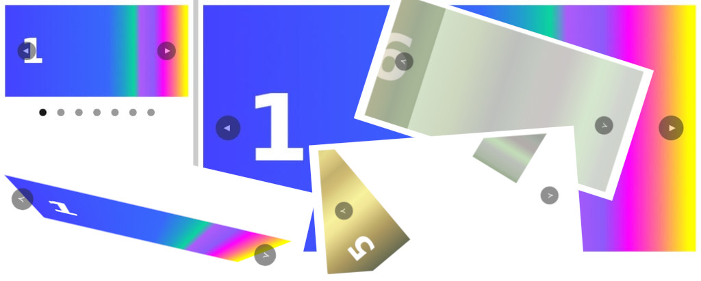
Responsive X-axis Slider
Downloads
82

Readme
rxslider
Responsive X-axis Slider
<!DOCTYPE html>
<html lang="en">
<head>
  <meta charset="UTF-8">
  <meta http-equiv="X-UA-Compatible" content="IE=edge">
  <meta name="viewport" content="width=device-width, initial-scale=1.0">
  <title>rxslider</title>
  <link rel="stylesheet" href="rxslider.min.css">
</head>
<body>

  <div class="rxslider" style="max-width: 800px;">
    <button class="rxslider__prev">≺</button>
    <div class="rxslider__slides">
      <div>
        <img src="img/1.jpg" alt="1">
      </div>
      <div>
        <img src="img/2.jpg" alt="2">
      </div>
      <div>
        <img src="img/3.jpg" alt="3">
      </div>
      <div>
        <img src="img/4.jpg" alt="4">
      </div>
      <div>
        <img src="img/5.jpg" alt="5">
      </div>
      <div>
        <img src="img/6.jpg" alt="6">
      </div>
      <div>
        <img src="img/7.jpg" alt="7">
      </div>
    </div>
    <button class="rxslider__next">≻</button>
  </div>

  <script src="rxslider.min.js"></script>
</body>
</html>
The basic slider settings are made through CSS variables in the rxslider.css file, as shown below:
.rxslider {
  --lightColor: #fff;
  --darkColor: #222;
  --btnSize: 40px;
  --btnFontSize: 15px;
  --btnPosition: 20px;
  --btnPadding: .3em;
  --navSize: 14px;
  --navUpper: 25px;
  --navLower: -35px;
  --durationHover: .3s;
  --transitionActive: all .5s;
}
You can override them after including the base slider style file:
...
  <link rel="stylesheet" href="rxslider.min.css">
  <style>
    .rxslider {
      --lightColor: red;
    }
  </style>
</head>
The currently active slide is assigned the class «rxslider__active». This allows you to create simple effects for slides, for example:
...
  <link rel="stylesheet" href="rxslider.min.css">
  <style>
    .rxslider__active {
      transform: scale(1.2) rotate(5deg);
    }
  </style>
</head>
For an active navigation button, the class «rxslider__nav-active» is used.
The slider takes four attributes. The data-stop attribute without a value disables auto-scrolling:
<div class="rxslider" data-stop>Attribute data-back without value, changes the scrolling direction of the slider. By default, the slider scrolls to the right, but this can easily be changed:
<div class="rxslider" data-back>The data-time attribute specifies the number of milliseconds the slider will pause before moving on to the next slide. By default, this value is 3000 milliseconds, but you can change it:
<div class="rxslider" data-time="1500">The data-sens attribute determines how sensitive the slider is when dragging to the next/prev slide. By default, this value is 10. The higher this value, the less distance you need to drag the slide:
<div class="rxslider" data-sens="30">A document can have multiple sliders. By default, sliders are center-aligned and stretch to the full width of the parent element.
To limit the maximum width of any slider, simply add an inline style to it:
<div class="rxslider" style="max-width: 800px;">Custom Effects
By default, slides scroll without changing their appearance. A slider allows you to define complex effects applied to its slides.
Slides are all child elements that are inside an element with the class «rxslider__slides»:
<div class="rxslider__slides">
  <div>
    <img src="img/1.jpg" alt="1">
  </div>
  <div>
    <img src="img/2.jpg" alt="2">
  </div>
  <div>
    <img src="img/3.jpg" alt="3">
  </div>
  <div>
    <img src="img/4.jpg" alt="4">
  </div>
  <div>
    <img src="img/5.jpg" alt="5">
  </div>
  <div>
    <img src="img/6.jpg" alt="6">
  </div>
  <div>
    <img src="img/7.jpg" alt="7">
  </div>
</div>
Slides do not have their own classes. They are used as an unnamed container and contain other elements, such as images, as in the example above.
To create effects, predefined CSS variables are used, which are stored in the rxslider-vars.css file. This file must be included after the basic slider styles:
...
  <link rel="stylesheet" href="rxslider.min.css">
  <link rel="stylesheet" href="rxslider-vars.min.css">
</head>
The file defines several variables for properties that are most suitable for applying effects. Their names correspond to the names of the properties whose values they define.
For example, the transition property has the variable "--transition", as shown below:
transition: var(--transition, revert);
transform: var(--transform, revert);
transform-style: var(--transform-style, revert);
transform-origin: var(--transform-origin, revert);
animation: var(--animation, revert);
perspective: var(--perspective, revert);
perspective-origin: var(--perspective-origin, revert);
backface-visibility: var(--backface-visibility, revert);
opacity: var(--opacity, revert);
color: var(--color, revert);
font-size: var(--font-size, revert);
background: var(--background, revert);
The same number of variables exist for the parent of the slides, i.e. for the «rxslider__slides» element. Their names start with the prefix "--parent" followed by the name of the property:
transition: var(--parent-transition, revert);
transform: var(--parent-transform, revert);
transform-style: var(--parent-transform-style, revert);
transform-origin: var(--parent-transform-origin, revert);
animation: var(--parent-animation, revert);
perspective: var(--parent-perspective, revert);
perspective-origin: var(--parent-perspective-origin, revert);
backface-visibility: var(--parent-backface-visibility, revert);
opacity: var(--parent-opacity, revert);
color: var(--parent-color, revert);
font-size: var(--parent-font-size, revert);
background: var(--parent-background, revert);
The same number of variables exist for direct children of slides, such as images. Their names start with the prefix "--child" followed by the name of the property:
transition: var(--child-transition, revert);
transform: var(--child-transform, revert);
transform-style: var(--child-transform-style, revert);
transform-origin: var(--child-transform-origin, revert);
animation: var(--child-animation, revert);
perspective: var(--child-perspective, revert);
perspective-origin: var(--child-perspective-origin, revert);
backface-visibility: var(--child-backface-visibility, revert);
opacity: var(--child-opacity, revert);
color: var(--child-color, revert);
font-size: var(--child-font-size, revert);
background: var(--child-background, revert);
You can define new variables in the rxslider-vars.css file for any properties you want to use when creating effects, for example:
text-align: var(--text-align, revert);All these variables allow you to define properties for the parent, slide and its direct child in a special class that is added after the base styles are connected.
Its name consists of the name of the slider class, a double dash, like variables, and an arbitrary custom effect name, for example:
.rxslider--myeffect {
  --transition: all 2s;
  --transform: rotate(0) scale(.1);
  --transform-origin: 80% 20%;
  --opacity: .1;

  transform: rotate(360deg) scale(1);
  opacity: 1;
}
Then you need to add the name of this class to the slider element:
<div class="rxslider rxslider--myeffect">In the example above, four variables were defined for the transition, transformation, and opacity properties of the slides:
--transition: all 2s;
--transform: rotate(0) scale(.1);
--transform-origin: 80% 20%;
--opacity: .1;
In addition to variables, two properties for transformation and opacity were explicitly defined in the class:
transform: rotate(360deg) scale(1);
opacity: 1;
Variables define property values before assigning a special class to the active slide in the window, and properties set explicitly in the class, after this class is added to it.
In this way, you can create a large number of different effects, as shown below:
...
  <link rel="stylesheet" href="rxslider.min.css">
  <link rel="stylesheet" href="rxslider-vars.min.css">
  <style>
    /* ------- rxslider--one ------- */
    .rxslider--one {
      --transition: all 2s;
      --transform: rotate(0) scale(.1);
      --transform-origin: 80% 20%;
      --opacity: .1;

      transform: rotate(360deg) scale(1);
      opacity: 1;
    }

    /* ------- rxslider--two ------- */
    .rxslider--two {
      --parent-perspective: 400px;
      --transition: all 2s;
      --transform: rotateX(0) scale(0);

      transform: rotateX(360deg) scale(1);
    }

    /* ------- rxslider--three ------- */
    .rxslider--three {
      --child-animation: three 3s infinite;
    }
    @keyframes three {
      0% {
        opacity: 0;
        transform: scale(1.5);
      }
      50% {
        opacity: 1;
        transform: scale(1);
      }
      100% {
        opacity: 0;
        transform: scale(1.5);
      }
    }
  </style>
</head>