
sabik-datagrid
v1.1.4
Published
Enterprise-grade reusable DataGrid component for React + TypeScript
Downloads
69

Maintainers
 sabikneta
Readme
sabik-datagrid
Enterprise-ready React + TypeScript DataGrid built on TanStack Table and TanStack Virtual.
Sort, filter, paginate, select rows, theme the UI, and render custom cells — without bringing your own table infrastructure.
Live Demo
Try it in the browser:
https://agent-6a5662a09d0a830e71067b1d--sabikdatagrid.netlify.app/




Explore the hosted showcase:
| Demo | Link | | --- | --- | | Interactive Showcase | Open | | Products Demo | Open | | Employees Demo | Open | | Admin Demo | Open | | Column Resize | Products → resize | | Column Reorder | Products → reorder | | Column Pinning | Products → pin | | Virtualization | Docs · Showcase | | Themes | Admin → theme |
Local showcase
A full documentation showcase also lives in consumer-app:
npm run build && npm pack
cd consumer-app
npm install
npm run dev
Run Playwright checks with npm run test:e2e inside consumer-app.
Regenerate README screenshots with npm run capture:docs (writes to ../docs/images).
Why sabik-datagrid?
| | |
| --- | --- |
| Lightweight | Lean bundle with React / TanStack / @dnd-kit as peers or externals — you own your React copy. |
| TypeScript-first | First-class exported types for props, columns, themes, density, and actions. |
| Built on TanStack Table | Industry-standard headless table engine, plus optional TanStack Virtual for large lists. |
| Production-ready | Sorting, filtering, pagination, selection, persistence, column layout, and a11y-minded markup. |
| Fully customizable | Theme tokens, density, custom cells, row/bulk actions, and CSS variables you can override. |
| React 18 / 19 compatible | Peer range react / react-dom >= 18. |
| No Tailwind dependency | Self-contained stylesheet — drop in and go. |
| Modern enterprise UI | Polished toolbar, filter row, sticky header, menus, and pagination inspired by AG Grid, MUI X, and Linear. |
Screenshots
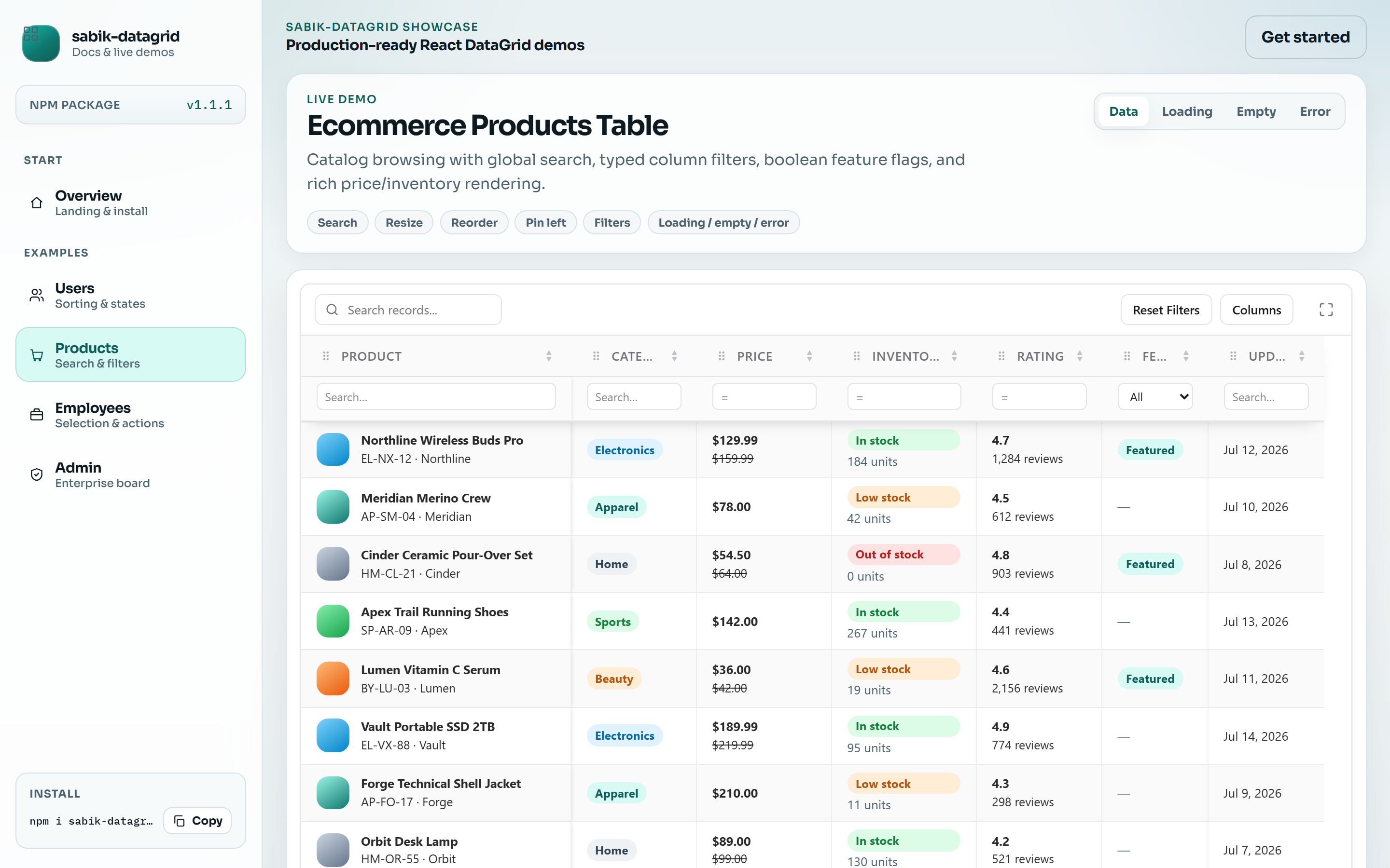
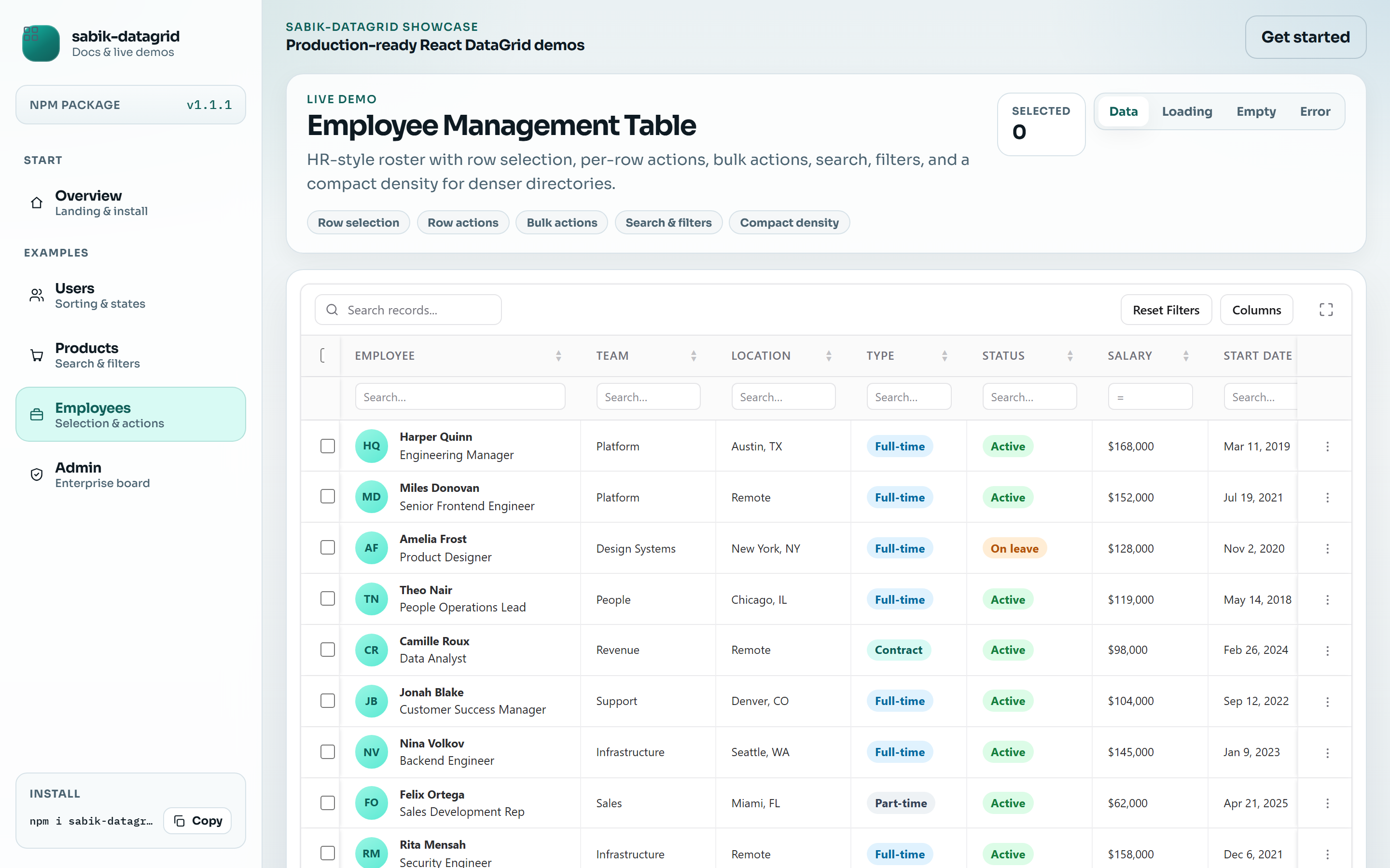
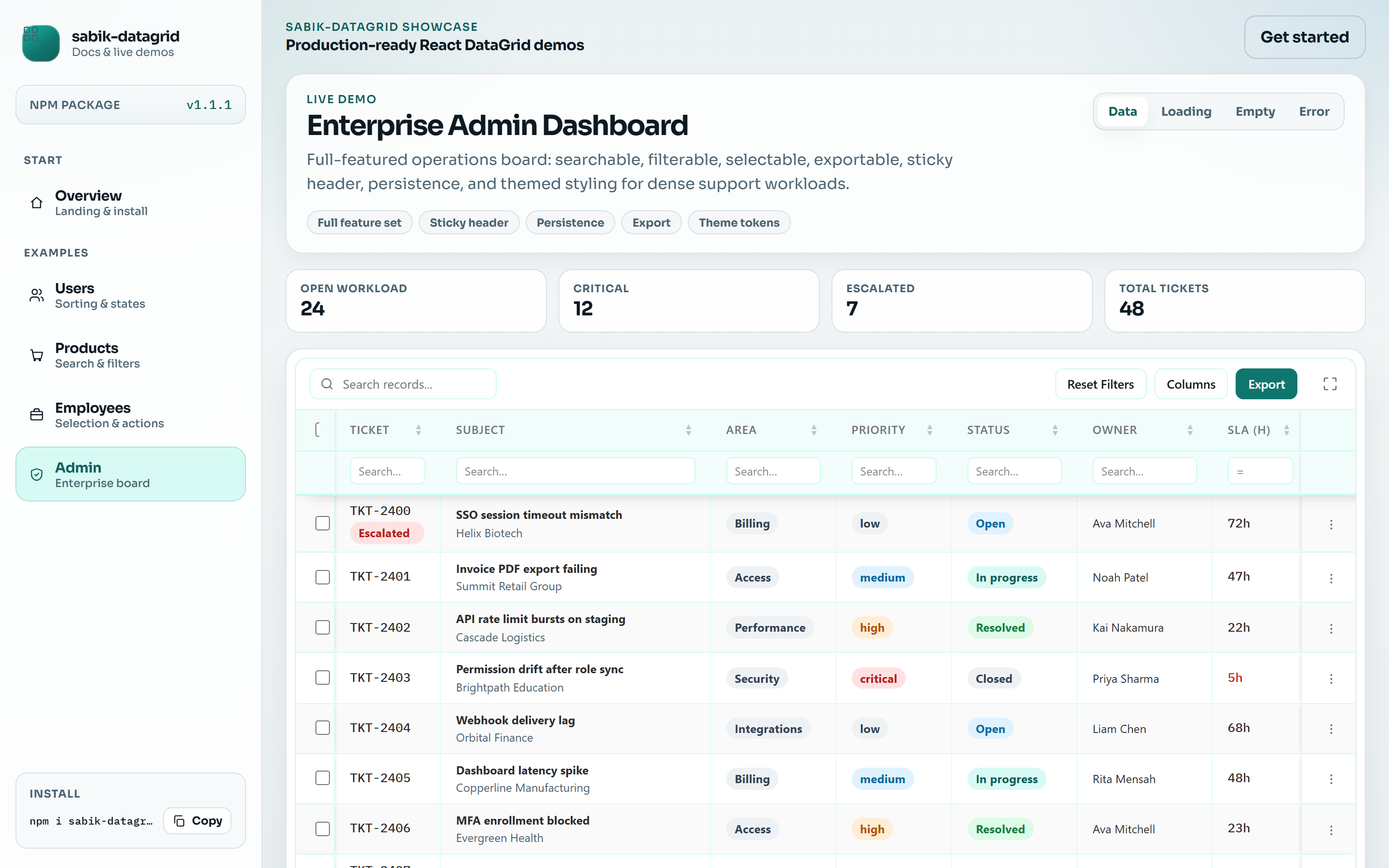
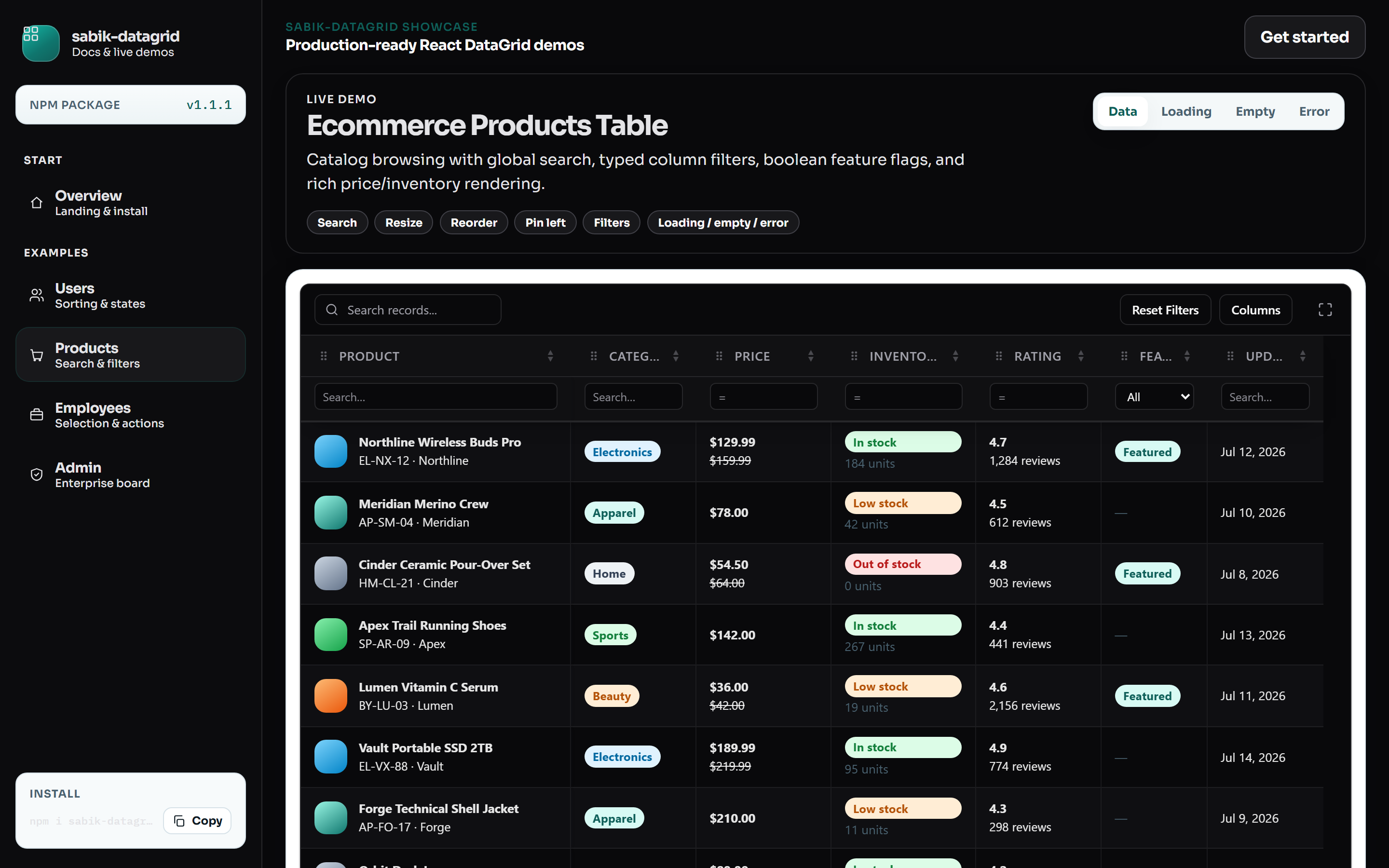
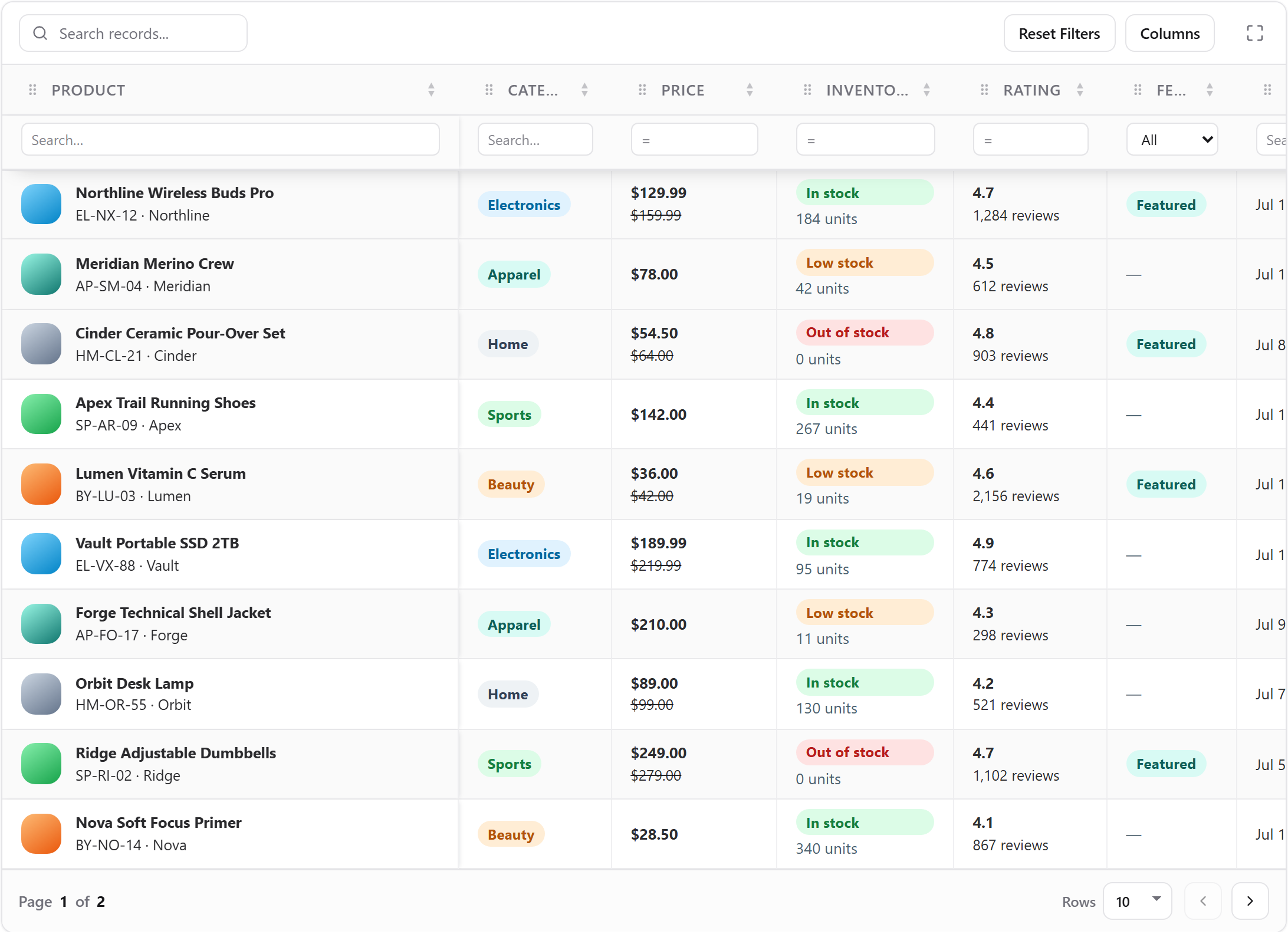
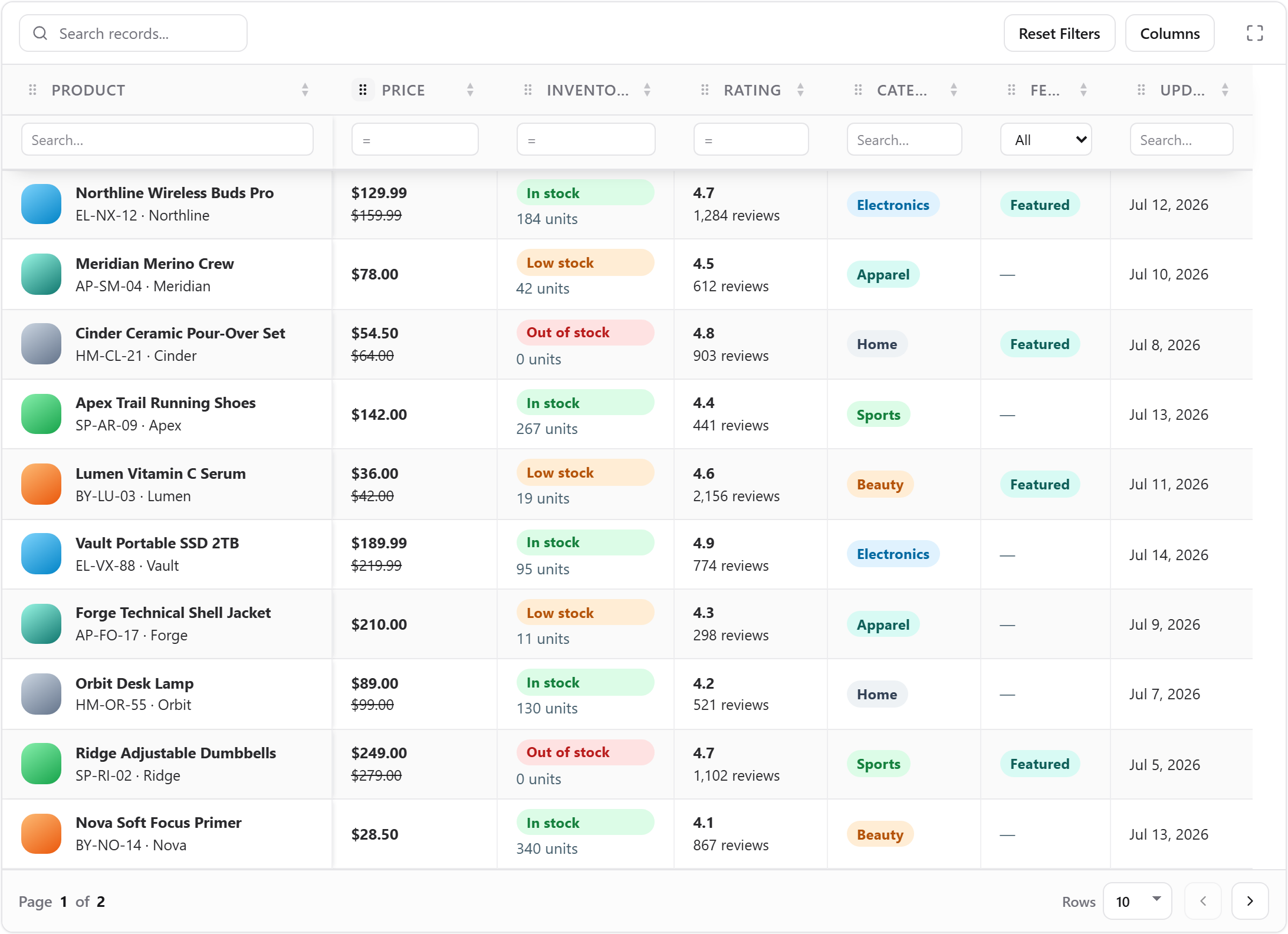
Captured from the local showcase at 1440×900 (2× device scale). Regenerate with npm run capture:docs inside consumer-app.
Products
Employees
Admin Dashboard
Dark Theme
Column Resize
Column Reorder
Column Pinning
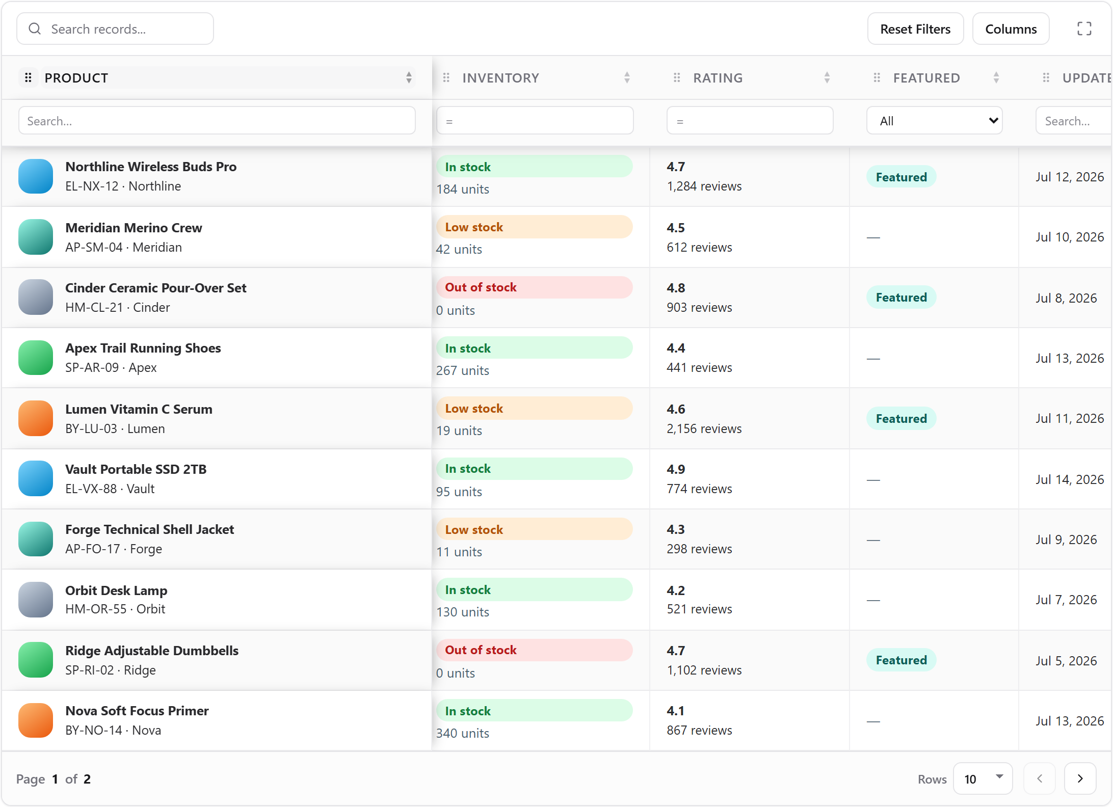
Table of contents
- Live Demo
- Why sabik-datagrid?
- Screenshots
- Features
- Installation
- Quick Start
- Props
- Column configuration
- Column resizing
- Column reordering
- Column pinning
- Sorting
- Filtering
- Pagination
- Selection
- Custom cells
- Themes
- Density
- Export
- States
- Persistence
- Virtualization
- Row & bulk actions
- FAQ
- Troubleshooting
- TypeScript
- Roadmap
- License
Features
| Area | Capabilities |
| --- | --- |
| Data ops | Client-side sorting, column filters, global search, pagination |
| Interaction | Row selection, row click / double-click, row menus, bulk actions |
| Appearance | Theme tokens, density, row padding / height, striped & hoverable rows, sticky header |
| UX states | Loading skeleton / soft overlay, empty state, error state |
| Scale | Optional row virtualization |
| Layout | Column resize, reorder (@dnd-kit), and left / right pinning |
| Tooling | Toolbar, column visibility menu, export callback, LocalStorage persistence |
| DX | Full TypeScript types, self-contained CSS (no Tailwind required) |
Installation
npm install sabik-datagrid
# or
pnpm add sabik-datagrid
# or
yarn add sabik-datagrid
Peer dependencies: react and react-dom >= 18.
Styles
CSS is imported automatically when you import the package. You can also load styles explicitly:
import 'sabik-datagrid/styles.css';Local development note: Prefer installing a packed tarball (
npm pack→file:../sabik-datagrid-x.y.z.tgz) over"file:..". A directory install can junction the library repo and create a second React instance, which triggers "Invalid hook call". See Troubleshooting.
Quick Start
import { DataGrid, type DataGridColumnDef } from 'sabik-datagrid';

type User = {
  id: number;
  name: string;
  age: number;
  active: boolean;
};

const columns: DataGridColumnDef<User>[] = [
  { accessorKey: 'name', header: 'Name', filterType: 'string' },
  { accessorKey: 'age', header: 'Age', filterType: 'number' },
  { accessorKey: 'active', header: 'Active', filterType: 'boolean' },
];

const users: User[] = [
  { id: 1, name: 'Ava Mitchell', age: 32, active: true },
  { id: 2, name: 'Noah Patel', age: 28, active: false },
];

export function UsersTable() {
  return (
    <DataGrid
      data={users}
      columns={columns}
      getRowId={(row) => String(row.id)}
      pagination
      searchable
      filterable
      selectable
      toolbar
      hoverable
      striped
      ariaLabel="Users"
    />
  );
}
Props
Required
| Prop | Type | Description |
| --- | --- | --- |
| data | TData[] | Rows to display |
| columns | DataGridColumnDef<TData>[] | Column definitions |
Features
| Prop | Type | Default | Description |
| --- | --- | --- | --- |
| searchable | boolean | false | Global search input in the toolbar |
| filterable | boolean | false | Per-column filters + “Reset Filters” |
| pagination | boolean | false | Footer pagination (page size 10 / 20 / 50 / 100) |
| selectable | boolean | false | Checkbox selection column + bulk bar |
| exportable | boolean | false | Export button; fires onExport |
| toolbar | boolean | false | Shows toolbar (search, columns, export, reset) |
| stickyHeader | boolean | false | Sticky header inside the scroll container |
| resizable | boolean | true | Column resize handles (TanStack sizing) |
| reorderable | boolean | false | Drag-and-drop column reorder (@dnd-kit) |
| virtualized | boolean | false | Row virtualization (forces manual pagination mode) |
| virtualHeight | number | 400 | Virtual scrollport height in px |
| persistenceKey | string | — | Scoped LocalStorage key (includes order / size / pin) |
| striped | boolean | false | Zebra striping |
| hoverable | boolean | false | Row hover highlight |
Appearance
| Prop | Type | Default | Description |
| --- | --- | --- | --- |
| density | 'compact' \| 'comfortable' \| 'spacious' | 'comfortable' | Preset spacing / row height |
| rowPadding | 'compact' \| 'comfortable' \| 'spacious' \| { x: number; y: number } | density default | Cell padding override |
| rowHeight | number | density default | Explicit row height (px), used by virtualizer |
| theme | DataGridThemeTokens | built-in | CSS variable theme tokens |
| className | string | — | Extra class on the root .sdg element |
| ariaLabel | string | 'Data grid' | Accessible name on the <table> |
Identity & server modes
| Prop | Type | Description |
| --- | --- | --- |
| getRowId | (row, index) => string | Stable row id (strongly recommended for selection) |
| pageCount | number | Total pages when manualPagination is on |
| rowCount | number | Total rows when manualPagination is on |
| manualPagination | boolean | Server-driven pagination |
| manualSorting | boolean | Server-driven sorting |
| manualFiltering | boolean | Server-driven filtering |
States
| Prop | Type | Description |
| --- | --- | --- |
| loading | boolean | Skeleton when data is empty; soft overlay when rows exist |
| error | Error \| string \| null | Replaces the grid with an error view |
| emptyState | ReactNode | Custom empty UI |
| loadingState | ReactNode | Custom loading UI |
| errorState | ReactNode | Custom error UI |
Actions & callbacks
| Prop | Type | Description |
| --- | --- | --- |
| rowActions | RowAction<TData>[] | Per-row overflow menu items |
| bulkActions | RowAction<TData>[] | Actions shown when rows are selected |
| onBulkAction | (action, selectedRows) => void | Bulk action handler |
| onRowClick | (row) => void | Row click |
| onRowDoubleClick | (row) => void | Row double-click |
| onSelectionChange | (selection) => void | Selection map changed |
| onSortChange | (sorting) => void | Sorting changed |
| onFilterChange | (filters, globalFilter) => void | Column filters / search changed |
| onPaginationChange | (pagination) => void | Page index / size changed |
| onColumnOrderChange | (order) => void | Column order changed |
| onColumnSizingChange | (sizing) => void | Column sizes changed |
| onColumnPinningChange | (pinning) => void | Column pin state changed |
| onExport | (type) => void | Export button clicked ('csv' \| 'excel' \| 'print') |
Typed but not implemented yet / removed
Former stubs editable, visible, onRefresh, and renderToolbar were removed from the public API until implemented.
Column configuration
Columns extend TanStack ColumnDef with DataGrid helpers:
type DataGridColumnDef<TData> = ColumnDef<TData> & {
  sortable?: boolean;      // default: true (unless set to false)
  filterable?: boolean;    // opt out of column filter when grid filterable
  filterType?: 'string' | 'number' | 'boolean';
  pin?: 'left' | 'right';  // initial sticky pin
  enableResizing?: boolean; // default true when grid resizable
};
Examples
const columns: DataGridColumnDef<Product>[] = [
  {
    accessorKey: 'name',
    header: 'Product',
    size: 280,
    filterType: 'string',
  },
  {
    accessorKey: 'price',
    header: 'Price',
    filterType: 'number',
    sortable: true,
  },
  {
    accessorKey: 'featured',
    header: 'Featured',
    filterType: 'boolean',
    filterable: true,
  },
  {
    id: 'actionsMeta',
    header: 'SKU',
    accessorFn: (row) => row.sku,
    sortable: false,
    filterable: false,
  },
];
Column resizing
Resizing is on by default (resizable, default true) via TanStack column sizing.
<DataGrid
  data={rows}
  columns={columns}
  resizable
  onColumnSizingChange={(sizing) => console.log(sizing)}
/>- Drag the column separator (
role="separator") to resize - Opt out per column with
enableResizing: false - Disable globally with
resizable={false} - Sizes persist when
persistenceKeyis set
Column reordering
Enable drag-and-drop header reordering with @dnd-kit (reorderable, default false):
<DataGrid
  data={rows}
  columns={columns}
  reorderable
  onColumnOrderChange={(order) => console.log(order)}
/>- Use the ⠿ handle in the header (keeps sorting clicks separate)
- System columns (
selection,row-actions) stay fixed - Order persists when
persistenceKeyis set
Column pinning
Pin columns left or right with sticky CSS. Set initial pin on the column definition:
const columns = [
  { accessorKey: 'name', header: 'Name', pin: 'left' as const },
  { accessorKey: 'status', header: 'Status' },
  { accessorKey: 'amount', header: 'Amount', pin: 'right' as const },
];

<DataGrid data={rows} columns={columns} stickyHeader />
Pin state is included in persistenceKey storage and can be observed via onColumnPinningChange.
Sorting
Sorting is enabled by default for each column.
- Click the header sort control to toggle ascending / descending / unsorted.
- Disable per column with
sortable: false. - Listen with
onSortChange. - Use
manualSortingwhen the server owns sort order (client sort model is bypassed).
<DataGrid
  data={rows}
  columns={columns}
  onSortChange={(sorting) => console.log(sorting)}
/>
Filtering
Global search
Enable with searchable and toolbar:
<DataGrid data={rows} columns={columns} searchable toolbar />Column filters
Enable with filterable. Filter UI appears under headers; “Reset Filters” clears column filters.
| filterType | Behavior |
| --- | --- |
| string (default) | Case-insensitive contains |
| number | Numeric equals |
| boolean | Select: All / Yes / No |
const columns: DataGridColumnDef<User>[] = [
  { accessorKey: 'name', header: 'Name', filterType: 'string' },
  { accessorKey: 'age', header: 'Age', filterType: 'number' },
  { accessorKey: 'active', header: 'Active', filterType: 'boolean' },
];

<DataGrid
  data={users}
  columns={columns}
  filterable
  searchable
  toolbar
  onFilterChange={(filters, globalFilter) => {
    console.log({ filters, globalFilter });
  }}
/>
Opt a column out with filterable: false on the column definition.
For server-side filtering, set manualFiltering and drive data from your API using onFilterChange.
Pagination
<DataGrid data={rows} columns={columns} pagination />Client mode pages the filtered / sorted row model. Page sizes: 10, 20, 50, 100.
Server pagination
<DataGrid
  data={pageRows}
  columns={columns}
  pagination
  manualPagination
  pageCount={totalPages}
  rowCount={totalRows}
  onPaginationChange={(pagination) => {
    // fetch pageIndex / pageSize from your API
  }}
/>
When
virtualizedistrue, client pagination is disabled andmanualPaginationis forced on.
Selection
<DataGrid
  data={rows}
  columns={columns}
  selectable
  getRowId={(row) => row.id}
  onSelectionChange={(selection) => {
    // { [rowId]: true }
  }}
  bulkActions={[
    { label: 'Archive', danger: true, onClick: () => undefined },
  ]}
  onBulkAction={(action, selectedRows) => {
    console.log(action.label, selectedRows);
  }}
/>
Always pass a stable getRowId when using selection across pagination or refetch.
Custom cells
Use the cell renderer for badges, avatars, currency, and other UI:
const columns: DataGridColumnDef<User>[] = [
  {
    accessorKey: 'name',
    header: 'User',
    cell: ({ row }) => (
      <div>
        <strong>{row.original.name}</strong>
        <div>{row.original.email}</div>
      </div>
    ),
  },
  {
    accessorKey: 'status',
    header: 'Status',
    cell: ({ getValue }) => <StatusBadge value={String(getValue())} />,
  },
];
Under strict TypeScript settings, annotate cell props if inference collapses (intersection with TanStack
ColumnDefcan erase parameter types).
Themes
Pass theme tokens to override CSS variables:
<DataGrid
  data={rows}
  columns={columns}
  theme={{
    primary: '#0f766e',
    background: '#ffffff',
    headerBackground: '#f0fdfa',
    border: '#ccfbf1',
    radius: '12px',
  }}
/>
| Token | CSS variable |
| --- | --- |
| primary | --sdg-primary |
| background | --sdg-bg |
| headerBackground | --sdg-header-bg |
| border | --sdg-border (also applied to --sdg-input) |
| radius | --sdg-radius |
The stylesheet also adapts to prefers-color-scheme: dark. For full control, prefer explicit theme tokens.
Density
<DataGrid density="compact" />
<DataGrid density="comfortable" />  {/* default */}
<DataGrid density="spacious" />
Default row heights:
| Density | Row height |
| --- | --- |
| compact | 32px |
| comfortable | 48px |
| spacious | 64px |
Override padding and height when needed:
<DataGrid
  density="comfortable"
  rowPadding={{ x: 20, y: 12 }}
  rowHeight={52}
/>
Combine with striped, hoverable, and stickyHeader for dense operational UIs.
Export
exportable renders an Export button. The library does not generate files — it calls your handler:
<DataGrid
  data={rows}
  columns={columns}
  toolbar
  exportable
  onExport={(type) => {
    // type is 'csv' | 'excel' | 'print'
    // Currently the UI triggers onExport('csv')
    downloadCsv(rows);
  }}
/>
Implement CSV / Excel / print in your app. Wire bulk or toolbar actions as needed.
States (loading, empty & error)
<DataGrid
  data={rows}
  columns={columns}
  loading={isFetching}
  error={fetchError}
  loadingState={<Spinner />}
  emptyState={<Empty title="No records" />}
  errorState={<ErrorPanel error={fetchError} />}
/>
| Condition | Behavior |
| --- | --- |
| loading + empty data | Full-grid loading UI / skeleton |
| loading + existing data | Soft overlay (keeps rows visible) |
| data.length === 0 | Empty state |
| error set | Error state replaces the grid |
Persistence
<DataGrid
  data={rows}
  columns={columns}
  persistenceKey="orders-grid"
  pagination
  filterable
  resizable
  reorderable
/>
Persists the following under keys prefixed with sabik-datagrid-persistence::
- sorting, column filters, column visibility, pagination
- column order, column sizing, column pinning
Storage access is SSR-safe (no window / localStorage during SSR).
Virtualization
<DataGrid
  data={hugeDataset}
  columns={columns}
  virtualized
  rowHeight={48}
  getRowId={(row) => row.id}
/>
Use for large lists. Virtual mode disables the client pagination row model and forces manualPagination. Pair with server paging when you need both virtualization and remote pages.
Row & bulk actions
const rowActions = [
  {
    label: 'Edit',
    onClick: (row) => openEditor(row),
  },
  {
    label: 'Delete',
    danger: true,
    onClick: (row) => remove(row.id),
  },
];

<DataGrid
  data={rows}
  columns={columns}
  selectable
  rowActions={rowActions}
  bulkActions={[{ label: 'Export selected', onClick: () => undefined }]}
  onBulkAction={(action, selected) => handleBulk(action, selected)}
/>
FAQ
Does sabik-datagrid require Tailwind?
No. Styles ship as self-contained CSS.
Which React versions are supported?
React 18 and 19 (peerDependencies: react / react-dom >= 18).
Can I use it with Next.js / SSR?
Yes. Persistence guards against missing window. Import on the client where hooks run (e.g. a Client Component in App Router).
Is export built-in CSV generation?
No. onExport is a callback so you control format, encoding, and delivery.
How do I hide a column?
Use the toolbar Columns menu (requires toolbar). The column visible flag is typed but not applied as initial state today.
Can I pin columns or edit cells?
Pinning is supported via pin: 'left' | 'right' on columns. Cell editing is not implemented yet.
Why do I need getRowId?
Selection, persistence, and refetch stability rely on stable ids. Index-based ids break when filtering / sorting changes order.
Does virtualization work with pagination?
Virtualization turns off the client pagination model. Use manualPagination + server data if you need both concepts.
Troubleshooting
Invalid hook call / Cannot read properties of null (reading 'useState')
Cause: Two copies of React at runtime — common with "sabik-datagrid": "file:.." because npm junctions the whole library repo (including its node_modules/react).
Fix:
Pack the library and install the tarball:
npm run build
npm pack
cd your-app
npm install file:../sabik-datagrid-1.1.1.tgz
In Vite, dedupe React:
// vite.config.ts
export default defineConfig({
  resolve: {
    dedupe: ['react', 'react-dom'],
  },
});
Confirm a single React path:
npm ls react
React and ReactDOM are peer dependencies and are not bundled by the library.
Styles missing
Import the package (side-effect CSS) or:
import 'sabik-datagrid/styles.css';Ensure your bundler does not strip CSS side effects. This package marks CSS as sideEffects.
Filters not showing
Set filterable on the grid. For search, also set searchable and toolbar.
Selection resets after data refresh
Provide getRowId that returns a stable business id.
TypeScript cell callback params are any
Annotate explicitly:
cell: ({ row, getValue }: { row: { original: User }; getValue: () => unknown }) => …Virtualized grid looks empty / wrong height
Set an explicit rowHeight and ensure the scroll container has height (library applies a virtual scroll viewport). Avoid combining client pagination expectations with virtualized.
TypeScript
Main exports:
import {
  DataGrid,
  type DataGridProps,
  type DataGridColumnDef,
  type DataGridThemeTokens,
  type Density,
  type RowAction,
  type ColumnFilterType,
} from 'sabik-datagrid';
Roadmap
Ship status for the public surface:
- [x] Sorting
- [x] Filtering
- [x] Global Search
- [x] Pagination
- [x] Selection
- [x] Virtualization
- [x] Themes
- [x] Toolbar
- [x] Persistence
- [x] Column Resize
- [x] Column Reorder
- [x] Column Pinning
- [ ] Inline Editing
- [ ] Keyboard Navigation
- [ ] Copy / Paste
- [ ] Tree Data
- [ ] Grouping
- [ ] Aggregation
- [ ] Pivot Tables
Contributions and feature requests are welcome via GitHub Issues.
License
MIT © sabik-datagrid contributors