
sanity-plugin-block-styles
v1.0.0
Published
Visual block style controls for Sanity Studio — spacing, borders, backgrounds, typography, and

Readme
sanity-plugin-block-styles
Visual style controls for Sanity Studio. Add spacing, borders, backgrounds, typography, and effects to any schema type through custom inputs.
What it does
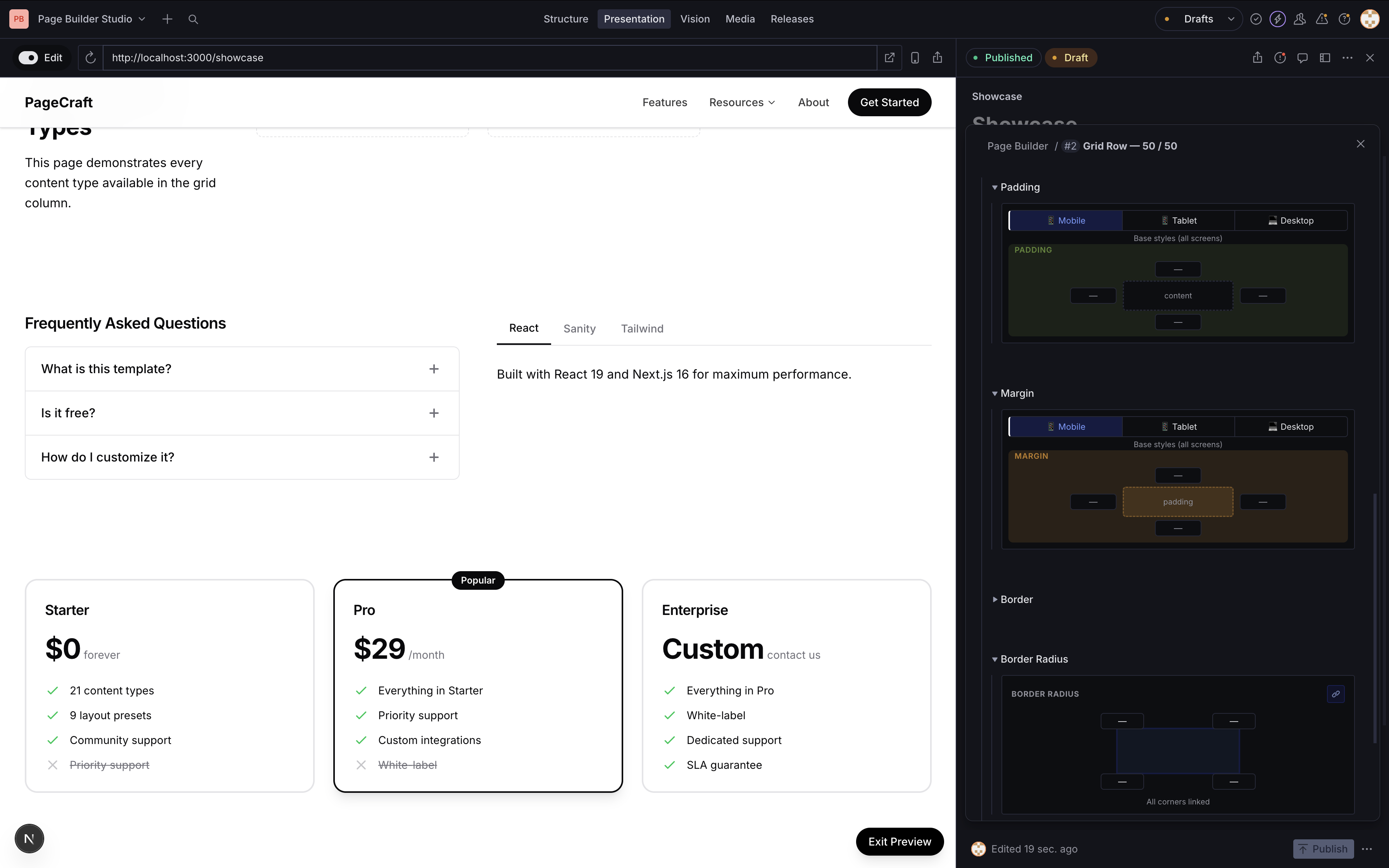
Registers a blockStyles object type in your schema with 6 custom input groups:
- Spacing — padding and margin with a visual box model picker, split into mobile/tablet/desktop breakpoints
- Border — width, style, and color with inline controls
- Border Radius — per-corner radius with a link/unlink toggle for uniform values
- Background — color picker + optional image with size and overlay controls
- Typography — text alignment, font size, and text color
- Effects — box shadow presets, opacity slider, and overflow control
Every group has a clear button to reset values. Color fields use an inline picker with swatch preview and hex input.
Installation
npm install sanity-plugin-block-stylesSetup
Add the plugin to your sanity.config.ts:
import {defineConfig} from 'sanity'
import {blockStyles} from 'sanity-plugin-block-styles'

export default defineConfig({
  // ...
  plugins: [blockStyles()],
})
This registers the blockStyles object type globally. No other config needed.
Usage
Add blockStyles as a field on any schema type:
import {defineType, defineField} from 'sanity'

export const mySection = defineType({
  name: 'mySection',
  type: 'object',
  fields: [
    defineField({
      name: 'title',
      type: 'string',
    }),
    defineField({
      name: 'blockStyles',
      type: 'blockStyles',
      options: {collapsible: true, collapsed: true},
    }),
  ],
})
Editors get the full visual style panel. On the frontend, read the blockStyles object and apply as inline styles or CSS classes.
Data shape
The blockStyles field stores this structure:
{
  "padding": {
    "top": "24px",
    "bottom": "48px",
    "topMd": "32px",
    "bottomMd": "64px",
    "topLg": "48px",
    "bottomLg": "80px"
  },
  "margin": { "top": "0", "bottom": "24px" },
  "border": { "width": "1px", "style": "solid", "color": "#e4e4e7" },
  "borderRadius": { "topLeft": "8px", "topRight": "8px", "bottomRight": "8px", "bottomLeft": "8px" },
  "background": { "color": "#fafafa" },
  "typography": { "textAlign": "center", "fontSize": "16", "textColor": "#09090b" },
  "effects": { "shadow": "md", "opacity": 100 }
}
Responsive fields (topMd, topLg, etc.) correspond to tablet (768px) and desktop (1024px) breakpoints.
Frontend example
function applyBlockStyles(styles) {
  if (!styles) return {}

  return {
    paddingTop: styles.padding?.top,
    paddingBottom: styles.padding?.bottom,
    marginTop: styles.margin?.top,
    backgroundColor: styles.background?.color,
    borderWidth: styles.border?.width,
    borderStyle: styles.border?.style,
    borderColor: styles.border?.color,
    borderRadius: styles.borderRadius
      ? `${styles.borderRadius.topLeft || '0'} ${styles.borderRadius.topRight || '0'} ${styles.borderRadius.bottomRight || '0'} ${styles.borderRadius.bottomLeft || '0'}`
      : undefined,
    textAlign: styles.typography?.textAlign,
    color: styles.typography?.textColor,
  }
}

// For responsive overrides, use CSS custom properties:
// Set --pt-md, --pt-lg as inline style values,
// then in your global CSS:
//
// @media (min-width: 768px) {
//   [style*='--pt-md'] { padding-top: var(--pt-md) !important; }
// }
// @media (min-width: 1024px) {
//   [style*='--pt-lg'] { padding-top: var(--pt-lg) !important; }
// }
Using individual components
You can import any input component standalone for use in custom schemas:
import {
  SpacingInput,
  BorderStyleInput,
  BorderRadiusInput,
  BackgroundInput,
  TypographyInput,
  EffectsInput,
  ColorInput,
  ColorStringInput,
} from 'sanity-plugin-block-styles'
ColorStringInput works as a drop-in components.input for any type: 'string' field that represents a color:
import {ColorStringInput} from 'sanity-plugin-block-styles'

defineField({
  name: 'backgroundColor',
  type: 'string',
  components: {input: ColorStringInput},
})
License
MIT © ogi988
Develop & test
This plugin uses @sanity/plugin-kit with default configuration for build & watch scripts.
npm run build    # Build the plugin
npm run watch    # Watch mode for development
See Testing a plugin in Sanity Studio on how to run this plugin with hotreload in the studio.