
satteri-callouts
v1.0.1
Published
Satteri plugin for processing and rendering blockquote-based callouts (admonitions/alerts).

Maintainers
 lin-stephanie
Readme
satteri-callouts




A Satteri HAST plugin for processing and rendering blockquote-based callouts.
What is this?
This plugin adapts the callout behavior and theme conventions from rehype-callouts to Satteri's HAST plugin system, allowing you to use Obsidian's callout syntax to achieve the following features:
- Includes default callout types for multiple themes.
- Supports collapsible callouts with
-/+and nested callouts. - Optionally import stylesheets for corresponding themes.
- Allows custom titles with Markdown syntax.
- Customizable default callout types.
- Configurable new callout types.
- Configurable aliases for callout types.
- Configurable icon display.
- Configurable element tags and attributes.
Installation
This package is ESM only. In Node.js (version 18+), install with your package manager:
npm install satteri-callouts
yarn add satteri-callouts
pnpm add satteri-callouts
In Deno with esm.sh:
import satteriCallouts from 'https://esm.sh/satteri-callouts'In browsers with esm.sh:
<script type="module">
  import satteriCallouts from 'https://esm.sh/satteri-callouts?bundle'
</script>
Usage
Say example.md contains:
<!-- Callout type names are case-insensitive: 'Note', 'NOTE', and 'note' are equivalent. -->

> [!note] This is a _non-collapsible_ callout
> Some content is displayed directly!

> [!WARNING]- This is a **collapsible** callout
> Some content shown after opening!
Choose your setup:
// example.js
import { readFileSync } from 'node:fs'
import { markdownToHtml } from 'satteri'
import satteriCallouts from 'satteri-callouts'

const { html } = await markdownToHtml(readFileSync('example.md', 'utf8'), {
  hastPlugins: [
    // Without options
    satteriCallouts(),

    // With options
    // satteriCallouts({/* options */}),
  ],
})

console.log(html)
// astro.config.ts
import { defineConfig } from 'astro/config'
import { satteri } from '@astrojs/markdown-satteri'
import satteriCallouts from 'satteri-callouts'
// https://docs.astro.build/en/reference/configuration-reference/
export default defineConfig({
markdown: {
processor: satteri({
mdastPlugins: [
// Without options
satteriCallouts(),
// With options
// satteriCallouts({/* options */}),
],
}),
},
})Run node example.js or pnpm dev:
<div class="callout" data-callout="note" data-collapsible="false">
  <div class="callout-title">
    <div class="callout-title-icon" aria-hidden="true">
      <!-- svg icon -->
    </div>
    <div class="callout-title-text">
      This is a <em>non-collapsible</em> callout
    </div>
  </div>
  <div class="callout-content">
    <p>Some content is displayed directly!</p>
  </div>
</div>

<details class="callout" data-callout="warning" data-collapsible="true">
  <summary class="callout-title">
    <div class="callout-title-icon" aria-hidden="true">
      <!-- svg icon -->
    </div>
    <div class="callout-title-text">
      This is a <strong>collapsible</strong> callout
    </div>
    <div class="callout-fold-icon" aria-hidden="true">
      <!-- svg icon -->
    </div>
  </summary>
  <div class="callout-content">
    <p>Some content shown after opening!</p>
  </div>
</details>
This plugin also processes blockquote callouts written as raw HTML in Markdown. See the Example below for usage.
API
This package exports no identifiers. The default export is satteriCallouts.
satteriCallouts(options?)
Creates a Satteri HAST plugin definition. Pass the returned plugin to markdownToHtml and mdxToJs through hastPlugins.
Parameters
options(UserOptions, optional) — configuration
UserOptions
Configuration (TypeScript type). All options are optional.
Fields
theme('github' | 'obsidian' | 'vitepress' | 'docusaurus', default:'obsidian') — default callout set and title casing.callouts(Record<string, CalloutConfig>, default: see source code) — configure default and custom callout types as key-value pairs, where each key is a callout type using characters ([a-z], [A-Z], [0-9]), underscores (_), or hyphens (-), and each value specifies its default text and icon, e.g.,{'note': {title: 'custom title'}, 'custom-type': {title: 'new callout', indicator: '<svg ...">...</svg>'}}.aliases(Record<string, string[]>, default:{}) — aliases for callout types, e.g.,{'note': ['n'], 'tip': ['t']}.showIndicator(boolean, default:true) — whether to display type-specific icons before callout titles.showDefaultTitle(boolean, default:true) — whether to display the default callout title when no custom title is provided.tags(TagsConfig, default: alldiv) — HTML tag names for generated callout structure.props(PropsConfig, default: allnull) — element properties for generated callout structure. SettingclassorclassNameoverrides the default class name for that element; see examples below.
Styling
You can customize callout styles with class names or by importing one of the theme-specific stylesheets.
Import in JavaScript/TypeScript:
import 'satteri-callouts/theme/github'
// import 'satteri-callouts/theme/obsidian'
// import 'satteri-callouts/theme/vitepress'
// import 'satteri-callouts/theme/docusaurus'
Import in CSS:
@import 'satteri-callouts/theme/github';Import in Sass:
@use 'satteri-callouts/theme/github';Directly include in HTML via CDN (unpkg.com or jsdelivr.net):
<link
  rel="stylesheet"
  href="https://unpkg.com/satteri-callouts/dist/themes/github/index.css"
/>
<link
  rel="stylesheet"
  href="https://cdn.jsdelivr.net/npm/satteri-callouts/dist/themes/github/index.css"
/>
Customize callout colors with CSS custom properties:
/* Using CSS custom properties for default callouts only */
:root {
  /* Customize default callout colors with: --callout-{type}-color-{light|dark}: <color> */
  --callout-note-color-light: pink;
  --callout-note-color-dark: #ffc0cb;
  --callout-tip-color-light: rgb(255, 192, 203);
  --callout-tip-color-dark: hsl(350, 100%, 88%);

  /* Docusaurus theme only: customize the left border color in both light and dark modes */
  --callout-note-border-color: #ff66ab;
}

/* Using attribute selectors for both default and custom callouts */
/* Custom callouts default to #888 if no color is set */
[data-callout='warning'],
[data-callout='custom'] {
  --rc-color-light: pink;
  --rc-color-dark: #ffc0cb;

  /* Docusaurus theme only */
  --rc-border-color: #ff66aa;
}
Themes
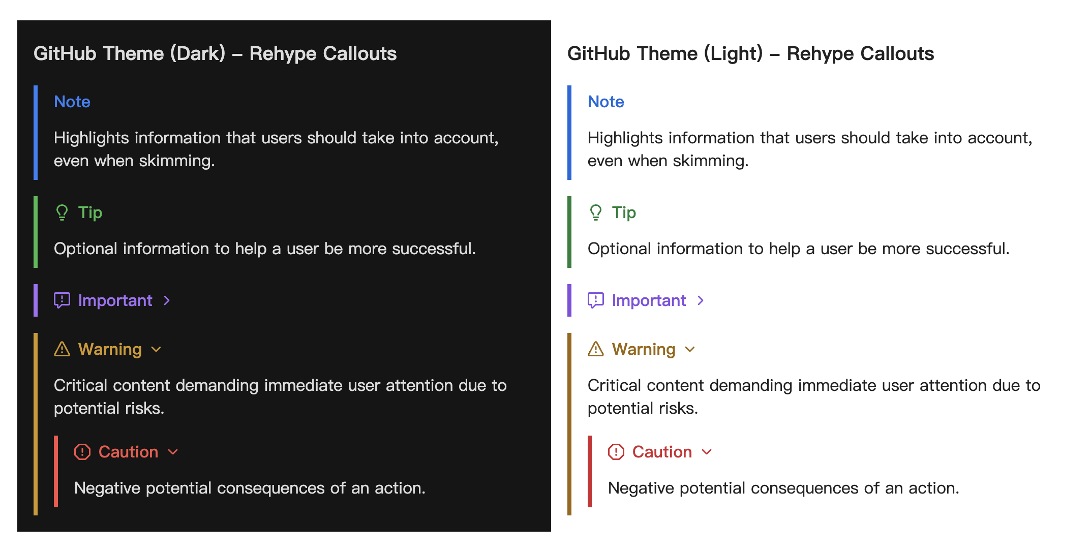
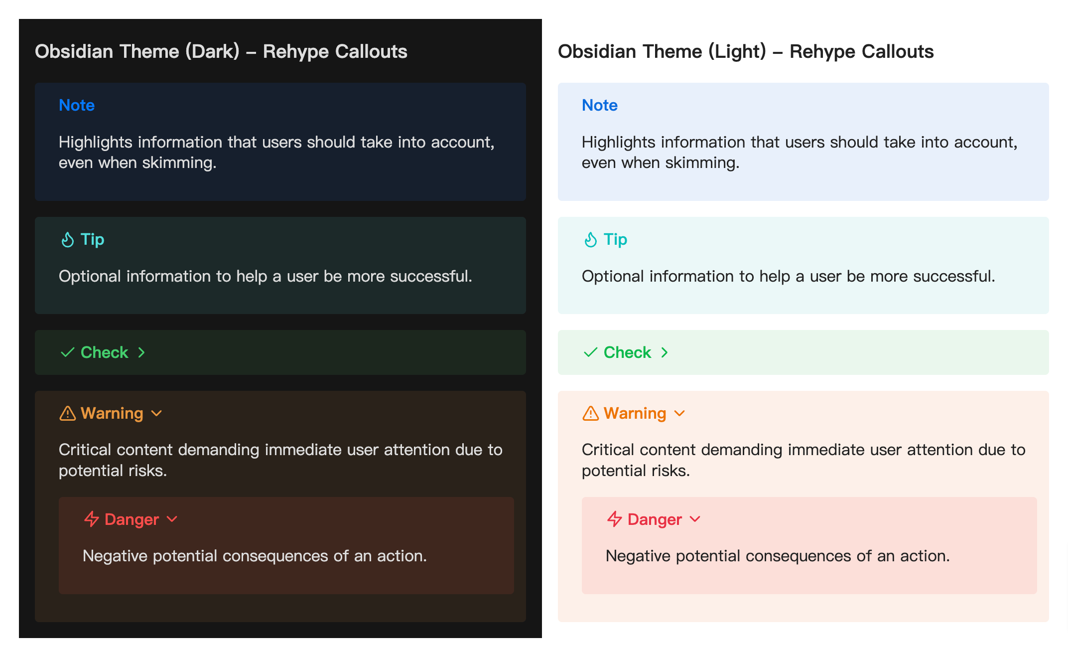
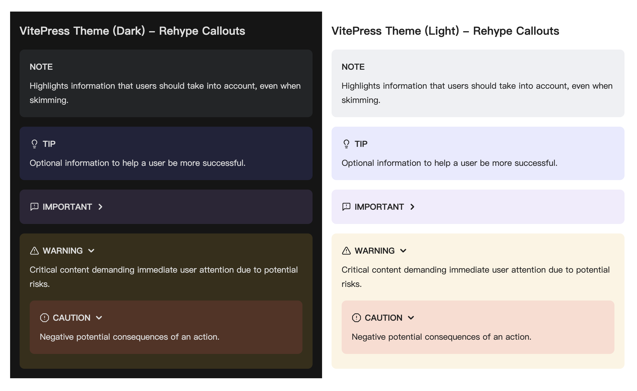
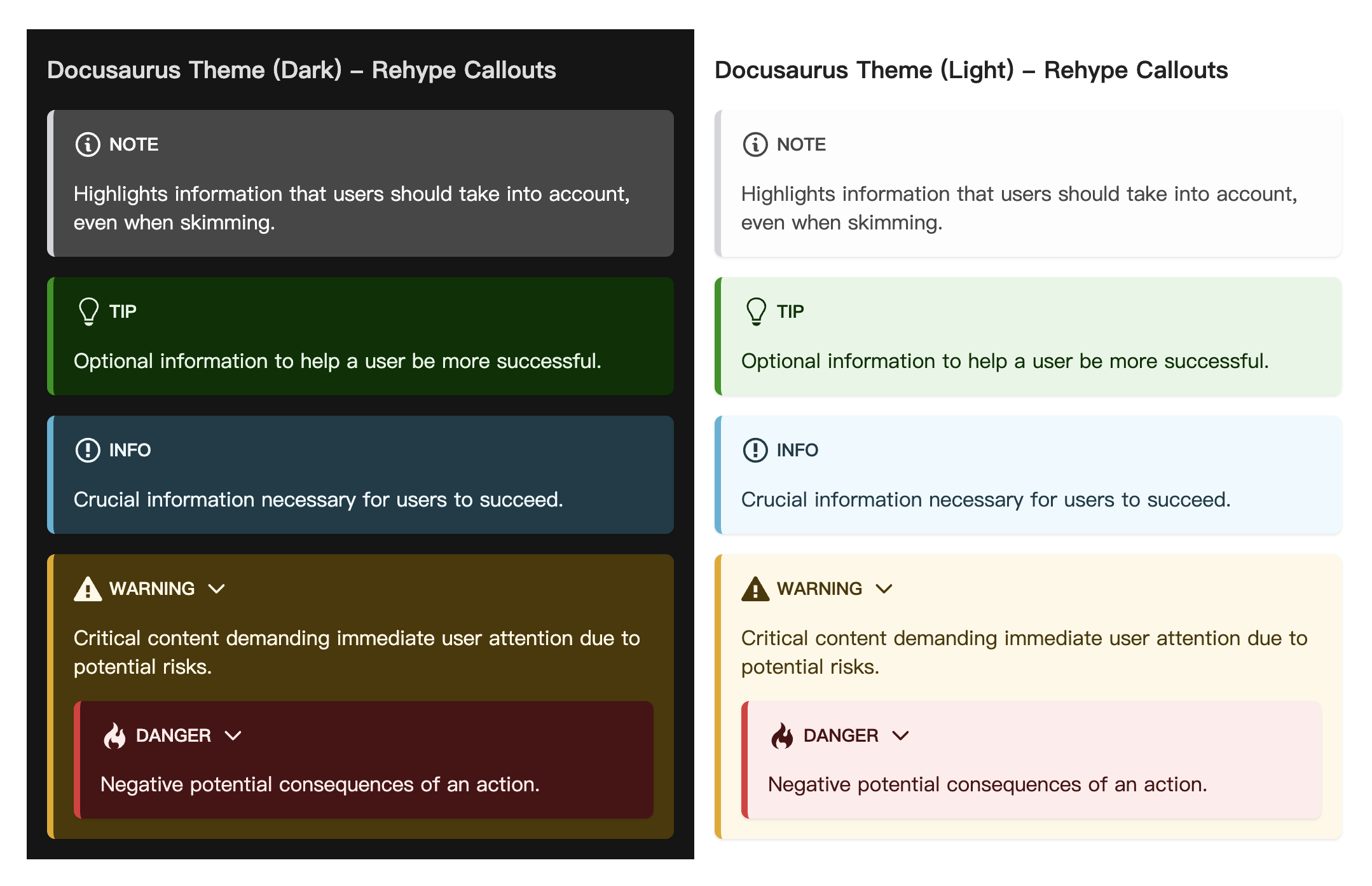
This package provides callout styles compatible with GitHub, Obsidian, VitePress, and Docusaurus, with dark mode support via the .dark class. See the source code for details.
GitHub
Obsidian
VitePress
Docusaurus
Examples
Example: override default class names
The props option allows overriding the default class names generated by the plugin. The example from before can be changed like so:
import { readFileSync } from 'node:fs'
import { markdownToHtml } from 'satteri'
import satteriCallouts from 'satteri-callouts'

const { html } = await markdownToHtml(readFileSync('example.md', 'utf8'), {
-  hastPlugins: [satteriCallouts()],
+  hastPlugins: [
+    satteriCallouts({
+      props: {
+        titleProps: { class: 'custom-class1' },
+        contentProps: { className: ['custom-class2', 'custom-class3'] },
+      },
+    }),
+  ],
})

console.log(html)
…that would output:
<div class="callout" data-callout="note" data-collapsible="false">
- <div class="callout-title">
+ <div class="custom-class1">
    <div class="callout-title-icon" aria-hidden="true">
      <!-- svg icon -->
    </div>
    <div class="callout-title-text">
      This is a <em>non-collapsible</em> callout
    </div>
  </div>
- <div class="callout-content">
+ <div class="custom-class2 custom-class3">
    <p>Some content is displayed directly!</p>
  </div>
</div>

<details class="callout" data-callout="warning" data-collapsible="true">
- <summary class="callout-title">
+ <summary class="custom-class1">
    <div class="callout-title-icon" aria-hidden="true">
      <!-- svg icon -->
    </div>
    <div class="callout-title-text">
      This is a <strong>collapsible</strong> callout
    </div>
    <div class="callout-fold-icon" aria-hidden="true">
      <!-- svg icon -->
    </div>
  </summary>
- <div class="callout-content">
+ <div class="custom-class2 custom-class3">
    <p>Some content shown after opening!</p>
  </div>
</details>
Example: custom attributes for callout elements
The props option allows adding custom attributes to elements in generated callouts. The example from before can be changed to add the dir: auto attribute to the outer container of both collapsible and non-collapsible callouts, and to set a custom color for 'note' callouts, like so:
import { readFileSync } from 'node:fs'
import { markdownToHtml } from 'satteri'
import satteriCallouts from 'satteri-callouts'

const { html } = await markdownToHtml(readFileSync('example.md', 'utf8'), {
-  hastPlugins: [satteriCallouts()],
+  hastPlugins: [
+    satteriCallouts({
+      props: {
+        containerProps(_, type) {
+          const newProps: Record<string, string> = {
+            dir: 'auto',
+          }
+          if (type === 'note') {
+            newProps.style = '--rc-color-light:#fc7777; --rc-color-dark:#fa9292;'
+          }
+          return newProps
+        },
+      },
+    }),
+  ],
})

console.log(html)
…that would output:
<div
+ dir="auto"
+ style="--rc-color-light:#fc7777; --rc-color-dark:#fa9292;"
  class="callout"
  data-callout="note"
  data-collapsible="false"
>
  <div class="callout-title">
    <div class="callout-title-icon" aria-hidden="true">
      <!-- svg icon -->
    </div>
    <div class="callout-title-text">
      This is a <em>non-collapsible</em> callout
    </div>
  </div>
  <div class="callout-content">
    <p>Some content is displayed directly!</p>
  </div>
</div>

<details
+ dir="auto"
  class="callout"
  data-callout="warning"
  data-collapsible="true"
>
  <summary class="callout-title">
    <div class="callout-title-icon" aria-hidden="true">
      <!-- svg icon -->
    </div>
    <div class="callout-title-text">
      This is a <strong>collapsible</strong> callout
    </div>
    <div class="callout-fold-icon" aria-hidden="true">
      <!-- svg icon -->
    </div>
  </summary>
  <div class="callout-content">
    <p>Some content shown after opening!</p>
  </div>
</details>
Example: raw HTML blockquote callouts
example.md can contain blockquote callouts written directly as raw HTML:
<blockquote>
  <p>[!note]</p>
  <p>This is the content!</p>
</blockquote>

<blockquote>
  <p>[!TIP] This is a tip callout</p>
  <p>This is the content!</p>
</blockquote>
Process it with the same Satteri setup:
import { readFileSync } from 'node:fs'
import { markdownToHtml } from 'satteri'
import satteriCallouts from 'satteri-callouts'

const { html } = await markdownToHtml(readFileSync('example.md', 'utf8'), {
  hastPlugins: [satteriCallouts()],
})

console.log(html)
…that would output:
<div class="callout" data-callout="note" data-collapsible="false">
  <div class="callout-title">
    <div class="callout-title-icon" aria-hidden="true">
      <!-- svg icon -->
    </div>
    <div class="callout-title-text">Note</div>
  </div>
  <div class="callout-content">
    <p>This is the content!</p>
  </div>
</div>

<div class="callout" data-callout="tip" data-collapsible="false">
  <div class="callout-title">
    <div class="callout-title-icon" aria-hidden="true">
      <!-- svg icon -->
    </div>
    <div class="callout-title-text">This is a tip callout</div>
  </div>
  <div class="callout-content">
    <p>This is the content!</p>
  </div>
</div>
Types
This package is fully typed with TypeScript. It exports the additional types UserOptions, CalloutConfig, TagsConfig, PropsConfig and CreateProperties. See jsDocs.io for type details.
Contribution
If you see any errors or room for improvement on this plugin, feel free to open an issues or pull request . Thank you in advance for contributing!
License
MIT © 2026-PRESENT Stephanie Lin