
sautocomplete-suggestion
v1.2.1
Published
A lightweight, dependency-free grouped autocomplete suggestion input (Vanilla TS). Sync + async dataSource, virtualized, sanitized, form-ready. Framework-agnostic with React, Vue and Angular wrappers.

Maintainers
 nbhson43
Readme
SAutocomplete Suggestion
A lightweight, dependency-free grouped autocomplete suggestion input built with Vanilla TypeScript.
Behavioral port of the Consent AI 4 main input — without any AI: the host app provides grouped data ({ id, group, label }[]), the component handles accent-insensitive filtering, active-word highlight, staged multi-select and submit. Framework-agnostic with React, Vue and Angular wrappers (full dynamic @Input/@Output for Angular).
All UI strings are in English by default and overridable via locale.
Enterprise edition (v1.2.1): async
dataSource(debounce + abort + cache), virtualization, allowlist-sanitized icons, native form integration (name+getFormValue()), genericSuggestionItem<T>payloads, pluggable history adapters, logger + telemetry hooks, design tokens (theme/density/RTL/font/ surfaces/cssVars), full keyboard nav + live regions. Full guide:docs/ENTERPRISE.md.


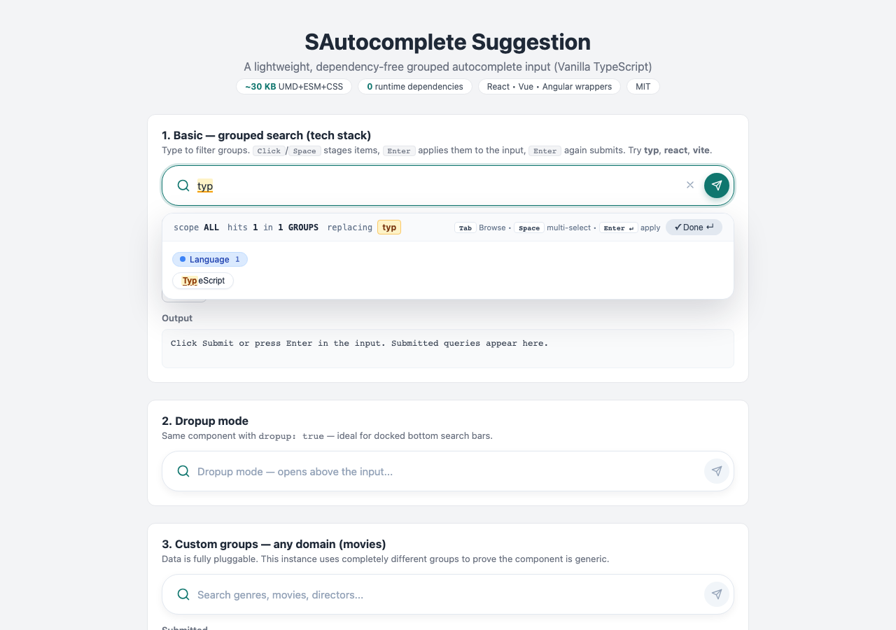
Table of Contents
- Features
- Installation
- Quick Start
- API
- Custom Groups
- Available Default Groups
- Custom Color & Submit Icon
- Locale (English by default)
- Keyboard Shortcuts
- How It Works (staged flow)
- Bundle Sizes
- Framework Integration
- Development
- Publishing to npm
- Project Structure
- License
Features
- 🚀 Lightweight — tiny bundle, 0 runtime dependencies
- 🗂️ Grouped suggestions — any groups + values; data is assumed available (no AI, no network)
- 🔍 Accent-insensitive matching + token matching (
cafematchesCafé) - 🖍️ Active-word highlight — mirrored underlay with amber highlight on the word/entity at the cursor
- ✅ Staged multi-select —
Click/Spacestages chips,Enter/Applycommits to input,Enteragain submits - 🎨 Customizable — accent
color,submitIcon, radii, fonts, surfaces and shadows viatokens+cssVars(full CSS-variable theming, no overrides needed) - ⌨️ Full keyboard control —
Tabcycle,Arrowsnavigate,Entercommit/submit,Escclose - 🕘 Recent history — dropdown when input is empty (configurable, default 5)
- ⬆️ Dropup mode — for docked bottom search bars
- ♿ Accessible —
combobox/listbox/optionroles,aria-selected,aria-expanded, labeled buttons - 🛡️ XSS-safe — all labels/queries escaped via a dedicated
sanitizermodule - 🌙 Dark Mode — automatic via
prefers-color-scheme - 📱 Responsive — works on all screen sizes
- 🔧 Simple API — one
createAutocomplete()call, framework wrappers included
Installation
npm install sautocomplete-suggestionQuick Start
Using ES Modules (Recommended)
import { createAutocomplete } from 'sautocomplete-suggestion';
import 'sautocomplete-suggestion/dist/styles.css';

const editor = createAutocomplete({
  container: '#editor',
  items: [
    { id: 'l1', group: 'Language', label: 'TypeScript' },
    { id: 'f1', group: 'Framework', label: 'React' },
    { id: 't1', group: 'Tool', label: 'Vite' },
  ],
  placeholder: 'Search languages, frameworks, tools...',
  onSubmit: (query) => console.log('Submitted:', query),
});

// Programmatic access
editor.setQuery('typ');
console.log(editor.getQuery());
Using UMD (via script tag in plain HTML)
Option 1: Via CDN (unpkg / jsDelivr)
No installation needed — just add these to your HTML <head>:
<!DOCTYPE html>
<html lang="en">
<head>
  <meta charset="UTF-8" />
  <title>My Page</title>
  <link rel="stylesheet" href="https://unpkg.com/sautocomplete-suggestion/dist/styles.css" />
</head>
<body>
  <div id="editor"></div>
  <script src="https://unpkg.com/sautocomplete-suggestion/dist/sautocomplete-suggestion.umd.js"></script>
  <script>
    const editor = SAutocomplete.createAutocomplete({
      container: '#editor',
      items: [{ id: '1', group: 'Language', label: 'TypeScript' }],
      onSubmit: (query) => console.log(query),
    });
  </script>
</body>
</html>
Note: the UMD build exposes the global
SAutocomplete. CallSAutocomplete.createAutocomplete(...).
Option 2: Using importmap (modern browsers, no bundler)
<link rel="stylesheet" href="https://unpkg.com/sautocomplete-suggestion/dist/styles.css" />
<div id="editor"></div>
<script type="importmap">
{ "imports": { "sautocomplete-suggestion": "https://unpkg.com/sautocomplete-suggestion/dist/sautocomplete-suggestion.esm.js" } }
</script>
<script type="module">
  import { createAutocomplete } from 'sautocomplete-suggestion';
  createAutocomplete({ container: '#editor', items: [] });
</script>
API
createAutocomplete(options)
Creates a new autocomplete instance. Returns an AutocompleteInstance.
Options
| Option | Type | Default | Description |
|---|---|---|---|
| container | string \| HTMLElement | required | CSS selector or DOM element |
| items | SuggestionItem[] | DEFAULT_ITEMS | { id, group, label }[] — data assumed available |
| groups | GroupConfig[] | DEFAULT_GROUPS | Group theming ({ name, badgeBg, badgeText, badgeBorder, icon }) |
| groupOrder | string[] | first-appearance | Explicit group display order |
| placeholder | string | 'Search by keyword...' | Input placeholder |
| value | string | '' | Initial query |
| dropup | boolean | false | Open dropdown above the input |
| disabled | boolean | false | Disabled mode |
| minChars | number | 1 | Min chars to trigger suggestions |
| maxHistory | number | 5 | History size (0 disables history) |
| history | string[] | [] | Initial history entries |
| maxItemsPerGroup | number | 0 | Limit per group (0 = unlimited) |
| maxTotalItems | number | 0 | Limit total (0 = unlimited) |
| matchMode | 'accent-insensitive' \| 'exact' | 'accent-insensitive' | Matching mode |
| dataSource | (req) => Promise<SuggestionItem[]> | — | Async provider ({ query, fullQuery, signal }); takes precedence over items |
| debounceMs | number | 200 | Debounce for dataSource (sync path stays immediate) |
| asyncCache | boolean | true | Per-query FIFO cache for dataSource |
| showStatusBar | boolean | true | Status bar: scope, hits, replacing pill, staged pill, keyboard hints, Apply button |
| virtualizeThreshold | number | 200 | Render cap for large hit lists (0 = off) |
| historyAdapter | HistoryAdapter | memory | Pluggable history persistence (createLocalStorageHistory() available) |
| name | string | — | Native form integration (renders a hidden input) |
| formJoin | string | ', ' | Separator for the hidden form value |
| tokens | DesignTokens | — | Theme/density/direction/fonts/surfaces/shadow + cssVars escape hatch |
| debug | boolean | false | Verbose console logging + timing in status bar |
| logger | Logger | — | Custom logger (debug/info/warn/error) |
| telemetry | { onSearch, onSelect, onError } | — | Observability hooks |
| onAsyncError | (err) => void | — | Fired when dataSource rejects |
| showHistory | boolean | true | Recent-history dropdown |
| showApplyButton | boolean | true | Apply/Done button in dropdown |
| className | string | '' | Extra CSS class on root |
| submitIcon | string | send icon | Custom submit button icon (inline SVG markup, trusted) |
| color | string | '#0f766e' | Accent color for focus ring, submit button, staged chips, status (any CSS color) |
| colorDark | string | derived | Darker accent variant for hover states |
| borderRadius | string \| number | 24 | Main input bar radius (any CSS radius or px number) |
| locale | LocaleStrings | English | Override any UI string |
| onSubmit | (query: string) => void | — | Fired on submit |
| onChange | (query: string) => void | — | Fired on every change |
| onStageChange | (staged) => void | — | Fired when staged multi-select changes |
| onFocus / onBlur | () => void | — | Focus callbacks |
| onReady | (instance) => void | — | Ready callback |
Instance methods
| Method | Returns | Description |
|---|---|---|
| getQuery() | string | Current query text |
| getText() | string | Plain text content (alias of getQuery) |
| getFormValue() | string | Query + staged labels serialized for <form> |
| reload() | void | Re-run current query (refetches dataSource) |
| isLoading() | boolean | Whether an async request is in flight |
| isEmpty() | boolean | Whether the query is empty |
| getCharacterCount() | number | Character count of the query |
| getWordCount() | number | Word count of the query |
| setQuery(v, { open, focus }) | void | Set query (opens + focuses by default) |
| clear() | void | Clear query + staged |
| focus() / blur() | void | Focus / blur the input |
| submit(overrideQuery?) | void | Submit (saves history, fires onSubmit) |
| getStaged() / clearStaged() | SuggestionItem[] / void | Staged multi-select buffer |
| getHistory() / clearHistory() | string[] / void | Recent history |
| setItems(items) / getItems() | void / SuggestionItem[] | Dynamic data update (unknown new groups are appended) |
| setGroups(groups) | void | Dynamic group order update |
| enable() / disable() / isDisabled() | void / boolean | Enabled state |
| setDropup(v) | void | Switch dropdown direction at runtime |
| setBorderRadius(v) | void | Update main input radius at runtime ('12px' or 12) |
| setTheme(accent, dark?) | void | Update accent theme at runtime |
| getElement() | HTMLElement | Root element |
| on(evt, handler) | () => void | Subscribe (submit\|change\|stage\|focus\|blur), returns unsubscribe |
| destroy() | void | Remove instance + listeners |
Working with the query (getQuery / setQuery / onChange)
const editor = createAutocomplete({
  container: '#editor',
  onChange: (query) => {
    // same string as getQuery()
    console.log('Current query:', query);
  },
});

editor.setQuery('React, Vite');
console.log(editor.getQuery()); // "React, Vite"

document.getElementById('save')?.addEventListener('click', () => {
  fetch('/api/search', {
    method: 'POST',
    headers: { 'Content-Type': 'application/json' },
    body: JSON.stringify({ query: editor.getQuery(), staged: editor.getStaged() }),
  });
});
Custom Groups
Any domain works — groups are just strings:
createAutocomplete({
  container: '#editor',
  items: [
    { id: 'g1', group: 'Genre', label: 'Sci-Fi' },
    { id: 'm1', group: 'Movie', label: 'Dune: Part Two' },
    { id: 'd1', group: 'Director', label: 'Denis Villeneuve' },
  ],
  groupOrder: ['Genre', 'Movie', 'Director'],
});
Available Default Groups
The bundled sample dataset ships with 6 groups (override freely via items / groupOrder):
| Group | Badge color | Example values |
|---|---|---|
| Language | blue | TypeScript, JavaScript, Python, Go, Rust |
| Framework | emerald | React, Vue, Angular, Svelte |
| Tool | amber | Vite, ESLint, Vitest, Playwright, Rollup |
| Platform | rose | Web, Node.js, Desktop, Mobile |
| License | purple | MIT, Apache-2.0, GPL-3.0 |
| Topic | indigo | Frontend, Testing, Accessibility, Performance |
Custom Color, Submit Icon & Border Radius
Each instance can carry its own accent theme, submit icon and input radius — no CSS overrides needed:
const editor = createAutocomplete({
  container: '#editor',
  items,
  color: '#0f766e', // any CSS color; focus ring, submit button, staged chips follow
  colorDark: '#115e59', // optional hover shade (auto-derived when omitted)
  borderRadius: 16, // main input bar radius: px number or any CSS radius (default 24)
  submitIcon: '<svg width="16" height="16" viewBox="0 0 24 24" fill="none" stroke="currentColor" stroke-width="2" stroke-linecap="round" stroke-linejoin="round"><path d="M5 12h14"/><path d="m12 5 7 7-7 7"/></svg>',
});

// Update radius later without recreating:
editor.setBorderRadius(12);
editor.setBorderRadius('999px'); // pill
<!-- Angular -->
<s-autocomplete-suggestion
[items]="items"
[color]="'#0f766e'"
[borderRadius]="16"
[submitIcon]="arrowIcon">
</s-autocomplete-suggestion>Design tokens & CSS variables (v1.2+)
For deeper customization (fonts, surfaces, panel, shadows) use tokens — every
key maps to a CSS variable on the instance root, so instances stay isolated:
createAutocomplete({
  container: '#editor',
  items,
  tokens: {
    theme: 'system',       // 'light' | 'dark' | 'system'
    density: 'compact',    // 'comfortable' | 'compact'
    direction: 'auto',     // 'ltr' | 'rtl' | 'auto'
    fontFamily: 'Inter, system-ui, sans-serif',
    fontSize: 15,
    background: '#ffffff',
    foreground: '#1e293b',
    borderColor: '#e2e8f0',
    mutedColor: '#64748b',
    dropdownRadius: 14,
    maxDropdownHeight: 320,
    shadow: '0 20px 50px rgba(15,23,42,.18)',
    cssVars: { '--sa-chip-gap': '10px' }, // escape hatch for any variable below
  },
});
| Token | CSS variable | Default |
|---|---|---|
| color / colorDark | --sa-accent / --sa-accent-dark | #0f766e / derived |
| borderRadius | --sa-radius | 24px |
| tokens.fontFamily | --sa-font | system stack |
| tokens.fontSize | --sa-font-size | 15px |
| tokens.background | --sa-bg | #ffffff (#0f172a dark) |
| tokens.foreground | --sa-fg | #1e293b (#e2e8f0 dark) |
| tokens.borderColor | --sa-border | #e2e8f0 (#1e293b dark) |
| tokens.mutedColor | --sa-muted | #64748b |
| tokens.dropdownRadius | --sa-drop-radius | 16px |
| tokens.maxDropdownHeight | --sa-drop-max | 360px |
| tokens.shadow | --sa-shadow | 0 20px 50px rgba(15,23,42,.18) |
| density compact | --sa-chip-gap, --sa-bar-min-h | 6px, 46px |
The status bar shows scope, hits, the
replacingpill, staged count, keyboard hints and Apply — all overridable vialocale. Themstiming was removed in v1.2.1 (it implied remote AI search; this library assumes local data) — elapsed time remains available viatelemetry.onSearch.
Locale (English by default)
createAutocomplete({
  container: '#editor',
  locale: {
    recentTitle: 'Recent searches',
    selected: 'Selected',
    apply: 'Apply',
    done: 'Done',
    hits: 'hits',
    groups: 'groups',
    replacing: 'replacing',
    loading: 'Loading…',
    loadError: 'Could not load suggestions',
    retry: 'Retry',
    empty: 'No matches — try another keyword',
  },
});
Keyboard Shortcuts
| Shortcut | Action |
|---|---|
| Tab / Shift+Tab | Move focus across suggestion chips |
| Space | Stage / unstage focused chip (multi-select), advances focus |
| ← → ↑ ↓ | Navigate chips |
| Home / End | Jump to first / last chip |
| PageUp / PageDown | Jump 5 chips |
| Enter (staged > 0) | Apply staged items into the input (does not submit) |
| Enter (chip focused) | Apply single chip into the input (does not submit) |
| Enter (on input) | Submit query |
| Esc | Clear chip focus → clear staged → close dropdown |
How It Works (staged flow)
- Type — the active word at the cursor filters all groups (accent-insensitive).
- Stage —
Clicka chip or focus it withTaband pressSpace. Repeat for multi-select. The header showsSelected: N. - Apply — press
Enteror clickApply (N)to commit staged labels into the input (dropdown closes, no submit yet). - Submit — press
Enteron the input or click the Send button. The query is saved to history andonSubmitfires.
Bundle Sizes
| File | Size | Format |
|---|---|---|
| sautocomplete-suggestion.umd.js | ~31 KB | UMD (script tags, SAutocomplete global) |
| sautocomplete-suggestion.esm.js | ~30 KB | ES Modules |
| styles.css | ~9 KB | CSS |
Total package: ~70 KB (~39 KB served: pick ESM or UMD + CSS) · Total runtime dependencies: 0.
Framework Integration
React
Copy frameworks/react.tsx into your app:
import { SAutocomplete } from './SAutocomplete';

function Page() {
  return (
    <SAutocomplete
      items={items}
      placeholder="Search..."
      onSubmit={(q) => console.log('Submitted:', q)}
      onQueryChange={(q) => console.log('Query:', q)}
      onStagedChange={(s) => console.log('Staged:', s)}
    />
  );
}
Vue
Copy frameworks/vue.vue:
<template>
  <SAutocomplete :items="items" placeholder="Search..." @submit="onSubmit" @change="onChange" @stage="onStage" />
</template>

<script setup lang="ts">
import SAutocomplete from './SAutocomplete.vue';
const items = [{ id: '1', group: 'Language', label: 'TypeScript' }];
function onSubmit(q: string) { console.log('Submitted:', q); }
function onChange(q: string) { console.log('Query:', q); }
function onStage(s: unknown) { console.log('Staged:', s); }
</script>
Angular
1. Install the package
npm install sautocomplete-suggestion2. Copy the wrapper component
Copy frameworks/angular.ts into your app (e.g. s-autocomplete-suggestion.component.ts). Every option is an @Input(), every event an @Output():
// @Input(): placeholder, value, items, groups, groupOrder, dropup, disabled,
//   minChars, maxHistory, history, maxItemsPerGroup, maxTotalItems,
//   showStatusBar, showHistory, showApplyButton, className, locale,
//   submitIcon, color, colorDark, borderRadius
// @Output(): querySubmit, queryChange, stagedChange, focused, blurred, ready
// Methods: getQuery(), getText(), isEmpty(), getWordCount(), getCharacterCount(),
//   setQuery(v), clear(), focus(), submit(q?), setDropup(v), setBorderRadius(v)
3. Use in a page
<s-autocomplete-suggestion
  [placeholder]="'Search...'"
  [items]="items"
  [groupOrder]="['Language', 'Framework']"
  [dropup]="false"
  [disabled]="false"
  [maxHistory]="5"
  (querySubmit)="onSubmit($event)"
  (queryChange)="onChange($event)"
  (stagedChange)="onStage($event)">
</s-autocomplete-suggestion>
export class AppComponent {
items = [{ id: '1', group: 'Language', label: 'TypeScript' }];
onSubmit(q: string) { console.log('Submitted:', q); }
onChange(q: string) { console.log('Query:', q); }
onStage(s: unknown) { console.log('Staged:', s); }
}Development
# Install dependencies
npm install --legacy-peer-deps

# Development mode with watch
npm run dev

# Build for production (styles.css + ESM + UMD + d.ts)
npm run build

# Run unit tests
npm run test

# Run unit tests in watch mode
npm run test:watch

# Lint
npm run lint

# Run E2E tests (requires build first)
npm run build && npm run test:e2e

# Open demo (build first, then serve repo root)
npm run build && npx http-server ./ -p 8080
# → http://127.0.0.1:8080/demo/index.html
Publishing to npm
# Login to npm
npm login

# (Optional) Dry run to check what will be published
npm pack --dry-run

# Publish
npm publish

# Update version and publish
npm version patch  # or minor / major
npm publish
Project Structure
sautocomplete-suggestion/
├── src/
│   ├── index.ts          # Entry point, exports
│   ├── types.ts          # TypeScript interfaces
│   ├── core.ts           # Core vanilla logic (input, dropdown, staged, keyboard, history)
│   ├── matching.ts       # Accent-insensitive grouped matching
│   ├── matching.test.ts  # Unit tests for matching
│   ├── sanitizer.ts      # HTML escaping (XSS protection)
│   ├── sanitizer.test.ts # Unit tests for sanitizer
│   ├── highlight.ts      # Active word/entity highlight
│   ├── default-data.ts   # Default sample dataset (English)
│   ├── themes.ts         # Group badge color themes
│   ├── core.test.ts      # Unit tests for core
│   ├── styles.css        # Component styles (light + dark mode)
│   └── global.d.ts       # CSS module declaration
├── frameworks/
│   ├── react.tsx         # React wrapper
│   ├── vue.vue           # Vue wrapper
│   └── angular.ts        # Angular wrapper (full @Input/@Output)
├── demo/
│   ├── index.html        # Demo page (basic + dropup + custom groups + events log)
│   └── screenshot.png    # Demo screenshot
├── e2e/
│   ├── autocomplete.spec.ts  # Playwright E2E tests
│   ├── test-page.html        # Isolated E2E test page
│   └── server.js             # Dev server for E2E
├── dist/                 # Build output (git-ignored)
├── package.json
├── rollup.config.mjs     # Rollup build config (CSS + ESM + UMD + d.ts)
├── tsconfig.json         # TypeScript config
├── eslint.config.mjs     # ESLint config
├── vitest.config.ts      # Vitest config (unit tests)
├── playwright.config.ts  # Playwright config (E2E tests)
├── .gitignore
├── LICENSE
└── README.md
License
MIT