
scraps-ui
v0.5.1
Published
A UI library where everything is cut and torn paper

Maintainers
 ogme01
Readme
scraps
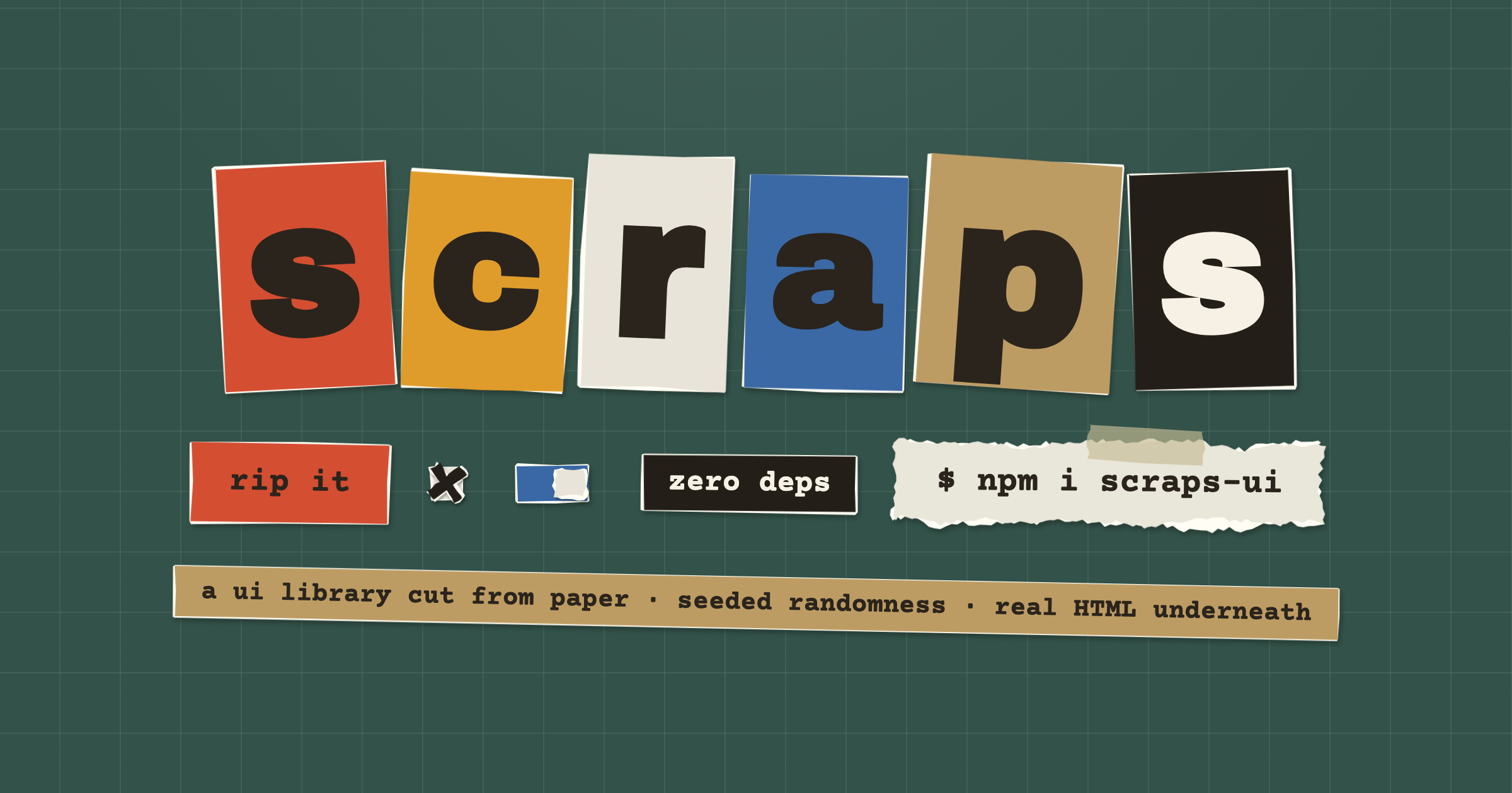
Demo: scraps.ogme01.com
A UI library where everything is cut and torn paper.
Every component is a real HTML element backed by a procedurally generated SVG scrap. Torn edges get a fibrous white fringe, scissor-cut edges get straight strokes with a little drift, and everything sits at a slightly crooked angle with a paper-grain texture and a drop shadow. Randomness is seeded (mulberry32): the same seed produces pixel-identical tears on any machine. Hover a scrap and it re-tears itself, quivering like a 90s cartoon.
Real HTML inputs underneath. Zero dependencies. Two files.
Install
<link rel="stylesheet" href="scraps.css">
<script src="scraps.js"></script>
Use
<button data-scrap="button" data-color="coral">rip it</button>
<label data-scrap="toggle"><input type="checkbox"> deckle edges</label>
<div data-scrap="card" data-color="kraft" data-tape>a note, taped to the mat</div>

<script>
  Scraps.init()               // tear everything with [data-scrap]
  Scraps.reseed('zine-04')    // re-tear the whole page from a new seed
  Scraps.tear(el)             // re-tear one element
  Scraps.setProgress(el, 64)  // move a progress bar
  Scraps.boil = false         // disable hover re-tearing globally
</script>
Components (data-scrap)
| type | element | edges |
| --- | --- | --- |
| button | <button> | cut |
| chip | any inline element | cut |
| card | any block element | torn |
| field | <input>, <textarea>, <select>, <input type=range> | cut |
| checkbox / radio / toggle | <label> wrapping an <input> | cut / torn |
| progress | <div data-value="40" data-fill="coral"> | torn |
| divider | <div> | torn |
| dialog | native <dialog> (also sheets via data-side="right") | torn |
| menu | a panel of buttons, opened by any data-menu="#id" trigger | torn |
| tabs | [data-tab] buttons + [data-panel] panels | cut / torn |
| accordion | native <details>/<summary> | torn |
| table | a real <table> on ruled paper | torn |
| avatar | <img> torn out along a seeded edge | torn |
| skeleton | <div> that slowly re-tears while loading | torn |
| alert | kraft paper, tape, and role="alert" | torn |
Selects open a paper dropdown instead of the native popup; the real
<select> keeps the value, the change events, and the keyboard focus.
Checkbox X marks land at a slightly different angle and position on every
check. Tooltips need no component: any element with data-tip="text" grows
a small scrap on hover and focus. Toasts are a call:
Scraps.toast('glued.', { color: 'ink', duration: 4000 }). Breadcrumbs and
pagination compose from chips; see the swatch book.
Attributes
data-color:white · kraft · coral · marigold · blue · inkdata-edge:torn | cut, overrides the type's defaultdata-seed: pin one element's tear so reseeds don't change itdata-rot: max crookedness in degreesdata-amp: tear amplitude in pxdata-tape: (cards) adds a strip of translucent tapedata-boil:"false"keeps a scrap still under the cursordata-fx:rip · fold · glue · shred, a paper effect played on click; also callable directly asScraps.fx.rip(el)etc. Skipped under reduced motion.data-tip: tooltip text, on any elementdata-menu: on a trigger, the selector of adata-scrap="menu"paneldata-side: (dialogs)left | rightturns the dialog into a sheetdata-active: (tabs) whichdata-tabstarts selected
React
scraps-ui/react ships thin components over the same core (React is an
optional peer dependency; vanilla users never load it):
import { ScrapButton, ScrapToggle, ScrapCard, reseed } from 'scraps-ui/react'
import 'scraps-ui/scraps.css'

<ScrapCard color="kraft" tape>
  <ScrapButton color="coral" fx="rip" onClick={save}>rip it</ScrapButton>
  <ScrapToggle defaultChecked>deckle edges</ScrapToggle>
</ScrapCard>
Every component renders its real HTML element and cleans up after itself on
unmount. The full set: ScrapButton, ScrapChip, ScrapCard,
ScrapDivider, ScrapInput, ScrapTextarea, ScrapSelect, ScrapRange,
ScrapCheckbox, ScrapRadio, ScrapToggle, ScrapProgress,
ScrapDialog (controlled via an open prop), ScrapTabs,
ScrapAccordion, ScrapTable, ScrapAvatar, ScrapSkeleton,
ScrapAlert, ScrapMenuPanel, plus a toast export and a tip prop on
everything.
Any design system
Scraps.adapt papers components scraps knows nothing about: Base UI, Radix,
shadcn, your own. You hand it a map from selector to paper and it does the
rest, so no host component has to be edited or wrapped.
const stop = Scraps.adapt({
  '[data-slot="card"]': 'card',
  '[data-slot="button"]': 'button',
  '[data-slot="button"][data-disabled]': { type: 'button', color: 'kraft', boil: false },
  '[data-slot="badge"]': { type: 'badge', color: 'marigold' },
  '[data-slot="input"]': 'input',
  '[data-slot="dialog-content"]': 'dialog',
})

stop()   // every element handed back as plain markup
One observer watches the document, so paper reaches a dialog or a popover the
moment it is portalled in, and comes off when it unmounts. Entries are read in
order and the last match wins, so a state selector can override a plain one;
only the attributes those selectors name are watched, so a component flipping
data-disabled or data-open re-cuts its paper on the spot and nothing else
costs anything.
The paper is attach() and nothing else. No wrapper nodes, no adopted
children, no behavior: the host keeps its own markup, keyboard handling and
accessibility, and scraps only supplies the tear. Elements that take no
children, <input> and <textarea>, get the tear cut out of the element
itself as a clip-path instead of laid behind it, and keep their own
background.
Skins available: button, chip, badge, tab, card, panel, dialog,
popover, menu, alert, field, input, box, checkbox, radio,
switch, thumb, row, divider, separator, progress, fill,
avatar, skeleton, tape. Each takes the usual color, edge, seed,
rot, amp and boil options, plus reset: false to keep the host's own
background, border, shadow and overflow.
In React, useScraps ties an adapter to a component's lifetime, which is all a
theme switch needs:
import { useScraps } from 'scraps-ui/react'
import 'scraps-ui/scraps.css'

const PAPER = { '[data-slot="button"]': 'button', '[data-slot="card"]': 'card' }

function Theme ({ children }) {
  const { preset } = useTheme()
  useScraps(PAPER, { enabled: preset === 'scraps' })
  return children
}
Define the map outside the component so it stays referentially stable. To
paper a single element by hand, Scraps.skin(el, 'card'), and in plain markup
data-skin on a data-scrap element opts it out of the wrapping builders.
Tailwind
In a Tailwind v4 project, import the bridge instead of the plain stylesheet:
@import "tailwindcss";
@import "scraps-ui/tailwind.css";
The paper palette becomes Tailwind color tokens (bg-scrap-coral,
text-scrap-ink, ...) and scraps reads the same tokens back, so overriding
--color-scrap-* in your @theme recolors both your utilities and the
paper.
shadcn
scraps hosts a shadcn registry, so you can copy the typed React components straight into your project and own the source:
npx shadcn@latest add https://scraps.ogme01.com/r/scraps.jsonThat installs the whole drawer (components in components/ui/, the shared
hook in lib/scraps-core.ts, scraps-ui as the engine dependency). Single
components work too: .../r/scrap-button.json, scrap-card, scrap-chip,
scrap-field, scrap-choice, scrap-progress.
Theming
Override the CSS custom properties on :root (--sc-white, --sc-kraft,
--sc-coral, --sc-marigold, --sc-blue, --sc-ink, --sc-fringe,
--sc-shadow, --sc-text, --sc-text-light) to recolor the stock palette,
or register entirely new paper colors:
Scraps.registerColors({
  brand: '#7A4FBF',
  night: { fill: '#101418', text: '#F6F1E4' },
})
Registered names become valid data-color values (and color props in
React).
License
MIT