
seat-editor
v3.6.54
Published
An interactive seat layout editor built with React (or your stack). Create, customize, and arrange seating layouts visually — ideal for theaters, events, restaurants, and more. 

Readme
🪑 Seat Editor
An interactive seat layout editor built with React (or your stack). Create, customize, and arrange seating layouts visually — ideal for theaters, events, restaurants, and more.
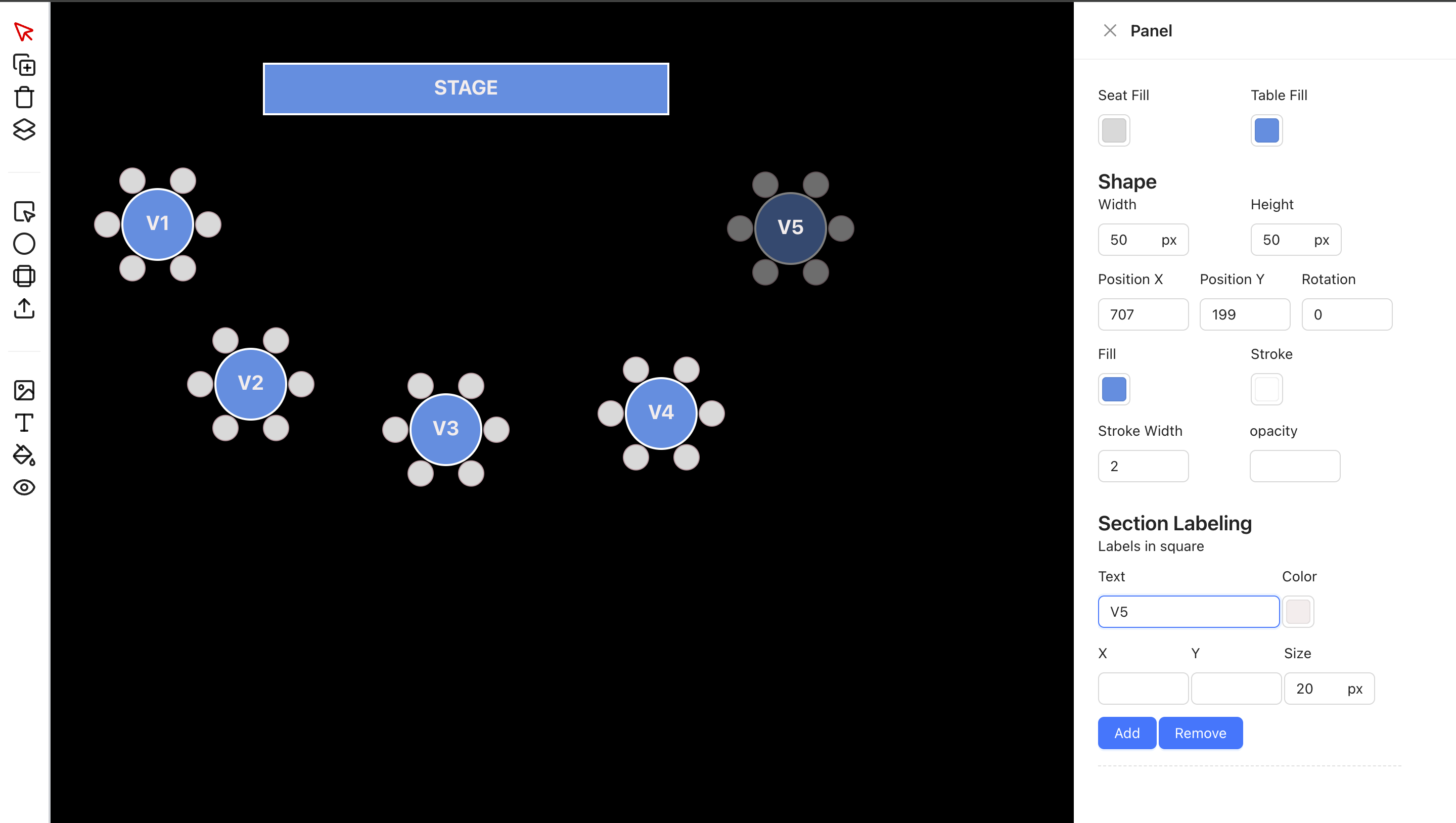
✨ Features
- 🎨 Drag-and-drop interface for adding and moving seats
- 🪑 Support for various seat shapes: square, circle, table with seats
- 🔤 Editable text labels
- 🔁 Rotate, resize, and duplicate components
- 🧠 Smart snap alignment (optional)
- 💾 Save & Load layout data
- 🔍 Zoom and pan the canvas
- 🧰 Modular component-based structure
"use client";
import { useState } from "react";
import { SeatEditor } from "seat-editor";

export default function Home() {
  const [componentProps, setComponentProps] = useState([]);
  const [extraComponentProps, setExtraComponentProps] = useState([]);

  const handleCurrentStateChange = (currentState: any) => {
    console.log("Current state changed:", currentState);
  };

  const handleSelectComponent = (selectedComponent: any) => {
    console.log("Selected component:", selectedComponent);
  };

  return (
    <div className="h-screen w-full bg-gray-200">
      <SeatEditor
        componentProps={componentProps}
        extraComponentProps={extraComponentProps}
        onCurrentStateChange={handleCurrentStateChange}
        onSelectComponent={handleSelectComponent}
        statusKey="status"
      />
    </div>
  );
}
For only View
"use client"
import LayerView from "@/features/view/index";
import { dataDummy, dummyImage } from "./constant";
const OnlyView = () => {
  return (
    <>
      <div className="w-full h-screen flex relative justify-center items-center">
        <LayerView
          componentProps={dataDummy}
          mappingKey="properties"
          extraComponentProps={dummyImage}
          statusKey="status"
          colorMatchKey={[
            {
              color: "red",
              key: "1",
            },
            {
              color: "blue",
              key: "2",
            }
          ]}
        />
      </div>
    </>
  );
};
export default OnlyView;
🔧 Props
| Prop | Type | Description |
|-----------------------|-------------------------------------------|------------------------------------------------------------------------------|
| componentProps | any[] | List of main components (e.g., tables, chairs) to render. |
| extraComponentProps | any[] | List of extra components (e.g., backgrounds, decorations) to render. |
| onCurrentStateChange| (state: any) => void | Callback triggered when component state updates. |
| onSelectComponent | (component: any) => void | Callback triggered when a component is selected (clicked). |
| mappingKey | string | Key name used to map nested shape data from component. |
| selectedTableColor | string | Color value for highlighting selected components. |
| colorMatchKey | { color: string, key: string }[] | Array to match status keys with specific colors. |
| statusKey | string | Key name used from each component to determine its current status. |
| action | File | You can put logic to this props|
| mappingProps | any | responseMapping?: {
status: string;
message: string;
data: string;
src: string;
};|
add tailwind prefix node add-tailwind-prefix.js --prefix=my-
remove prefix tailwind node remove-tailwind-prefix.js --prefix=my-