
sena-a11y
v1.1.0
Published
A customizable accessibility sidebar component for React, Next.js and TailwindCSS projects.
Maintainers
 andresh.dev
Readme
📘 Sena a11y – Accessibility Side Menu for React + TailwindCSS
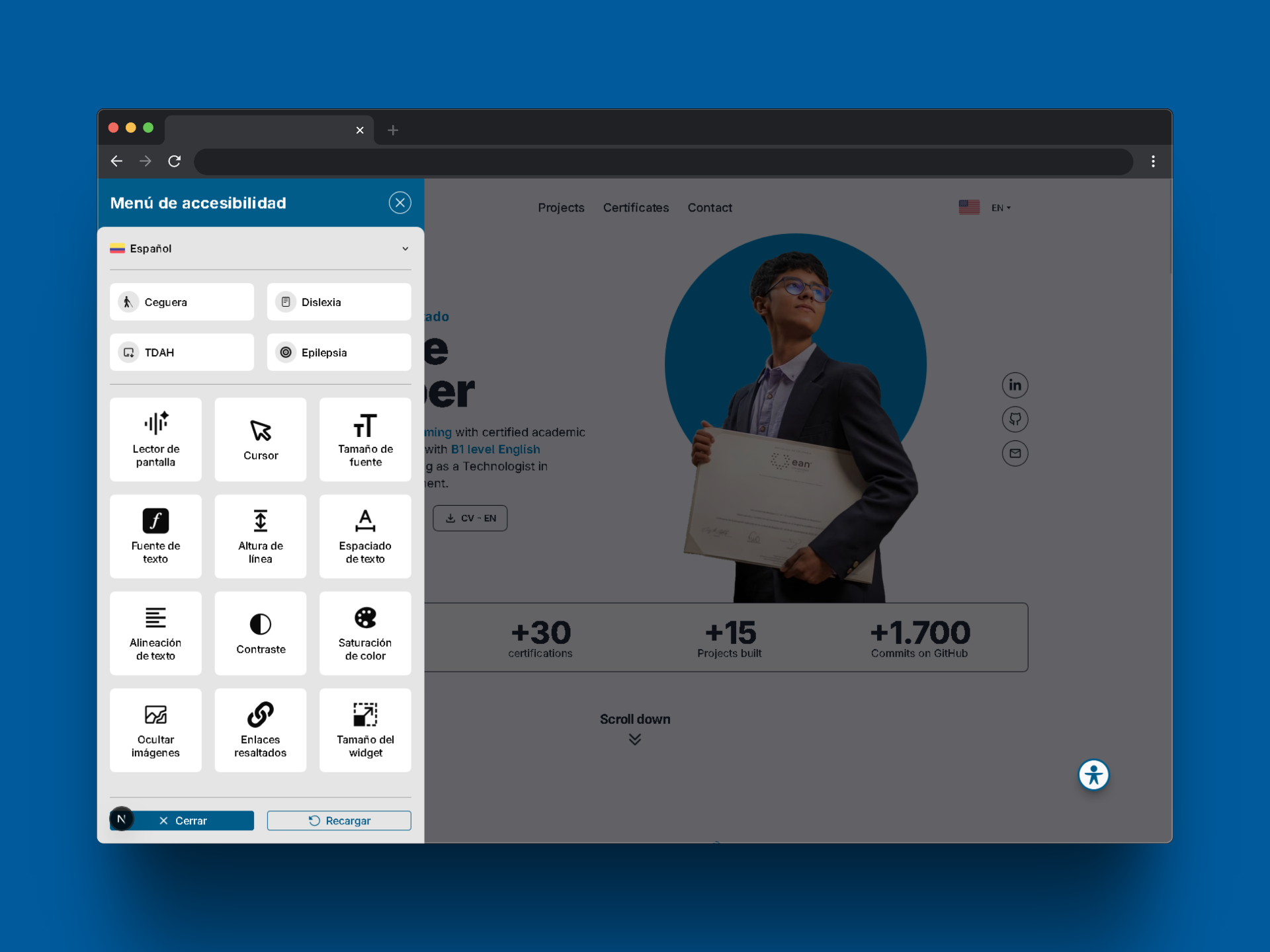
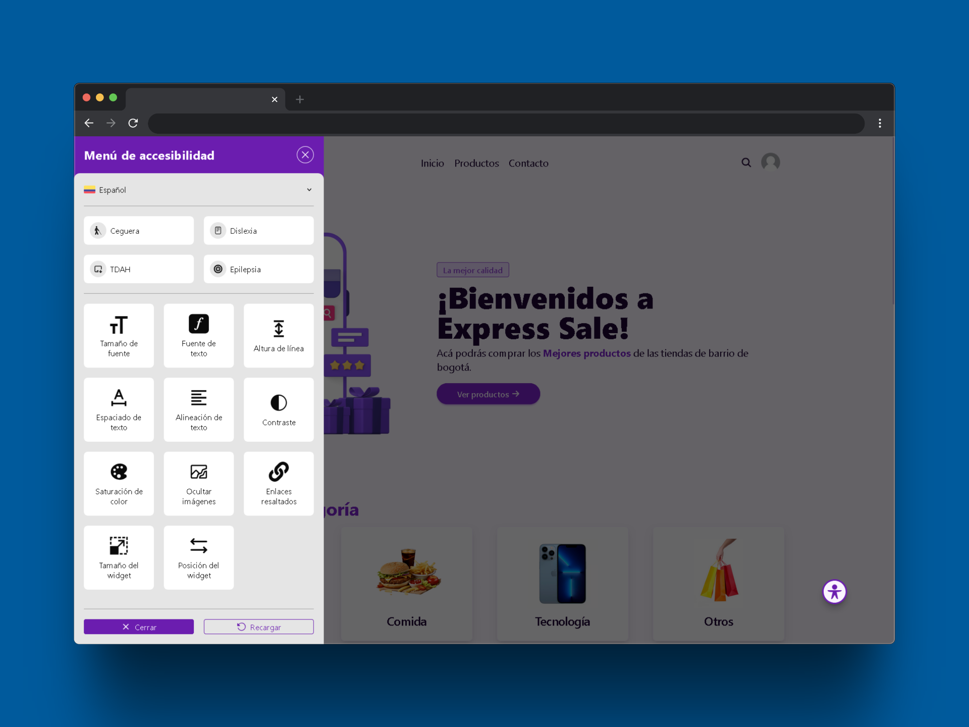
Sena a11y is a lightweight and customizable side menu component designed to enhance web accessibility in modern React projects using TailwindCSS. It is also fully compatible with Next.js (Server-Side Rendering).
🧩 Easily plug & play into any project.
🔗 View on GitHub – Full documentation, demos, and contribution guidelines available.
✨ Features
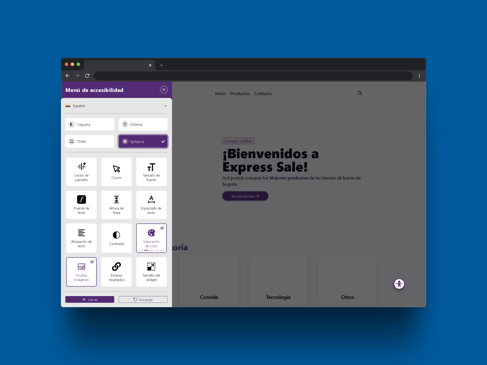
- ♿ Accessibility Tools – Improve UX for users with disabilities.
- ⌨️ Keyboard-Friendly – Fully operable via keyboard.
- 🎨 Custom Styles – Customize colors using the
stylesprop. - 🧰 Modular Tools – Enable/disable features via the
toolsprop. - 💾 Persistent Settings – Preferences are saved in
localStorage. - 📁 Predefined Profiles – Ready-to-use setups for common needs.
- ⚡ Next.js Support – Works with server-side rendering.
🧩 1. Installation and Basic Usage
📦 Installation
Run the following command in your terminal to install the library in your React project:
npm install sena-a11y[!WARNING] 💡 Make sure you have TailwindCSS properly configured in your project, as it is a required dependency for the widget to work.
🚀 Integration into your project
In a traditional React application:
import React from "react";
import { AccessibilityWidget } from "sena-a11y";

export default function AppLayout() {
    return (
        <>
            <Header />
            <Content />
            <AccessibilityWidget />
            <Footer />
        </>
    );
}
In a Next.js application (SSR disabled):
import React from "react";
import dynamic from "next/dynamic";

const AccessibilityWidget = dynamic(
    () => import("sena-a11y").then((mod) => mod.AccessibilityWidget),
    { ssr: false } // Prevents issues with server-side rendering
);

export default function AppLayout() {
    return (
        <>
            <Header />
            <Content />
            <AccessibilityWidget />
            <Footer />
        </>
    );
}
⚙️ Customization
🛠️ Enable Specific Tools
const tools = ["text-size", "contrast", "highlight-links"];
<AccessibilityWidget tools={tools} />;
Available Tools:
[
    "screen-reader",
    "cursor",
    "text-size",
    "text-font",
    "text-line-height",
    "text-spacing",
    "text-align",
    "contrast",
    "color-saturation",
    "hide-images",
    "highlight-links",
    "widget-size",
    "widget-position",
];
🎨 Customize Colors
const styles = {
    "widget-primary": "#6b1daf",
    "widget-primary-content": "#faf5ff",
    "widget-base-100": "#ffffff",
    "widget-base-200": "#eeeeee",
    "widget-base-content": "#111111",
    "widget-divider": "#cccccc",
};
<AccessibilityWidget styles={styles} />;
| Property | Description |
| ------------------------ | ------------------------------------------------ |
| widget-primary | Widget header & active buttons background color. |
| widget-primary-content | Text color over primary. |
| widget-base-100 | Background color for internal cards. |
| widget-base-200 | Main background color. |
| widget-base-content | General text color. |
| widget-divider | Color for section/control dividers. |
📁 Predefined Profiles
Use predefined accessibility settings for common needs.
🎮 Keyboard Shortcuts
| Action | Shortcut |
| ----------------- | ---------------------- |
| Open/Close Widget | Ctrl + Shift + K |
| Navigate Options | Arrow Keys / Tab |
| Activate Option | Enter / Space |
✅ Compatibility
| Technology | Supported | | ------------------- | ------------- | | React (v17+) | ✅ | | Next.js (SSR) | ✅ | | TailwindCSS | ✅ (required) | | Screen Readers | ✅ | | Keyboard Navigation | ✅ |
❓ FAQ
Can I use only some widget functions?
Yes. Use the tools prop to define which ones.
Does it support keyboard navigation? Yes. The widget is fully keyboard-accessible.
Are user preferences saved?
Yes. Settings are stored using localStorage.
🧪 Testing & Validation
- ✅ Test across all major browsers.
- ✅ Confirm compatibility with screen readers and keyboard-only use.
- ✅ Ensure custom styles are applied correctly.
📫 Contact
Author: Andrés Gutiérrez Hurtado